Book analysis for Illuminations by Walter Benjamin & Interim crit on initial idea
Interim Crit & Initial reading
Based on an initial reading of the book I took forward some points from the essays on "The work of art in the age of mechanical reproduction". What I took from this reading was his thoughts on certain art works having an aura too them when seen and appreciated in first person, and how this aura is lost when this work is reproduced and replicated for mass production.
The work in the sistine chapel is a classic example, it has a spiritual feel too it but this cant be replicated through secondary sources.
This relates quite well to famous artworks been reproduced digitally for application in interior decor and for style purposes with no real thought of what the work means or represents just that it looks nice hung up on your living room wall!
This same idea applies to when work is photographed and presented on the internet or in books, the Aura (Feel, Field of energy, its personality, atmosphere, mood) is lost.
Initial Ideas
A few ideas I came up with to emulate, this idea of lost of aura is to work off the idea of dilution or fading, this could be visualized through the exploration of tones, contrasting colors, transparencies, monochrome schemes.
Use sizing, proportions, positioning within type, icons, shape, color to emulate dilution and fading. Ideas exploring these ideas alongside perspective could represent how the message from artwork is perceived depending on application, positioning, re-production, the thoughts and personality of the viewer, re-appropriation and if its a source image or viewed as the original.
Feedback was sparse on this proposal but everyone seemed to agree with the idea but some further reading will help provide a broad alternative to potential ideas.
Further book analysis/Study task 5
Scanning through the book I analysed a number of points that had potential for expansion into ideas for possible resolutions.
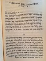
Focus on Essays 'The Work of Art in the Age of Mechanical Reproduction" and "These on the Philosophy of History"
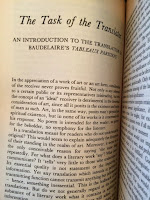
Other content covers the translation of Art and its messages something that could provoke ideas based around medium is message and how design decisions can visualise a focused idea.
Has poetic tone of voice when discussing theories and there interaction with artwork.
"Lithography enabled graphic art to illustrate everyday life" gives off the impression that as technology develops the methods of communication becomes more concise, quite the opposite of dilution more of an idea of refinement and precision which represents the "Reproduction" section of the essay title.
Ideas of progress through social democratic theories.
Some language is quite dark while some is vivid and bright, contrast of tones.
How simple theories can be overanalysed and become overwhelming.
Contrasting to this he does break up subjects into relevant subsections that approach a range of issues. Multiple angles approached.
Predicts modern theories and social solutions 50 years before.
Contrast and relationship between modern aesthetics and how they present political issues.
Culture and effects on how work is perceived, analysing different peoples view points.
The meaning of life, how this could reflect theories of the everyday. Reflection of the everyday within complex theories.
Deception, how messages and meanings have been hidden from society ranging from the middle ages to predictions to the modern day.
How medium has strengthened message over the ages.
Translation of artwork and its message is a way of expressing social and political messages.
How figurative speaking terms can form and develop into riddles and critical thinking to everyday life.


Persona of book
The books audience would be people interested in philosophy focusing on studying a range of theories from political & social issues, to cultural issues all the way to theories on art work and the messages behind it taken from multiple view points. The target audience would be interested in History, its quite a specific style of writing so the reader would appreciate quite complex writings so presenting quite a complex visual outcome wouldn't be an issue.
The wide view points and multiple subjects covered in the book would suggest the reader would take the content with an open mind, this further supports an idea of presenting quite a conceptual visual response with potential to emulate the complexity of the book within a visual outcome that explores lateral thinking.
On the flip side of this the reader is after working out theories so presenting a clear concept through a visual response would benefit this. Literal thinking within idea generation would support this, clearly communicating a defined issue.
A third persona would want to read the book to figure out the content itself, the complex language and tone of voice suggests this. So the response should consider leaving the message open to interpretation. Lateral and abstract ideas would support this.
Analyse of the book to influence Ideas
Throught word generation, mindmaping and deeper thinking relating to the highlighted persona these points will influence informed ideas to work from.
Deception
Reflection of the everyday within complex theories.
Predicts modern theories and social solutions 50 years before.
language is quite dark while some is vivid and bright, contrast of tones.
"Lithography enabled graphic art to illustrate everyday life" gives off the impression that as technology develops the methods of communication becomes more concise, quite the opposite of dilution more of an idea of refinement and precision which represents the "Reproduction" section of the essay title.
Ideas of progress
poetic tone of voice
Focus on Essays 'The Work of Art in the Age of Mechanical Reproduction" and "These on the Philosophy of History"
Translation of artwork and its message
Expand on the initial ideas of Aura within the deeper analyse
Feedback was sparse on this proposal but everyone seemed to agree with the idea but some further reading will help provide a broad alternative to potential ideas.
Further book analysis/Study task 5
Scanning through the book I analysed a number of points that had potential for expansion into ideas for possible resolutions.
Focus on Essays 'The Work of Art in the Age of Mechanical Reproduction" and "These on the Philosophy of History"
Other content covers the translation of Art and its messages something that could provoke ideas based around medium is message and how design decisions can visualise a focused idea.
Has poetic tone of voice when discussing theories and there interaction with artwork.
"Lithography enabled graphic art to illustrate everyday life" gives off the impression that as technology develops the methods of communication becomes more concise, quite the opposite of dilution more of an idea of refinement and precision which represents the "Reproduction" section of the essay title.
Ideas of progress through social democratic theories.
Some language is quite dark while some is vivid and bright, contrast of tones.
How simple theories can be overanalysed and become overwhelming.
Contrasting to this he does break up subjects into relevant subsections that approach a range of issues. Multiple angles approached.
Predicts modern theories and social solutions 50 years before.
Contrast and relationship between modern aesthetics and how they present political issues.
Culture and effects on how work is perceived, analysing different peoples view points.
The meaning of life, how this could reflect theories of the everyday. Reflection of the everyday within complex theories.
Deception, how messages and meanings have been hidden from society ranging from the middle ages to predictions to the modern day.
How medium has strengthened message over the ages.
Translation of artwork and its message is a way of expressing social and political messages.
How figurative speaking terms can form and develop into riddles and critical thinking to everyday life.


Persona of book
The books audience would be people interested in philosophy focusing on studying a range of theories from political & social issues, to cultural issues all the way to theories on art work and the messages behind it taken from multiple view points. The target audience would be interested in History, its quite a specific style of writing so the reader would appreciate quite complex writings so presenting quite a complex visual outcome wouldn't be an issue.
The wide view points and multiple subjects covered in the book would suggest the reader would take the content with an open mind, this further supports an idea of presenting quite a conceptual visual response with potential to emulate the complexity of the book within a visual outcome that explores lateral thinking.
On the flip side of this the reader is after working out theories so presenting a clear concept through a visual response would benefit this. Literal thinking within idea generation would support this, clearly communicating a defined issue.
A third persona would want to read the book to figure out the content itself, the complex language and tone of voice suggests this. So the response should consider leaving the message open to interpretation. Lateral and abstract ideas would support this.
Analyse of the book to influence Ideas
Throught word generation, mindmaping and deeper thinking relating to the highlighted persona these points will influence informed ideas to work from.
Deception
Reflection of the everyday within complex theories.
Predicts modern theories and social solutions 50 years before.
language is quite dark while some is vivid and bright, contrast of tones.
"Lithography enabled graphic art to illustrate everyday life" gives off the impression that as technology develops the methods of communication becomes more concise, quite the opposite of dilution more of an idea of refinement and precision which represents the "Reproduction" section of the essay title.
Ideas of progress
poetic tone of voice
Focus on Essays 'The Work of Art in the Age of Mechanical Reproduction" and "These on the Philosophy of History"
Translation of artwork and its message
Expand on the initial ideas of Aura within the deeper analyse


