Studio Brief 1 - Initial ideas & Refined research
Proposal
My research suggests that there is an obvious housing crisis at current, ranging from the regeneration of London and national social housing leaving limited social housing solutions to the difficulty for first time buyers to get on the property ladder.
To address this problem I plan on creating a campaign aimed at local councils, property developers and first time buyers with suggestions and guides on sustainable, cost effective, accessible and environmentally friendly housing solutions & methods.
To address this problem I plan on creating a campaign aimed at local councils, property developers and first time buyers with suggestions and guides on sustainable, cost effective, accessible and environmentally friendly housing solutions & methods.
Refined concept & purpose
Working from the proposal to solve issues relating to social housing and options for first time buyers a campaign will be created that revolves around raising awareness of these issues and suggestion of possible solutions and there advantages for local councils, property developers and first time buyers.
Proposals for housing solutions will incorporate plans for building propositions and the advantages of these for;
Councils to deliver social housing solutions.
Property developers for offering cheap and accessible housing solutions (Rent and Buy to own)
First time buyers looking to see the advantages of self building.
The proposals will act as information packs, mailed out to local councils, property developers and available upon request for first time buyers or self builders through http://www.selfbuildportal.org.uk/. A resource for people interest in self building.
The proposals will act as information packs, mailed out to local councils, property developers and available upon request for first time buyers or self builders through http://www.selfbuildportal.org.uk/. A resource for people interest in self building.
Build guides influenced by my range of research will be emulated through the exploration of illustration, typography, 2D and 3D craft within the campaign and will form the main focus point of the deliverables.
Initial Ideas
Create a publication that raises awareness of current housing issues and possible solutions for multiple audiences.
Create a poster campaign to raise awareness on a national scale, to be positioned in corporate buildings, build sites of high end un affordable accommodation or in places where demolition of social housing is happening.
As a means of informative rebellion.
Colour code different types of housing to effectively communicate multiple solutions through the exploration of colour and basic image.
Expand on the idea of rebellion by connoting it through aesthetics like spray paint to reference urban rebellion.
Create a corporate aesthetic for final visual document to simulate importance and improve chances of approval from council and government bodies.
Create a series of do it yourself guides, strip all my research down into a system that emulates a strong message through image and architectural drawings. Theres no need for large bodies of text as it will loose the target audiences attention, tell them what they need to know and how they can go about solving this issue in as concise way as possible.
Play around with colour texture to emulate material without the need of explanatory texts, colour and texture can say a lot, rough texture brown for example has a recycled wood feel.
Vector or photographic texture.
Aesthetic needs to be structured to aid easy digested information, minimal abstract aesthetics.
Concentrate on cost effective solutions.
Show customisability, functionality and efficiency for self builders, appeals to a range of audiences then.
Consider the effective use of small space and un-used space to solve another location based issue.
Take influence from other cultures.
Dont just concentrate on exterior and structure concentrate on solving issues that Brutalism aimed to solve, creating a sense of community and functional living. Think about adjustable rooms, sliding walls allowing different formations for good use of small space.
Think about self sufficient builds, if theres money to be saved by councils and self builders theres better chance of involvement.
Consider the re-use and re-purpose of materials from demolished sites or local recycled materials before considering other materials to keep things sustainable.
Expand on the idea of modular houses for functional solution to social housing, and shipping container homes for promotion of self building.
Refined research
Alongside my existing research further investigation into build techniques and use of materials that take consideration to energy efficiency, sustainability/environmentally friendly aspects and ergonomic & efficient constructions will help form stronger proposals for these constructions.
Visual research will support how I go about presenting the message from my initial ideas through exploration of materials, process, design techniques and production.
VSM Studio
Although quite abstract in its aesthetic the interaction between these installations takes into account typography, image, shape and color in a very tactile and 3D way. I mentioned I wanted to influence aesthetics around brutalism to reference past architecture relevant to housing solutions, this work takes influence from Constructivism through the exploration of geometric artwork to represent an idea of still life. This us of physical objects to create image is something I want to consider when using 3D products within my visual response. My photography skills need developing to achieve this level of quality though.


.jpg)
Contrasting colors give an interesting aesthetic and tone of voice, considering the tone of voice presented to the 3 main focus's for the housing proposal is important. The tone of voice and feel presented to a council or government will differ to the first time buyer who will appreciate contemporary and abstract aesthetics due to them been in a younger age bracket. Consider the relationship between traditional and contemporary, either balance it out or contrast it completely.


Emulating the brand image or a message is important in every design decision, right down to the attention to layout, positioning and sizing. As my subject and message is related to architectural plans and guidance for proposed solutions consideration to accuracy needs to be considered in every design decision.


Not as functional and versatile as wood so wouldn't be very accessible for self building and small scale projects but for larger scale projects the durability of stone has been proved over thousands of years. Concrete was what made brutalist architecture so well known but the aesthetics received mixed feedback, bringing back stone and concrete for there durability using recycled stone products from waste buildings would be a good way of repurposing un-used space or buildings for use to solve housing problems.


Different build techniques
Whatever route I go down Im going to need to do some sort of plans or architectural drawings that are both informative and technical so taking some influence on these drawings and taking aspects from successful structures into a refined outcome would show consideration to multiple cultures and techniques. Basically taking the best bits from all cultures techniques to help propose a solution that could solve a world wide sustainable housing solution.


VSM Studio
Although quite abstract in its aesthetic the interaction between these installations takes into account typography, image, shape and color in a very tactile and 3D way. I mentioned I wanted to influence aesthetics around brutalism to reference past architecture relevant to housing solutions, this work takes influence from Constructivism through the exploration of geometric artwork to represent an idea of still life. This us of physical objects to create image is something I want to consider when using 3D products within my visual response. My photography skills need developing to achieve this level of quality though.


Mr. W Neon Mob collection
The idea behind these illustrations created for Neon Mob by Mr.W is similar to mine but in a more contemporary and playful way, this is a small selection of over 50 images within print packs available to collect, the idea is based around unrealistic and warped structures aimed at "corporate magnates & the common man" The consistency is something I will influence my images from, how even though they all share a range of aesthetics they feel like they belong as a set. Il be creating a number of proposed housing solutions so learning from how color, tone, texture, angles and use of contrasting shapes are used will benefit my outcomes.
Points of influence
Varied shades, tones, tints of a fixed color to keep things simple and consistent.
Simple use of shape and consistent angles.


Lilly Des Billons
From simple and subtle use of color to more complex with the incorporation of texture, gradients, lighting and shadows shows how consistent angles and shapes can be made to appear surreal and have more of a depth within flat illustrations.
I mentioned in my idea stages the incorporation of texture to represent material, been experimental and abstract will achieve varied effects to give off different tactile feels to a flat visual outcome. An important consideration as the drawings will be representations of 3D final outcomes.


Tom Haugomat
Success of a limited color palette is shown within this work with more consideration to texture as a way of adding a sense of atmosphere and energy too work, although a sense of energy isn't important in my work a sense of realism is again the use of angles is an important consideration to make, consistency in the angles of lines within the drawing will separate work that looks organized and structured from work that looks loose, messy and unorganized. As its architecture this sense of accuracy needs to be maintained.

.jpg)
Contrasting colors give an interesting aesthetic and tone of voice, considering the tone of voice presented to the 3 main focus's for the housing proposal is important. The tone of voice and feel presented to a council or government will differ to the first time buyer who will appreciate contemporary and abstract aesthetics due to them been in a younger age bracket. Consider the relationship between traditional and contemporary, either balance it out or contrast it completely.

Marcel häusler
Expanding on the idea of contemporary aesthetics this work for a fitness event shows how abstract design can be a way of provoking thought and interaction, this design doesn't really communicate health and fitness yet its impact through contrasting colors, deconstructed type and shapes and alternative layout. Experimenting into creating thought provoking reactions and high impact through abstract visualization of messages may meet contemporary audiences and change perceptions on housing issues as a whole.


Measuring exhibition - Tokyo
Expanding on the idea of accuracy and its connotations with architecture this visual representation of measurements places quite a dry subject into an aesthetically pleasing outcome. Using shape, color and angles to show proportions and area is how I perceive this. A very effective example of emulating a message making me consider how I can go about presenting accuracy and typical architectural aesthetics in a more contemporary way which resonates with ideas of sustainability, efficiency and considerations to environment to reflect the build process of the proposed houses.

SPIN - Algunos Artistas Exhibition
Keeping on the theme of conceptual approaches to visualizing a message SPIN are the perfect studio to look into, use of words alone can have a powerful message, so to strengthen the issues im raising about housing I believe creating a link between my proposed ideas of typeface design and illustrations of house designs will be important in establishing a strong message and link between raising awareness of an issue and proposing potential solutions.
The typeface here is used in conjunction with promotions for an artists event but the use of angles, shape and negative space could be used to emulate and reflect construction plans, materials and the building process.
And interesting idea to expand on from my initial ideas is the idea of using blank and negative space as a focus point, as part of my proposed solution is to show how small space and un-used space can be used to solve housing issues.


Other work by SPIN
Focus on texture, shape and angles used to link image and type together.


We Live Here - Jonathan Wilkinson
I bought myself a print from this guy at the Wakefield Print fair and had a nice chat about his approach to design and the We Live Here series, they are a number of prints and paintings that celebrate past British architecture and what type of architecture defines certain locations.
His stripped back style of flat line drawings have a very accurate and architectural feel too them, Im certainly drawing towards the idea of creating very stripped back drawings, architectural plans done need lots of fancy aesthetics as the purpose is to direct, and as im directing and proposing an idea it needs to be as concise as possible.


Nice use of monochrome colors contrasting pastel colors, these colors could work alongside the idea of visualizing the different types of housing solutions.

More use of limited palette with varying tones to keep things consistent and to work with the neat and accurate style of image making. It emulates the Brutalist feel well too, giving off a certain atmosphere. I wanted to emulate past movements and tone of voice so using color as a reference point may be an option

Atipus - Altalink
A perfect example of how effective stripped back aesthetics can be when communicating a message and mean, the use of quite metallic grey tones and muted yellow gives off an industrial feel while the angular shapes strengthen this feel.
Consider use of angles, curves, color, tints, shades and tones to denote architecture and considered materials.

Two Points - Aamodt/Plum
The use of flat color is something I already have enough exploration potential with (Texture, shade, gradient, tints) but the interaction with physical photographs is an interesting way for me to emulate my idea of visualizing textures of material within the housing plans/drawings.
Two points created an identity for architecture studio Aamodt/Plum, working off the angle between the slash between the names as a flexible system, used as a representation of division of space and in my opinion further enhance the architectural feel. The use of pastel colors and photographic textures add a contemporary aesthetic and as mentioned previous provoke though and interaction to the identity as it doesn't instantly suggest architecture.


Emulating the brand image or a message is important in every design decision, right down to the attention to layout, positioning and sizing. As my subject and message is related to architectural plans and guidance for proposed solutions consideration to accuracy needs to be considered in every design decision.

Two Points - Tonangeber
The work created for record label Tonangeber expands on the interaction of texture, color and shape to create a high impact and tactile design that has depth and interactivity within it even though the deliverables are a flat printed outcome. If I go forward with creating 3D structures I would like a link between the print deliverables and physical 3D deliverables.


Sawdust - Shanghai Ranking numerals
Expanding on the idea of linking typography and imagery together could learn a lot from these glyphs, they have a 3D feel too them that has a certain brutalist feel too it through its aggressive angles and monochrome color.


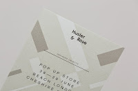
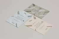
Delivered by Post - Hustler & Rose
This link between the physical, print and the medium and message is rounded up perfect with Delivered by Post's identity for Hustler & Rose carrying consistent aesthetics across a range of collateral. The visual language of overlaid block of color, texture and pattern take influence from Herbert Bayer's Bauhaus posters and record sleeve designs and pays attention to companies attention to detail and quality of there made products.


Atlas - MAD 2014
I mentioned the use of color coding, this is used in this editorial design by Atlas for Masters of Art & Design exhibition guide at Zurich University of the Arts the influence comes from pharmaceuticals suggesting abstract influences from a range of sources can produce abstract aesthetics and provoking messages.


Other work by Atlas
To expand on the experimentation proposals and abstract contemporary aesthetics these works show how versatile these aesthetics can be.


SuperWarmRed Designs - New York City subway
Architectural drawings need to be accurate and well communicated, as do public transport guidance systems which the New York subway system designed by Vignellli was renowned for. Color coding, coding systems and keys, and stripped down and concise diagrams present information clearly and effectively.


Handmade Houses & Other buildings the world of vernacular architecture - John May
Reading into this book will help inform self build techniques for self building projects while looking into more sustainable housing production methods for larger scale builds that can possible tackle the social housing and accessible buy and rent house solutions.

Use of material.
Lots of these self build don't follow the route of using manufactured bricks. using natural material in its purest form like wood, wood can be a very versatile material and has been used for thousands of years and theres lots of potential for using recycled and repurposed wood from older structures rather than cutting down more tree's, its also a material that can be used as main frame works.


Not as functional and versatile as wood so wouldn't be very accessible for self building and small scale projects but for larger scale projects the durability of stone has been proved over thousands of years. Concrete was what made brutalist architecture so well known but the aesthetics received mixed feedback, bringing back stone and concrete for there durability using recycled stone products from waste buildings would be a good way of repurposing un-used space or buildings for use to solve housing problems.


Different build techniques
Whatever route I go down Im going to need to do some sort of plans or architectural drawings that are both informative and technical so taking some influence on these drawings and taking aspects from successful structures into a refined outcome would show consideration to multiple cultures and techniques. Basically taking the best bits from all cultures techniques to help propose a solution that could solve a world wide sustainable housing solution.

Both the skeletal drawings of the structures and the detail technical drawings give a very clear idea of the materials and the structural plans within a build. Exploring emulation of material through simple or complex texture through analogue, digital or photographic techniques will be explored.


No comments:
Post a Comment