Studio Brief 1 - Refinement and Production
The production stage was a bit of a disaster, there were two main concepts for the use of stock. For the sustainable social housing solution it needed to not only emulate accuracy of the modular housing but also have an aesthetic that suggested sustainability.
The use of yellow simulated a feeling of doing good and positivity but my printer miss alligned the double side print. TWICE.


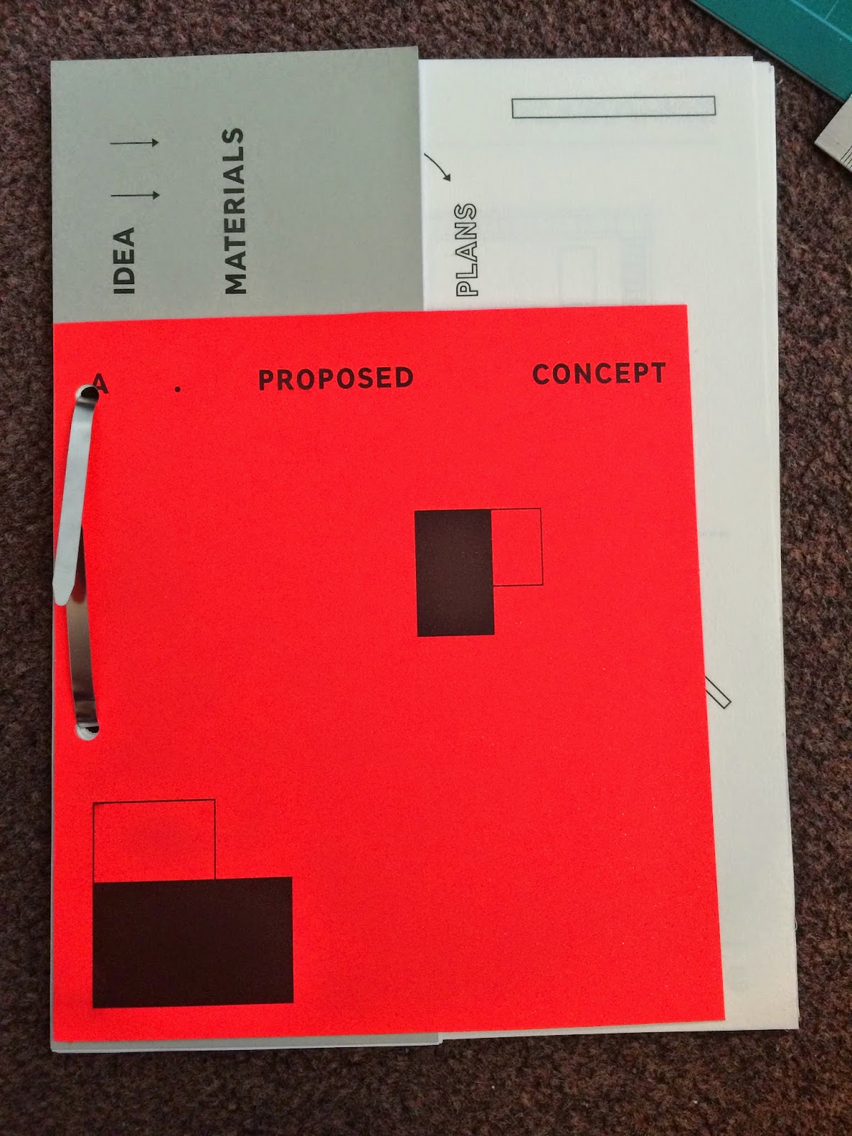
Grey stone Daler Rowney paper was used with standard print paper for the leafs as I didn't want it too be too thick and difficult to turn through the pages. It was difficult lining up the arco clip as the punch only went through a few pieces at a time.
The arco clip reinforced the feeling of construction and had that organised architectual feel that reflected the concise tone of voice within type and image.


To reflect ideas of DIY a mish mash of color stocks were selected, I tried out the GMUND neon GF Smith stock but it was far too bright and the grey stone was far too mechanical in contrast with it.
So the other colours explored were more pastel, this pastel tone has a more sustainable feel while the colours used reference self sufficiency, progression and environmental connotations.


No comments:
Post a Comment