Covered development of ideas - Scamps, focused visuals, digital development
Working from the word generation and concept development a number of scamps have been developed into basic then more refined digital visuals.
Concept to inform scamps
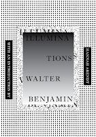
The main focus for the concept comes from an essay within the book, "The Work of Art in the Age of Mechanical Reproduction", the idea is to visualise how aura in physical artwork is lost through reproduction & documentation of original artwork.
Supported by a sense of tactility to emulate the energy the feel that denotes an artworks aura and other iconic aspects of the book through exploration into tone, texture, legibility and illegibility, construction, deconstruction, contrast, progression, altered perspective, surreality, warped aesthetics, pattern, colour and typography
Target persona who would digest visuals with an open mind in terms of the message behind them through the alternate multiple view points relating to subjects so quite abstract outcomes can be created.
Scamps
Different angles of gradient, a gradient could emulate the dilution of aura through 2 tones lightening. Remember its a 2 colour limit though so there needs to be a strong contrast.
Idea of refinement to show how modern techniques clarify the communication of information, explore this through rough and smooth contrasting textures.
When working with black and white many tones can be achieved through less amounts of black ink and sparser dots through the print process, working with dilution of shade would emulate lost aura quite well with a nice high impact aesthetic suiting book covers.
Warped imagery can visualise warped aesthetics to represent ideas of deception outlines in social theories in the book.
Contrast should be played around with to emulate the books dark & light tone of voice.
Covering text to show more warped reality and messages.
Play around with moving shapes to show progression, an iconic element mentioned in the book about how modern print process is helping to aid communication. Use digital print and CMYK colour exploration to emulate this in a contemporary way as there was a lot of discussion on predicting future social, political and communication theories in the book.


Think about physical application of colour after the digital print, merging the idea of refined print and analogue techniques to contrast on both past and present and a subtle reflection of the contrasting tone of voice in the books language.
Play around with reflection to emulate warped reality to emulate theories that analyse and reflect on the everyday within the book.


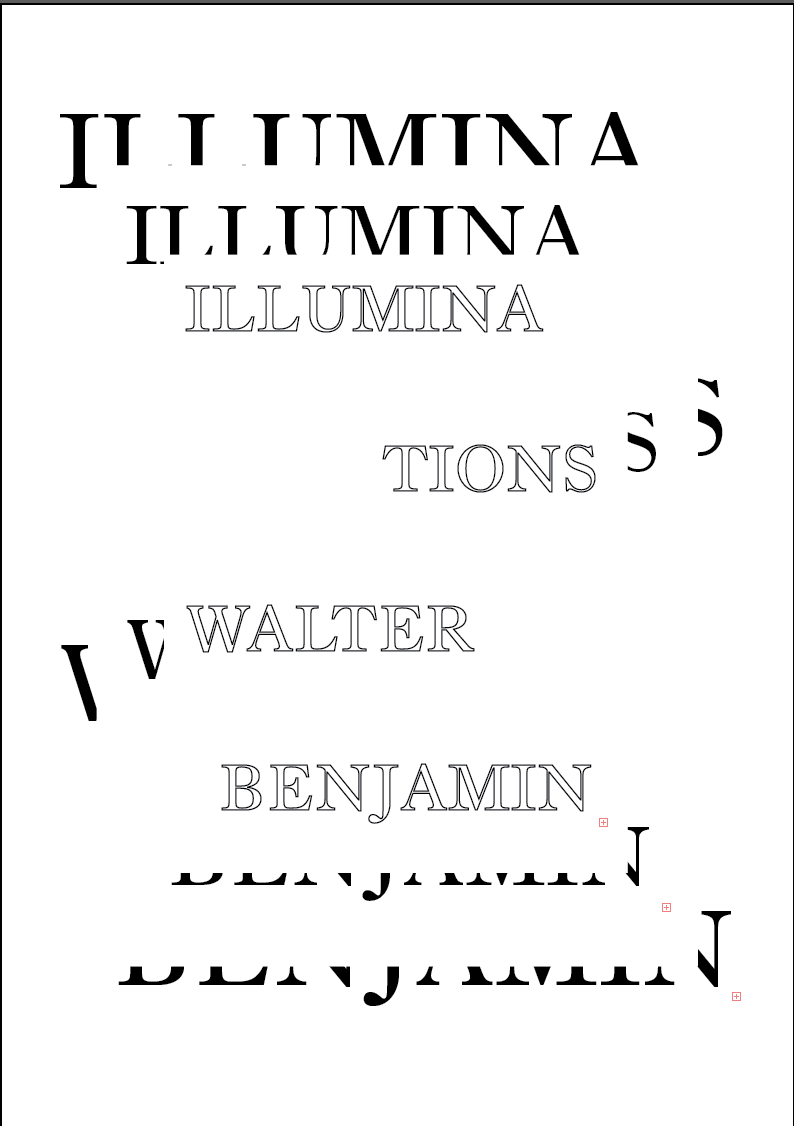
Bringing text in, back to the angular shapes as there contrast worked a lot better, a large white block creates even more contrast to reference the tone of voice while the serif typeface choice references traditional typesetting, something that links with the discussions on how modern methods were helping enhance communication. The main focus is lost though, dilution of aura isn't presented anymore.


The diagonal gradient has a nice aesthetic too it but its quite hard to achieve balance and structure, an important consideration in a book cover design. There is good hierarchy though through the uppercase Old Style typeface with small sub title. This contrast of large and small also references the contrasting tone of voice.


This worked again but was far too contemporary, very trend driven. Even the persona who approach subjects with an open mind wouldn't place connection with this to the books content.


Bringing in gradients as a more visual representation of lost and diluted aura with contrasting tone of voice. The whole background gradient doesn't work, it causes imbalance, the smaller rectangle of gradient is starting to become more balanced but the white space needs filling to make the design feel more structured. Structure is important to show refinement and good communication of information.


A drop shadow was added to lift this section of type off the page a little expanding on the idea of layering mentioned in the idea generation while also adding a tactile feel. It feels detached from the rest of the design though.

To expand on the idea of warped aesthetics to reflect warped perceptions, deception and further supporting the feeling of how Aura changes through reproduction I began to create some warped headers and subheaders.


Once the book cover was established the spread was easy enough to expand on as there was already an established concept and visual delivery of the concept. To expand on the contrasting tone of voice I wanted to make a contrast between light and dark between the covers while also showing a reflection of past and present, to do this I used black as a reference to the limited print capabilities while contrasting in tone with the front cover.


Slight addition of blue was added, a series of these covers could be created for the books but blue had a much more religious connotation which referenced the idea of Aura a lot better. Alternative positioning of subheads was explored to achieve better balance and structure, there needed to be a reflection of the structure and balance seen on the cover so some consistency needed to be resolved.


Alternative angles showed progression well but didn't feel structured.


Digital final


Started to interact the CMYK colours together, but the simple square in the middle begins to generate literal ideas of print, reminds me of registration bars in proof printing. Started to explore warping a shape that references a page from the book, to show the incorporation of the books context into a contemporary output. This wasn't working though it felt very messy and too playful.


Referencing the CMYK colour in full format now but again it has far too much of a print oriented aesthetic, started to bring in contrasting textures going back to the noise textures I made in the initial developments. This was certainly working in terms of showing progression and refinement with the gradient supporting the idea of lost Aura.


From here there was 3 main developments before arriving at a final resolution, exploring solid colour application to show contrast of tone and refinement but the block color caused a little confusion was block colour a final outcome from refinement or the starting point? Quite confusing what it represents. The final poster references the vertical positioned subheads and altering header position to reference progression from the book cover to keep a consistent link. The noise texture contrasts with the dots, the idea here is to show refinement of communication, contrasting tone of voice and an idea of repetition to reference aura and mechanical reproduction.


Concept to inform scamps
The main focus for the concept comes from an essay within the book, "The Work of Art in the Age of Mechanical Reproduction", the idea is to visualise how aura in physical artwork is lost through reproduction & documentation of original artwork.
Supported by a sense of tactility to emulate the energy the feel that denotes an artworks aura and other iconic aspects of the book through exploration into tone, texture, legibility and illegibility, construction, deconstruction, contrast, progression, altered perspective, surreality, warped aesthetics, pattern, colour and typography
Target persona who would digest visuals with an open mind in terms of the message behind them through the alternate multiple view points relating to subjects so quite abstract outcomes can be created.
Scamps
Different angles of gradient, a gradient could emulate the dilution of aura through 2 tones lightening. Remember its a 2 colour limit though so there needs to be a strong contrast.
Idea of refinement to show how modern techniques clarify the communication of information, explore this through rough and smooth contrasting textures.
When working with black and white many tones can be achieved through less amounts of black ink and sparser dots through the print process, working with dilution of shade would emulate lost aura quite well with a nice high impact aesthetic suiting book covers.
Warped imagery can visualise warped aesthetics to represent ideas of deception outlines in social theories in the book.
Contrast should be played around with to emulate the books dark & light tone of voice.
Covering text to show more warped reality and messages.
Play around with moving shapes to show progression, an iconic element mentioned in the book about how modern print process is helping to aid communication. Use digital print and CMYK colour exploration to emulate this in a contemporary way as there was a lot of discussion on predicting future social, political and communication theories in the book.


Think about physical application of colour after the digital print, merging the idea of refined print and analogue techniques to contrast on both past and present and a subtle reflection of the contrasting tone of voice in the books language.
Play around with reflection to emulate warped reality to emulate theories that analyse and reflect on the everyday within the book.


Beginning to make black and white gradients first exploring angular layered shapes, layering references ideas of repetition to link with ideas of lost aura through repetition, the altered aesthetic and gradient further support this concept. The more fluid warping has a much more surreal feel, with the contrasting tones to represent contrasting tone of voice this works better while also referencing ideas of deception.


Bringing text in, back to the angular shapes as there contrast worked a lot better, a large white block creates even more contrast to reference the tone of voice while the serif typeface choice references traditional typesetting, something that links with the discussions on how modern methods were helping enhance communication. The main focus is lost though, dilution of aura isn't presented anymore.

Beginning to explore textures to bring in ideas of refinement, this rough texture made from a screen shot of a noise texture in photoshop then vector tracing in illustrator to give it more clarity and precision. The black and white also references the contrasting tone of voice.


Starting a fresh on a fresh concept visual delivery, bringing in the CMYK colours to reference digital print, with alternative type position and sizing strengthening feelings of progression and movement, starting off with quite structured type references concise presentation of information. Something that was outlined in the book from the future oriented print methods.


The diagonal gradient has a nice aesthetic too it but its quite hard to achieve balance and structure, an important consideration in a book cover design. There is good hierarchy though through the uppercase Old Style typeface with small sub title. This contrast of large and small also references the contrasting tone of voice.


Moving on from ideas of impact and how the gradient on an angle wasn't working in terms of balance heavier use of the gradient across the full page was tried out, the use of white type had a nice feel too it that referenced Aura very well but was illegible, when put in black it just didn't have the same balance and structured aesthetic, all attention was took away from the blue gradient. There needed to be balance as the gradient was a main reference to the concept.
Moving on to a more vibrant gradient Yellow and Magenta was placed into a gradient, this worked well in terms of aesthetic and the white type was more legible but it didn't show dilution or have a feel of aura.


Bringing in more balance and trying it out on the full spread there was more of a feel of dilution been established but the bright tones just felt too playful. Not a good reflection of the book when the books tone of voice can often be quite dark.

This worked again but was far too contemporary, very trend driven. Even the persona who approach subjects with an open mind wouldn't place connection with this to the books content.

Onto a new idea working on repetition to show how Aura is altered, exploring heavy use of white space and blocks of black. The black certainly supports the contrasting tone of voice while the repetition shows lost aura, especially with the outline of type making the typography feel empty, type often carries communication. If it has feelings of emptiness it begins to lose purpose, just like how religious artwork loses feel and purpose when reproduced.
The white works in a very surreal way, it has depth too it. A nice tactile aspect for the book but its quite confusion, I don't want the typography to be unreadable, jus slightly altered in aesthetic. A balance of illegible through warping with legibility through structure. This shows the refinement of communication in the book.

Bringing in gradients as a more visual representation of lost and diluted aura with contrasting tone of voice. The whole background gradient doesn't work, it causes imbalance, the smaller rectangle of gradient is starting to become more balanced but the white space needs filling to make the design feel more structured. Structure is important to show refinement and good communication of information.


Moving on from the noise textures and making a texture out off vector squiggles, this doesn't work at all, tried to make it smaller to show a finer texture but it felt far too contemporary and very playful in its tone of voice.


Back to the black and white versions adding more content to see if there can be some structured added to the white version, still not working though in fact it feels very cramped losing all structure and losing the feeling of refinement and dilution.
The black version is beginning to work very well though, the empty type carrying a strong message while the reversed out white type creates more contrast and a better balance of content on the page.


Going back to the minimal application of gradients and bringing in the CMYK colours again a whole new layout was tried out, with the title and author been very clear and legible while its repeated central typeset section symbolises progression through moving alternative layout type and lost aura through the illegibility caused through covering the type and the fading gradient. The white text has that slight feel of energy too.

Taking this use of colour into the already established structure I expanded it to explore the full CMYK range to reference modern print and its aid on helping establish well communicated messages. The yellow and blue certainly have a feel of aura and dilution through the gradient. Black type was tried out again but I much preferred the balance with the outline text and the feeling of emptiness it carried.


A drop shadow was added to lift this section of type off the page a little expanding on the idea of layering mentioned in the idea generation while also adding a tactile feel. It feels detached from the rest of the design though.

To expand on the idea of warped aesthetics to reflect warped perceptions, deception and further supporting the feeling of how Aura changes through reproduction I began to create some warped headers and subheaders.


Once the book cover was established the spread was easy enough to expand on as there was already an established concept and visual delivery of the concept. To expand on the contrasting tone of voice I wanted to make a contrast between light and dark between the covers while also showing a reflection of past and present, to do this I used black as a reference to the limited print capabilities while contrasting in tone with the front cover.


Slight addition of blue was added, a series of these covers could be created for the books but blue had a much more religious connotation which referenced the idea of Aura a lot better. Alternative positioning of subheads was explored to achieve better balance and structure, there needed to be a reflection of the structure and balance seen on the cover so some consistency needed to be resolved.


Alternative angles showed progression well but didn't feel structured.


Digital final


Poster series expansion
As there was quite a strong reference to CMYK and warping there was potential for a series of explorative and experimental posters to extend on the current concept. At this stage I wanted to start thinking about stock choice and print finishes, acetate was a consideration to work on an idea of opacity to reference dilution of Aura.
Additions of CMYK through spray paint to incorporate digital print and analogue techniques to reference traditional print in a contrasting and intriguing way.
Expand on the idea of textures to show refinement, showing the advancement of technology and well communicated messages.
Create a series of warped type or imagery the type becomes more warped and less legible showing how aura is lost and how the meaning and message behind it is lost too. Or vice versa to show refinement and progression within medium is message through the use of technology.
Neon spray paint in CMYK will help literally represent the books name illuminations.


Creating texture from neatly arranged circles to explore the idea of repetition and refinement while the CMYK colour references print advancement and the gradient shows dilution of aura.

Started to interact the CMYK colours together, but the simple square in the middle begins to generate literal ideas of print, reminds me of registration bars in proof printing. Started to explore warping a shape that references a page from the book, to show the incorporation of the books context into a contemporary output. This wasn't working though it felt very messy and too playful.


Referencing the CMYK colour in full format now but again it has far too much of a print oriented aesthetic, started to bring in contrasting textures going back to the noise textures I made in the initial developments. This was certainly working in terms of showing progression and refinement with the gradient supporting the idea of lost Aura.


From here there was 3 main developments before arriving at a final resolution, exploring solid colour application to show contrast of tone and refinement but the block color caused a little confusion was block colour a final outcome from refinement or the starting point? Quite confusing what it represents. The final poster references the vertical positioned subheads and altering header position to reference progression from the book cover to keep a consistent link. The noise texture contrasts with the dots, the idea here is to show refinement of communication, contrasting tone of voice and an idea of repetition to reference aura and mechanical reproduction.


Digital files for testing with print process's
To be printed on acetate to work with the idea of dilution of aura, the gradient has been brought back in to further support this with a series of warped CMYK headers that gradually get more illegible to reference how repetition of something loses its original intentional message. Ending on black to show traditional print limitations and the communication issues.
White text helps reference dark and light tone of voice but when printed on acetate it will just be clear so I feel this expansion on the outline text will be strong in terms of referencing emptiness and meaningless work from this idea of repetition.


No comments:
Post a Comment