Research for book cover and poster design & influence/plan - Focus on medium is message & relationship between theory and how there visualized
The work here reflects the relationship between theory and practice, how a range of complex and simple theories are emulated through a visual response. This research will help me expand and develop on my initial ideas, focusing down on how to present the books content into a focused concept and resolution based on a specific persona.
As the persona has quite an open mind and the subjects covered in the book broad limiting myself to just book cover and poster design isn't necessary so influence will be taken from a range of creative outputs with focus on medium and message through visualization of strong concepts and theories rather than just meaningless aesthetic design.
Research will expand on my concept idea and help inform a visual exploration into; tone, legibility, illegibility, construction, deconstruction, contrast, progression, altered perspective/surreality, warped aesthetics, pattern, color and typography. The purpose of this is to emulate other iconic elements to support the main concept idea that focus's on how aura in physical artwork is lost through reproduction and recording/documentation.
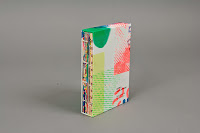
ZERO - Sydney Sie
Gradients as outlined in my ideas can present an idea of surreality, progression, tactility and contrast to emulate a lot of the books outlined contents within one strong high impact visual outcome. These more deconstructed examples show the idea of deconstruction analyzed in my idea generation stage as a way of showing progression, something outlined in the theories in the book.
The pastel colors contrast in tone yet remain quite soft and subtle, allowing more abstract positioning and interaction of shapes to be explored without it becoming a confusing eye sore, its important not to cause confusion within my designs. I want to show altered perspective but theres a balance that needs be achieved to maintain the feel of reality and altered reality.


.jpg)


.jpg)


The exploration of different textures and contrasting tones within this brand identity gives each piece of collateral its own personality. The textures contrast, some are quite grainy, some linear. This contrast reminds me of how the introduction of technology helped refine the message and quality of artwork and would be something worth exploring. The use of stock supports the monochrome scheme, I need to consider if the color application is coming from the stock or the Ink, a sense of clarity needs to be achieved in my outcome as I plan on digitally printing to show reference to modern technology as a means of showing precise communication.
This means that if I print in color on colored stock the ink could be distorted and tainted so I need to decide through testing the route to go.


More use of acetate with the application of just typography, its quite an interactive outcome with a white backing sheet added that gives contrast to make the body copy legible, although a little unrealistic within the time frame an interactive poster would be good to bring in a physical application of tactility to reference the "feel" within artworks Aura.


Contrast between a smooth gradient and abstract and analogue texture, this contrast reminds me of the ideas I came up with that emulate the idea of refinement of communication.
The typographic layout works perfect though, theres good consideration to hierarchy of information something thats important when drawing in certain information within a book cover or poster design. Its important for people not to notice sub titles before reading the title, equally important is drawing focus to the author name as people tend to search for books by looking at authors.
The column grid system here structures the typography out well. The large pt size sans serif allows the poster edition to be read first with the eye reading from left to right the large pt title then the sub title in its smaller pt size. A pretty simple method of hierarchy through positioning and sizing but exploration into weight, color and more experimental positioning will be tried out.


As the persona has quite an open mind and the subjects covered in the book broad limiting myself to just book cover and poster design isn't necessary so influence will be taken from a range of creative outputs with focus on medium and message through visualization of strong concepts and theories rather than just meaningless aesthetic design.
Research will expand on my concept idea and help inform a visual exploration into; tone, legibility, illegibility, construction, deconstruction, contrast, progression, altered perspective/surreality, warped aesthetics, pattern, color and typography. The purpose of this is to emulate other iconic elements to support the main concept idea that focus's on how aura in physical artwork is lost through reproduction and recording/documentation.
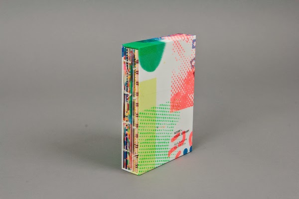
ZERO - Sydney Sie
Gradients as outlined in my ideas can present an idea of surreality, progression, tactility and contrast to emulate a lot of the books outlined contents within one strong high impact visual outcome. These more deconstructed examples show the idea of deconstruction analyzed in my idea generation stage as a way of showing progression, something outlined in the theories in the book.
The pastel colors contrast in tone yet remain quite soft and subtle, allowing more abstract positioning and interaction of shapes to be explored without it becoming a confusing eye sore, its important not to cause confusion within my designs. I want to show altered perspective but theres a balance that needs be achieved to maintain the feel of reality and altered reality.


Major Project Report - Keyla Nakayama
More high impact, stronger contrasts and more of a focus on abstract imagery through the exploration of textures and monotone color halftone imagery. It has quite a contemporary aesthetic, the book outlines theories of predicting modern day social activities but there needs to be a balance of modern and traditional within the book and I feel exploration into color, texture and image would be a way of achieving this contrast.

Bad Bonn 2013 - Atlas Studio
Moving on from the idea of contemporary aesthetic with the addition of ideas of deconstruction and construction to show progression Atlas Studio created a series of posters that are all very unique in there aesthetics and layouts but somehow feel like they belong as a set? I propose to make a series of posters so maintaining this consistency is important.
The use of gradients and deconstructed layouts provides me with confidence that exploring 2 very strong visual experiments can work well, as my persona has an open mind and as my research suggests quite abstract aesthetics have mileage when it comes to communicating the books content and my concept idea.
.jpg)


Draw Down Book
I mentioned the idea of creating tactility to give off a "feel" to represent aura, I proposed the refinement of textures within my ideas to emulate progression of technology and how lithographic printing aided concise communication of information. The exploration of physical textures from photographic sources like this examples could be explored but making my own would help show an aspect of the book that explains how artwork can translate a message, creating something with analogue techniques has better connotations of traditional art. Making my own then scanning in could emulate the inclusion of technology and progression too.
.jpg)
Taepi South Town Arts Festival Poster
A perfect example of warped aesthetics to emulate altered reality through abstract aesthetics, a cultural reference was considered through the inclusion of Chinese glyphs and the typographic positioning reflects well with the vertical rectangular shapes within the imagery. The imagery is a good literal example of a relevant element of the poster, its an abstract city scape for the location of the festival.

Aesthetic Criteria
Contrast and progression all in one, the segregation of the quartered gradient shows contrast of tone that could be used to emulate the idea of loss of aura while the idea of segregation could influence ideas of deconstruction & construction to show progression. Every tiny design decision needs to be considered as theres a lot of theoretical elements I want to visualize.

Narcsville poster
An interesting response that could influence the idea of dilution through the idea of perspective and illusion, the repeating of an element could be used in such a way that represents how Aura is lost. This depth and repetition makes me think about how I can provoke interactivity and draw people in as thats an important consideration for book covers and posters, to draw attention in.

Basic stamps
A few nice examples of stamps that use effective application of color, color will be an important consideration and will be one of the main focus's what will help visualize ideas of; surreality, abstract, progression or dilution, mirror image and literal representation of the books title "illuminations". Bright and contrasting colors with simple use of shape and minimal structured layout not only shows concise presentation of information to reflect the progression of technology and communication but also would show the contrast of light & dark tones of voice in the book.


Contrasting colors and alternative angles shows reflection perfectly.


SOHO - Flip Tofil
A very minimal layout but has a sense of movement too it aided by this large use of negative space, the stretched H cross bar has a subtle reference that makes me think about the warping of typography in subtle ways to show altered reality something that denotes the feeling of Aura and an abstract representation that flips reflection of the everyday theories in the book on its head.
The limited color palette which has quite a dull feel supports the minimal layout but exploring subtle colors with the application of warped aesthetics within type and image will show the idea of reflection with a focus on dilution of aesthetics.

Maribor Mapping
Theres no limitations to using more experimental stocks, I proposed a poster series as an expansion from the book cover and poster so exploring how stocks interact with each other to emulate tactility and support the idea of dilution, reflections and illuminations. This example influences me to play around with neon stocks, acetate, and more pastel stocks to contrast with each other.
The layout of this example has a contrast too, the layering allows a contrast of deconstructed and constructed and structured layouts to be explored between the sleeve and the cover. An interesting idea to consider between my cover design.

Helen Yentus
More focused aesthetic and design decision research will provide me with a more considered idea on how contents and messages are visualized through effective design focusing on book covers.
Helen's approach is quite abstract yet interactive, the designs have a certain depth too them through exploration of layering, illusions, perspective, shapes and proportions. Her aesthetics are varied too which is important she works equally well with type and basic vectors alongside more photographic responses.
These vector responses show how simple use of a single color and simple shapes can emulate strong concepts and interesting aesthetics, they both use the space within the page as an exploration of communicating a message, "Exile" is shown through displacement of the bracket shapes while theres an obvious reference to the golden ratio within The Myth of Sisyphus.


An interesting way of placing a character of the book into context with his face been taken up by the typography it shows how he is the main focus of the book and the content it covers revolves around him.

This example is one of my favorites and makes me think about the use of a scanner as a way of altering the perspective and reality through the physical exploration of "reproduction" which could support the idea of loss of aura while also bringing in the idea of how technology alters the message of artwork.

Peter Mendelsund
Out of all the designers on the list provided for the brief Peter Mendelsund was one of my favorites, his visuals are quite contemporary and abstract in there aesthetic, by presenting quite lateral visual responses through random objects thoughts would be provoked by the viewers, drawing them in to investigate the books content further. My persona for this book has quite an open mind and the subjects covered are varied, so showing this variation through abstract aesthetics and randomness would work.


Germano Facett
Repetition of a simple shape, layering and interaction of color presents the books title here quite effectively, this interaction of shape with focus been brought to the centre through the dark color shows the idea of self and others, others been the multiple color, self been the middle section surrounded by interaction of others. Very clever yet very simple.
I mentioned ideas of repetition to show progression or dilution, both could be explored by repeating an element to clarify something (progression of technology) or repeating an element to distort and alter reality (reflections and show dilution of Aura)

Jonathan Barnbrook
Don't quite understand this example but this isn't an issue, design doesn't always have to be literal and as mentioned can provoke a lot of thought, this thought provoking concept is strengthened through the idea that the imagery here is made up through glyphs, they dont represent the book title whatsoever but I feel this rebellion suits the name of the book as its quite intriguing and dark in its tone of voice. This dark tone of voice is contrasted with the bright colors showing how a literal element of a book can be flipped on its head completely when visualized.

SP Graphic Design
Use of shape can create a focal point of a design, and using repeated and refined shape would emulate ideas of progression quite well. They can be used in minimal ways or quite complex and high impact ways as shown here and can be used in varying ways to create different layouts and aesthetics across a range of collateral but still feel like they belong together. An important consideration for my poster series.
This minimal use of shape shows deconstruction and construction with ideas of progression as the shape builds up, this could influence ideas of how technology progressed to help aid communication. The opposing message it could send is the dilution of Aura if the shape was to start as a hole and be deconstructed. The poster series could explore both these elements of the book.
The use of space is balanced out and structured very well with what looks like a modular grid made up of 12 or 15 modules to allow fine tuning and precision, considering the guidelines I follow will subtly represent precision and support the idea of concise and precise presentation of information.

A good example of how color can contrast, while tactile feel and an injection of personality has been created through the quite playful application of textured dots,


Visual Graphic
These simple posters have a sense of movement and playfulness through the application of contrasting pastel colors and deconstructed layouts, the large amount of white space help aid this feel of movement so considering space when showing progression will be important. The use of these simple shapes can show deconstruction very effectively but also they could tie up together and construct together to show progression while application of color can emulate the contrasting dark and light tone of voice.

Inspiration 3000 Blog


While showing dark tone of voice these progressive tones show progression and could be reversed to show dilution of aura. This shows how effective simple shape and use of color can be to communicate a message.

I mentioned the use of acetate in discussion with Danny and feel the use of stock can be a main point of focus within a concept, these business cards work perfect within a business and professional context. Iv mentioned it in my PPP the use of clear stock can show honesty and truth, something important with customer facing profession, it can also show the idea of clarity something important within the graphic design industry.
I need to test out acetate and varying opacity stocks to emulate the idea of dilution, the visuals printed onto the stock could then emulate other aspects outlined within the concept.

Going back to warped aesthetics these examples work as a series of posters that support each other, the warping is further enhanced by other posters flipping the text and inverting the colors, while warping certain elements it does draw attention into the poster through its illegibility. This consideration to interaction with the poster series is something I want to take forward and I feel I could really show the idea of reflection through these interacting poster series. Maybe warped gradients? Inverted gradients? Reflected typography? Warped typography?
Or the warped aesthetic could be a starting point with other posters in the series becoming more clarified to show refinement and progression relevant to how technology presents more concise communication of information.
Or start out clarified and warp them through the series to show distortion as a way of reflecting how Aura is lost through reproduction.


A good example of warped gradients, it has quite a surreal feel too it which shows altered perspective. The contrasting black and white tone emulates the title "Lazy but cool" in a contrasting way. This contrast of tone could also emulate the dark and light tone of voice of the book.

White is seen as a pure color, but this idea of purity can be distorted through the application of even the smallest addition of black to create light grey tones. Not sure what the idea behind this GIF is, probably just for aesthetic purposes but the idea of Aura could be seen as purity, and when artwork that has this feel is reproduced or documented this feel is lost. I could emulate this through the exploration of tainting purity in a progressive way.

The exploration of different textures and contrasting tones within this brand identity gives each piece of collateral its own personality. The textures contrast, some are quite grainy, some linear. This contrast reminds me of how the introduction of technology helped refine the message and quality of artwork and would be something worth exploring. The use of stock supports the monochrome scheme, I need to consider if the color application is coming from the stock or the Ink, a sense of clarity needs to be achieved in my outcome as I plan on digitally printing to show reference to modern technology as a means of showing precise communication.
This means that if I print in color on colored stock the ink could be distorted and tainted so I need to decide through testing the route to go.

Layering seems to be a common thing at the moment, layering of the same information solidifies the importance of information as shown here while contrasting tone differentiates and separates the typography to stop it merging together and becoming illegible. What this also reminds me of through this repetition and lighter tone is the dilution of Aura within a repeated element.

Everything wants to run - Delivered by Post
Gradients allow lots of color application to show surreality, altered perspective, illegibility and texture but these digital "glitch" style images have a more modern approach to showing these aspects, contrast this with the minimal layout that supports and encases the imagery a strong outcome has been created.


More use of acetate with the application of just typography, its quite an interactive outcome with a white backing sheet added that gives contrast to make the body copy legible, although a little unrealistic within the time frame an interactive poster would be good to bring in a physical application of tactility to reference the "feel" within artworks Aura.

SPIN
Extremely bold application of color within these posters, the bright tones contrast in color creating impact an important factor in a poster. Considering the tone of the color applied will help emulate a few factors in the book. Literal examples it could emulate the books name "illuminations" while lateral examples exploration could be made into visualizing the contrasting dark and light tone of voice within the language.
These posters are very simple, following set guidelines within type application with variation in color. Suggesting my poster series could keep one fixed element and one varied element to keep consistency.


Joni Kirton
The persona has a very open mind and theres a lot of subjects within the book, rather than creating a consistent poster set I could create very unique posters.
The alternative designs all have different aesthetics, they don't fit to a certain style but learning from the experimental approach will give me good development opportunities to really strengthen my visual outcome.
Learn from the use of;
Shapes
Color
Analogue techniques
Photography
Texture


Contrast between a smooth gradient and abstract and analogue texture, this contrast reminds me of the ideas I came up with that emulate the idea of refinement of communication.
The typographic layout works perfect though, theres good consideration to hierarchy of information something thats important when drawing in certain information within a book cover or poster design. Its important for people not to notice sub titles before reading the title, equally important is drawing focus to the author name as people tend to search for books by looking at authors.
The column grid system here structures the typography out well. The large pt size sans serif allows the poster edition to be read first with the eye reading from left to right the large pt title then the sub title in its smaller pt size. A pretty simple method of hierarchy through positioning and sizing but exploration into weight, color and more experimental positioning will be tried out.


All elements highlighted in yellow will provide deeper influence to my initial ideas to inform my scamps and later development & production.
No comments:
Post a Comment