Colour management for commercial print 2
Second session to introduce us to the process's involved behind preparing & designing work for commercial print through different programs & applications.
In this session we focused on Photoshop.
DOCUMENT ALL THESE PROCESS'S FOR APPLICATION RELEVANT TO DESIGN FOR PRODUCTION BRIEF AS WE NEED TO CONSIDER COMMERCIAL PRINT FOR THESE OUTCOMES.
Gamut warning shows printable colours for CMYK mode.

CMYK mode for commercial print using the 4 process inks. Convert to CMYK for nearest printable colours is one option.

Levels image adjustment is a way of adjusting printable colours.

Altering hue and saturation levels is quite a good way of achieving a printable image. When converting to CMYK mode no change of colour will happen keeping consistent colour reproduction.

Using the selection tools for selecting specific areas of image is another option

Using proof colours shows CMYK preview of how image would look when converted to CMYK, but still in original RGB colour mode. Good to work in proof colour mode and do all editing through this before converting to CMYK mode.

Photoshop uses RGB as a default colour mode, due to the smaller file size and allows more editing through things like filters.

Adobe recommends working in RGB mode until editing is finished, flatten a file before sending the CMYK file to the commercial printer, check colour and tonal adjustments, highlights and shadows, levels, curves, hue/saturation adjustments to make corrections. Use TIF files for applying files to indesign.
Important photoshop shortcuts
Alt and click on swatches to erase swatches.
"D" resets foreground & background colour.
Using CMYK Color swatches & palletes in Photoshop
Save for exchange for use in other adobe programs.


How to bring swatch pallets into programs.

Eye dropper tool allows me to swatch colours from an image.

Color picker allows fine tuning of colour selection for creating swatches for the swatch palette.

Alert symbols for non cmyk printable colour.

Non web safe colour. Click or alter the colour values to eradicate this.

Using spot colours in Photoshop
Spot colours are for consistent colour reproduction globally, a brand commonly has a set spot colour so this is important to consider when printing for these companies. They commonly follow the Pantone system for set colour codes, and also allow use of inks like metallic inks, fluorescent inks, spot varnish overlays etc.
Discuss with printer on use of stock and what colour reference system to use. Or giving a specific libary to work with.

Solid coated and uncoated pantone systems are most common used.

To inform the commercial printer of the use of these inks. start off with a greyscale colour mode.

Chosing duotone mode allows specific inks to be outlined.

Specific pantone reference is visible for the commercial printer.


More colours can be added to achieve desired effect for image.

How these inks are applied can be altered by selecting the diagonal line next too the ink selected which allows curve alteration. This allows the switch of the greyscale image, it brings in the new ink selection to replace the Black inks used in the greyscale image.


Adding black/key to the sequence of colour it brings detail back into things. Its also important to consider cost when using a large amount of colours.

Save in photoshop file format for taking into programs like indesign.

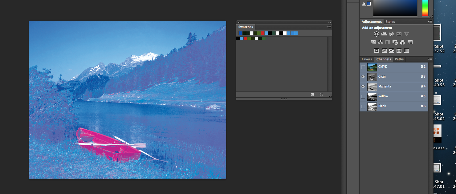
Another technique using spot colours is through the channels adjustment, it shows the colour breakdown of the output you see on screen (RGB) or how it would be printed (CMYK)


Shows how the lithography process is used, an onscreen application. How the printing plates for each colour would be set up.


Spot colours can be added through the channels, even in greyscale base images. To add colour to greyscale images.


Color can be painted onto the greyscale image.


SPOT CHANNELS CAN BE USED TO SUGGEST THE USE OF SPOT VARNISH.
Solidity is the transparency of the ink. This is a consideration with screen printers as well as commercial printers.
0% is transparent.
50% semi transperent, 100% solid. In between alterations can obviously be made.


These images with spot channels are saved as TIFF or photoshop files so the spot channels carry through to indesign.

No comments:
Post a Comment