Augmented advertising campaign finals - Tsukuba Motorsport
Concept
The intention of this advertising campaign was to extend on an existing website I created in an interactive way. An automotive blog influenced by Japanese motor sport & cars and focusing on high quality imagery with little textual distraction. Eye candy for automotive fans. I took forward elements of structure, minimalism, accuracy and movement from the website along with familiar aesthetics to keep things consistent across the brand image.
From this I created a physical advertising campaign taking supporting influence from the website with additional consideration to use of materials and process's to emulate Japanese engineering and traditional Japanese craft, from this I reproduced a refreshing line of promotional products and merchandise that sways away from the usual garish and tacky automative campaigns.
Photobook.
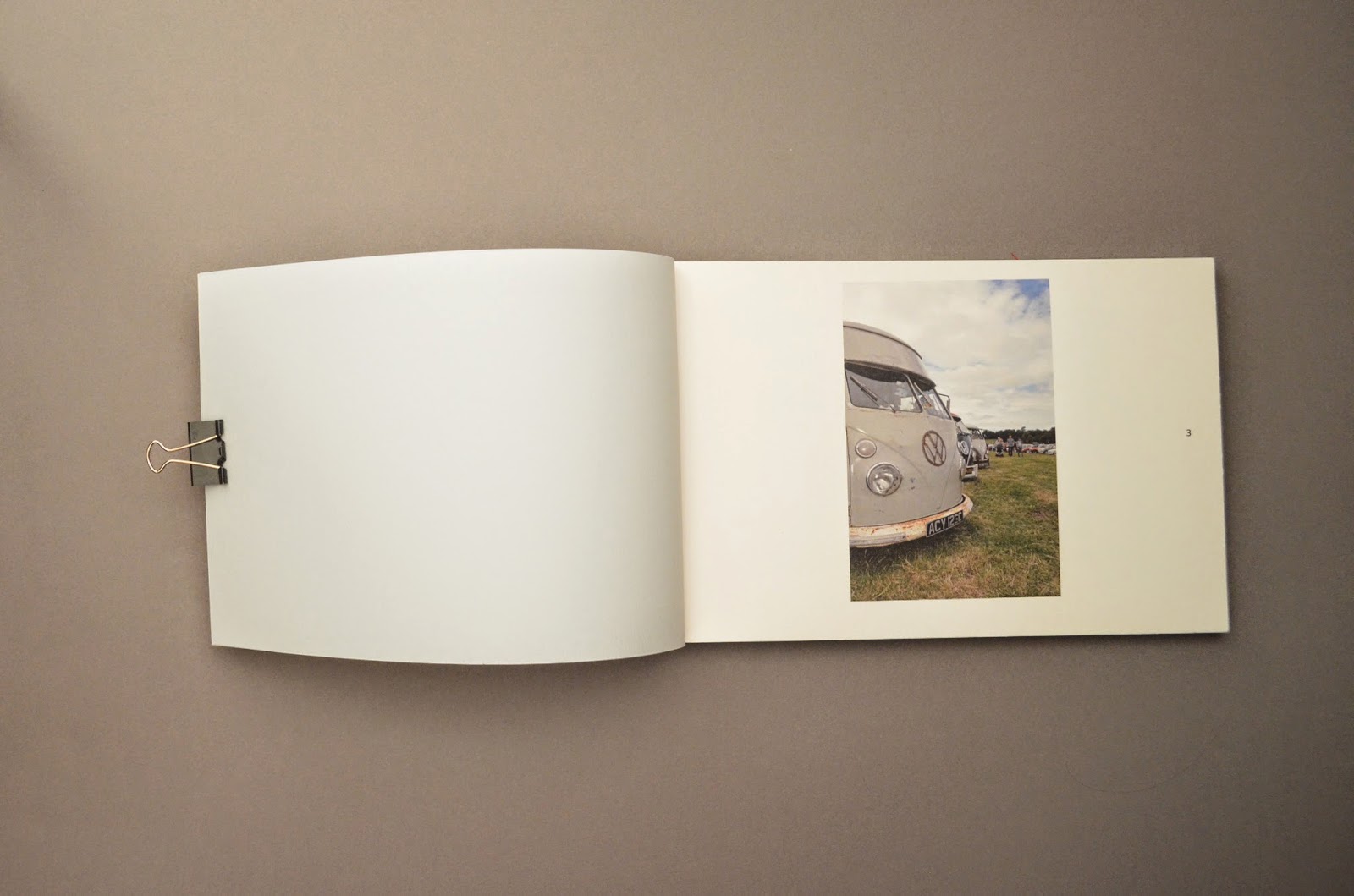
This photo-book emulates traditional Japanese craft and Japanese engineering through its bolt bind and Japanese stab bind with a hand painted water-colour logotype on the front cover. The use of stock and ink is influenced from the existing website colour scheme wich takes influence from Japanese heritage through red and white stock and ink and is supported by coloured stock and ink inspired by mechanical elements through the use of greys. The layout maintains structure extending from that seen in the website, with a feeling of motion as the images rotate around a clock face guideline which is influenced by the iconic motor sport Time Attack. A race event where drivers race against the clock.
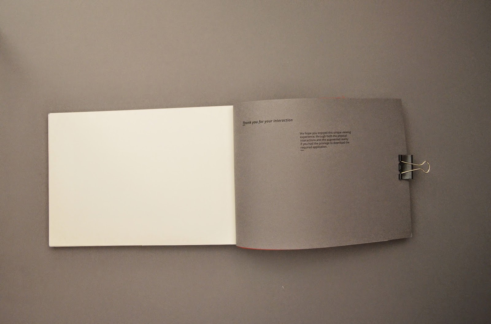
Theres an option for the photo book to be supplied in an interactive kit, allowing the end user to construct the book to there tastes creating a unique outcome personalised to them. This has obvious links back to mechanics and construction.
This photo-book emulates traditional Japanese craft and Japanese engineering through its bolt bind and Japanese stab bind with a hand painted water-colour logotype on the front cover. The use of stock and ink is influenced from the existing website colour scheme wich takes influence from Japanese heritage through red and white stock and ink and is supported by coloured stock and ink inspired by mechanical elements through the use of greys. The layout maintains structure extending from that seen in the website, with a feeling of motion as the images rotate around a clock face guideline which is influenced by the iconic motor sport Time Attack. A race event where drivers race against the clock.
Theres an option for the photo book to be supplied in an interactive kit, allowing the end user to construct the book to there tastes creating a unique outcome personalised to them. This has obvious links back to mechanics and construction.


Stickers.
Sticker sets allow external placement of the brand image reaching out to wider audiences.


Advertising poster and photographic prints.
Advertising posters for placment in Garages, shops, showrooms and car events to help establish external off page recognition aiming at wider audiences.
Photographic prints extend on the websites focus on high end imagery offering end users the opportunity to purchase there favourite prints.


Perforated tear out leaflet book.
A perforated book for holding leaflets for easy distribution of the leaflets at car shows and race events.


Laser cut acrylic key rings.
A gimmicky merchandise item that strongly appeals to the target persona, the use of a laser cutting machine emulates the accuracy and engineering seen in Japanese mechanics, engineering and car parts.


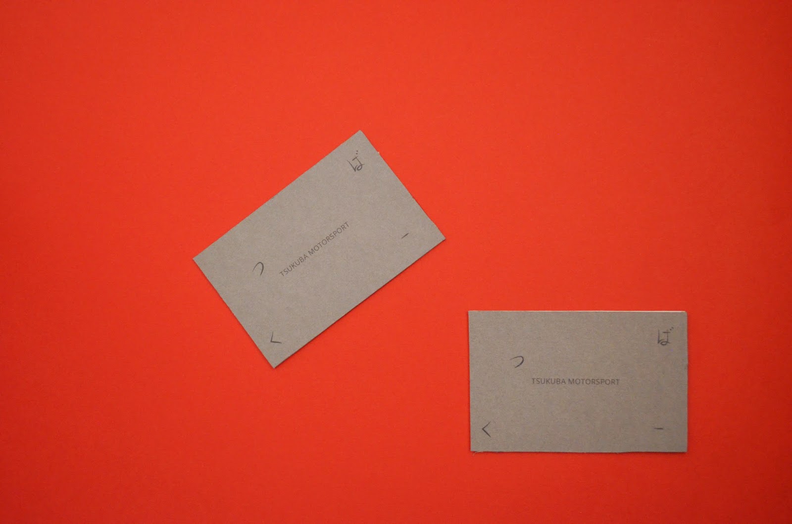
Triplex stock business cards
I tied together various elements seen across the website and brand collateral in these business cards, the main one been the use of motion within the Japanese glyphs and the incorporation of the coloured card stocks in various triplex combinations.
Laser printing simulates spot UV varnish for glossy typography.


Detail shots.


Augmented reality interactive app
This app meets the requirements of the persona that wants to find out more detail about there favourite cars, simply hover the phone over the image you want to find out about to discover interaction points and vital overall statistics.
Or play around with the interactive home page and follow the icon links to the Tsukuba Motorsport website.


Track & Car signage
More external recognition for the website situated on race cars and track signage.


Evaluation
Quality of outcome
I am extremely happy with the outcome of the Tsukuba Motorsport advertising campaign, from a conceptual point of view I feel I created content well influenced by aspects of Japanese Motorsport, engineering and Japanese craft through the use of relevant materials, process's, layout, aesthetics and print finishes.
The purpose of the campaign was to promote and support my current website, considering the target audience throughout in terms of target persona's wants and need and promotional and marketing techniques. The collateral I produced took into account marketing and promotional aspects taking into consideration placement and how each item can reach out to potential audiences. Combined all the items offer opportunity to reach out to a vast array of target audiences.
The focus of the site was a high focus on imagery with very little distraction the content that included imagery here emulated this perfectly showing support for the websites current concept, but the material that didn't offered promotion to bring new target audiences into the website.
The interactivity was successful as well, through the augmented reality app that interacts with the physical printed photographs with a supporting interactive homepage. It also meets the needs of the target persona that wants to learn more about the images presented.
Build quality
The physical construction of some of the items could have gone better, I wanted absolute accuracy throughout to emulate japanese engineering. Things like the stamp production didn't go so well due to the use of wrong inks and trouble with the laser cutting (See development)
I feel I emulated triplex printing quite well too when it came to the business card production, it was quite an accurate reproduction but obviously it would have been better if I had purchased professionally produced triplex printed paper from someone like GF smith.
The quality of the photo book outcome was my strongest outcome, the quality of the Japanese stab bind and the bolt bind worked perfect both ergonomically, aesthetically and conceptually for emulating Japanese engineering and Japanese craft.
Materials
I feel through the use of nuts and bolts I emulated Japanese engineering perfectly, combine this with the red stitching on the Japanese bind that carry through the brand image through use of colour and influence of Japanese craft which was obvious in the website but was expanded on in the advertising campaign.
The use of coloured paper stocks helped maintain a high end overall finish and helped carry through the colour scheme in a more physical tactile way.
The use of acrylic worked perfect for the purpose of key rings and allowed me to use the laser cut machine to emulate Japanese engineering and extend on the accuracy seen in the website. Acrylic worked amazing with the laser cut giving a very high quality outcome.
Processes
Physical print process for the material I used digital print, this offered high detail for the photography, all the photos I took myself on a Nikon d5100 DSR so I wanted the quality to shine through so digital print was an expensive option but the focus was high quality imagery so it was required.
More physical techniques like water-colour painting added a tactile feel and hand made quality to the book, customers appreciate hand built things. Especially automotive fans, for example they see hand built cars as high quality so emulating this quality while combining Japanese craft benefits the overall concepts I wanted to include.
Laser printing onto the uncoated stock simulated UV varnish, a more cost effective solution for creating a high end finish.
Time limitations and time keeping
I managed my time reasonably well when it came to researching, idea generation and visual development, but when it came to producing the digital files ready for production and print I messed up a little, I had to rush my production of everything luckily I didn't ruin anything but I wanted to create two versions of the photo book. A hand made version and a photo book kit they could assemble there selves to strengthen the idea of mechanics.
Improvements
Better time management to enhance quality outcomes and fully meet my plans of action.
Learn how to properly use the laser cut machine, I messed up with the stamp quality due to having to JPEG the file. Learning how to set up files for raster and learning how Ethos software works properly would benefit this if I redid a stamp.
I could have benefited with more print process experimentation. screen printing may have benefited some of the collateral to increase the tactile feel but luckily the laser printer simulated a UV varnish effect so this worked to my advantage.
Commercial consideration
I have individually analysed the commercial considerations for each item, most things are realistic for reasonable external printing, posters, photographic prints, business cards would be the most cost effective.
Laser cutting would be required for the key rings, the materials are not expensive just the use of the machinery, but its an item Tsukuba Motorsport could sell so this wouldn't be a major problem.
Same with the photo book, this would be a purchase too so the costs that add up from hand binding wouldn't be so much of a bad thing if people are willing to pay. The pages would be digitally printed or litho printed by an external printer, the holes could be drilled by an outsource engineer or a table top drill could be purchased.
The leaflet could be adapted to single sheets without the japanese bind so this would be commercially viable allowing it to be printed digitally or litho printed.
The paper stock wasn't too expensive either so this wouldn't be a problem and it was a cost effective solution to achieving a high end finish.
No comments:
Post a Comment