Thursday 27 November 2014

Advertising considerations - Study task 10

Advertising considerations 

I created a few design boards for a starting point for the influence of my print based advertising campaign. 

I need to consider factors on:
Audience
Message
Tone of voice

By looking into & analyzing:
Similair campaigns that communicate to my Persona - Automotive enthusiast, specifically Japanese motorsport, campaigns with limited and concise textual content and lots of image content, car advertisements would also be beneficial to consider refined advertising aims. 
Print based advertising that explores material & process's.
Locations, positioning & format of the print campaigns.
Use of color, type, language, photography, how tone of voice is communicated through these. 


These can all help go towards further and deeper investigation into successful advertising campaigns, the incorporation of augmented design in print based outcomes exploring digital interaction and physical interactions. All fully exploring different print & material process's taking into account the format and placement of these items all while considering whats best for targeting the target audience and receiving positive reaction. In this case a fan of Automotive sports with specific focus on Japanese events, cars & engineering. 

**Another main purpose of these design boards is to provide a starting point for me to produce design boards for my concept idea when an idea has been generated from a rationale. Study task 11**

Augmented Design Studio Brief 4 problem analyses and brief requirements

Augmented Design Studio Brief 4 problem analyses and brief requirements 

The brief requirements & problem analyses
The brief is an opportunity for me to expand on my current concept and content I have for the image focused Japanese motorsport website. The main focus of the brief is to create an interactive print campaign advertising and promoting the website and its content, to achieve this I need to consider& inform myself on the cross over of print & digital media and how they can react with each other.

Its not just limited to digital interactions of these print mediums though, print medias can be interactive with the end user without the need of a digital presence, and as my target audience is someone who doesn't really follow technology driven trends this is a strong consideration I need to keep at the back of my mind. 


A consideration to external commercial print preparation is important for the final deliverables, explaining how I would prepare the documents and potential use of materials will need to be evaluated but the actual deliverables will be printed in house with college facilities so I need to make use of the resources at my disposal to fully explore and experiment with materials and process's for print based outcomes.


Before beginning to tackle the brief I need to consider a project rationale taking into account:

Audience
Communication
Distribution
Content
Materials
Quantity
Time-frame
Printing method and cost

I need to look into advertising strategies and concepts along with physical aesthetic inspiration to help influence the print campaign I create, looking into campaigns within the automotive industry will add specific & relevant influence to the idea generations. 


Look into the latest technologies used in digital advertising alone, and the idea of augmented design through the use of print based mediums with interactive digital elements. 

Look how digital media can be translated into some sort of print format, this would be good to satisfy the target persona as they aren't very technology driven.


Consider how I can take over the focus of imagery and concise/precise textual information through Augmented design. 

Consider how I can bring in concepts from the website I created into this campaign so everything ties in together. (Japanese aesthetic, minimal aesthetic, lots of negative space, contrast of large image & small pt size type, GIF image, use of grids relevant to Japanese motorsport, structure, Japanese technological engineering etc)

Consider commercial printing throughout as mentioned. 

Highlight the benefits of digital technologies and the issues and advantages they will have for my specific content, concept and the target audience my website's currently aimed at. If theres any disadvantages how can I turn them round to benefit me and the end user. 
  

Saturday 22 November 2014

Pantone - Reimagine your hometown through the language of color - Initial Idea generation

Pantone - Reimagine your hometown through the language of color - Initial Idea generation

I began generating some ideas taking into account previous considerations of all underlying factors to help spark initial ideas in the previous blog post. 

Main ideas I took from these rough notes
From these rough notes I took a few main ideas and reinterpreted them into more concise and precise explanations to develop further on and receive feedback on to aid development. 
  • Create a timeline of how Tingley was back in the middle ages showing its progression to how it is now and reimagining it in the future based on an ideal Tingley how I would like it to be or how I would have liked it to be when I was a child, a sort of playground for me. This meets both target audiences allowing a sense of nostalgia to be presented through visualization of iconic childhood events (inspired by mine and friends) as well as informative and explanatory aspects been communicated through the historical and factual time line. Possible solutions for this at this time is a motion graphic with strong use of imagery and explanatory text where needed, each stage of the time line i.e. more historic events will be communicated through a set colour scheme. 
  • Create a brand image for Tingley, producing collateral and stationery inspired by iconic aspects of Tingley, locations, historic events, and basing the color schemes around either a color that communicates the character of Tingley as a whole or take colors from all the iconic history and facts of Tingley and produce a color scheme from this. 
  • Highlight all the iconic elements in Tingley both historic and current into a visual representation with relevant color use that helps communicate them, create stripped down and basic visual representations of these elements (inspired by how the Norway bank notes are pixelated version of coastline photos), from these basic shapes animations can be created or the shapes and imagery dismantled and typography created. Possible production methods for this would be to produce print material using the shapes, typography & interaction of color a focus, produce 3D physical shapes or typography from this using a variety of materials and colors that clearly communicate iconic aspects, memories, locations and events (deriving from research)

Pantone - Reimagine your hometown through the language of color -Potential starting base points & idea's

Pantone - Reimagine your hometown through the language of color - Potential starting base points & idea's

Looking over my contextual research on facts & figures on Tingley and my visual research I have outlined key directions that could come from these and spark a number of potential starting points and ideas to work from for "reimagining my home town through color"

Informing myself on as many possible factors that need to be considered will help me think of a more considered and precise direction for when it comes to the idea generation and selection stage.

Potential points to spark ideas & concept's
Possible outcomes in terms of use of visual content:
  • Strong use of image through the interaction of color.
  • Strong use & focus on typography within the use and interaction of color.
  • Or a combination of the both in equal proportions or subtle additions (e.g. subtle type addition on image focused design outcomes)

Possible tone of voice:

Based on the contextual research and the contrast of the historic and factual based research and mine and friends memories of Tingley I feel theres 2 potential tone of voices in terms of how the contextual research is used to create a final outcome. 

  • Playful, fun & lighthearted
  • Informative & serious
Materials, Process's & media outcomes:
Based on research pointing to the obvious fact that medium is message, the production method and media/medium can strengthen and work alongside a concept idea. It needs to be relevant to the idea.
  • Physical 3D craft based outcomes
  • Print media
  • Digital media & motion graphics
What are my intentions for the outcome I create:
Its important to consider what Im wanting to achieve in terms of audience reaction and what I want them to get from the outcome I create. (This links with tone of voice, both help each other out)
  • Am I persuading people to visit Tingley?
  • Informing them and educating them on iconic facts & history of Tingley?
  • Entertaining them through engaging and informal media presentation
  • Am I wanting to provoke reaction; feelings of nostalgia, happiness, sadness (missing there hometown), humor 
  • Delivering instructions 
  • Delivering directions 
To establish & consider all these points I need to first consider the persona and target audience based on age range mainly as there familiarity to my childhood memories will differ if I chose to base the outcome around a visualization of these memories or if I chose to be more informative and factual based wich will suit a more broader audience as its more informative rather than provoking memories and been entertaining. 

Friday 21 November 2014

Pantone - Reimagine your hometown through the language of color - Examples of strong use of color

Pantone - Reimagine your hometown through the language of color - Examples of strong use of color 

To support the research I have gathered and before I began thinking up initial ideas to develop on I think its important to see how other artists and designers have created works focusing on a strong use of color to get their message or concept across or just as a visual aid. 

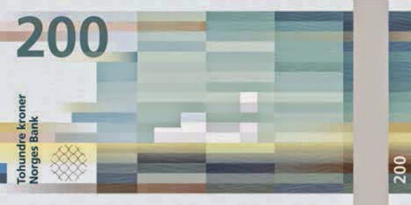
Snøhetta & The metric system collaborated on the redesign of the new bank notes of Norway to be produced in 2017, I love the stripped back pixelated imagery its a refreshing visual compared to the usual detailed photographic images seen on bank notes. These pixelated images derive from images of Norway's costal landscape, a clever thing to consider when using source imagery and reproducing it in an abstract way. 

Theres a certain scale of pixel density, scale & position corresponding to the monetary amount, small square pixels for lower value, longer pixels for higher values. 

I like the use of 1 majority color for each note with tonal differences and minimal use of other hues but when used they produce a subtle contrast to add a certain depth to these flat images. 


Snask studio creates a brand identity and physical collateral for Swedish Handicraft Societies, the hand crafted services they supply i communicated clearly through the physical 3D typography they created and the brand collateral they produced, the use of image also suggests this service too so the brand's services are well presented in this sense.

What my focus is on though here is the strong use of color, the use of primary colors (red yellow and blue in conjunction with simple shapes to create the 3D letterforms create a feeling of simple yet effective craft. The use of material in the 3D "H" with fabric and weaved wick material suggests a more finer detail craft service, a strong consideration of material. 

All in all the brand identity is very successful through subtle and conceptual use of material, shape and color, a consideration I want to take forward. 


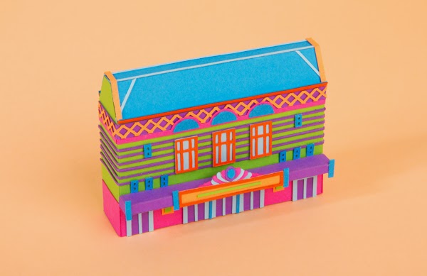
Sim & Zou produced physical models for SXSW Film Festival, clearly inspired by on set props and equipment used but presented in a much more contemporary and playful way. I like the attention to detail and level of craft, looks to be made out of card stock or some kind of thin plastic. This shows that concepts don't need to be considered all the time, more literal and obvious outcomes can be created to represent the needs & requirements of a brief. 

A considered tone of voice is the only real consideration I can see here, playfulness has been emulated through the cartoon like aesthetic to the use of shapes and detail in the aesthetic, supported by vibrant and clashing contrasting colors. 


Build studio created an identity for Studio Aves, they designed a color based identity for the studio based around British bird markings, the word Ave is the latin meaning of Bird so this was a clever yet subtle conceptual idea presented in a stripped back and simplistic aesthetic (through the use of angles and shapes) which allows nice focus in on the use of color, a main intention for my initial ideas at current.

Color plan and digital printing was used in terms of the printing and material process, there are lots of color's available in the Colorplan range allowing experimentation with how the colors interact within tone, saturation and hue like seen here, a consideration on how different colors interact needs to be taken into account. Not just the physical chromatic values but the tones, saturations and tints of the colors, all these need to be considered when thinking about how color contrasts or works in conjunction with each other. 


Hey studio designed these bi-monthly annuals basing the overall aesthetic and layout around sustainability. They wanted the style to last at least 5 years and not feel outdated, I think this is why they used such a variation of cover designs. The studio are known for there strong use of primary colors but here there a little more experimental to produce a diverse range of outcomes to achieve this sustainable overall range of designs. 

Considering sustainability is important to me in this case, not in the sense that it needs to last for a period of time but the aesthetic needs to appeal to a range of age ranges if the resolution I chose is to be aimed at all generations who live or have lived in Tingley as I want to provoke emotion from them be it pride or nostalgia. If i am basing the resolution around one target audience this neutral and mutual aesthetic that suits all audiences isn't required but consideration on if the style needs to be contemporary or traditional needs to be decided depending on the audience. 
 

This example was chosen to demonstrate how there doesn't need to be any complex elements or strong use of imagery within a design to create an impact, the interaction of color through the typography and stock choice is the main focus here to create an aesthetically pleasant range of print products. 

Muted tones and contrasting vibrant tones all create contrast and interaction between color keeping the viewers eye busy, this takes away the fact that the layouts are extremely minimalist  perhaps this clean layout aesthetic supports this but it's interesting to see how color effects how the positioning of content and elements appear to the viewer. 


Google released some print material designs, new grids provided me with details on the project. They took inspiration from the "material world, using paper, layering space and light to create an interact that feels tangible and grounded in reality" 

Studio "manual" celebrated googles original inspirations from the material world and created a "rich, tactile and layered print" outcome, I think there aim was to reinterpret the digital interfaces google use and present it in a visual way that has been stripped back in aesthetic.

This stripping back of the digital interfaces into print media appeals to me, I have a current habit of simplifying things down to present clear and concise design. What I get from this stripping back is an idea that I take everything iconic within Tingley's past and present and create a visualization of all the best bits of Tingley erasing things that have appeared that make it a worse place and highlighting elements of Tingley that make it a great place. 


Neven Cvijanovic created a minamilistic identity for Berlin gallery Neumeister Bar-Am, the gallery is located an old Post Office space so the aesthetic of the identity is inspired by aspects of the postage industry (the tape, the handle with care strap lines). The color scheme derives from Deutshe Postal services so this highlights how a simple use of a single color can clearly communicate a strong message. 

I like the flexibility of the identity and collateral materials and stationary, the tape can be used for multiple functions and I love how stripped back and straight to the point the typography is, its a perfect interaction within the interaction of the precise yellow hue to communicate Deutsche Postal services. 


A studio I have been following since they started out in their final year last year are Hungry Sandwich club there playful tone of voice & geometric use of image and motion is becoming a very iconic style of theres and really makes them stand out from the crowd. 

This animation produced for The Design Museum for the exhibition Woman Fashion Power they produced a beautiful and bold motion graphic that promotes feelings of positivity and inspiration through the interaction of the geometric shapes and motions with the powerful tone of voice within the woman providing the script audio. 


What I'm taking from these examples
To help influence idea generation through the use of this visual inspiration and my previous contextual research on Tingley I will be taking forward these points: 

Conceptual reproduction of source image, if reproducing source images into something more abstract from there original forms consider a way in which I can bring in a concept like the Norway notes creating pixelation images of the Norway codes and following a system for the scaling & positioning of pixels for the monetary values. 

The use of 1 major color in the color scheme with tonal variations, if any other colors would be used make sure there only used minimally. 

Think about what color communicates, create a color representation for each iconic aspect of tingley, like how yellow is used to represent Deutshe postal services, color can also be used in terms of theory in what it communicates like the color red can be perceived as a warning or quite angry. Looking into this will be important. 

Stripping back the aesthetic of something quite complex to create a more concise and minimalist version is something I want to consider, a suggestion may be to create a visualization of Tingley erasing parts out that make Tingley a worse place and creating an ideal location either based on what I would want or what would suit a wider audience. 

Consider the media used, medium is message is important here, I want to consider creating 3D physical things, digital animations or an idea of creating a brand image for tingley with relevant collateral and stationery. Like Snask I want to consider materials for adding that aesthetic & physical extra as well as adding more conceptual relevance, for example using astro turf would emulate my memories of football pitches. 

Think about how color can be used to be the main focus, like The Rain Color print medium a minimalist and clean use of type and layout can be overlooked through the strong interaction of color, as color should be the main focus its important nothing really distracts the target audience away from it. 

Consider tone of voice and its relevance to the audience, does it want to be a playful tone of voice and contemporary aesthetic which would be more suited to a modern interpretation and visualization of Tingley suited for someone of a younger generation who. This target audience could relate to a modern re-imagination of Tingley based on what I would have liked to be in the Town based on childhood memories me and this age range share. I could also present the Tingley I used to know and love back when I was younger to suit this target audience.

Or

A more informative tone of voice with traditional aesthetics and use of image and type to suit to the older age range who may be interested in the detailed history and iconic events that happened in tingley. Or if possible produce an outcome that suits both audiences merging both ideas together. 

Pantone - Reimagine your hometown through the language of color - Research on Tingley

Pantone - Reimagine your hometown through the language of color - Research on Tingley

To begin generating informed ideas on how to "reimagine my home town through the language of color" I needed to conduct research on Tingley, the hometown I grew up in. Learning about the history & current aspects of Tingley aswell as geographical information will help spark ideas and concepts for how to tackle the project. 

I will also base my research on a more personal level, highlighting memorable memories from my childhood activities, to support this and gather more wider nostalgic memories I asked a few childhood friends on what there favorite memories were. 

Historical & Iconic facts & figures - Secondary source
Unfortunately wikipedia was the only source I could find with good history and facts about Tingley.
  • Settlement in West Yorkshire, England.  
  • Part of the Parish of West Ardsley within Leeds.
  • The name Tingley came about in the 13th century, coming from the middle ages, the name derived from the medieval name Thing(e)law(e). 
  • The meaning of the world comes from old english names þing (meeting, assembly) hlāw (mound, hill)
  • Was a meeting place for people of near by town Morley.
  • Geographically situated between Leeds, Wakefield & Bradford.
  • Considered part of Morley, Leeds.
  • Unique as it has a WF3 (Wakefield postcode), 0113 prefix (Leeds number) 
  • A geographical landmark is "Tingley roundabout" an eponymous roundabout. 
  • Historically famous for its trade in coal & wool industries, this was going on well until a little after World War 2.
  • All within a 5 mile radios are town centre's of Morley, Leeds, Batley, Dewsbury & Osset so quite central to everything. 
  • Known for its football club Tingley Athletic JFC (White & Green striped top, black shorts & socks), David Batty who played for England, Leeds and Newcastle started off here. 
  • Radio Aire and Real radio masts for Yorkshire broadcasting are located here.
  • In 1980 Zigmund Adamski a coal minor set off from Tingley to Wakefield for a shopping trip but was never seen alive since, he later turned up ontop of a 10ft high mound of coal in Todmorden with strange burns and an unexplained substance internal and external of his body that couldn't be explained by scientists & with no explanation to his death, his death was linked to a UFO incident. (http://www.bbc.co.uk/insideout/yorkslincs/series2/ufo_alien_abduction_yorkshire_pennine_sighting_adamski_mystery.shtml)
  • November 14th 1944 a Halifax Bomber crashed in Tingley taking the top of houses out in its path. (http://www.wakefieldfhs.org.uk/Tingley%20WWII%20memorial.html)
  • Lee Gap fair, the oldest chartered fair dating back to 1136 and has been supported by traditional gypsies since 1540's, mainly a horse fair, selling off horses and riding equipment as well as agricultural & farming materials and vehicles. (http://www.grtleeds.co.uk/Culture/leeGapFair.html)
18th century painting and 1908 photograph.
 

In comparison with a photo taking in 2000.

The fair has changed alot over the years as is highlighted in these two videos, mainly the involvement between traveling communities and settled communities building bridges and forming friendly relationships with each other and trading goods and enjoying the fair together. 


These historic and iconic elements of research I gathered will help provide idea generation that follows a more informative tone of voice, its important to consider the tone of voice style and how it strengthens the overall message and concept behind the idea. The audience targeted here is more broad as its more historic it isn't really based on peoples past memories just general aspects of Tingley and its history so familiarity through a range of target audience would be achieved by using these aspects to influence ideas. 

Mine & Friend's past & present memories of Tingley - Primary source
Its important to combine historic facts with more primary sources based on personal experiences (childhood memories, nostalgic events, how things have changed) and first hand research gathered on Tingley. 
 

  • Skating at hilltop carpark.
  • Biking in Haigh woods, digging out bike jumps.
  • Fishing & camping at Tingley reservoir
  • Shooting stuff in Haigh woods
  • Football at Westerton & Hilltop football pitches
  • "Lacking art" a term used by me and old friends basically meaning "are you coming out"
  • Fish & chips on the way home from Woodkirk High school from Roys fish shop (No longer there)
  • Lal's shop
  • White Bear pub, Hare & Hound pub, British Oak weekends
  • Sledging at Haigh woods & reservoir in winter
  • House parties
  • Woodkirk Valley parties 
  • Woodkirk High school
  • Westerton Junior school
  • Hilltop Infant & Primary school 
  • Woodkirk leavers party at costcutter hill 
  • Ginnels & Triangle party's (Were the ginnels from all housing estate meet in a big field) 
  • Meals at Balti House 
Its important to not focus it on me and my friends as a narrow audience here, recognition and nostalgia needs to be communicated across a broader audience so more overall things that other people maybe able to relate too needs to be considered. At the moment the examples I have gathered from me and friends target people of my generation. 

Thursday 20 November 2014

Color Management for commercial print

Color Management for commercial print

Correct use of colour for desired outcomes, using the CMYK mode for print(subtractive colour, ink on paper)  RGB for screen based output (additive colour, mixtures of light. 

CMYK often referred to Process Colour. 

Commercial Printing comes under many forms, the most common been:

Offset Lithography 
Digital Printing
Screen Printing 

When thinking about the use of colour through the computer, consider the ink output. 

Swatches & Global colors to change used colours efficiently. 

Different tints can then be taken from these initial swatches. 


Discuss with external printer the colour libarys they use, generally Pantone library but its important to know what the printer uses before you start using colour books and making swatches.
  

Can create spot colours from these pantone swatches. 

Dot within white triangle shows spot colours.

Save swatch Libraries for use in other applications to keep colour reproduction consistent, and to supply to printers so they know what swatches have been used. 

Then these swatch libraries can be transferred to other adobe programs.


Process colours
A process colour is printed using a combination of the four process inks; cyan, magenta, yellow and black. By default, illustrator creates new swatches as process colours.

Global swatches 
A global colour is automatically updated throughout your artwork when you edit it. All spot colours are global; however, process colours can be either global or local. You can identify global colour swatches by the global colour icon (when the panel is in list view) or a triangle in the lower corner (when the panel is in thumbnail view)

Spot colours 
A spot colour is an ink that is used instead of, or in addition to, CMYK process inks. You can identify spot colour swatches by the spot colour icon (when the panel is in list view) or a dot in the lower corner (when the panel is in thumbnail view)