Final Development from crit & Supporting research for progression plan
Plan
Coming from the crit were I presented forward the continuous scroll homepage and fixed pages for the content pages I decided to start a fresh in terms of layout and the idea of a continuous scroll.
There were a few points I took forward from the previous crit in this new development of my website though, these were mainly the way I can emulate Japanese motorsport within the typography, it needed to work within the stripped back aesthetic of the site and structured layout as this was important for supporting the whole minimalistic website and how the focus point was the imagery so garish aesthetics and clashy aesthetics were something that needed avoiding.
Playing around with the type alignment at the top navigation of the site was something mentioned in the pervious crit so playing about with this was a main intention.
Focus aesthetics & layout around relevant aspects of Japanese motorsport avoiding typical cliche presentations of the sport that current automotive sites seem to display. Keeping it stripped back, structured and precise will help achieve focus on imagery while denoting Japanese technical innovation with there engineering of the cars and typical traditional Japanese aesthetics within there traditional artworks.

I need to think of a name for the website that has links with Japanese motorsport and the main focus of the site Drifting and Time Attack.
Gather my image content, editing them so they all work together in a constant tonal range. Lowering saturation and muting the tones helps avoid the typical bright and bold garish aesthetic presented in usual automotive sport photographs. It can start straining the eye a little due to these bold tones giving an unpleasant viewing experience.
Keep thinking about hover over transitions of images and links. (How images change, or type changes color)
Further Support websites
As I am starting a fresh I thought some fresh inspiration would help me develop a better visual outcome, I mentioned the aesthetic and function of the site needs to be image focused, stripped back and minimal in aesthetic, structured in layout and minimal color palettes.
I gathered together a few examples of minimalistic websites that alongside current influence examples will help influence me in further idea generation reacting on previous crit feedback and my new future plans for the website.


What influence I want to take from these examples & why.
A common aspect I found throughout the majority of the sites was the large use of white space, so this is something that I will continue to develop in my website ideas.
Large scale imagery is used, something I was already using, and funny enough the tones seem to be muted in alot of these images, I think this helps them appear more easy on the eye due to the size and detail of the images and the contrast they have on the majority negative space backgrounds.
Small typography, in contrast with the images the typography is very small, I feel it works, and for my intentions of focusing on the images and the end user isn't interested in large bodies of text Im going to keep developing this small pt size typography. It also has a certain delicacy too it, emulating typical Japanese artwork and culture along with emulating the detail and accuracy within Japanese engineering in there car production.
Minimal & considered use of color helps maintain consistent balance in interaction with small typography and contrasting large scale images within the large use of white space. Taking forward this minimal use of color helps me avoid that typical in your face garish aesthetic seen in current sites while maintaining that delicate yet structured & stripped back overall aesthetic while keeping focus on imagery.
Obvious use of a considered grid keeps everything locked into place within the negative space, not floating about wich can be a problem when using lots of white space, keeping all my content locked in will be a main intention so developing and using a fine tuned grid system will help achieve this.
No distractions from the images, thats the purpose here and all these sites demonstrate this and its what Im going for in my website. My end user wants to see imagery and minimal typography within a structured and easy on the eye website.
Development & Further contextual research
I developed a concept to work from and name for the website after doing more external research into history and its origins. Taking main points from the websites:
www.driftingstreet.com
www.worldtimeattack.com
I gathered and put together a mind map highlighting all points that could help me develop a website name and concept for the whole site, I focused on the two events I collected imagery for and the most influential Japanese automative sports at current Drifting and Time attack.


The main points I am taking forward to help develop a name and concept for the site is:
Drifting was born in Japan
Tsukuba Circuit is a world famous Japanese Race track and is were Time Attack and Drifting had there first official tournaments held. 1.27 mile circuit.
Drifting is judged on: Speed angle & Sportsmanship so taking something from these points will help develop relevant concepts, visuals and other aspects of the website. Also who can create the biggest crowd reaction through the use of opposite lock in corners gets more points.
Opposite lock is the idea of counter steering, if the car is turning left during a slide the more the wheels point the opposite way (right) the more points awarded, this kind of system could influence investigation into angles and other geometric equations to create a visual output or maybe a layout structure to support the website.
Loss of traction is how cars manage to Drift, another aspect that could be taken into a visual output or concept idea to work along the whole site.
Drifting started when Kunimisu Takashi in the 1970's developed a new style of racing round the track giving an amazing crowd reaction. He started sliding round the track and the crowd payed more attention to these "drifts" than they did the cars coming in 1st position in the race.
It then got brought onto Japans streets in the 1980s by Kunimitsu Takashi drifting on mountain roads, this is when it was brought to the famous Tsukuba Circuit at the end of the 80's.
Drifting is known as Tsulso and Tanso, so this translation could be an idea for a name for the site.
The basic concept for Time Attack is racing against the clock with no physical opponents to overtake, so this idea of racing against a clock could be developed into something more.
Japan, USA, Europe & China all have strong involvement in Drifting and Time Attack tournaments so including this unity of countries within the site maybe a good idea.
The measurement of time for Time Attack is measured on a A-B C-D E-F sectioning of the track, each section of the track is timed. This idea of sectioning off in increments could be brought into developing a concept or visual system to work with.
Name choice
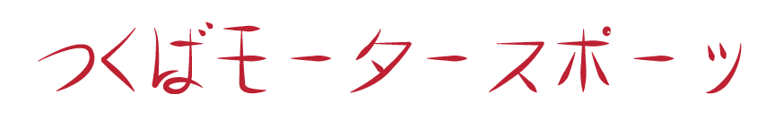
From these main points deriving from external research I decided on a name for the website, Tsukuba Motorsport. The name hints at heritage and history, and ties both Time attack and Drifting together as both these sports became internationally known from this very circuit. So using this name to present a website on Japanese motorsport seemed fitting.
I translated the name into Japanese, I wanted to develop it into a logotype as a main typographic visual of the website. So getting the correct translation was important to work from.
Logotype concept
I wanted to consider font choice in terms of communicating aspects of Japanese motorsport so looking back into my external contextual research I came up with an idea of making a grid system to base the logotype design on.
I gathered together all the flags involved in the events.
A clock face to represent the main concept behind Time Attack (racing against the clock).
Got a scaled down outline of the Tsukuba Circuit.

Made sure everything was in proportion in case grids were used in conjunction with each other.

The final grids from the flags and Circuit (Birthplace of TA & Drift), and clockface (Concept of TA)

Playing about with the grids, defining a grid to use for my logotype.
Tried bringing the grids all together to create guidelines to work from for the imager, instantly released this wasn't going to work as it was far too complex with all the intersecting lines. I wanted to create a structured, and efficient aesthetic to support the whole concept I wanted for the website as a whole. (structure, stripped back, focused, efficient, no distracting away from imagery)


I decided to use the grids deriving from the clock face (Represents concept of TA racing against the clock), the Tsukuba circuit (Birth place of TA & Drift) and the Japanese flag the country of origin were everything began and obviously the fact my website is on Japanese Motorsport.
(Top left Tsukuba circuit, bottom left clock face, bottom right Japan Flag)


I prefer to work rough and analogue before bringing into digitization so playing around with these grids I began to develop my logotype using the translation as a visual reference point and the grids as guidelines to create glyphs from.
I was happy with how this turned out, i used the grid from the Tsukuba Circuit the most as I saw it relevant that it tied both Drift and Time attack together as the circuit is where these events became international known, the grid also allowed more flexibility within the intersecting lines giving good guidelines for the glyphs.
Sort of like traditional typography design (Baseline, Cap height, X-height etc) hopefully this will help me acheve nice balance, structure, proportion, and good aesthetics.


Digitizing
Now I know these glyphs can be created from the guidelines of the Tsukuba grid I began to develop the digital version in illustrator.
Using the program allowed much more geometrical accuracy and precision, an important factor when considering Japanese technical innovation in there cars engineering.


To keep fluid constancy through the glyphs I took elements from existing glyphs to make up other glyphs.


After creating each individual glyph from the guidelines within the grid, I began using other parts of the grid, more appropriate typographic oriented guidelines to achieve a more considered typographical design end result.
It allowed me to have a Cap height and baseline.
I added an X height in for the top horizontal strokes of some of the glyphs to follow.

Fine tuning of the glyphs so everything sits on the right guidelines, and intersecting elements of glyphs interact in a consistent way in this case the curve of the flick/finial needs to be consistent with the curve of the parallel loop.

Achieving consistent width and height between all the glyphs will help it appear more balanced and aesthetically pleasing.
Its important to consider extra elements of the glyphs, It was so hard not to make the final glyph look like a smily face, it looks ridiculous, It just didn't feel right compared to the other glyphs. It was way too playful and cheesy.
Arrived at a point I was happy with. FOR NOW.
Started to play around with more detail of the glyph, these extra elements of the glyph needed to be at a correct angle with the axis and the interaction of the horizontal and vertical stems, a 45 degree angle made them feel balanced.

The circular element of the glyph was placed within a fair amount of negative space so it was hard not to make it feel lost within this space but I think I achieved a good enough balance.

More alterations and fine tuning of glyphs to achieve precision and accuracy.


The final glyphs placed in correct proportions, after undergoing spacing between glyphs to finalize the structure, I tried it out in orange. A common color used in Time attack and drifting websites, But I don't think it works aesthetically it looks too playful and childish. I don't think the softness of the line strokes helps this playfulness though either so I need to address this.
I also addressed the smiley face issue, I place the two marks on the "X-height" I created for horizontal strokes and dashs to follow, this consistent alignment made it feel a little more integrated with the other glyphs making the glyph not look so "smiley".

I began to play around with the width profile of the logotype, and went back to a dark red hue to connote traditional Japanese aesthetics.
These logotypes will allow me to quickly try out different stroke style examples quickly when it comes to website development. I like the second from the bottom the best though at the moment.

GIF concept & development
After showing a few peers my logotype I received a fair amount of positive reactions, everyone loved the use of the grid and said it showed good consideration to heritage in a subtle way.
So working on this feedback I though I would make something extra using these grids, I think at the moment it may be a little confusing to just place the Japanese logotype in the website with no real explanation of what it means. So I began developing a way in translating it with aspects of motion and angles relevant to Drifting and Time attack.
So I began working from grids from the Japanese Flag & The clock face.
Again starting with analogue sketches to see if my idea will work.
I liked how the use of the clock face allowed fine tuning of the placement of the typography, allowing variation in the positioning within the negative space.
Using the clock face grid I segmented the typography to visualize how the timing of Time Attack is split up into sections, timing within the race is based on A-B C-D D-E sections so breaking the words up emulates this keeping things conceptually relevant.


Making use of the Japanese Flag grid for "Tsukuba", as its location is Japan.
(The rectangle is a scamp of the logotype been brought into the animation sequence.)


It also has overall relevance seen as the website Tsukuba Motorsport is named after this race track.
A nice finishing point giving a good introduction to the website.

Final sequence of how the images will move through the motions, hopefully will digitize well!


Digitizing the GIF
A few alterations were made in the digital creation of the GIF, mainly in the form of positioning the sections of typography as I get a more accurate visualization through the digital outcome, I followed the basic guidelines of the scamps though which is obvious here.


Using the Japanese flag grid for the inclusion of the Logotype allowed me to position the logotype as a central focus point giving a pivot for the other typographic to move around.

This same pivot is used with the "to" in this sequence, this pivot allows everything to feel locked into place within the large amount of white space, keeping with the structured feel I want within the whole website layout.

Theres no real need for this pivot point here as the typographic elements are spread out the space a lot more so a balance is achieved within used and unused space.

Really like how locked in these free motion glyphs feel through the use of the Japanese flag grid.


These are the extra points I added to the animation sequence as it seemed a little short and I felt the logotype needed deconstructing to help satisfy the feeling of the Japanese type been translated through this animation.


Using the clock face grid allowed versatility & fine tuning within the positioning of the glyphs. I needed it to be accurate and precise as it could very easily look like a load of randomly positioned glyphs if I wasn't careful. But this grid system helped me avoid that and they felt balanced within the negative space.


Tsukuba Motorsport was presented in a deconstructed way throughout the animation, but I thought it was important to present it in a more constructed way to add focus to the typography as it is the translation of the logo type and the websites name. It also links back to the idea of mechanics, turning something deconstructed into something complete.


Final GIF

Website Development
Now I have a website name and logo to work with and a set direction for how I want the website to look and interact with the end user. I began to work on the final website design, I quickly tried to see if I could resurrect the old website mockups before totally scrapping them off.
I tried making better use of the negative space by filling it with a subtle pastel color, but as I was set on using red for the subtle color within the typography this combination of colors didn't work at all. It didn't feel clean and stripped back anymore wich was my main intention.
Also caused distraction away from the imagery, another main intention.


Played around with how the top navigation links were positioned, none of them felt quite right in terms of balance and the overall aesthetic of the website.


I thought taking the dash from the logotype and creating a frame for the links would make them feel more locked in, but it created too much of a visual distraction away from the images, I wanted the focus to be on the images and I couldn't help but think that the user would be distracted by these contrasting red lines.


More scamps & thumbnails
So back to the drawing board and to the rough thumbnails and scamp to get a fresh outlook on things.
Taking influence from points I made deriving from previous crit feedback, extra contextual & visual research mentioned in previous points of this post.


Digital development
I couldn't really decide on a scamp to work from directly so I plan on taking aspects from them all to create a more considered digital outcome.
Taking forward these scamps focusing on:
Focus on image
Central positioning of the logotype.
The inclusion of the gif image I made.
Contrast of small pt size typography and large scale imagery to help focus on imagery.
Stripped back aesthetic, no visual distractions within the site.
Lots of white space to help achieve minimal distraction.
Achieve locked in structure within this minimal layout to emulate the technical innovation of Japanese engineering.
Keep that interactivity within the User Experience, transitional images from B&W to color, and interactive navigation systems of images.
Minimal color palette, use red though to denote Japan.
A set grid system so I can find all measurements easily to transfer my mockups to HTML & CSS code outputs in Dreamweaver.
Using this 12 column grid with 8pt baseline as a starting point for my layouts, it allowed be alot of versatility within my layouts. Something which was important as to achieve balance and structure within websites that have alot of white space can be difficult and require fine tuning when it comes to positioning of elements.

I created the size based on 1024x768, a resolution that apparently most web designers use as a starting, and to be fair I believe the end user won't be someone who has a very large PC screen so this size will be the best choice for my end user.

Font used was Open Sans, a free font from fontsquirell with licensing for public use giving my website potential to be used in the public domain.
The choice of typeface will help maintain legibility and readability within small pt sizes so I can keep contrast within large image and small type as suggested in my intentions for the site, its also a very stripped back and basic site, no extravagant aesthetics within its anatomy. Just a clean & simple typeface design again keeping with the overall aesthetic of simple, clean, stripped back & structured aesthetic of the site.
This is the logotype I chose out of the stroke variations, the tapper of the strokes emulate traditional Japanese sable brush writing techniques keeping that hint of Japanese heritage in there.
First I focused on trying to get down a nice balance, structured and easy functioning navigation system for the end user within the vast amount of negative space, it was difficult to achieve a nice balance due to the small pt size I wanted to use to give off a delicate and accurate feel often seen in successful minimalistic design and traditional Japanese art & design work.


The use of lines made the text feel locked in to place or framed up within the vast white space, allowing me to keep the small pt size and still maintain structure within the positioning of elements within the layout.


I added an italic/shear to these headers for the links, this use angle is often used in garish and horribly cliche logos and images in other automotive/drifting/time attack websites. So this subtle representation adds familiarity and relevance to the whole website in a more subtle and stripped back style keeping with the current aesthetic of the whole site.


I felt like this navigation system worked and had potential for framing up and focus on imagery through the use of the horizontal line.
So I began to develop my media content page, it would work on a vertical scrolling system to allow lots of image content to be viewed.
So I added some content images and lowered the saturation so they worked as a group along the same tonal range.


As previously mentioned I wanted to focus on user interaction, so to achieve this I visualized the idea of the images been B&W until the user hovers over them and it turns color. Through having all these images B&W it didn't cause a clash of images, it helped the website keep its minimalist, stripped back and accurate aesthetic.

So I began to work on centralizing everything, I liked this better instantly I felt the white space framed the image up nicely and with the support of the horizontal line the images felt locked in with the white space.
So far I'm achieving my intentions of creating a site that has focus on imagery, the typeface at current is balanced within the space and creates a nice contrast through small type and large imagery.

The next thing to do was try alternative logo placement, I tried out vertical and horizontal alignments even a diagonal alignment to add an element of familiarity based on current Drifting website using angled imagery.
Didn't work in this case though.


Tried out two versions of a text box, a long thin one in red and a short one in yellow, as typography is going to be very minimal and concise as the user isn't interested in reading lots of texts the body copy will be more suited to short captions of text.

So this version of text box will work better, not sure on the color though I wanted to try bring in yellow/orange hues to add familiarity again for the end user as current Drift & Time Attack websites use these colors alot. I still think red is going to work better though.

Based on this more centralized layout I went back to the media page and added this layout structure too it and decided it maybe best if I focused down the images a little so they can be viewed at larger sizes allowing the end user to experience the detail within the images.
So I went from a large mss of images to just 4 images.
The same B&W to color transition is used though to keep things interactive and allowing individual focus on each image the user choses when hovering over.


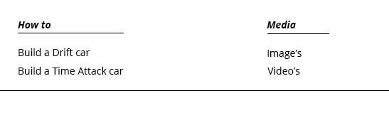
To see if there was any more potential layout options within the top navigation system I began experimenting again looking back on my scamps and keeping the idea of stripped back aesthetics, structure, minimalism, and focus on imagery with the use of lots of white space.


I liked the addition of these more subtle lines to frame up the sub pages, the use of the header and sub-pages (e.g. About | Drifting) meant that I didnt have to repeat words meaning less space had to be used and it created a more concise and precise digestion of the content pages available.
I tried alternating the positioning of the logo but it the space between the logo up in the top left corner and the content at the bottom felt very unbalanced and lose, it all needed locking in together.

Going back to the GIF and the "Welcome To Tsukuba Motorsport" translation I thought having this at the top of the page give a welcoming feel to the site giving a more positive inviting feel to the site for the end user, and also adding a consistent translation of the Japanese logotype.
I feel the central alignment of the logo type works the best so tried this out in a few variations.


This didn't work at all though, it created a sort of taper down from the typography at the top of the page to the logo type ruining the whole structured feel and locked in feel of all the content which is ever important when using lots of white space.


Now I have the top navigation system in order and set for all the pages I started looking at the interaction system of the images.
The central alignment of the Japanese logotype along the vertical of the layout allowed a pivot point for the welcome strap line at the top of the page to work from for both top corners of the page, the navigation links worked by locking into the left alignment of the page while the large scale image made everything lock in together as a whole structured overall layout.
There were two main options, one was to take glyphs from the logotype to create a navigation system based on forward or backwards depending if you press left or right, this used up some of the white space I guess but it just didn't feel balanced and it stopped the image feeling framed up by the negative space on the sides.
The other option (right) came from my mockups, the fixed navigation box with circular icons that the user clicks, this square element helped achieve support within the structured and locked in feel through its rectangular shape and how the angles of the image, negative space and linear elements interact with each other in an interlocking way.


Trying out again how text boxes will work, large scale or small, again trying to use that yellow/orange hue but it causes too much of an impact, I don't want impact coming from color text boxes I want them coming from the images!
So back to the small concise text box, this time bringing the red into the static navigation rectangle, this just looked awful again causing impact and distracting away from the image and the text so this wouldn't work at all in terms of good user experience. I wanted textual information communicated to them in a clear and concise way so they can spend there time enjoying the high quality images.


This works much better, a nice subtle semi opaque text box with monochrome & white navigation system with the active link been highlighted in red, a nice little addition of red making use of the minimal color palette I have going on. It also has subtle connotations to the Japanese flags central circular element.
I also like how the 3 elements of red keep the eye moving around the page in a subtle use of color hierarchy, the active like describes what page your on, the red logo highlights the brand image of the site and the circular element connotes Japan. They all have uses and relevance.

Now I have a basic structure I began creating the other pages, starting with the home page, not sure how all this will work in terms of the animation on the page but right now it looks nice, I love the clinical cleanness of it and the animation should hopefully be received well by the end user as a nice bit of "eye candy" while been informative yet playful in its tone of voice of translation and emulation of automotive motion/racing within the animation.

I began working on a new page structure, for the how to guide on creating a Drift & Time Attack car, I had to work out the best alignment for the body text and how it interacts with the image to explain subsequent stages of how to build a drift/time attack car.

To keep with the subtle use of type as to not draw attention away from photographs I placed the type within the central frameworks and dimensions that the images use within the position of the page, this kept a feeling of structure. Or was my intentions but it felt a little lost within the space still.


I brought images in to lock everything into place with a supporting block color text box to stop the text feeling like it was floating around within the negative space, altogether it now feels quite structured and all the elements feel locked into place.


The way in which the text interacts with the photographs is based on a hover over transition from image to text box explaining each stage of how to create a drift car, I like the motion and the interactivity within this system the user can pick and chose what image to choose rather than having to cycle through a set navigation system guessing what image will be next. (like the media page circular navigation system)
Tried out the semi opaque text box apposed to the block color text box, better readability is achieved through the block color box due to a higher contrast of town between the text and background image. The light grey tone works well for this contrast.


Mobile Version development
Based on the current system from the desktop site I developed a mobile version as I wasn't ready to tackle responsive web design coding I will just make 2 versions of the site.
The 3 column grid I used & 320 x 480 resolution a common starting point and in-between size for modern smartphones.
Began to take forward the alignment and positioning of the navigation links and welcome strap line, it was instability obvious it wasn't going to work as there wasn't enough space to position the elements within the canvas to achieve balance of negative space and used space. It all felt too squeezed together.


Took the strapline welcome text off to free up some space, started to feel a little more balanced within the space but still didn't feel right so I went for a vertical stack of the links with the lines (used in the desktop site) to achieve the same interlocking of elements within the space.


Everything feels locked into place now, the typeface at current is 8pt Open Sans, I read on a help section on Google web developments that you can get away with 6pt size on phone outputs due to the high PPI resolutions of the screens allowing better viewing and better legibility of smaller glyphs.
So I lowered the pt size and it allowed me to bring in the strapline back in, Im happy with how this navigation system works now so I can start adding content into the site.


Brought the grey box in from the desktop site to frame up the navigation links but this didn't work at all it clashed and caused an in balance between all the elements of the navigation system, strap line welcome text and logo type, works much better within white space.

Due to capabilities of smart phone browsers and how the user interacts with the sites I decided against the navigation bars with circular icons and the transition of images from color to B&W with text boxes as theres no hover function in smartphone interactions.
So the images will just be on a continuous vertical scroll across all the content pages to keep things consistent.
The text will be placed within 2 of the 3 columns, I tried out the type running across two columns but I didn't like the long strings of line it created more visual impact through contrast of extension & tone due to the large lines of text, this in turn drew attention away from the imagery a little which isn't my intentions.


The images felt a little lost within the space, having good experience with horizontal lines in previous developments I brought these in to lock each image and text element together.


Tried out the lines for framing up the GIF image on the home page this works for framing the content up. But I'm not sure I like how this GIF looks, I could keep a consistent size between the Japanese logotype on the header of the page and the GIF but now its alot smaller causing a bit of a visual clash.


I decided to erase the GIF animation from home page and work on deconstructing the glyphs into an abstract alignment across the page inspired by the GIF animation, it also makes better use of the negative space and has a similar idea of deconstructing glyphs from the Japanese logo type to tie in and translate the website name "Tsukuba Motorsport" through the welcome strap line "Welcome To Tsukuba Motorsport"

My initial idea was to position the glyphs on the top of the imagery and content, the same "layer" as the navigation icons, welcome strapline and logotype.
When the user scrolled through image & type content everything stayed locked in place overlaying over the top of the content. I showed Joe this and he said it was a little visual confusing.
I agree on this it draws attention away from the main focus point of the site the images.


Placed the glyphs as a background to everything so the glyphs stay locked in place like the navigation links, logo and strap line but don't overlay over the images causing confusion.

Final Mobile & Desktop site ready for final crit & coding
Here are the final website mockups ready to measure up pixel dimensions and positioning within the 1024x768px canvas to convert to a website format within dreamweaver.


The good thing about this site is the fluid motion within the transitions and presentation of text and imagery, but Im not sure on the aesthetic of it Im not sure it fits the rest of the website, the large grey text boxes look out of place as the previous color boxes were smaller and more subtle in there use, this is a little in your face and contradicts the whole subtle and stripped back aesthetic I wanted.


This version remains consistent with the other large scale image pages but doesn't quite have that interactive feel and fluid user experience. But as consistent user experience is a priority and a structured overall site presenting a familiar presentation of text and image may be beneficial.

Mobile site
All the pages will follow this simple vertical scrolling presentation of image and text to keep things fluid and the user experience consistent to avoid confusion through different interaction on different pages like the desktop site. The size of a phone screen doesn't allow the interactive navigation system with the circular icons as they will be scaled too small for the end user to chose the image causing difficult user interaction.


No comments:
Post a Comment