Monday, 28 October 2013

Production Method Typefaces

Production Method Typefaces

Following the last session we learnt about production methods and organized our collection of collected letterforms into groups. We are required to do a similar task but this time bring in an ABC XYZ uppercase and lowercase collection of one of each production method from the table below. Thinking into obvious styling characteristics like the Anatomy, Identity and charecter. 

Production Methods - Stone, Sable, Bone , Wood, Lead, Silicon/digital, Hand Rendered, Stencil, Block Print
Anatomy - Line/Stroke weight, Serif, Curve/Apex, Terminals, Uppercase/Lowercase, Bold, Italic, Ascenders/Descenders, 
Identity - Name, Designer, Historical, Chronological, Cultural, Humanist, Modern, Traditional, Context, Function
Character - delicate, contrats, Sophisticated, Playful, Childlike, Fun, Exciting, Minimal, Formal, Geometric, Balanced, Simple, Decorative, Feminine, Corporate, Industrial.
Below are my examples displayed digitally. These will be cut out into individual 10cm x 10cm formats. 
Stone - Minion Pro. Obvious serif starting points for chiseling. 

Sable - Linotype araby. Soft contrasting heavy and light strokes with fluid motion. 


Bone - New Berolina pro. Hard feel. Angular end terminals/stems, smooth calligraphic lightweight and medium weight contrast in stems. 

Wood - Blackoak. Solid block style, square cut serifs, bulky weight for durability. 

Lead - Linotype Aroma. Very accurate and linear. Straight cut lines and thin weight of stems and bowls. 


Silicon - Alexie LL. Completely abstract, awful looking typeface that couldn't be created with traditional techniques to this consistent series of letterforms.

Type Journal

Type Journal

As an ongoing source of recording inspiration for my practice I will use this blog and other linking blogs labeled under type journal to record, document and analyze typography I like, dislike or am inspired by from a various amount of sources. Consider type characteristics we have learnt previous:

Production Methods - Stone, Sable, Bone , Wood, Lead, Silicon/digital, Hand Rendered, Stencil, Block Print
Anatomy - Line/Stroke weight, Serif, Curve/Apex, Terminals, Uppercase/Lowercase, Bold, Italic, Ascenders/Descenders, 
Identity - Name, Designer, Historical, Chronological, Cultural, Humanist, Modern, Traditional, Context, Function
Character - delicate, contrats, Sophisticated, Playful, Childlike, Fun, Exciting, Minimal, Formal, Geometric, Balanced, Simple, Decorative, Feminine, Corporate, Industrial.
And categorize these fonts accordingly. Look at elements of typography found around everyday items, when your traveling, walking etc. Look into font foundries, text books, magazines and photocopies of examples of type. The idea is to collect and record such examples to help get started into on going investigations. 

What is visual literacy

What is visual literacy

With the selection of typefaces selected individually in the previous task we were put into 4 groups and asked to categorize the typefaces into there style origins. The origins came from how the typeface was created in its original format. The categories were Stone, Sable, Bone, Wood, Lead and Silicone. Stone been a traditional style typeface with sharp serif points. The serif point been the staring point for the chisel to carve in the desired lines. The characteristics of Stone typefaces are curved serifs bone straight stems with sharp serif points were the chisel enters the stone. 


Sable is a more elegant oriental inspired typeface design that uses a special type of brush. Different stem weights can be created by applying a range of pressure and angle with the brush and a tapering can be achieved by using the tip of the brush but less contrast in stem weights is obvious. 

Bone again uses tapered strokes to create a calligraphic effect. I feel calligraphy pens stemmed from this style of writing using wet ink and the angles of the pen/nib to create different weight, tapers and flicks within the typeface anatomy. Its hard to distinguish the difference between sable and bone. The main differences come from the stroke weight, sable is quite bold in weight. Bone is more thin and elegant. The appearance of bone is more 'hard' so to speak compared to the softness of sable. 

Wood block is the most distinctive. The weight of the stems are bold and heavy. The press/carving needs to withstand numerous prints so a thick, deep, simple lined sans serif and serif typeface is the characteristics of wood block type. Serifs wouldn't be delicate they would be quite robust to ease carving. Complex designs are hard to carve out of wood and maintain smooth bowls or straight angular stems. 

The final type setting method is and origin is lead. Molten lead is poured into a mold to create. To me the characteristics of lead, or hot metal typesetting is the most obvious. Consistency and accuracy is the main characteristics. Lead type setting was used back before digital pressing to create large bodys of text in a mass produced format. As the legibility remains throughout. The overall feel of the letterforms would be very clean cut much like wood blocking but lighter weight/finer letterforms can be created. 

Silicone. Silicone refers to the inventing of the microchip as it was created from silicone. Its the reference too digitally created typefaces. To categorize silicone or digital typeface the letter form has to contradict all the above characteristics. Typefaces that have a very abstract style like the one shown below. The stem does not complete the counter fully. This is easily achieved using vector programs like adobe illustrator were geometric shapes can be created with ease but using traditional techniques creating a clean cut accurate representation of this wouldn't be possible. 

We then went on to categorize out groups typefaces. From left to right we decided that the first was Lead, interestingly following a sans serif and symmetrical feel through the use of identical line weights.  Stone was the second due to the serifs been the starting point of were the typeface would be originally started. Third was sable, the first one i disagreed on the more squiggly random abstract typeface looks more digital too me, but the second followed an oriental style with varying line weights and 'flick' like angular serif points. The 4th was digital due to its abstract smooth edges and overall soft retro feel and the final one was wood block due to its heavy weight. Clean cut lines and square angular points.

Some key points I learned through the session along with typeface origins was a brief insight into origins of type. For example In COP sessions i learnt about the term of connotations of things been understood as fact through cultural agreement of said elements. The letter A used to be presented by a bulls head through a pictogram? why did it mean A? I don't know it was just an agreed language upon what everyone understood. It then went through manipulations to what we see today. The point I am trying to get at is everyone knows an A for what is is through common agreements. So if legibility is manipulated and the element added into context like next too a B C or in a word then legibility is gained. 


Along with production methods there are many sub categories of characteristics of typefaces. These are displayed bellow to help describe typefaces more professionally:   

Production Methods - Stone, Sable, Bone , Wood, Lead, Silicon/digital, Hand Rendered, Stencil, Block Print
Anatomy - Line/Stroke weight, Serif, Curve/Apex, Terminals, Uppercase/Lowercase, Bold, Italic, Ascenders/Descenders, 
Identity - Name, Designer, Historical, Chronological, Cultural, Humanist, Modern, Traditional, Context, Function
Character - delicate, contrats, Sophisticated, Playful, Childlike, Fun, Exciting, Minimal, Formal, Geometric, Balanced, Simple, Decorative, Feminine, Corporate, Industrial.

Friday, 25 October 2013

Design Skills - Alphabet Soup - Typeface Interim Crit

Design Skills - Alphabet Soup - Typeface Interim Crit

Had my interim crit today only this time following a different format to the previous 2 crits run. This one we were to present out work out to out peers and the idea we had should be presented in a conceptual and visual way with little or no explanation on what's on show. Meaning legibilty and a strong concept needs to be evident. 

Admittedly I wasn't ready for this style of crit I was more prepared to presend my work and talk through it with my sketchbook. Not let my work do all the talking for me. So the feedback I relieved was good I expected a lot more people to struggle to understand my concept. But the concept was praised and strengthening ideas generated from people suggesting looking into my own code, creating typography that simulates engine parts, look into dot matrix printers and lots of other useful feedback on concepts.

Visually feedback was also good, as expected legibility issues were brought up. But this is something I will work on through use of a grid and different layout ideas. Wich is something I initially planned anyway. So this concept will be one I will be definitely taking forward along with experimentations with merging this idea with the existing chosen typefaces with manipulation.

Out of all the ideas presented the dot idea was praised the most but with additions of suggesting adding dashes into it to emulate morse code maybe? But the main thing I have to agree on is narrowing my concept down and focusing on a polished outcome. 

From this crit I have chosen to polish up and develop towards a final idea incorporating the dot concept, mechanical engine elements and keep the minamilistic approach and try out embossing maybe. I will look into existing type design that fits this criteria to help strengthen development ideas. But I now know we're to head with the idea thanks to this crit.

Here is what i took in the crit. 


Friday, 18 October 2013

Alphabet soup final crit

Design Skills Studio Brief 1 final crit

Today I presented my first final crit to the group. The feedback i received was positive and has helped me establish what elements to take from this brief into creating a full typeface. As you know my word was symmetry and my typeface Garamond, after the intrim crit I had the idea of splicing an element and mirroring it on an axis point. I played with this idea a little as is shown in my design practice log. But my peers again went back to the 'z' idea they favored in the interim crit. But again they liked the X idea but the same issue came up that legibility would be an issue. The mirror 'i' found at the bottom is a development from its predecessor spliced 'i' positioned above. It was said in the interim crit that the idea of a visible axis point was a nice idea. So i played on this visible mirror point through basic type anatomy, used the baseline as a mirror point and reflected the spliced element either side of this line. This worked well but in terms of body text it was agreed it wouldn't work as a family of letterforms it would work nice as something like a logo though maybe?

 So my initial ideas at the moment is to take this idea and the splice idea with the 'i' letterform and develop these together somehow. I was happy with my feedback obviously but it would have been nice to receive some harsh feedback so to speak so I know were to improve upon next time. One thing that i did learn from the crit is that some people created grid systems for creating there letterforms and I feel this would be a nice way in which to create an accurate system and produce a number of letterforms much faster due to having a production system. 

Below is a snapshot of the produced visuals. 

Thursday, 17 October 2013

Alphabet Soup - Visual Thinking Finals


Design Skills - Alphabet Soup - Visual Thinking Final developments

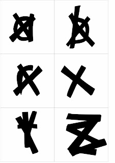
Presented bellow are my final analogue drawn 10cm x 10cm examples of my visual responses to this brief. I explained there concepts in the previous post but there has been a few changes in these final examples. The first one is emulated in the first example, my initial idea was to create an uppercase out of a lowercase but playing about with this idea i came up with combining 2 spliced elements of separate letters to create a representation of a 'y'. I like this idea but its legibility is the problem. The final example comes from the mirror idea, i liked the idea of splicing a letter up so i spliced up a lower case 'i' squared off the top of the stem to create a more square serif and added bold weight to the element then mirrored the spliced section on a visible baseline mirror point. 

My favorites are the 'Z' and the bold weight 'i' and these are what I will go onto create a full range of letterforms in a digital output. Although I do like the handmade analogue feel of this and the contrast of the black on the recycled grey card is something I like. It sort of contrasts the old with the new, as Garamond is an old style serif font I thought I would use a paper-stock that emulates an old feel to contrast with the bold contemporary drawing style. An element of age needed to come into this due to the typeface been based on a punch cutter  An old style type press machine. 


In terms of use this would work best in a body text to keep legibility good when letterforms are placed next to each other in sequence. As mentioned my favorite elements are how the 'Z' uses an axis point as a stem as well as a visible mirror point, and I love the simplicity of the bold spliced 'i'. Its a very stable letterform due to adding bold weight to the stem and squaring off the top of the stem and the serif isnt as rounded on the brackets. What i would have liked to do tho was take the apeloig inspired 'a' into further development as this isnt like my usual style, its very abstract and fluid in its motion and this is something I will keep in mind for future developments were I see fit. I would also experiment with printing methods more to obtain a more broad range of final outcomes but apart from that Im pleased overall with the completion of my first brief and look forward to digitally manipulating it now. 

In terms of inspiration if you look into the inspiration post I made I soaked up a few concept ideas from this. For example the repeated dots to create the color blocking in the spliced 'i' is inspired by the use of dots in the lego letterpress piece made by Levi Bunyam. The element of splicing and fragmenting arrangments used throughout some of the letterforms in inspired by the sculpture created by Valee Duhamel. Unfortunately i could not use bold colors within the typeface due to legibility issues and how the typeface would work as a body text. Finally the last inspiration piece came from the combination of Apeloig Drops typeface which inspired my abstract 'a' and the whole digital bold feel came from the threesix font i found on typetoken. Along with underlying influences from initial research into Garamond and word association as is all described in previous posts. 


Below are visual responses in terms of trying out new things, I tried out a range of paper stocks to create the old feel i desired. The brown worked well but to me felt too 'crafty' so to speak and a little to hand made which interferes with the crispness needed to emulate my word symmetry. I liked the idea of stippling the color in but again this contradicted the crisp feel I wanted to emulate. The use of different paper stocks was recommended in my crit, the print method i tried out still used fine liner but created a kind of half tone through the use of 'stippling' it was inspired by the legopress letterform in my inspiration research. 

Below are examples of using type weight on my chosen stock for final production. Ranging from light, regular and bold I feel the bold works well and creates a nice contrast through the tonal ranges of the black type on the grey background. 


Tuesday, 15 October 2013

Design Principles Studio Brief 1 - What is visual literacy

Design Principles Studio Brief 1 - What is visual literacy

Today we had the briefing for the design principles module. From what i gathered from the talk I feel it will help influence and inform my practice in a variety of ways. These been that all aspects learnt within this module will help inform other briefs in an underlying way. It will help me to base all my visual and conceptual decisions around what the audience or client require. It will help me create simple yet effective design before going into more complex designs. What I am looking forward to the most is learning subjective colour theory, type and grid concepts and learning about Type legibility, readability, Type + Image combination and layout concepts. Visual dynamics and literature is also a concept we will be learning about, this will all be influenced by context of practice teaching us how to create designs with meaning. Not just something that looks 'pretty'. 

The first Task we have been asked to do to help begin the process of learning fundamental design principles is to collect 3 completely different typefaces using letters A B C X Y Z in uppercase and lowercase. And present them in individual 10cm x 10cm formats.  


Din 1451 std


Simoncini Garamond


Helvetica Neue Medium

Design Skills - Alphabet Soup - Visual Thinking 2

Design Skills - Alphabet Soup 

After evaluating my rough sketches presented in the previous post I have chose the 10 designs I want to finalise and polish up. My working style works best on constant improvement through different stages bringing in underlying influences in each stage. So the 10 designs you see here will now take influence from some source inspiration i have presented within the design context blog. I will also tie in historical references in a visual way based on Garamond, I feel tying these references in a visual way in with my contemporary type manipulation will create an in interesting concept. 

Idea 1. I got this idea from discussion in a crit, i used an axis point and someone mentioned using the axis point in a different way so as I was using splicing as a word to provide visual response I had a play with using a set axis point to remove sections of a letterform while still maintaining legibility. I like how the serif has been removed from the bottom creating a hybrid sans serif and serif letterform. I have also added weight into the stem.


Idea 2. This was my personal favourite but upon further inspection and crit analysis it is obvious this will only work in letterforms that have 4 main points positioned on right angles to create this square, disassembled concept. So this wouldn't work well only on things like X, T, O, W letters with more structure. I squared off the brackets to create this more angular feel on this and it worked nicely. 


Idea 3. Is what gained the most positive feedback in the crit. It uses a variety of the words I stemmed from symmetry in my mind mapping. These been spice, mirror and axis. The idea as mentioned previous came from Idea 2 which lost legibilty in certain letterforms so a crossbar or diagonal stroke would be left in to maintain legibilty and emulate a mirror on an axis point for the spliced element. An interesting concept that uses a range of words to create a simple visual outcome with a complex meaning. Lots of weight has been added to the mirror point to create a contrast between bold and light which i like. This would work best as a header text but once more are made it may be legible for body text.


Idea 4. Was a brief idea I had using a concept of still motion animation through the 10 slides, this would work in a concept of creating and constructing an element using the words splice, pivot and add from my mind mapping. But in terms of creating a manipulated letterform this concept doesn't fit. As manipulation isn't really explored of terms of anatomy. 


Idea 5. This idea was a quick little play on the words splice and mirror. I spliced parts of lowercase letters to make uppercase but this would only work with letters like. h and g for example that have ascenders and descenders removed and the loop and bottom half of the elements mirrored to create a representation of the uppercase form. As presented here with lowercase h elements creating an uppercase representation. An interesting concept but not very neat and legible which doesn't fit in with the word symmetry that portrays order and form. 


Idea 6. This idea stemmed off from idea 5 using the word mirror, i simply reflected the element along a horizontal axis on the baseline to create something that looks like its reflecting in water, kind of looking at itself in its own reflection along a still body of water or a floor laying mirror. 


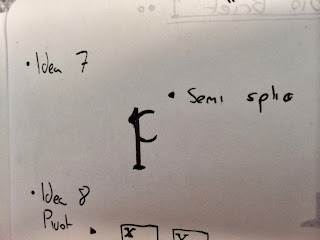
Idea 7. This idea was a more subtle approach to the word splice. It creates a more delicate final outcome, splicing an angular section off the stem of the loop, disposing of the counter creating a wide aperture but still maintaining legibility of a p. A very complex and technical concept. 


Idea 8. Here is my first play on pivot and another touch on motion. Using a visible pivot point and moving the letterform around the pivot creating a circular motion. The concept been here that this circular motion contrasts with the word angular which was derived from my word association of symmetry and i basically flipped angular on its head to create a more abstract concept. 


Idea 9. This is probably the most simple visual outcome I arrived at but most effective in terms of visual concept. It has no type manipulation in terms of anatomy just a bolder weight on the stroke. The concept is to add a visual axis point on all the letterforms to emulate a mirror point and axis point in a anatomical way. It also emulates splice quite well, in such a way it shows the line of motion were a splice or cut could be applied. 


Idea 10. My final idea is a complete abstract concept. The word symmetry has been flipped on its head to emulate the word distort in a visual way. So basically this is just a freehand/script representation of Garamond in a fluid motion creating a bold, hippy style abstract letterform. 


From here I will go onto create final presentations of these 10 letterforms in polished up finalised visual response. I will experiment with paper type, letterform weight, size and print methods to create varying outcomes using various mediums. 

Monday, 14 October 2013

Alphabet Soup Interim Crit

Alphabet Soup Interim Crit

Today I had my first group crit, a small group of 12 unique disciplined students to help me spark further ideas and concepts from my current quick sketches. I found this very beneficial and soaked in alot of what was said, not just to me but to other people as it will all prove helpful in the development of my ideas. 

I presented my work forward and received positive feedback on a few elements but the most coming from an 'X' idea that is presented in my design practice blog, people liked this but mentioned how it could be made more legible on other letterforms. This could be done by adding a support element, and after seeing i experimented with an axis on one of my pieces it was said an element should be used as an axis to support the splices elements of certain letterforms. As is shown below in this 'Z'. I will bare in mind peoples advice on experimenting with paper stocks, printing methods and color combinations to portray different visual responses.


This is the second piece of developed work that i really like. Its very clean, simple and legible with an abstract twist. Splicing part of the letter from a set axis (create an axis/grid point for the set or individual axis points to splice off elements). Combining this with other words I have stemmed from could create strong design outcomes.


Main points for me to remember now are: 
Experiment with axis points, line weights, color, size, alignment within the 10cm x 10cm box and printing methods. These will provide to be the main development stages to create 10 different visual responses.

OUGD403 Design Skills - Alphabet Soup - Typeface

OUGD403 Design Skills - Alphabet Soup - Typeface

To inform development more upon my contextual research on my partner I have included an image of her handwriting to try base my manipulation around this and the facts I have gathered around her. 


I have been working on some rough design ideas deriving from my contextual research into Braille and mechanics and formed a basis upon my word association. I am looking forward too the interim crit as I feel i am at bit of a dead end on were to take my ideas and concepts. I have a few basic ideas worked on favoring the dots idea derived from Braille. A way in which I could experiment and develop this is form a grid system to create different outcomes quickly experimenting with abstract layouts with minimal legibility and more legible clear cut outcomes. Once this is established I will try bring one or more of the chosen 3 typefaces into it as shown in idea 3 on the bottom image. Keeping a singular element of the dot keeps a sort of focus point upon the letterforms concept.

After discussion with my girlfriend late at night she mentioned the idea of roman numerals so I briefly played about with deconstructing the Casion typeface with these visual elements. 

Si scott is someone I want to look into now after playing about with mechanical inspired spiral style letterforms seen in idea 4. These intricate letterforms could really give off the idea of mechanics and Helens love of illustrative hand made and handcrafted style. It will be nice to see how my ideas can be informed to be brought forward into polished outcomes through a group crit. I feel I have a diverse range as it stands just more clarity is needed in terms of a strong visual response and supporting concept.