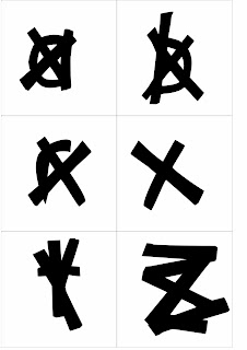
Production Method Typefaces
Following the last session we learnt about production methods and organized our collection of collected letterforms into groups. We are required to do a similar task but this time bring in an ABC XYZ uppercase and lowercase collection of one of each production method from the table below. Thinking into obvious styling characteristics like the Anatomy, Identity and charecter.
Production Methods - Stone, Sable, Bone , Wood, Lead, Silicon/digital, Hand Rendered, Stencil, Block Print
Anatomy - Line/Stroke weight, Serif, Curve/Apex, Terminals, Uppercase/Lowercase, Bold, Italic, Ascenders/Descenders,
Identity - Name, Designer, Historical, Chronological, Cultural, Humanist, Modern, Traditional, Context, Function
Character - delicate, contrats, Sophisticated, Playful, Childlike, Fun, Exciting, Minimal, Formal, Geometric, Balanced, Simple, Decorative, Feminine, Corporate, Industrial.
Below are my examples displayed digitally. These will be cut out into individual 10cm x 10cm formats.
Stone - Minion Pro. Obvious serif starting points for chiseling.
Sable - Linotype araby. Soft contrasting heavy and light strokes with fluid motion.
Bone - New Berolina pro. Hard feel. Angular end terminals/stems, smooth calligraphic lightweight and medium weight contrast in stems.
Wood - Blackoak. Solid block style, square cut serifs, bulky weight for durability.
Lead - Linotype Aroma. Very accurate and linear. Straight cut lines and thin weight of stems and bowls.


No comments:
Post a Comment