Design Skills - Alphabet Soup
After evaluating my rough sketches presented in the previous post I have chose the 10 designs I want to finalise and polish up. My working style works best on constant improvement through different stages bringing in underlying influences in each stage. So the 10 designs you see here will now take influence from some source inspiration i have presented within the design context blog. I will also tie in historical references in a visual way based on Garamond, I feel tying these references in a visual way in with my contemporary type manipulation will create an in interesting concept.
Idea 1. I got this idea from discussion in a crit, i used an axis point and someone mentioned using the axis point in a different way so as I was using splicing as a word to provide visual response I had a play with using a set axis point to remove sections of a letterform while still maintaining legibility. I like how the serif has been removed from the bottom creating a hybrid sans serif and serif letterform. I have also added weight into the stem.
Idea 2. This was my personal favourite but upon further inspection and crit analysis it is obvious this will only work in letterforms that have 4 main points positioned on right angles to create this square, disassembled concept. So this wouldn't work well only on things like X, T, O, W letters with more structure. I squared off the brackets to create this more angular feel on this and it worked nicely.
Idea 3. Is what gained the most positive feedback in the crit. It uses a variety of the words I stemmed from symmetry in my mind mapping. These been spice, mirror and axis. The idea as mentioned previous came from Idea 2 which lost legibilty in certain letterforms so a crossbar or diagonal stroke would be left in to maintain legibilty and emulate a mirror on an axis point for the spliced element. An interesting concept that uses a range of words to create a simple visual outcome with a complex meaning. Lots of weight has been added to the mirror point to create a contrast between bold and light which i like. This would work best as a header text but once more are made it may be legible for body text.
Idea 4. Was a brief idea I had using a concept of still motion animation through the 10 slides, this would work in a concept of creating and constructing an element using the words splice, pivot and add from my mind mapping. But in terms of creating a manipulated letterform this concept doesn't fit. As manipulation isn't really explored of terms of anatomy.
Idea 5. This idea was a quick little play on the words splice and mirror. I spliced parts of lowercase letters to make uppercase but this would only work with letters like. h and g for example that have ascenders and descenders removed and the loop and bottom half of the elements mirrored to create a representation of the uppercase form. As presented here with lowercase h elements creating an uppercase representation. An interesting concept but not very neat and legible which doesn't fit in with the word symmetry that portrays order and form.
Idea 6. This idea stemmed off from idea 5 using the word mirror, i simply reflected the element along a horizontal axis on the baseline to create something that looks like its reflecting in water, kind of looking at itself in its own reflection along a still body of water or a floor laying mirror.
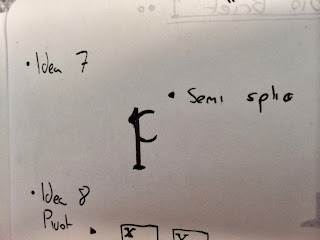
Idea 7. This idea was a more subtle approach to the word splice. It creates a more delicate final outcome, splicing an angular section off the stem of the loop, disposing of the counter creating a wide aperture but still maintaining legibility of a p. A very complex and technical concept.
Idea 8. Here is my first play on pivot and another touch on motion. Using a visible pivot point and moving the letterform around the pivot creating a circular motion. The concept been here that this circular motion contrasts with the word angular which was derived from my word association of symmetry and i basically flipped angular on its head to create a more abstract concept.
Idea 9. This is probably the most simple visual outcome I arrived at but most effective in terms of visual concept. It has no type manipulation in terms of anatomy just a bolder weight on the stroke. The concept is to add a visual axis point on all the letterforms to emulate a mirror point and axis point in a anatomical way. It also emulates splice quite well, in such a way it shows the line of motion were a splice or cut could be applied.
Idea 10. My final idea is a complete abstract concept. The word symmetry has been flipped on its head to emulate the word distort in a visual way. So basically this is just a freehand/script representation of Garamond in a fluid motion creating a bold, hippy style abstract letterform.
From here I will go onto create final presentations of these 10 letterforms in polished up finalised visual response. I will experiment with paper type, letterform weight, size and print methods to create varying outcomes using various mediums.


No comments:
Post a Comment