Friday 29 November 2013

Photoframe interim crit

Photoframe interim crit 

As previously mentioned I was struggling were to take my concepts and ideas from the presented sketches.  For the crit i formed 3 questions to ask half of the group who went round looking at examples of peers work. The questions I asked  have produced answers that will help me move forward with my ideas and concepts. Below are my questions.

Do these designs present versatility/universal outcome? Strengths? Suggested improvements?

Describe my work in one word?

Any suggestions on concept ideas to present versatility in a minimalist way? 

Here are everyones responses.


Noted down here is an overview of all the feedback I have received in a way in which will help form a base to take forward my ideas and concepts. 

Don't make things too minimal so it looks too empty. Fine line between too minimal and too cluttered. 
I didn't display the use of color in my mock ups so this question popped up a lot but it was suggested to use a limited pallet of 2 colors that create a high impact while working with the frame style. Look into bold colors, pastels or a combination of both. 
Remove elements that cause clutter, if i am going down the minimal route keep distractions to a minimum this will also aid the concept of clarity and versatility. 

The one word response feedback was positive giving me confidence in the initial concepts at the moment. The best been:
Clinical 
Organized
Minimalistic 
Clean 

Pick a brand to work with and follow there past color schemes. Could look at ikea and create an high end range of frames for them as i initially wanted to aim at the top end of the market. 
Use some simple vector graphic to enhance the simple & clean compositions. 
Look into generic icons like cameras, could create simple vectors of these icons? How minimal looking can i make a camera icon?
Show my grid in the later stages of my developments. Experiment with layouts within a set grid.

The above are my interpretations of peoples responses in a way in which will help me strengthen and develop my existing ideas and concepts. 

Legibility & Readability within a sentence 2

Legibility & Readability within a sentence 2

Following on from the 4 sentences I made i realized i made a mistake as the words were supposed to be put into 10x10 cm squares, this gave me a better opportunity to be more playful in terms of layout and type edits. As you can see the first example is similar to the previous example i created. Using a singular line and tapering point size to distinguish from left to right. 

The 2nd one is my favorite working with the noticeable characteristics of each typeface origin. Block/Bold was strengthened by making it larger and more high impact, script isn't very legible in small point sizes so this was increased, and the roman/serif & gothic/sans serif typefaces are legible and readable in all sizes this concept is obvious here as they are still more readable than the large point size THE and QUICK. The 3rd was a playful attempt at how the eye still follows letterforms even on diagonals, this worked well because the most legible type style serif and serif were used at first as these have very easy to distinguish letterforms creating very readable words. The final was a play around with keeping typography within an imaginary block (centre justified) this created an overall high impact feel and surprisingly maintained legibility, again i think this was due to the most legible type styles been used for the opening 2 words and the least legible typeface been the last word.   

Thursday 28 November 2013

Backing paper concept sketches

Backing paper concept sketches 

I went on to create a few rough sketches and highlighted 3 that i could take foreword to create 3 base concepts from to present in my critique. At this moment i am at a dead end on how to create a good visual response and really do need some direction. I created an imaginary brand for the frame backing photo i chose clarity as I feel it gave me a sufficient use of words like 'minimalist, fresh, angular, linear & grid'. I wanted to simulate versatility so attempted with some pieces to create abstract compositions but try keep some clarity about the overall design.

Clean sans serif typeface has been emulated here, the large cross represents were a stock image would be used. I like the type only example on the 2nd row, I feel as a set it works the best and has a very minimalist feel. The type edit on the y is something I like too, it has a feeling of deconstruction which contrasts nicely with the overall structure and accuracy of the composition. I am undecided were I can take my ideas right now and as mentioned aren't happy with these outcomes. 

I would like to use monotone overlays in some of these photos, would be interesting what kind of colour combinations I can experiment with within type & image usage to create different outcomes. 

Works in a hierarchy kind of way with the header been the largest point size with smaller point sizes forming a vague triangular shape which is something i like. I could play about with the idea of creating different shapes like circles and squares through different type layout.

Thursday 21 November 2013

Legibility of a Sentence

Legibility of a Sentence

Bellow are manipulations and type edits of a sentence using changes in tracking, point size and horizontal scaling. These simple things used on the sentences increased visual recognition of individual letterforms enough for the sentences to read how a sentence should be read from left to right.

The bellow had a large overall tracking increase with more increase applied too FOX, the point size was reduced on the word quick. There was no need to alter more than one words point size as the first 2 words are serif and sans serif fonts. Or roman and gothic. They are legible letterforms and produce easy to distinguish words to create readable outcomes through easy to distinguish glyphs, the tracking was increased more on FOX due to the original tracking been quite tight creating a visually obvious block of type drawing attention too it. 
As the block or wood typeface was eye catching enough I enhanced this to create a loud first word of the sentence creating an obvious starting point for the eye to read from left to right. Each corresponding font thereafter was decreased in point size creating a taper effect wich worked well. The horizontal scale of THE was reduced to 50% due to the legibility issues of the individual glyphs on the original word due to the glyphs been stretched out. The eye reads this sentence in terms of size order wich is another way forcing the eye to read something in a chronological order.


This one was a difficult one, this script font wasn't very legible terms of individual glyphs as well as readability issues when glyphs combines. So I increased the tracking to help maintain better readability, contrasted the next word QUICK with a small point size nearly half the size as THE. This helped distinguish THE as the first word as the block type is a very visually obvious type. Tracking was gradually increased on BROWN and FOX wich helped the eye distinguish BROWN before FOX. 
The final sentence again benifited from 2 legible fonts to begin the sentence so distinguish the beginning of the sentence wasn't difficult. An increase in tracking on  QUICK helped distract attention from the bold highly visual BROWN word so to strengthen this the point size of BROWN was decreased along. Script word FOX was decreased again in point size to create a taper affect again to lead the eye to the smallest word last.


I am personally not happy with these outcomes as a whole because I feel Readabilty is still an issue due to lack of consistency within point size, tracking etc and confusion caused by various font styles. In my opinion to maintain Readability and legibilty consistency is a key thing to consider.

Wednesday 13 November 2013

Illustrator Typeface Final

Illustrator Typeface Final

Presented here is the final outcome of my illustrator brief. I was required too create a manipulated typeface on a word given to us at random and style this around a given typeface. Mine been Garamond and Symmetry. 
The typeface followed suit from this letter from my 10 examples based on symmetry. 

The concept is to use a visible axis point on diagonal strokes or whatever axis point can be used on other letterforms to keep this concept of mirroring and symmetry going on. Through development on elements that didn't have reflected serifs I created a pointed splice on the same angle as this, this is evident in letterforms: I, J, K, F etc. 

As you can see the concept run throughout having a visual angular stroke on most letterforms. It seemed to work best on square, sturdy structured glyphs, on some letterforms the splice had to be repositioned horizontally or vertically but everything still remains constant and still emulates symmetry. 

The outcome was printed from the digital print resource in a 4x7 grid on an A2 stock. I placed my word and typeface in context with a line of symmetry that reflects both words along a baseline point. A nice little finish to apply my concept to something in context. 

I am happy with the final outcome, it obtains subtle changes within the anatomy like simple squaring of the serifs to create a clean and crisp glyph that supports the dismantling of elements and reflection along a set 45degree axis/mirror point. It maintains a good consistency the letterforms that I don't particularly like are the S, and the H. If anything stands out it these due to there obvious horizontal separation. But it still portrays the concept well. What I would like to do with something that has these clean, architectural kind of sharpness within its aesthetics is print it on acetate. It would create less distraction away from the letterforms and create a very clean overall feel, and would also emulate an actual mirror. It would be interesting to create a stencil from these too, as it has that kind of stencil feel. 


Partner Typeface development & Finals

Partner Typeface development & Finals

Presented below will be the process's in which I went through in creating my partners typeface. The typeface I used as a base was a combination of 2. Bauhaus and Caslon pro. These two typefaces in combination simulate 2 visual attributes of Helen, Bauhaus simulates her curved handwriting style through its circular geometrical anatomical elements and the serifs within Caslon present her love for traditional drawing techniques, combining the both will create a nice contrast. The style will be inspired upon braille. A communication method I came up with to visually communicate her knowledge in sign language, although sign language is for people who lack hearing I felt the link still worked to create a visual response in terms of how language is communicated with people who have problems distinguishing language through medical conditions. 

Styling: Based on braille from her knowledge of sign language which inspired me to look into other means of communication for people with medical issues.
Bold: Due to her love of black clothing and black having color connotations of boldness. 
Layout: Grid based for her organized personality and follows the 3:2 of Braille writing system.
Deconstructed for her unusual love of engine mechanics, wanted it to feel slightly mechanical as well as coded and it was hand drawn to simulate her analogue hands on style of design processes. 


To begin the production process I played around with deconstructing the letterform as much as I could and still retain legibility in a way in which presented Code in a visual outcome. After playing about with straight linear shapes with a single dot element I began adding curves to the stems to distinguish the glyph into a more recognizable form.

I played about with this method a little more for an uppercase B and felt the boldness hindered the legibility of the letterform so I reverted back to the styling of Caslon and this is were I decided to base the lines the letterform follow around Bauhaus and the styling would be influenced by Caslons serifs with elements of deconstruction and a dot element to present braille and code.


As you can see I went through a few variations of each letterform in terms of element layout and how the letterform would be deconstructed to maintain legibility. I then experimented with letterform weight, as she liked the color black I looked into this and saw it as a Bold kind of color so it was convenient when the ascetics of the letterform suited better in a bold weight. Each glyph was placed in a 3:2 ratio to emulate the grid set up within the braille writing system.

I began to mock these letterforms up in larger scale ready for manipulation on photoshop and illustrator. They really began to take shape at this scale and more detail was added to the serif points adding a curve were the serif meets the stem.


Once all these letterforms were mocked up in an analogue format I digitally manipulated the in photoshop, they were scanned in and the background erased and placed in a grid ready for print. 

Poster Finals & development

Poster Finals & development 

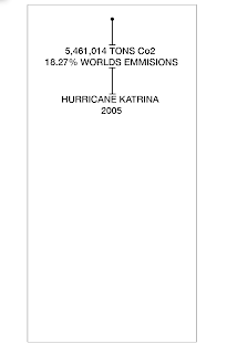
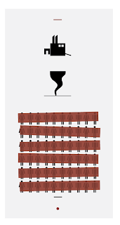
Bellow are examples of my final printed outcomes presented in there 2:1 ratio on A3 paper. I am happy with the outcome but when i created the pdf mockup i chose a lightweight grey hoping that I could find a paper stock to match this mockup. But this wasn't possible this was the closest i could get and it changed the ascetics completely, before the grey was light now its darker and more pastel. The outcome instill high impact but the contrast between the light grey and the red provided a higher impact outcome before. This restraint of not having the correct paper stock is something I will consider into more detail next time as this altered the outcome more than I would like, I would also like to try out screen printing next time so with better time management I will try out this method next time. Overall though i was happy with the outcome though and I will display the stages it underwent to arrive at this finished product.

The typeface used was Helvetica Neue in bold weights and regular weights of varying type sizes. Uppercase was used for high impact. 


Below are the source sketches in which my designs were developed from with underlying influences coming from my investigation into existing poster designs. 


I will now go through the digital development stages highlighting were major changes happened. 

Tightened the leading to attempt to increase a more solid block of type to increase the high impact outcome. 
Centre justified to visually emulate a hurricane in an abstract format. 
A quick discussion with Simon made me see that it just wasn't working in terms of impact, from a distance it wasn't very visually eye catching and the centre justification wasn't working. Everything needed to be presented in one flush block of type. Still staying with the centre positioning I went on to start increasing point sizes on important figures to draw the viewers eye into key statistics. Bold weight was used to strengthen this concept.

To keep everything neat and well aligned i played about with leading to create even consistent spaced between all the design elements.


Getting there now in terms of impact, but the page still appears too empt, and the positioning of the type is a little all over the place still so some adjustments need to be made. 

Visually the linking lines weren't working so I began to remove these and started to increase leading a little bit. 

Established it wasn't necessary for any of the linking lines the small lines frame up the 3 blocks of information well enough.

I thought that the bottom of the page had too much white space so to make use of this I placed the Hurricane Katrina as a footer of the poster as the figures were to be the focal point of the poster so the viewer would go through the 3 elements top to bottom in terms of importance. The emissions been the most important issue due to this causing the deaths and the disaster outcomes. 


 I played about with subtle type edits, this helped add a little playfulness to the design and created a feeling of interaction with the glyphs. The A was overturned to emulate death a little more, my concept was that things seem to float and turn over when dead in the water, and the water was the main focal point of the disaster so i edited the 2005 to simulate waves in an abstract format. And the D been blown over to simulate wind. 

Kerning, tracking and leading were altered while playing about with typeface weights and sizes to help focus in on important facts while keeping typography aligned in a rectangular centre aligned block and keeping it as easy to read as possible letting the eye flow from line to line with ease. This works ok i guess with the eye stopping to take in the figures presented in bold and large point size. 

Began to add color to increase impact, red was the main color used in charities in the recovery stages after the disaster and emulates emotions of danger so I felt this fit the concept well. The contrast it created with the black type was nice as well framing up the 3 segments. 

In my research stages I liked the idea of striking elements out to emulate that if the emissions displayed were 'struck out' then the outcomes deaths and other stats wouldn't have happened. 

The strike outs were brought close together to create a more solid block to increase visual impact. But the solid colors completely hid the facts, and my concept was to link the disaster outcomes with global warming.

Adding opacity helped prevent this problem around 70% was applied, it balanced nice in terms of tonal range with the contrasting black typography. 


Played around with different shades of grey arriving at this final grey presented bellow. The image only and type & image followed the same layout style as the type only poster to keep constancy throughout so the posters work nice as a set. 

Tuesday 12 November 2013

Legibility & Readability session

Legibility & Readabilty session 

Todays session was intense with the information we received but will be invaluable in all influences of my design principles and practices. We learned about factors of Legibility and Readability. 

Readability: Is how easy a text can be read.
Legibility: How well glyphs can be distinguished determines good legibility. 

Factors that affect Legibility & readability are the following:

Kerning: Too close kerning creates hard to distinguish glyphs. Kerning should be left alone generally in body text as the spacial framework has already been laid out by the typeface designer. Kerning can be effective with pairs of glyphs at large scale were small changes can make a big visual difference. 

Legibility of individual glyphs will help maintain a readable set of letterforms. The negative space within glyphs, the counters help distinguish individual glyphs. 

Maintaining good readability means your eye can flow across the line of type easy, so line length needs to be took into consideration.

Tracking: Too much tracking can make the word un recognizable and fade away, too close tracking can create a cluttered outcome and hard to distinguish individual glyphs. When used correctly it can have a robust effect in changing typographic dynamics and visuals. 

Justification: How the type is justified helps create more readable outcomes, align left is good for large body texts due to the eyes natural nature to read from left to right creating a good flow of movement through reading.

Leading: This creates space between each line of type, it can be adjusted to create easier to distinguish words and allow the eye to move across the page well. By increasing leading or decreasing to tighten words together words can feel cluttered or even overlap anatomical elements like descenders and ascenders into the baselines of other words. Too much leading can break off the flow of reading the lines of words. Increased leading is readable at a distance but less unclose. 

Case format: Uppercase is good for distance reading for things like headers, lowercase is easy on the eye and good for body text. 

Anatomy: Contrast within bold elements and light elements can hinder legibility e.g. lightweight stems contrasting with very bold bowls.

Line length: Line length can effect how well the eye flows, too short and the eye breaks off too often causing confusion, too long and reading will become tiresome. 

Weight: Bold typefaces are high impact and good for headers like newspapers, in body text they become too hard to distinguish individual glyphs. No more than 8 words is said to be a limit for headers.

Type origin: Script fonts are hard to read in body text best suited for decorative purposes, with roman and gothic fonts in regular weights maintaining good readability. 

Using our discussed knowledge to determine if text is legible we ordered our typefaces into order of most legible to least. 


Below is the most readable. A gothic face. 

Our groups most readable and un readable texts bellow. A roman typeface and a stretched out block typeface, the stretched elements created bad legibility and made it hard to distinguish individual glyphs and the too close leading created one solid block of type to the cap height been too close to the baseline of the above word. This also applies to an x height that nears the cap height in a combination of uppercase and lowercase glyphs. 

Everyone else's most readable and least readable. 

Using my new found typographic knowledge on readability and legibility we cut up out texts to create 4 sentences with 1 of each fonts. 4 different fonts for the 4 words, we are required to make the sentence into an easy to read, readable sentence with the eye distinguishing "the" as the most obvious word following onto "quick" etc etc. for example. Use the template of words shown below in a digital outcome.

THE QUICK BROWN FOX