Saturday 28 March 2015

Studio Brief 2 Covered - Brief and Problem analysis

Studio Brief 2 Covered - Brief and Problem analysis

To expand on the application of thorough research and visualizations of theories related to social, political, ethical, environmental and technological issues the Covered brief allows me to apply these aspects too an A4 poster and book cover for a theoretical, philosophical book. Concentrating on the meaning and message and how aesthetics, design principles, material and production communicate and support messages and concepts. 

To emulate the books content within the A4 poster and cover considerations into the books:
Theories and content been presented
Target audience the book is presented at define there persona
Tone of voice of the book
Cultural 
Social
Ethical 
Technological theories 
The purpose of the book 
Past, Present and Future
Why do people read the book? 
How can the books content be visualized through literal or lateral idea investigations
How can the production and finish of the poster and cover enhance the concepts and the theories
How to resonate with the target audience
How do the design aspects like; Grid, Type, Colour, Layout, Format reflect the content of the book

Plan of action
Outline the main content of the book and what its communicating and to who. Is it aiming at informing the end user, raising awareness, outlining a theory or aiming at solving a specific problem?

Generate ideas on how to communicate the books content and purpose to its intended audience 

Think of a Concept that reflects the content and purpose of the book

Research editorial/cover design and expand on theoretical research aspects to strengthen the concept. 

Generate scamps 

Technical development and selection of scamps to refine on considering
Grids & Layout
Colour 
Stock choice - Transparency, Texture, Neon, Pastel 
Finish and production
All these need to enhance and reflect the concept and the contents and purpose of the book

Refine 

Presentation and evaluation of final work 

Requirements of the Book cover and A4 poster
The book jacket requires a full range of content; front, back, spine, blurb, publishing logos, ISBN numbers.
All the content from the source book I choose.

The A4 poster will be a reflection and reproduction of the book jacket but there is potential to produce an extension of these posters. A series of posters that reflect the book and its content in a more abstract way. 

Thursday 26 March 2015

OUGD503 Responsive module evaluation

OUGD503 Responsive module evaluation 

What Skills have I developed through this module and how effectively did I apply them?
I continued to push my conceptual approaches to design but began applying them to a variety of creative disciplines, through the briefs I chose I was able to apply effective concepts to brand identity, editorial design, marketing and promotional tools, music oriented design, illustration, type design and colour theory. Advancing on these skillsets has really helped me develop my individual practice. 

The concepts where carried out very effectively targeting a range of audiences and taking into account cultural, historical, contemporary, social and contextual subjects relevant to the intended message delivered through my outcome. 

Having the opportunity to collaborate has also allowed me to expand on the combination of two individual disciplines to create well informed design that takes into account multiple specialisms to create a stronger final outcome. 

My thought process has also developed and how I record and develop ideas has began to be more informed, analyzing a specific direction by analyzing a brief and its problem before beginning to research contextual, conceptual and aesthetic research influence, this in turn resulted in stronger more informed outcomes that had a thought process behind them and a solid message delivery that supported my conceptual approach. 

My research has also began to become more informed and indepth and takes a wider consideration rather than just aesthetics it has began to take into account historic elements, cultural elements, social impacts and specific research aimed at solving a specific problem. 

What approaches & methods of design principles, production and concepts have I developed and how have they informed my development process? 
My basic design principles have expanded a lot through this module, taking into account technical aspects like grids, typography, layout, hierarchy and color not only applied in conceptual ways but also in very accurate and aesthetically considered ways. 

Expanding on the idea of color theory and illustration I began to apply my conceptual approach to these 2 aspects and realized they can interact quite well to result in very strong outcomes. 

Expanding on the conceptual approach to typography I also feel I effectively developed my type design skillset, it was something that I used to take quite an illustrative analogue approach too but I definitely developed it into a more technical & digital i output relevant to contemporary audiences to meet the needs of an editorial brief. 

My physical craft has developed a lot more, producing more physical outcomes that take consideration from considered research that inform the process behind the construction and format of 3D outcomes, moving away from flat work has made me think more into technical details and it relies a lot more on developments and mockups before finalizing an idea resulting in a stronger design outcome through this development. 

What strengths where obvious within my work and how can I expand on these?
Concepts, keep applying relevant concepts too my work and expanding on the relevance and influence behind these concepts through the developed design process's I have undergone during the module. 

Physical craft, expand on physical crafts, I really enjoyed creating physical outcomes that where made of multiple elements I find its an important skill as a designer to consider elements like packaging, and with my focus point been brand identity the outcomes can be varied and diverse so developing on these skillsets is important. 

Technical innovation, to expand on design principles I want to begin reading a lot of design books and start looking into more diverse sources relating to grid systems, layout, hierarchy and type design. I want to look into historic and contemporary sources to inform my practice to maintain sustainable design outcomes and concepts. 

Research, I want to expand on the primary and secondary research I made in this module, using primary and secondary sources and a diverse range of research influences and start points will help me expand on the thorough research I underwent. 

What weaknesses where obvious overall and how can I improve on them in the future?
Time planning was an issue, as usual I thought of an idea after lots of research but didn't really develop on it as much as I could due to bad timing, I began to eradicate this by making time schedules breaking down the stages of the brief at the beginning so I feel this helped a little and will continue to help me. 

The group work didn't go as well as I hoped, it seemed a little unorganized workload so I feel next time in a collaborative we should designate specific jobs and a specific timeframe to work from. 

Traditional print failed a lot in this module, it was unfortunate as it was the main idea for a very strong concept. I managed to sort this problem out and apply the concept to a more contemporary print process but I feel practice is needed with aspects to do with letterpress, screenprint, foiling and embossing. 

What  would I do differently next time and what can I gain from doing this?
Better time planning will result in a structured way of working and stronger design outcomes as more time can be spent on relevant elements of the process rather than spending loads of time on research and non on developing the idea. 

When approaching brand identity I think next time more peer feedback from a wider range of audience will result in more informed concepts and delivery. 

Next time I undergo the combination of contemporary production methods to influence traditional process's and ideas I will create a range of possible methods rather than just one, as the relief press didnt work first time I had to go back and re book laser and spend hours re-jigging the pressing blocks on indesign. 

Attendance = 5
Punctuality = 3
Motivation = 3
Commitment =  4
Quantity of work produced = 3
Quality of work produced = 4
Contribution to the group = 5

Monday 23 March 2015

YCN - GAP Collaborative Production, Finals, YCN Boards & Evaluation

YCN - GAP Collaborative Production, Finals, YCN Boards & Evaluation 

Idea & Concept
The main idea revolves around a freshers pack with other elements of the campaign branching off, the theme of the pack is based on student essentials with a conceptual visualisation of the 25% discount through proportions, positioning and ratios with supporting influence coming from the idea of GAP been essential wear clothing through functional, versatile and neutral design. 

A social media campaign called #7daysofGAP with a daily prize of £100 will run during the freshers period as a way of expanding the GAP identity and the recognition of the brand into a more contemporary audience, students could do a lot with £100 during Freshers so this will generate quite a viral response. 

Finals & Rationale
The idea behind the leaflets & posters was to invite students to position the leaflets and posters around university settings to promote the 25% off campaign, through submission within a social media campaign on instagram through the #7daysofGAP campaign that reflects on the 7 days of freshers alongside the GAP promotion. 

Colors used reflect the past dress normal campaign of GAP, with color applied to monetary values to focus in on savings of set amounts ranging from £100, £75, £50 & £25 all within 25% increments.

The positioning of the header, logo and body copy is based on 25% proportions of the page and rotates around the page taking influence from the positioning within the past dress normal campaign. 

The use of white stock and minimal color within neutral color schemes reflects the idea of GAPs range of clothing been seen as essential wear and the structured layout emulates functionality & versatility to support this. 

Color interaction within multiple flyers & posters references the dress normal color campaign and set monetary values which link between flyers and posters focusing in on set savings and budgets and what this money could be spent on to satisfy a student lifestyle. 


The color squares reference the dress normal campaign while also adding a subtle contemporary abstract aesthetic to add a more "cool" asthetic too the campaign, something GAP agree they are lacking. 

More aesthetic trend driver posters where included in the Freshers pack, the idea here takes the squares and colurs referencing the dress normal campaign and places them in a more contemporary aesthetically pleasing output resulting in students putting them up in there room.

The underlying concept of 25% proportions and positioning used in the flyers and posters promoting the student discount was extended to these aesthetic posters, a consistent large square taking up a quarter of the layout acted as a pivot point where the other cuboids were scaled down in 25% increments and positioned in 25% proportions of the page. 

The 4 posters were printed on acetate to again work from 25% proportions while also offering the opportunity of interaction through layering, this idea of interaction reflects the whole freshers experience and socializing in a quirky and abstract output that references students unique personalities. 

The idea of clarity functionality and honesty is expanded through the use of clear acetate stock and the grid system derives from repetition of the squares used in the previous collateral. 

A lot of contents in a freshers pack has limited use, one time use or no use at all. By provoking interactivity through a plastic model kit idea we created items the students could really use, with promotional wordplay and logos subtly applied too the items so the students obtain good remembrance of the brand and the campaign as these items should be generally used a lot. 

The pencil holder/desk tidy operates on a versatile system where the base acts as a pivot point for the placement of the 2 separate sections allowing alternative arrangements and structures within the pencil holder, this references the idea of freedom GAP want injecting into there campaign. 


The kit consists of a a coaster/beermat a bottle opener and a versatile pencil holder/desk tidy that can be put together in a variety of ways to emulate a students unique personality and subtlety add the idea of freedom into the collateral. Something GAP wanted injecting into there tone of voice. 

All the content was placed in a clear bag, the clear bag shows the visible contents giving off a feeling of honesty that is evident within GAPs heritage, while also supporting the idea of neutrals and clarity to support the idea of GAP been essential wear. 


A simple addition of the 25% discount focus was placed on the back of the bag as there was a focus on the 25% through the positioning of the poster in the front of the back, the dress normal colours would be carried out across varied application through the %.
 

The same concept applies for window signage with additional focus in on the 25% discount with supporting text, the colour bar also subtlety references the dress normal campaign and the use of squares which is the basis of the aesthetics throughout all the collateral. 

Evaluation
I enjoyed this project as a whole and it was interesting to collaborate with a like minded designer to produce an outcome that makes use of 2 thought process's but with specialisms in different creative areas. We made use of our multiple skill sets between us, we combined concept driven design, playful design, technical innovation, digital design and strong consideration of the brand and there end users and how ideas resonate well with meeting both there needs.  

We managed to turn quite a dull company and standard campaign into something quite conceptual based around the campaigns focus point, we also did a good job when it came to referencing GAPs past heritage and past design work while enhancing there current uncool image into something a little more contemporary but still injecting there honest tone of voice.

Taking forward a certain connotation of there range we expanded and developed the idea of essential wear to influence a large amount of the aesthetics, production and layout of the collateral.

It was good to make use of the laser cutter for a more informed use rather than it been quite gimmicky, the idea behind the plastic kit had quite a strong concept and with my experience on the laser cutter it was executed very well. 

It was also interesting to make use of different types of print facilities that allowed us to obtain varied results for specific purposes, as inkjet would not apply to acetate laser produced a much better outcome.

Throughout the design stages I considered commercial outcomes, expanding on printing we agreed that laser print would provide more efficient and cost effective distribution of posters and flyers. 

A final point that I enjoyed was the varied type of design outcomes and production process's we created, creating a contrast in functional design work and more trend driven design met a variety of target audiences and met a lot of the briefs requirements but we did well to carry it out in a way in which it all felt like it belonged together. The investigation into colour and Heritage aided this a great deal. 

If I was to do this again I would recommend both of us working to a set time scale and job list as from the action plan it felt a little unbalanced in who did the work outlined in this plan, but overall we managed to pull it all off and managed to put GAP into a more contemporary light and heres hoping YCN and GAP think the same!

YCN Boards
The rationale and explanatory points made here sum the project up well enough for the submission within YCN so this content within this post will be stripped down and applied to the board we submit. 
 

YCN - GAP Collaborative Final idea refinement, scamps & digital development

YCN - GAP Collaborative Final idea refinement, scamps & digital development

Plastic kit scamps & development
I began generating the imagery and format for the plastic kit system, the theme for this "kit" was to contain useful objects that students could make used of. Student packs at freshers can often be full of random gimmicky rubish, we want to portray the idea of basic essentials that relate to the GAP range through the freshers pack so we agreed on including a beermat, a bottle opener and desk tidy into the kit. 

The outcomes needed to portray this idea of essentials through the use of basic shapes which will resonate well and reflect the functionality of these items which works alongside the idea of basic essentials within the GAP range of clothing.

The pencil holder/desk tidy needed to carry on this idea of versatility so a few variations of holes was played around with to emulate this, I wanted to emulate movement within the alignment of the holes to subtlety reference the dress normal campaign and the movement and rotation of the typography and logo around the posters. 

An idea was tried out based on two levels for the pencil/desk tidy, the pencils will acts as struts to hold the two levels up but this doesn't really suggest functionality. 

To expand on this idea of functionality the pencil/desk tidy had an element of interactivity too it, the base had 2 sections that could be positioned in multiple variations on-top of the base, this ability to make unique varations of the pencil holder references a students unique mindset in a subtle way. 

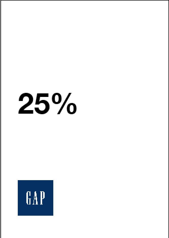
The final system used consistent proportions and sizing with the sections of the pencil holder been of a 25% ratio to keep with the theme of 25% discount.

Elliot added some type and I prepared it ready for lasercuting, the wordplay was stripped back to just focus in on the 25% off due to limited space on the images within the plastic kit and would be engraved rather than raster to remain detailed and legibility of type as good as possible. 


I prepared the file on ethos pro adding an engrave around the sections that are to be snapped off so they snap a little easier, it took over 2 hours to cut this all out so in a commercial sense it wouldnt be very cost effective but as an advertising tool having items the students can use in there hands a lot of the time would work well for the campaign. 

Typographic flyers & posters for 25% off focus
I designed the flyers, Elliot designed the posters, I fine tuned the layouts of Elliott's posters while fine tuning my own so everything works together as a consist set of collateral.

Within the initial scamps I was looking for clean and structured layouts that would express functionality and the idea of basic essentials within the GAP range, this clean aesthetic also references the dress normal campaign which was a key focus of the brief. 

From this idea of structure and functionality I took forward the idea of 25% proportions and expanded it into an idea based on using spacial ranges of the page based on splitting it up into 25% sections both horizontally, vertically and into quarters. A consistent and versatile grid system set up in indesign would help maintain accuracy and versatility within the layout and positioning of content. 

Vertical proportions using a 4 column grid, the logo feels a bit detached at this point but more body copy needs to be added. 

When it came to the final column it has to go from left justified to right justified within the interaction of the GAP logo so this looses consistency and the idea of structure. 

Horizontal positioning works better in terms of the logo and 25% header feeling like they belong together due to the orientation of the A5 page and the narrow width. 

But when it came to the position of content on the bottom the spacial use looked a little out of balance, a little bottom heavy.

Using a variation of arrangement from vertical, horizontal and quarter positioning allowed more flexibility within the arrangement and positioning of content and the logo, we decided at this point to reference the dress normal campaign through the pastel colors used in the body copy and logos but kept the logo pantone 655 (Pantone blue), the alternative arrangement and positioning of the content also kept with the theme of movement used in the pencil holder and links with the rotation and movement within the dress normal campaign. 

A few alterations of the position of the logo still using ideas of positioning in 25%, it felt out of place and unbalanced losing overall structure, everything needed to be locked together so it all rotated and moved around the page together. 


The bright hues within the 25% header caused slight legibility issues with colors like pink due to the light tones and minimal contrast within the white background. To get around this we created a sort of color registration using pantone blue and colors taken from he dress normal campaign


Leading was minimized within the headers and the space between body copy and logo to bring everything closer together to make it feel structured and together so in terms of hierarchy all the information is communicated in order, they see the bold header then read the body copy explaining the social media campaign then the #7daysofGAP and Win £100 Everyday folio's frame everything up and are read last. 

Quickly tried the idea of using % to expand on the focus of 25% off but it didn't suit the stripped back minimal style of the leaflets.

The versatile modular gird system allowed alternative layouts to be tried out quickly and efficiently and kept everything structured within the 25% proportions of the page, the extra body copy that suggests what could be purchased with the savings was also positioned within 25% proportions with the addition of color added to the savings on the flyers which for the students is an obvious focus point within the hierarchy of information. 


Elliot printed them using digital print inkjet printers, they came out amazing quality and the colors used came out well and referenced the dress normal campaign while also putting the outcome into a more contemporary light.

Elliots posters, he created them in illustrator so to fit the the modular grid system that allows positioning based on quarters will be applied to Elliott's poster to keep things consistent through the use of indesign. 

Originally we were going to go with Moon type family but to meet the needs of the brief and injecting GAP's tone of voice we decided to use the Helvetica Neue family. I suggested to Elliot that he adds the color squares used in the flyers to keep consistency between the range of promotional materials. 

The posters will be printed out A3 so Elliot's addition of the dress normal colors on % marks draws more attention into the focus point on saving money, the bold large point 25 also draws attention in so in terms of communication of information Elliot did a good job here. 


Alterations on indesign were made, not that there was anything wrong with the designs we just needed to use the same modular grid system to keep layouts consistent. The colored body copy was taken away and replaced with more legible black body copy with the same focus on the savings been brought in through colors from the dress normal campaign (Like seen in the flyers) 


Sent off the pdf's ready for print for Elliot to print in the digital print suite.

Again the quality of these came out amazing, we discussed after these were printed that laser print would be a more justified choice on a commercial sense to save on print costs as the requirements of the brief is to achieve recognition within students so lots of these would need to be printed to position around universities around the country. The £100 prize money from this social media campaign will draw students in as Freshers is all about socializing and this money would come in very useful. 


Bags, Signage & Window displays
I was in charge of designing the layouts for the freshers bag elliot was tasked with digitally mocking up similar style window displays to keep consistency in the aesthetics and idea of the 25% focus and the idea of proportions within use of space. 

Upon discussion we decided due to the use of a clear bag there was no need for any image or type on the front of the bag, the back just had a stripped back percentage discount which could use different dress normal colors. 

The idea of using a clear bag and future experimentation with acetate enhances the idea deriving from GAP clothing been essential-wear, to emulate this we decided that using neutral tones (stock and ink) and minimal use of color would visualize functionality and versatility relevant to this idea. Clear material would also suggest honesty as nothing is been hidden, something that the GAP brand thrive on. They are what they are and thrive on it through all there promotions and brand identity. 

Taking the layout from the posters with a slight variation and addition of the color bar to reference the dress normal campaign worked perfectly this splash of color combined with the bold large scale 25% draws attention in to the shops and the colors used in the color bars could be carried out across multiple store fronts which again works with the variation in the posters & flyers. 

Aesthetic poster for students dorm's
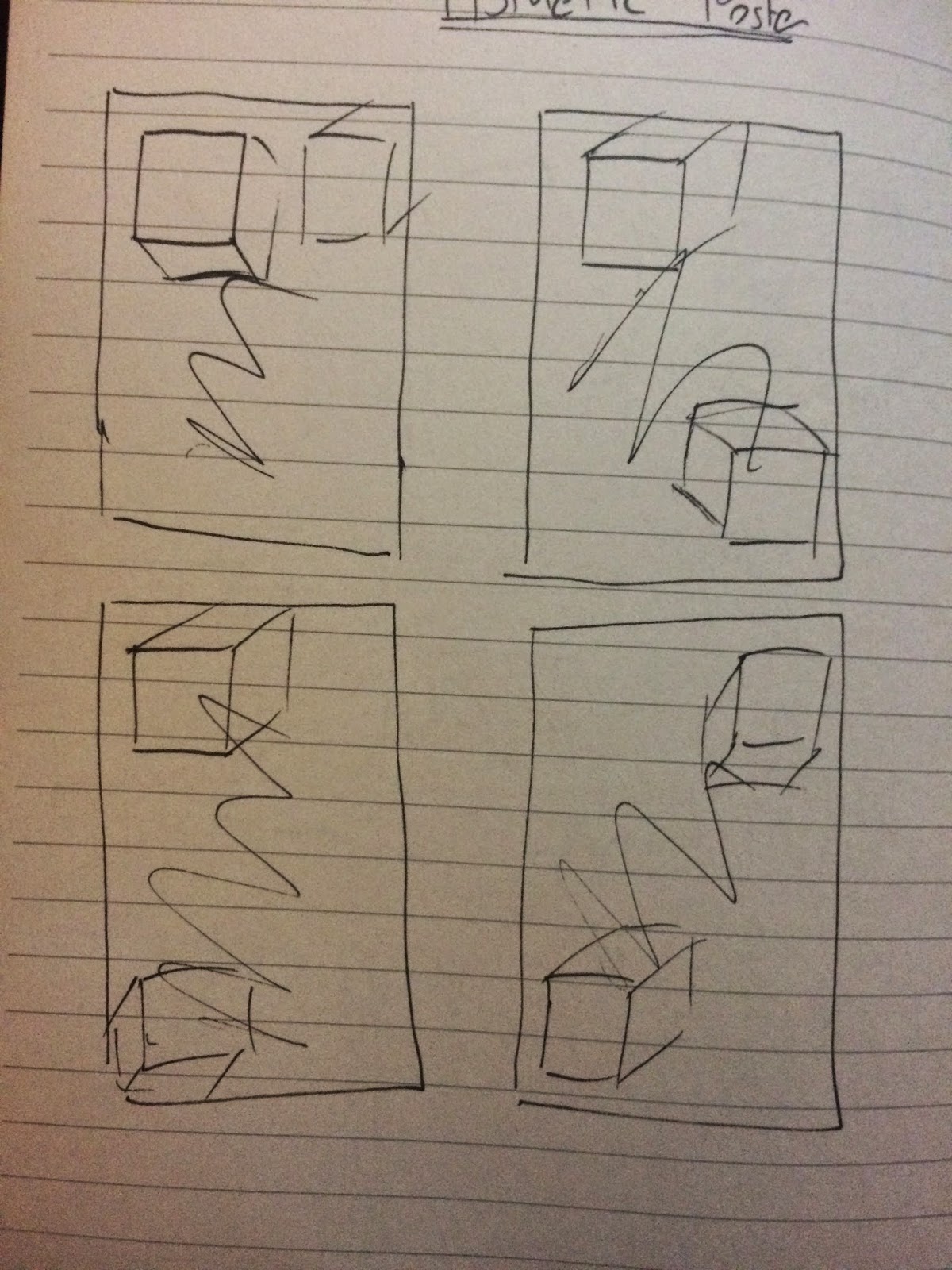
To work alongside the structured, neutral aesthetic and ideas to express the essentials of GAP clothing I began creating some plans and scamps on more aesthetic posters to express the students unique personality's and to enhance the current un cool image of GAP. 

These were to be completely separate from the rest of the campaign in terms of aesthetic, reference to gap would be made through more abstract use of the dress normal campaign color scheme. 

I was explorative within the scamps, playing around with shapes a lot as this could draw a lot, rotations to reference the dress normal campaign in subtle ways, repetition, texture, grids and block color all with a focus of giving opportunity for contemporary, high impact imagery that students would be happy to put up in there room to reflect there bold and unique personalities. 

The final 2 main ideas I want to develop reference the dress normal campaign a little more, taking the squares into cuboid formats that would carry the dress normal campaign colors. The idea of the positioning of the content again will be based on 25% proportions but with an expansion of the physical shape taking up 25% of the volume/area of the page. 

Interacting with these cubes are potential grid systems that are based on the idea of repetition of the squares used to represent the dress normal campaign colors, or a random analogue squiggle that would be applied after the digital print process to suggest interactivity, freedom and individualism due to the marks made will all be unique. 

This resonates with a students individual personality.
Interactivity reflects socializing within freshers week. 
Freedom is a tone of voice gap want injecting into there new campaign to improve there current brand image. 

The more trend driven aesthetic should hopefully give the brand a more "cool" appearance, something the brief requires, swaying away from the bland dress normal campaign into something a little quirky and abstract but with reference to there past aesthetics through color and the use of squares reference the posters and flyers we have already made to maintain a little consistency. 

The process was quite in-depth using illustrator, indesign and photoshop to sort out image editing, vector shapes and type layout. I will be responsible for printing these while elliot sorts the digital inkjet printing I will try out acetate prints on the laser printer. 

Small or large grids will be tried out to see what has better aesthetics and allow better use of layout and space when the shapes are added. 

Again the page is split int proportions to extend on the 25% proportions and positioning idea. 

Flat cuboid shapes and more 3D shapes with detail lines were tried out, the 3D shape has a more tactile feel too it and the 3D depth sways away from the flatness of the current flyers and posters which was a personal requirement of mine and Elliot's. 

Additions and reference to the dress normal campaign was added with the consistent use of the color bar to link all the collateral together, and the front face of the cuboid taking on the dress normal campaign colors with darker tones on the sides of the cuboid to support the 3D depth of the design.

The more tighter grid works better, it allows us to position the shapes in a more structured and accurate way positioning them flush with the grid lines. 

The idea of opacity was expanded with the addition of trend driven gradients to place the design into a more contemporary tone of voice. More abstract shapes were tried out at this stage to see how they would work but they look a little like paper cut outs, this crafty theme doesn't fit with a fashion brand. 

The rest of the dress normal campaign colors were added to the shapes, the tonal differences really aids the presentation of 3D depth. 

A grainy texture was added in photoshop using 10% uniform noise, a slight textural addition to aid the tactile 3D depth of the shapes. 

To enhance the quirky abstract aesthetic which references a students personality quite well a few warps of the grid system were tried out, the first one added an addition of depth and tactility while the other was just plain confusing and looked awful due to the contrast of curves/waves and angles within the 3D cuboid. 

As mentioned the idea expands on the previous posters, still positioning in 25% proportions seen here taking up  all 3 quarters of the page and the top horizontal section of the page but now with an addition of scaling of the shapes. 

How this works is the first shape takes up a quarter section, the other shapes then reduce in 25% increments and are alternatively positioned in unique layouts, this emulates the feeling of freedom GAP want to inject into there campaigns tone of voice. 

Reflections and rotations of these shapes give a better sense of movement and tactility. 

At this point I was working between indesign, illusrator and photoshop, putting it all together in indesign but quality was lost this way due to file compressions. 

So unfortunately the posters had to be made in Photoshop, not ideal for layout opportunities but the positioning of type was more fluid, using rotations and movement  to create unique posters through the positioning of shapes and type.


The printing on acetate offers opportunity of interaction through layering, this idea of interaction reflects the whole freshers experience and socializing in a quirky and abstract way. The idea of clarity, functionality and honesty is expended through the use of clear stock/acetate.

The laser print aids the grainy aesthetic with how the toner sites on top of the surface.