Fedrigoni Finals, YCN Submission boards, Evaluation & Rationale
Fine tune testing
Format and layout had already been sorted at this point in the previous development stages, a quick test was to show the versatility of the range through adding a pop of colour with some bright toned colours on the information leaflet, this kind of lost focus on the progression of tone from white, to grey to black within the composition though. It showed the versatile interactions of the black with other colours but didn't support the idea of using progressive tone to highlight the dark black tones of the paper.


Preparing Final images
All images had a light blue overlay at 30% applied to keep all the images consistent to maintain a more professional appearance, although minute it made a huge difference throughout the images, I rushed them though to get them submitted for YCN in time so some better ones will be taken for my Behance.


Within my research I noticed a link between contemporary, trendy design and the aesthetics seen in futurist art work, this in itself shows the potential of traditional influences within a modern day light. To emulate this a series of posters influences by these modern and futurist aesthetics were created using the same geometric and symmetrical consideration to create a number of intersecting shapes that work perfect as posters due to there high impact aesthetic.


YCN Submission boards


Format and layout had already been sorted at this point in the previous development stages, a quick test was to show the versatility of the range through adding a pop of colour with some bright toned colours on the information leaflet, this kind of lost focus on the progression of tone from white, to grey to black within the composition though. It showed the versatile interactions of the black with other colours but didn't support the idea of using progressive tone to highlight the dark black tones of the paper.
All images had a light blue overlay at 30% applied to keep all the images consistent to maintain a more professional appearance, although minute it made a huge difference throughout the images, I rushed them though to get them submitted for YCN in time so some better ones will be taken for my Behance.
Finals, Concept & Rationale
The influence behind the concept comes from Italian culture and the transition from the renaissance era, to the futurist era to modern day contemporary design. The focus I took forward from the brief was the idea of showing how sustainable print process's can be in modern applications.
The renaissance era was an iconic time for both communication, art and culture. Taking forward the development of writing systems I decided to use the Bodoni type family, not only to reference Fedrigonis Italian culture & original paper mills but also due to the fact italic serif style writing systems where the forefront of the development of latin writing systems.
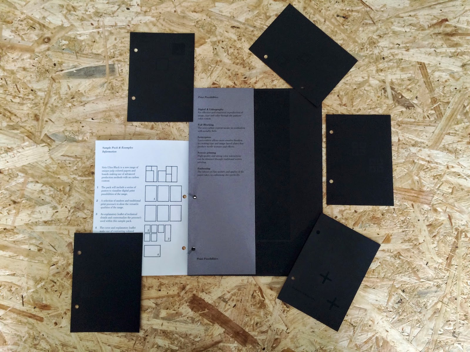
The idea was to create a marketing tool, I didnt want to create singular elements like singular posters and flyers. A pack that could be sent out to clients, shops or designers would work much better, within this pack I included different elements to introduce and provoke interaction within the range. This whole structure and format was inspired by the symmetry, geometry and use of the golden section used in renaissance architecture, connect this with the margin and column grid system taking influence from the Guttenberg press. An iconic turning point for publication and the communication of information, a very strong link to the most iconic times of creativity was made to show how print & creativity came about in a modern vessel.
The format starts with A4 paper, and is then based on halving vertically and diagonally to produce individual sections that all piece together to create one structured format similar to the golden section.
An iconography system was created, made from simple geometric shapes that all share the same proportions to keep with this influence of renaissance symmetry and geometry. Each of these icons represent print process's that are applied to sample cards of varying weights to add that tactile element of interactivity to the pack.
An explanatory leaflet supports this iconography explaining more modern applications of these possible print process's this takes into the consideration the focus on proving there is still potential for the use of considered print process's through the use of paper products.
Within my research I noticed a link between contemporary, trendy design and the aesthetics seen in futurist art work, this in itself shows the potential of traditional influences within a modern day light. To emulate this a series of posters influences by these modern and futurist aesthetics were created using the same geometric and symmetrical consideration to create a number of intersecting shapes that work perfect as posters due to there high impact aesthetic.
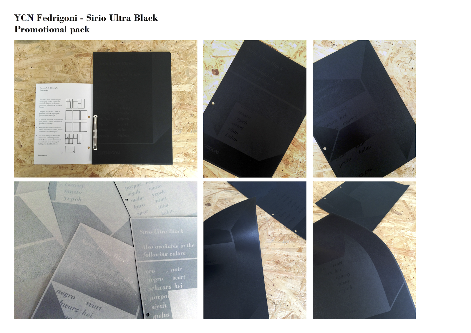
They were printed black on black to focus in and expand on the multi cultural front cover that makes use of all the countries Fedrigoni ship too's translation of the word black. Using wordplay "Also available in the following colors" again shows focus on the promotion of this black range by flooding the end user with the word black in multiple translations that apply these translations into context through the use of black ink on black paper.
The focus I took from within the brief was to show how the range is the blackest of black papers, by using white and grey it shows a transition from light to dark which supports this focus on the dark tones through contrast of tone but in a more progressive way, it also helps maintain readability and legibility of the information.
The cover provides a run down of the marketing pack, explaining its versatile use as a tool rather than a singular promotional item, everything has a use, ranging from:
Interactive sample cards that encourages interaction to touch and feel the quality and versatile weights of the range.
Posters that draw attention in and take consideration to different cultures.
Explanations and inspiration on how this range can be used with varying print process's, persuading the creative audience to try out modern, traditional and modern interpretations of traditional print process's. For example laser cutting woodblock for relief prints.
Had to submit through my personal email due to not receiving a confirmation link from we transfer on the college email but got it submitted in time still!
Evaluation
Out of all the projects within the responsive module this was my favourite and even with the mishaps during production was one of my strongest outcomes both conceptually, aesthetically and the physical quality of the production.
I mentioned in the secret 7 evaluation how I wanted to inspire concepts and resolutions around history and culture so I saw this brief as another perfect opportunity to take these aspects into consideration.
In terms of the quality of resolution it definitely resonates with the concept idea based on influence from renaissance era, communication & architecture futurism and contemporary design. One focus point I took from the analyse of the brief was to express the versatility of the paper range while proving to a creative audience there is still milage in print and paper production process's, by using historic and contemporary references a link was made to emulate this very successful. The format and how everything was structured and the type layout also took equal influence from these aspects, considering the target audience was a creative influencing type layout around the Gutenberg press worked perfect, to enhance the cultural consideration multi translations of black where made while italian typeface Bodoni met even more cultural considerations.
I took the concepts of architecture into a whole new light by using symmetry and the golden section to form the format and structure of the marketing tool, and within this format I feel I met the needs of the brief in creating a tool that promotes the full possibilities of the range in an interactive way yet works well solo and compiled together.
I did have to re-jig the production method a little to suit the concept, due to bad time planing and bad luck in the print room some laser cut wood blocks, embossing plates and letterpress plates couldn't be used to there full effect, I was originally going toe emulate sustainability within print process's by embossing paper samples, letter pressing paper samples, screen printing paper samples and foiling. All I got done successfully was a few relief prints but as I was meant to screen print type over these patterns these ideas had to be scrapped too. Next time I will plan well in advance in the print room and hope for better luck, the emulsion didn't apply well to the screen and I was put on a portable bed so the application of the ink wasn't no were near accurate enough for legible and readable typography.
Digitally printing the outcome worked though, it still had links to history within the format, construction, type and layout with modern production methods, the arco bind clip also added an industrial feel relevant to renaissance print process's. Every design decision was considered and influenced by successful and in-depth research.
I definitely took very thorough consideration into colour theory, layout, structure, in-depth research, target audience and print process's throughout every stage of the design process and am more than happy with my outcome even with all the set backs.
No comments:
Post a Comment