YCN - GAP Collaborative Research to enhance idea generation (Cultural, Aesthetic, Conceptual research influence)
To enhance the idea I came up with and begin developing some more informed scamps and visual explorations a selection of research was made to influence different aspects of the campaign, concept and idea.
Aesthetic influence will enhance the posters for students to keep for purposes like application in there room.
This mood board of imagery aims at influencing how we can create aesthetics that resonate with a students unique personality and how they like to stand out from the crowd, this will go towards creating posters that they would be proud to display in there room and act as a talking point to enhance the word of mouth promotion of the GAP range.


.jpg)

A focus on type, colour and shape will be the main point of influence for creating visual impact and if there are too be visual metaphors or messages they will be based around student life to resonate with the intended target audience.


To inject GAPs tone of voice colour from the dress normal campaign will be taken forward.


This mood board of imagery aims at influencing how we can create aesthetics that resonate with a students unique personality and how they like to stand out from the crowd, this will go towards creating posters that they would be proud to display in there room and act as a talking point to enhance the word of mouth promotion of the GAP range.
The use of opacity here gives a certain clarity to a quite abstract design which would help these aesthetic designs flow well with the more structured, conceptual and promotional collateral. we want to show off versatility and functionality through clean and simple design to promote the essential wear within GAPs range, considering clarity of presentation of type and image will enhance this. Opacity is one way of strengthening this, it also shows honesty, something important in a brand image, nothing is been hidden everything is out in the open.
Marcel Hausler's typographic work plays around with both shape, colour and custom type to create bold and high impact posters that although are quite bulky and heavy in weight have certain detail too them, this contrast between fine detail and high impact would be good influence for the 2 aesthetics we want to represent in our campaign. High impact contemporary asthetics for meeting students aesthetic needs and unique personalities and versatile, functional and structured used of word play to emulate essentials and value for money.
French student Pauline Le Pape focus on type design within her degree is executed perfectly, this style of experimental typography is something I will try out for our aesthetic posters, maybe include elements of 25% word play within the abstract patterns to keep things consistent but the bold aesthetic and strong use of colour creates an interesting aesthetic that is unique as it is structured.
More technical and influential design decisions for the layout, use of type and colour for the promotional posters and for the social media campaign, the plastic kit, the freshers pack contents, window and shop signage.
Using a plastic bag would usually seem a cheap and tacky way of distributing a freshers pack, but if we could use clear or white bags this consideration of neutral colours would support the versatile, functional and clean aesthetic we want to go down to express the idea of basic essentials.


The visual real time display of Klarna's business activity may not reflect the fashion based work we are carrying out but the interesting use of color, shape and interactivity through onformotive studio takes detailed consideration into brand services when creating this financial influenced digital campaign.
The use of these shapes and colour visualises percentage systems in a more interesting way than just bland numbers, with the audience been students there attention span is short, so how wordplay and the presentation of 25% savings quotes are presented too them is important. It needs to draw them in and keep them there, so attention to high impact type and interesting use of language that resonates with there personality is important.


.png)
Expanding on these ideas of versatile identities and consideration into culture Art Centrals identity designed by The plant is inspired by energy and takes the Chinese character for central (中) and splits it into bright sections within a coloured grid that can be pulled apart and slotted together for multiple applications across a range of collateral.


Using a plastic bag would usually seem a cheap and tacky way of distributing a freshers pack, but if we could use clear or white bags this consideration of neutral colours would support the versatile, functional and clean aesthetic we want to go down to express the idea of basic essentials.
Freytag anderson shows how simple use of type and shape can work consistently over signage and printed collateral, maintaining recognition and a connection between the window signage, shop signage and contents of the freshers pack is important so to strip it down to a constant layout structure, colour scheme, type size/family/weight choice and use of image is important.
The visual real time display of Klarna's business activity may not reflect the fashion based work we are carrying out but the interesting use of color, shape and interactivity through onformotive studio takes detailed consideration into brand services when creating this financial influenced digital campaign.
The use of these shapes and colour visualises percentage systems in a more interesting way than just bland numbers, with the audience been students there attention span is short, so how wordplay and the presentation of 25% savings quotes are presented too them is important. It needs to draw them in and keep them there, so attention to high impact type and interesting use of language that resonates with there personality is important.
Amigos Skate shop brand identity and collateral by Jorge Leon takes consideration of the services and products the company sells but through conceptual and aesthetic considerations based on the target audiences creative nature, people who wear skate wear or skate are usually somehow involved in the creative industry and this was considered here in the stripping back of the identity to show skateboarding through simple shape and a 2 color scheme influenced by the Barcelona city location.
This consideration of target audience and culture was carried out in a very concise way, something that we need to consider, the message we portray needs to be concise and well informed.
Sagmeister & Walsh take versatility to a whole different level with there intelligent system where the logo regenerates itself giving constant change of aesthetic based on the companies evolution giving timeless design that boost into the digital age.
It also allows you to upload any sort of visual file and music into a digital program and it will create a logo based on a language of code suited to the brand image and its technical future oriented services it offers its customers. All a little confusing but the elegant aesthetic has a certain classy feel too it, and with it been a tech company it shows aesthetics can break the mould a little when it comes to common expectation of certain companies. Meaning we don't have to follow the usual fashion oriented design, we can really focus in on the idea of uniqueness, freedom and contemporary style which resonates perfect with the target audience.
Expanding on these ideas of versatile identities and consideration into culture Art Centrals identity designed by The plant is inspired by energy and takes the Chinese character for central (中) and splits it into bright sections within a coloured grid that can be pulled apart and slotted together for multiple applications across a range of collateral.
Contemporary fashion promotion and design work to influence a more contemporary approach to designing work for the GAP campaign.


The stripped back aesthetic allows focus in on more high impact aesthetics like colour and texture, this use of colour and texture could resonate with the materials and process's that make up GAPs clothing.


Use of material can emulate varied tones of voices and enhance certain messages and aesthetics, APC a upmarket clothing brand create beautiful promotion material that takes attention to detail to a different level to portray the quality construction of there clothing. The use of rustic materials like wood and raw fabrics sways away from typical upperclass fashion that relies on bling and fancy aesthetics with the strong use of black, golds and other such colour connotations.
This shows how simple stripped back use of type carrying colour can create a contemporary representation of a location, this could be taken forward to represent Gaps heritage through past colours used, colours that denote america, or colours taken from the dress normal campaign,
Amy Woodside uses typography that interact together to create image in an abstract and contemporary way to create posters to promote her range of sweatshirts, through the exploration of texture and colour within these letterforms a unique and visual impact has been created. This proves I don't need to rely on image to represent clothing range.
Going back to 2013 Margarida Borges identity for fashion brand Sita Murt proves how simple design and consideration into relevant use of material and production method can create timeless design, something that resonates quite well with GAP's sustainable brand image and logo design that has only gone through basic changes.
The stripped back aesthetic allows focus in on more high impact aesthetics like colour and texture, this use of colour and texture could resonate with the materials and process's that make up GAPs clothing.
Slightly contemporary and a little too quirky for injecting GAPs tone of voice into the idea generation but it shows how simple typographic treatments can work with playful imagery, how 2 separate aesthetics can work together when layout, colour and type is carefully considered and structured.
Kurppa Hosk shows how something as simple as essential underwear can be given its own personality, we want to show GAP wear as an essential range of clothing. Taking forward how two extreme contrasting aesthetics can work together in a functional identity is something we need to consider for the interaction of the aesthetic posters and the stripped back wordplay campaign.
Passport design agency's work for Pearly Queen London shows how stripped back layouts and simple use of type can be the perfect vessel for carrying colour. This example really shows how colour can communicate a whole brand image without any need for lots of supporting visuals and typography.
Stock's identity takes a very well executed conceptual approach to there brand collateral, packaging and signage. They cleverly focus on the brand name when considering every approach and it shows how material choice and process can really enhance and support a brand name, this ultra clean and minimalist identity emulates a very high end feel of the clothing. The use of quality paper stock within the printed collateral enhances the quality feel of the clothing.
If we could take forward this conceptual consideration within the use of words we would create a very strong campaign with a timeless aesthetic to strengthen GAPs current timeless brand identity, this in turn will support a consideration to a wider range of ages due to the neutral and functional outcome.
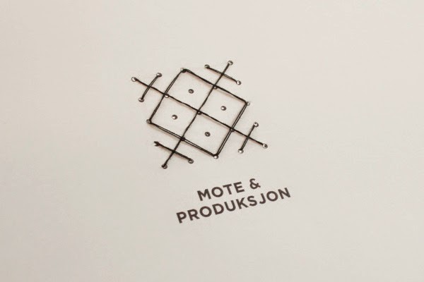
The brand identity and collateral for HiOA shows how neutral hues and tones can really enhance a concept resolution based on versatility and functionality, the logo system is based on stitching pattern which resonates with the quality production of clothing but the versatile system also suggests functionality. I analysed the clothing range of GAP and concluded that there clothing range is basic essentials so by taking forward this identities consideration into showing versatility through an alterable logo system and neutral tones I feel we can create a strong outcome.
No comments:
Post a Comment