Pantone Responsive - Scamps, Idea development & Digital preparation
Working from the source imagery I began to sketch out the basic shapes from each source, by using analouge methods it allowed me to strip back to these basic shapes easier, if I was to digitaly trace these images I would depend too much on detail within the images and lose focus of the main idea, using simple shape to provoke mood, recognition and be used as a vessel for color to benefit the concept.
"Provoking memory within past residents and informing people with no knowledge of Tingley through the presentation of iconic events, history & heritage and past and present architecture using shape and pattern as a visual vessel for colour that alongside these visuals will support these elements with relevant color connotations and theories."
It was difficult to strip back some sketches into very basic and simple shapes and still achieve recognition of what they are due to there complexity, this is where a short contextualization of the illustration will support the image and color interaction and support the visual journey in a travel guide sort of format that would target well to new audiences, existing residents as an informative historic reference and a refresher for past residents.
Not all the imagery was used, I needed to keep things concise rather than been a mass of content, the imagery needed to communicate diverse things to sum up the history and heritage of Tingley from all areas rather than focusing on a mass of architecture and maps which was included a lot in my source imagery.
The first lot of scamps focuses on the use of abstract shapes to loosely represent what was iconic about Tingley, this could have got a little confusing even with textual support but these shapes would carry color well.
The more stripped back and symmetrical ideas worked well and for things like football and church towers worked well.


.jpeg)


It was starting to appear quite difficult to present birds eye view and location shots in stripped back detail due to needing to present the contours and shapes within the landscape, there aesthetic was quite different to things like architecture, football events, train tracks, pub interiors and connotations etc which worked quite well with angular and simple shapes.
In the digital development I feel a grid system used for the images will keep aesthetics consistent.


Along with the use of a grid system it was clear having set shapes and textures to work from to create the images from the source images that represents Tingley would work well to keep things consistent and have the illustrations work together rather than clash.
By using texture with supporting color more abstract shapes and images can be communicated in clearer ways avoiding confusion, for example the reservoir could be made up of a simple square but would still denote a reservoir through the textures and colors used.


Shapes where lent from other images here and there to maintain further consistency and produce more conceptual links, for example the pubs where made up of the same shapes as the coal industry imagery as the pubs were a main social point for the mining community.
The shapes from the wool industry morphed into the radio aire mast to show the development of industry from industrial trade to technology services. They both shared similar patterns within the source images so this strengthened things too.
A focus on the roofs was made with the shape systems used, as this was the main characteristic differences between the pubs.


Again balance needed to be achieved, as well as supporting the context and the purpose of the photo, this is the coal tunnels but it needed some support to represent this, so some abstract coal rocks were created and scattered around the double page spread, this joining of pages shows the focus on this element as the location was very well known for its coal industry.


The front cover works as an informative tool taking influence from dictionary explanations with keywords that provide a very concise yet informative overview of the logistics of Tingley. There wasn't much body copy so structure and balance was importing, each element needed to be considered in both Hierarchy of how the information is presented while also making best use of the space.
Size 12 body in Avenir and an 18 header in heavy Avenir was the final choice after playing around with futura, futura worked with the imagery, it was quite playful and curvy in its anatomy but Avenir shared this same playfulness but with more accuracy and detail in the intersecting strokes, shoulders, and curves.


Linking lines were tried to express the idea of a journey and add motion but it ruined the whole stripped back aesthetic I wanted, its complexity didn't really fit with the imagery that would be inside the book.


After trying out alternative arrangements having difficulty making use of the space in a structured way with sections of text feeling like they were just floating within the page I came up with a more balanced and locked in structure aided by the multi modular grid, the subheads at the bottom frame up the top half of the text nicely, the header acts as an anchor point for everything else to pivot from with the centre body copy section feeling locked between these elements.


Now I had this structure for the headers, folio, subhead and body copy the rest of the type alignment was easy. A few alterations in leading was needed, more positive leading with the contents page fit in better with the grid systems guidelines keeping that structured feel going.


The modular grid system allowed versatility when it came to body copy and how it interacted with the header, it worked with the body offset by one column while also working flush up-to the header when more body copy was needed. With large amounts of body copy it created a heavier weight, making it difficult to achieve balance of negative and used space when positioned more central.


Body copy worked better positioned central or offset by one column from the header, it fit in better and locked in place withe the centre positioned imagery, alterations of the images were needed in scale and position to create that ever important balance of weight, space and structure.

Due to the size of these pitches it was difficult to position these elements in a structured way.


When it came to color application for the majority of the imagery it was taken from the religious colors to represent Tingleys religious background, it was quite a versatile color palette though and had lots of varied connotations and representations in regards to the images it was supporting, so it wasn't just entirely religious color application.

I chose to go with quite bright tones from the Pantone CMYK + system, as I wanted strong and high impact aesthetics and nice contrast at points while more complementary interactions in others, dependent on the contextualization of the image and the message I want to portray.


Finals ready for print
Here are the final spreads ready to print with personal explanatory points and annotations of each concept behind the imagery to support my design boards.


To represent David Batty's progression in his career the teams he played for where represented in size order with there relevant team colors from Tingley, Leeds to England. This was featured first as Its quite a feature for the location.
Weird events like UFO abductions worked perfect with stripped back abstract imagery due to the tone of voice and message, more historic events like the plane crash worked better with more structured and concise tone of voice images. I tried to add as much detail to the plane as possible as a Halifax bomber was iconic of the war the khaki green worked perfect to denote this.


To support the churches religious colors were applied in varying interactions, while the crosses where made up from the shapes within the buildings to support this religious connection and show strong religious involvement through all aspects of Tingley through this shape system been used througout the image range.


More informal and playful tone of voice here with a bit of humor too it to with a full and empty pint glass and a pool game representing through basic shapes, this focus on pub culture works in terms of showing off more arcitecture with this effective shape system while also denoting back to the strong mining community Tingley had and these pubs satsfied there social needs.


A timeline of industries going from the tunnels of the coal mines, to the wool mill machines to the transition to the radio masts within Tingley.


"Provoking memory within past residents and informing people with no knowledge of Tingley through the presentation of iconic events, history & heritage and past and present architecture using shape and pattern as a visual vessel for colour that alongside these visuals will support these elements with relevant color connotations and theories."
It was difficult to strip back some sketches into very basic and simple shapes and still achieve recognition of what they are due to there complexity, this is where a short contextualization of the illustration will support the image and color interaction and support the visual journey in a travel guide sort of format that would target well to new audiences, existing residents as an informative historic reference and a refresher for past residents.
Not all the imagery was used, I needed to keep things concise rather than been a mass of content, the imagery needed to communicate diverse things to sum up the history and heritage of Tingley from all areas rather than focusing on a mass of architecture and maps which was included a lot in my source imagery.
The first lot of scamps focuses on the use of abstract shapes to loosely represent what was iconic about Tingley, this could have got a little confusing even with textual support but these shapes would carry color well.
The more stripped back and symmetrical ideas worked well and for things like football and church towers worked well.
More abstract patterns and shapes where used to create quite strong visuals, but the complexity and contrasting shapes would cause a clash and confusion within the color interaction and there intended events or history there meant to communicate.
More Simple ones worked though that relied on repeated simple patterns and textures like waves to represent Tingley Reservoir. And repeated lines within negative and positive space to make up a cross to represent the strong parish history and religious community Tingley was known for.
An idea that worked for more simple events and elements that represent Tingley like architecture and football was the use of simple shapes that made up these illustrations and where then deconstructed in an ordered way so a visual transition between deconstruction and construction was achieved, this would support the idea of the concept following a timeline of Tingley as some of these elements are now obsolete so presenting them in there original form and deconstructed form would represent this well while adding structure and contrasting aesthetics that would carry color well.
The more weird events like the alien abduction could be represented through more abstract patterns and shapes, considering the mood and tone of voice of the event is important when deciding on aesthetics, structure and color theory in the later stages.
The norway bank notes anaylysed in my research gave me a few ideas on how to emulate a source image in a system of shapes and patterns, not as complex as Snohettas concept for the notes using money values for the pixel sizes, more so just converting images into set systems of shapes then using different color, tone and pattern to represent the different images. This keeps aesthetics consistent throughout the illustrations.
By analyzing the images some source's have quite obvious patterns that can be taken forward and repeated to create a good vessel for carrying color and achieving a high impact aesthetic that will provoke interaction and further investigation into what this image represents.
More obvious reference of these images could be used for more prominent events and elements of Tingleys heritage like its strong history in the coal industry, these shapes could be supported by textures as well as shape and color.
Expanding on this emulation of iconic elements of history and heritage more conceptual approaches to the images made were considered, David Battyes links to Tingley Atheltic, Leeds United and England where represented through:
The experimentation of 3 circular shapes to represent footballs, each would carry the color of that team.
The other idea was to present 3 pitches in size order to represent the journey of importance and recogntion of these teams as David Battyes career progressed, (small pitch for Tingley, Medium for Leeds, Large for England) again an interaction of color would support the representation of these teams colors.
Representing locations like the reservoir will work with supporting simple textures that began to be generated in the initial scamps, a zoomed in version would work better to represent one color in more focus to support the image as the shape will be quite stripped back and minimal to keep aesthetics consistent.
Events like the UFO abduction and plane crash where presented in a before and after snapshot to add an element of motion to flat and stationery print formats.
Playing around with simple shapes to create a more complex illustration will be needed to create recognition of a plane without it appearing too childlike as its quite a serious matter so the tone of voice needs to remain serious.
It was starting to appear quite difficult to present birds eye view and location shots in stripped back detail due to needing to present the contours and shapes within the landscape, there aesthetic was quite different to things like architecture, football events, train tracks, pub interiors and connotations etc which worked quite well with angular and simple shapes.
In the digital development I feel a grid system used for the images will keep aesthetics consistent.
A transition from the industries like wool industry to the radio broadcasting mast shares quite similar aesthetics so showing a timeline of this change through a before and after snapshot would work very well, the abstract patterns would carry color and produce an intriguing aesthetic too drawing the viewer in through provoking imagery.
Along with the use of a grid system it was clear having set shapes and textures to work from to create the images from the source images that represents Tingley would work well to keep things consistent and have the illustrations work together rather than clash.
By using texture with supporting color more abstract shapes and images can be communicated in clearer ways avoiding confusion, for example the reservoir could be made up of a simple square but would still denote a reservoir through the textures and colors used.
Format
To keep focus on this concept the use of shape and texture would be the way to go to represent the source images and elements and history of Tingley so not much focus was needed on the format of the publication, I knew I wanted a publication as the idea was to place the concept and imagery within something that represents a travel guide. An informative and information tool for existing, new and past residents or people interested in the area.
Keep layouts and use of text simple and minimal to support and focus on the imagery and use of color.
Use different stock to support tone of voice, color theory, connotations and imagery.
Play around with orientations of A5 format as this fits in with the idea of a travel guide.
Play around with either structure within the shapes and image to support certain source images (Architecture)
Use motion within flat image to add interactive elements.
Play around with the interaction of block use of color and texture and shapes with separate elements.
Overlapped elements to add 3D depths.
Digital development
Going from these scamps I began to develop a system of shapes and images to represent the source imagery and the different aspects I chose to work alongside the concept idea to show a visual and colorful representation of Tingley.
Having the basic frame works from the scamps allowed the striped back shapes to have a preliminary format and structure to work from so it was more of a matter of sizing and fine tuning from these scamps.
For the architecture and more complex illustrations a series of simple shapes was developed to show an idea of deconstruction and construction to show the constant development and change of Tingley over time but by using these simple shapes for all he illustrations added consistency to the aesthetic of the imagery.
These shapes allowed lots of various systems of how the shapes go together to create unique imagery but still maintaining consistency a strange balance but it worked. The idea of stripping the shapes used in the buildings made up the crosse's to contextualize reference religion to support the church imagery. This high impact aesthetic of the cross draws obvious attention into one of the main aspects of Tingley been a parish village with lots of active churches.
A change from the scamps happened at this point, I tried out different variations and styles of digital images from these scamps but there was too much of a clash and contrast between the images, they all needed to remain consistent or they wouldn't feel like they were communicating and referencing to the same location.
From the top left images of the UFO imagery and the football reference they both changes considerably and made use of the shapes used from the churches, starting off with these shapes from the religious reference of Tingley seems relevant due to the location been commonly known as a religious village, so I will maintain this connection throughout the rest of the imagery while also keeping it all consistent.
Once these logistics where sorted out it was simple enough to recreate and adapt the scamps into more considered, consistent and structured imagery, one thing this proved was how working on paper very rough makes digital development stages simple. Sometimes!
What was obvious was the weight of the elements of the imagery, very bold and high impact and would cary relevant colors very well later on allowing further contextual support of the imagery using color theory and connotations.
Shapes where lent from other images here and there to maintain further consistency and produce more conceptual links, for example the pubs where made up of the same shapes as the coal industry imagery as the pubs were a main social point for the mining community.
The shapes from the wool industry morphed into the radio aire mast to show the development of industry from industrial trade to technology services. They both shared similar patterns within the source images so this strengthened things too.
A focus on the roofs was made with the shape systems used, as this was the main characteristic differences between the pubs.
More bulky imagery made use of repeated elements to create impact yet maintain structure and balance of negative and positive space, I didn't want impact to be too high on some imagery and less on others it all needed o be balanced, color will also support this, by using lighter tones on heavy weight imagery I can fine tune this balance.
Expanding on this point on weight and balance, I wanted to show a focus on the landscape of Tingley, it has a strong agricultural community due to its rural location and vast fields, its also a main source for Yorkshire Water and West Yorkshires water supply from the reservoir
At first the field was represented in one block but this created an imbalance, the resovoir was a made from stripping back the source image into a more angular format to work alongside the rest of the imagery, this worked but the field image needed altering.
Splitting it up worked better it maintained better balance, better use of the space, and had a certain movement too it that was nice it kept the eye moving keeping that interactive aesthetic going I wanted within this publication. It also represented a number of small and large fields which denotes the landscape more accurately rather than just been one big field.
Again balance needed to be achieved, as well as supporting the context and the purpose of the photo, this is the coal tunnels but it needed some support to represent this, so some abstract coal rocks were created and scattered around the double page spread, this joining of pages shows the focus on this element as the location was very well known for its coal industry.
Layout & Format
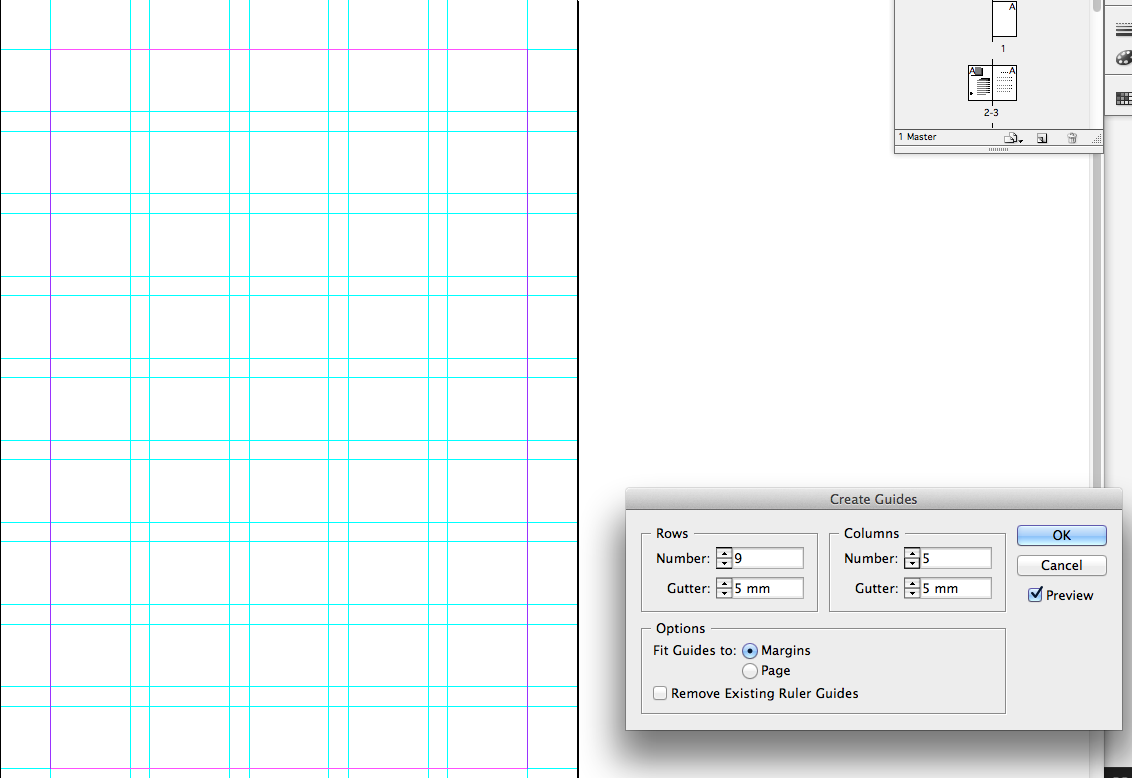
The layout and format will be that of an A5 booklet, this works with the idea taking influence from travel guides, while taking influence from dictionaries to maintain that informative tone of voice through the colorful journey and representation of Tingley. A 9x5 modular grid with consistent 13mm Margin keeps the framework tight yet versatile in positioning as it needs to maintain that structure and angular feel that comes from the shape system used.
The front cover works as an informative tool taking influence from dictionary explanations with keywords that provide a very concise yet informative overview of the logistics of Tingley. There wasn't much body copy so structure and balance was importing, each element needed to be considered in both Hierarchy of how the information is presented while also making best use of the space.
Size 12 body in Avenir and an 18 header in heavy Avenir was the final choice after playing around with futura, futura worked with the imagery, it was quite playful and curvy in its anatomy but Avenir shared this same playfulness but with more accuracy and detail in the intersecting strokes, shoulders, and curves.
Linking lines were tried to express the idea of a journey and add motion but it ruined the whole stripped back aesthetic I wanted, its complexity didn't really fit with the imagery that would be inside the book.
After trying out alternative arrangements having difficulty making use of the space in a structured way with sections of text feeling like they were just floating within the page I came up with a more balanced and locked in structure aided by the multi modular grid, the subheads at the bottom frame up the top half of the text nicely, the header acts as an anchor point for everything else to pivot from with the centre body copy section feeling locked between these elements.
The modular grid system allowed versatility when it came to body copy and how it interacted with the header, it worked with the body offset by one column while also working flush up-to the header when more body copy was needed. With large amounts of body copy it created a heavier weight, making it difficult to achieve balance of negative and used space when positioned more central.
Body copy worked better positioned central or offset by one column from the header, it fit in better and locked in place withe the centre positioned imagery, alterations of the images were needed in scale and position to create that ever important balance of weight, space and structure.
Due to the size of these pitches it was difficult to position these elements in a structured way.
When it came to color application for the majority of the imagery it was taken from the religious colors to represent Tingleys religious background, it was quite a versatile color palette though and had lots of varied connotations and representations in regards to the images it was supporting, so it wasn't just entirely religious color application.
I chose to go with quite bright tones from the Pantone CMYK + system, as I wanted strong and high impact aesthetics and nice contrast at points while more complementary interactions in others, dependent on the contextualization of the image and the message I want to portray.
Different combinations of the colors where tried out, if I listed them all it would just be tiresome but the idea behind these interactions was to achieve balance of tone, keep contrast of extension on a consistent level so nothing out weighs each other in terms of weight while remaining high impact. The shapes definitely carry the color well though.
Finals ready for print
Here are the final spreads ready to print with personal explanatory points and annotations of each concept behind the imagery to support my design boards.
To represent David Batty's progression in his career the teams he played for where represented in size order with there relevant team colors from Tingley, Leeds to England. This was featured first as Its quite a feature for the location.
Weird events like UFO abductions worked perfect with stripped back abstract imagery due to the tone of voice and message, more historic events like the plane crash worked better with more structured and concise tone of voice images. I tried to add as much detail to the plane as possible as a Halifax bomber was iconic of the war the khaki green worked perfect to denote this.
To support the churches religious colors were applied in varying interactions, while the crosses where made up from the shapes within the buildings to support this religious connection and show strong religious involvement through all aspects of Tingley through this shape system been used througout the image range.
More informal and playful tone of voice here with a bit of humor too it to with a full and empty pint glass and a pool game representing through basic shapes, this focus on pub culture works in terms of showing off more arcitecture with this effective shape system while also denoting back to the strong mining community Tingley had and these pubs satsfied there social needs.
The idea of a zoomed in version of the track and a zoomed out birds eye view of the train track denotes ladders as well as a track for the first image, this links with the underground mines and coal industry in a loose way, the trains where used for transporting the coal goods while also supporting commute and visitors transport.
The landscape imagery supported the rural location and the agricultural community at current and also supported the main water source for West Yorkshire, Tingley reservoir.
A timeline of industries going from the tunnels of the coal mines, to the wool mill machines to the transition to the radio masts within Tingley.
A roundup of the colors used throughout the book, I didn't want to create an actual color scheme for Tingley without any relevance to the actual locations history so I feel this scheme actually reflects and represents everything iconic and everything in the past and present that makes Tingly the place it is today.
Some alterations of layout here are played around with, also trying out contextualizing the colors with there correct pantone codes. The multiple angles and positioning does work to end the book though, it links with the arrangement of type on the front cover.
No comments:
Post a Comment