Responsive - Fedrigoni preparation for production & development
Digital Development
Working from the scamps I began to develop the structure and layout of the collateral, the preliminary decisions on layout and arrangements was already made so this stage went relatively smoothly. A Van Da Graff ratio of the page was made using the margins which would be applied to all the collateral.


The scamp layouts looked like they made good use of the space but when it came too the digital production things didn't go so smooth so I had to adapt and change the idea to make better use of space, I needed to make impact through textual content not through the iconography.
The scamp layouts looked like they made good use of the space but when it came too the digital production things didn't go so smooth so I had to adapt and change the idea to make better use of space, I needed to make impact through textual content not through the iconography.


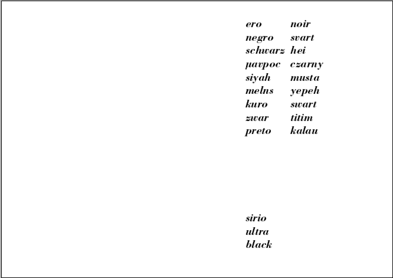
To work alongside the advancement of communication through publication an literature in the renaissance period I looked into referencing all the key locations Fedrigoni is distributed to expand the potential target market to various cultures. By translating the word black into these multiple languages to place the paper products in context with these translations.


I played around with different arrangements and wordplay, it was a little heavy on the balance of space when including "sirio ultra" in as it wasn't really necessary to include it this many times. and by just adding the translations it made better use of the space and drew more attention to the "sirio ultra black" the header that ties everything together.


Tried splitting the translations over 2 or 3 columns to experiment with the use of space in a more structured way inspired by the typical 2 column grid system used in Van Da Graaf alignments with the 3 column been a modern variation.


Altering the alignment of the header to alter the communication and hierarchy of information, both top and bottom left aligned header feels lost and doesn't really link with the translations.


Going back to the position at the bottom makes better use of the space and allows appreciation of the multiple translations of black placed within context (on the black paper).
Garamond in bold worked for creating impact and had nice roundness within the serifs maintaining that more friendly tone of voice I wanted to achieve, this serif face links well with the development of typography through the renaissance period analyzed in my research. Unfortunately some of the characters used in the translation weren't within this type family character set.

Bold italic Bodoni was the next typeface to try out, with its Italian heritage it linked perfect with Fedrigonis history and the italic style added elegance to the simple structured layout.


Further fine tuning of the header was tried out, stacking single words didn't communicate it as a whole header, it split it up too much causing issues with communication.
Playing around with symmetry influenced by renaissance symettria with the body copy and header worked well in terms of aesthetic but again communication of information was a problem.

I wanted to add a modern aesthetic to the renaissance influenced layout by adding vertical positioned headers a contrast of angles and alignment was achieved that produced a nice abstract aesthetic but again didn't communicate content in a legible way.


The header was switched up a little bit, the black been positioned at the bottom of the translations acted as a more direct communication of the translation, the gap visualized with a line will work perfect when printed on black as the paper color itself fills this gap to communicate the color in context, it also has an interactive feel and connection with all the individual translations.
As a multi cultural marketing tool these words could be switched around, with the country the range is promoted to having there native translation on the bottom of the layout.
Final fine tuning of the layout was made so the 2 columns black translations line up perfectly to keep things structured.


I began generating content for the explanatory section on the inside cover to resonate with the diagram and iconography that explains the marketing tool, I chose to leave out the information weights and technical details as this would be communicated in the sample cards using physical weights. This also made better use of the space within the 2 column system leaving space for the icons to breath and be understood.


A numbering system was added to the explanations so the information resonates well with the iconography.

The layout of the information pamphlet was easy, to keep things consistent I just copied over the text box that fit perfect in the margins of this format, the content was kept brief and concise yet informative for the explanations of the promotion cards.
Like the cover a subhead was positioned at the bottom of the format to show consideration to symmetry in a subtle way but aided better communication of information.

Expanding on the idea of symmetry from my scamps a few different arrangements of type and icons were made, it seemed to work better with the icons working on a diagonal when it came to symmetry, they seemed to make better use of the given negative space.
The cards with single icons didn't work as well, I know I wanted to leave space to allow the quality of the paper to be appreciated but there was a little too much unbalance going on. The placement of the header in the bottom left corner corresponds with the subhead on the other collateral keeping things consistent and when all the products are placed together an overall structure will be achieved.


The use of the modular grid system allowed good use of the space, a certain movement was created with these alternative alignments inspired by symmetry, provoking interaction and adding a further tactile feel to these physical print examples.
The varying scale and weight between the contrast of type and icons will allow a comparison of how these print productions appear in context both through there physical properties and visual contrasts and interactions.


Out of all the scamps these took the most consideration from my preliminary research into futurism and its influence on modern day trends, I took forward the idea of using renaissance symmetry and sacred geometry to produce simple yet high impact scamps that would work perfect on aesthetic posters.
The scamps that worked the best were the ones that used more simple shapes and contrasting angles as this would create more of a high impact aesthetic that would draw the attention in serving as a good recognition tool as a poster but would work within the simple and structured design aesthetic within the whole interactive marketing pack.

I took forward the scamp using steps to create this abstract illusion that could be perceived in many different ways, showing flatness and multiple angles and view points provoking interaction and drawing attention in, this whole aesthetic didn't really have structure too it though, it had symmetry but no structure and this is what was needed for the posters to work alongside the layout and construction of the whole marketing tool.
The contrasting tones would work well though with screen print, but the white areas wouldn't contrast well with the black squares when printed on black paper if it was to be digitally printed which was my first idea.
Playing around with alternative alignments and sizing still didn't improve things, when rotated and size increased imperfections in symmetry and structure became obvious so A more structured system of shapes needed to be adapted.


Working from the angles and block shapes from my scamps I came up with multiple outcomes that made use of the shapes in interactive and adaptive ways much like the structure and format of the package/marketing tool itself. The structure of the tool worked off renaissance grids and symmetria by halving, folding and rotating an A4 piece of paper, this idea takes the idea of halving, folding and rotation through the use of more abstract shapes to create a more high impact aesthetic that will suit posters more to draw people in.
The contrast of tone with the colors and the angular interactions I print with will work well with making something flat seem to have a certain depth.
PDFs & Prepared outputs for print process's and Lasercut
Digital print/Screenprint
The front and cover and pamphlet will try out digital print and screen print to maintain accuracy of the text as this is quite text heavy so needs to remain legible. Screen printing will allow the use of white inks to maintain contrast on the black stock.
Different stock alongside black will be used to show how well the range interacts with other colored stocks.


Obviously this sample card will be printed digitally to place this production method in context.

Screenprint positives
These will be exposed on screens ready for screen printing and foiling, I want to use metallic ink to emulate foiling to present contemporary approaches of traditional print.


Letterpress & Embossing
A series of the collateral will be printed with letterpress and embossing process's with the press blocks been laser cut to show a modern interpretation of a technique that enhanced communication and publication back in the renaissance period. This shows a consideration to the briefs requirements of keeping print and paper craft alive working off the term "Rebirth" that derives from renaissance.
Change of print process & Problems with digital print
I wanted to maintain a tactile approach when it came to appreciating the paper quality so decided on digital printing varying grey and black tones, but stupidly I realized during printing that the lighter grey areas where not visible at all due to lighter tones been made through less black ink been added to the mix, using an inkjet printer also meant the colors soaked into the paper, maybe a laser printer would show more contrast in tones as the ink sits on top of the paper but a change of plan was needed.
THIS ALSO CHANGES THE PURPOSE OF THE POSTERS, THEY ARE NO LONGER FOCUSING ON DIGITAL PRINT, NOW FOCUS MORE ON MODERN INTERPRETATIONS OF TRADITIONAL PRINT.

Adjusting the files preparing for application on letterpress blocks. All that was needed was to just turn the colors black and add a border and edging so the shapes are separated, I will use these grey tones as reference for when I mix the inks for letterpressing.


To prepare a file for lasercutting the raised sections of the block need to be in white as the laser cuts into the black areas, I left an 8pt gap round the border and in-between the shapes so I can lay all 3 colors down in one press with no colors merging meaning that everything will line up perfect maintaining that geometric and accurate feel.


Extension to adapt to idea change
Type alignments need to be created to work over the top of the letterpress prints, screen printing will be the technique to use here as its crispness and accuracy will allow good legibility and readability of the glyphs with solid and thick application of the ink. Using the same modular grid system with Van Da Graaf margins will keep layouts consistent across the range of collateral.
Using the left aligned arrangement of type and logo to keep things consistent with the rest of the collateral, Bodoni bold italic and poster italic where tried out but poster italic was far too heavy even with large point size usage, and had quite an extended stretched out aesthetic to the glyphs which didn't suit the sheered angle on italics.


To suit the left alignment the header was stacked but this didn't communicate as one word very well and wasnt very readable, back to the bold italic bodoni in pt28 seemed to balance well within the space of the A4 format and the shapes. The centre positioning works well within the use of space as well as interacting well with the shapers rather than simply been placed over as an afterthought.


Moving on from this interaction of the shapes and space I went back to the front covers use of multicultural translations to keep things consistent and the use of word play would be effective on a poster, to extend on this idea "Also available in the following colors" keeps focus on the promotion of the color black by playing off this multi cultural consideration.
Playing around with leading and paragraph spacing allowed me to make better use of the space with the header, quote and translations of black lining up on a horizontal guideline keeping things structured and in line with influence from Renaissance symettria and geometry.


To contrast between header, intro folio copy and body-copy regular bold Bodoni was used alongside the italic bold Bodoni, to keep things consistent though italic was used, it also benefits from a more elegant texture which works well with the elegance and beauty of the black paper and keeps consideration of past research into renaissance typography and culture based on how italic style serifs were the starting point for type design.


The use of the shapes was just as a mockup to prepare the layout for the screens positive template, the use of white font will contrast with the monochrome scheme and black stock.

Rough mockup seeing how all black works in terms of differentiating the different elements when compiled together, wasn't a problem really I thought the dark tones of the paper would cause confusion but it worked well.


Letterpress, relief and embossing plate/blocks
Using the raster technique on the laser cutter with some 9mm MDF a test run was made for the letterpress and embossing plates. It didnt go as well as I thought, for the poster plates I think it will be better to cut out some 3mm MDF and woodglue it to some 9mm MDF to act as a base as it took 4 hours and over 15 passes of the laser to achieve this minute depth and I have 6 to make.

The sample card plate worked well as it was smaller and didn't take half as long to carve into, but the typography is a little small so not sure how that will come out in the printing process.

Developed versions, took no time at all and are much more accurate and have better depth for a better print, using the etch function on the lasercutter allowed an outline to be made for the shapes to be applied too.

The type was removed from the sample card plates, it was far too small and would be too fiddly to allign using this method, a better but more costly method is to use copper plate etching, but for 8 plates this cost £3, where as copper would have cost about £30-40.


Big change of production method
Due to bad luck and bad timing a whole change of plan was needed for the production, a broken letterpress machine meant I couldn't emboss or letterpress for the sample cards, the screen-print room was booked out all week to printed textiles and this was the only available week for me to print, this was down to my time planning but it had to be finished by this week 13th march.
What went wrong.
I got a tiny space and a "portable screen-print bed" which was useless, the screen didn't make close contact with the stock due to no vacuum so the quality of the print was terrible, grainy and pixelated and I needed clear legible type or this just wasn't going to show the modern capabilities of print I was going with.
This meant the letterpress prints I made were useless, they looked good I changed the plan of individual colors and went for textues often seen in futurist paintings, especially this piece found in my past research.


A digital print interacting with the screen print to show the opportunities and relationships between modern and traditional print and paper process to show print isn't dead just yet.

Blurry, low quality text and grainy iconography due to bad screen coating, I need a lot more practice at this and plan my time better as this idea had lots of potential, Im still proposing the whole concept within a digital printed interpretation though as the concept is strong.

New poster concept.
The concept of the poster has changed now I will be digital printing them but proposing them to be screen printed and digital printed together to keep with the theme of sustainable print.
The idea behind this conceal and revealing of the translations is to provoke interaction & investigation and produce uniquely aesthetic posters that still use the same van da graff type setting used throughout the other layouts to keep with the renaissance influence.
The different visible and interactive translations also communicates to the end user a versatile and universal communication of black, whatever translation is revealed as the intro text and paper name "Sirio Ultra Black Also available in the following colors" is visible creating a recognisable connection between these distorted names and the paper this word play is promoting.
Again these examples follow an abstract aesthetic influenced by futurism in a modern light using geometric shapes inspired by renaissance, showing a solid transition of time periods from renaissance to modern day creative cultures.


The logo was positioned to the right at first to make better use of the space but to keep things consistent it was placed back to the left where it was more legible as this needed to be a focus point within the hierarchy, a bit of positive leading change and type size decrease was needed as the space between the body copy and logo was too tight.


No comments:
Post a Comment