Showing posts with label Communication is a virus. Show all posts

Sunday, 30 March 2014

Salt & Sauce competition pack & Round up evaluation

Salt & Sauce competition pack & Round up evaluation

For the competition we were running with the people who bought the T-shirts me and Neil created and printed a competion pack consisting of prints of the T-shirt illustrations plus a California map that didn't make it onto the T-shirt created by Daria along with a sticker pack of some quirky and fun cone of chip stickers that Me and Neil designed in some different color variations using the blue color to establish and distinguish the brand throughout. The final sticker was a keep repping sticker me and Niell created intended for T-shirts but due to time scales and budget we went with a sticker pack.

Here is the images that will be used for the prints and sticker packs. 


It all came together quite nicely I thought bringing back the tracing paper gift wrap we tried out before which were intended for the T-shirts for the stall. But due to cost we decided to scrap this idea and use it as a bespoke design element for the competition pack. 


Evaluation
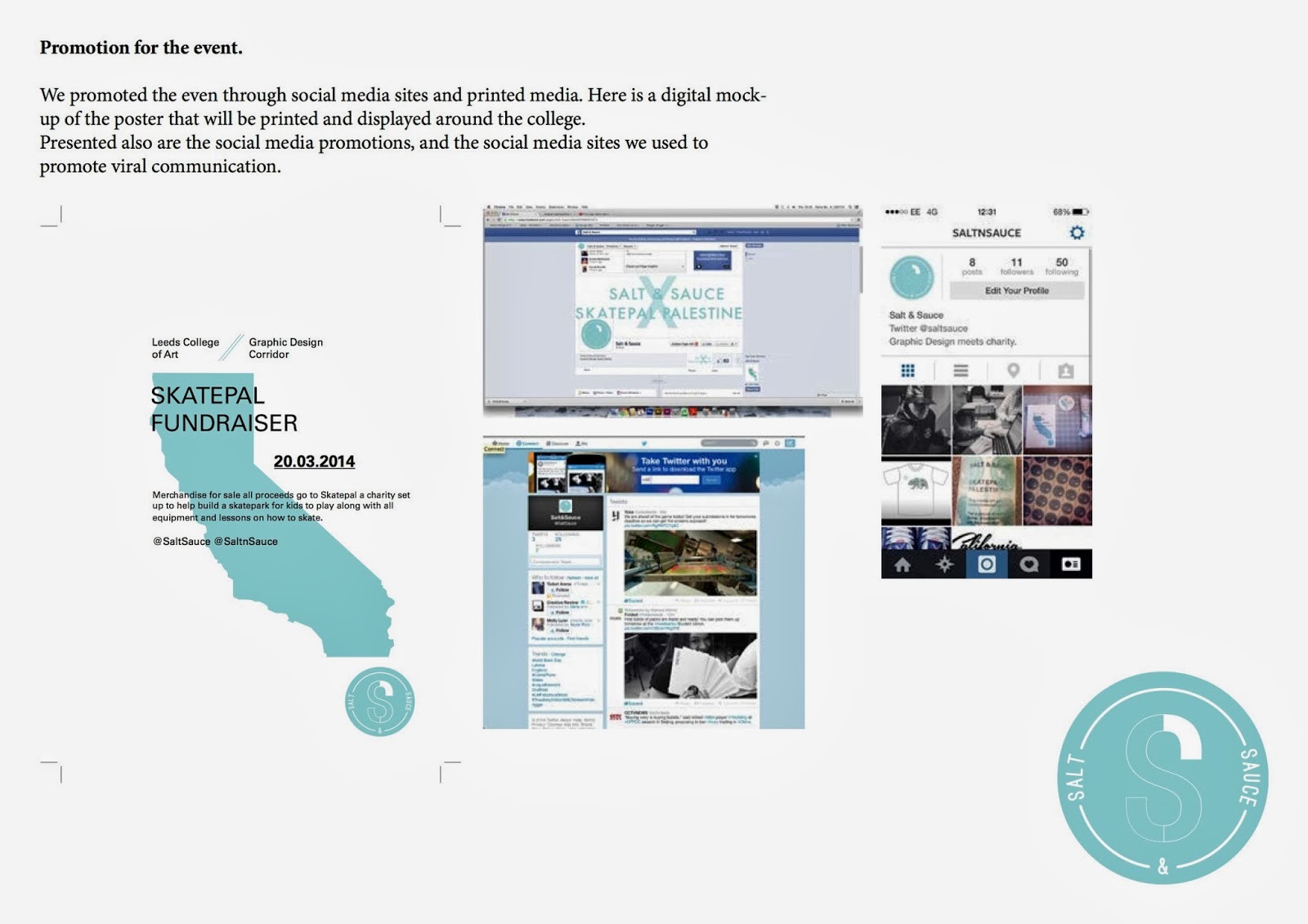
I am happy with the final results from running this stall, we did manage to sell out of the T-shirts raising around £140 for Skatepal which was good. It proved we went viral in that sense with the T-shirts selling out. I think this was due to the strong promotions we carried out with print media and social media methods getting the word out there to a wide audience, and also me sending an email to be forwarded on to the whole college informing them of the stall. 

But the competition pack we run didnt go so well, everyone bought a T-shirt but the idea was for people to post photos on our instagram page wearing there T-shirt in unique locations. We had no submissions to this, I think this is because we didnt really push this element of the project very far. We just put a tag in with the T-shirt in with the details and a short tweet and facebook message reminding people. If we pushed the competition a lot more maybe we would have got a few submissions and gone viral on the social media side of things, although we did get a large amount of followers on the instagram, twitter and facebook page combined so this provide we succeeded in this area I guess. 

The things we did best on this were the promotion and the running of the stall, this all went really well.
The girls produced some really nice T-shirts that people were obviously attracted to buy which was good.

Really loved the quirky sticker set me and Neil made too, these were one of my favourite elements too it to round things of nicely with the chips in the cone really carrying through our brand name with unique and aesthetically pleasing visuals. Loved the different materials and print methods I used too using tracing paper and stickers so our groups name and style was portrayed through many different mediums. 

I myself carried out all print promotion, some social media promoition, the competition pack, the instagram page and the sending of the chain mail but wasn't available for the stall due to illness wich I wasnt happy about so obviously if I could do the project again I would hope to be there for all stages of the project. 

Monday, 24 March 2014

Salt & Sauce Stall

Salt & Sauce Stall 

Everything went well in terms of the stall going ahead, everything except me been ill for the actual stall which I regret missing out on. 

22 T-shirts were available for sale. Taylor, Eva and Niel held the stall on the 20th of March and did a great job in the setting up of the stall.

The use of pale pink paper to cover the frame on the wall and the table worked well with the pastel tones and minimal imagery used within our T-shirt and Print designs, displayed centered were the T-shirts, to the right the prints of the T-shirt illustrations and to the left a few more prints with T-shirt tags and instructions on the Instagram and twitter competition. 

A selection of promotion materials and print images were displayed on the wall these worked well with the display on the table. 
More promotions for the event/stall were posted on social media sites. 


The response for the stall was positive, we managed to sell out of all T-shirts and raised £140 for the Skatepal charity with around a £80-90 profit margin left over from the production of T-shirts and print promotions. We had a lot of online requests for more T-shirts if we were to print anymore.

The next stage we need to do now is promote the competition to win the limited edition Salt & Sauce X SkatePal promotion pack. 

Whats left to do?
The final stage is for us to produce the limited edition winners pack for the winner of the Instagram competition. Me & Neil will be going forward with this as the girls did the T-shirts, we plan on creating a sticker set of the illustrations, some prints and a possible custom T-shirt as time is minimal now with other briefs and modules coming to submission point. 

Tuesday, 18 March 2014

Further promotion of Salt & Sauce X Skatepal stall & T-shirt preperation

Further promotion of Salt & Sauce X Skatepal stall & T-shirt preparation 

Along with the past postings on twitter, Facebook and instagram promoting the event for the online/social media side of the promotion. As well as the printed posters placed around the college.


I got tom to send an email around to the whole university informing them of the upcoming stall. The mass audience that can be reached through this simple stage of promotion was so simple and easy it just had to be carried out as our location is quite out of the way not many people would venture down there. But this little email informs them of a chance to buy some "one off screen print t-shirts" so I'm hoping it draws in people from other courses.


T-Shirt printing
The girls got a good start on the T-shirt printing ready for selling for the stall. More information on the process's they went through creating illustrations and designs and production of the T-shirts can be found on Talors, Darias and Evas blog. 

Friday, 7 March 2014

Final crit presentation & further action plan

Final crit presentation & further action plan

The group presented what we have done so far and what we intend to do to complete what we set out to do. We covered who we are.
What we plan on doing for our charity task we were set at the beginning of the brief.
How we plan on carrying it out (Stall)
How we promoted the event through printed media and social media.
What we will be selling to raise money for the charity.
Mockups of the T-shirts on sale. 
Healthy & safety coverage for throwing the stall. 
Explanation on the competition we plan on running and how it will be run and the prize on offer.

Overall feedback was positive on the proposal for the stall. Everyone loved the packaging idea and how they would definitely buy a T-shirt if it came presented like that and that they would easy pay £8 for a T-shirt. This means if we spent £3 on T-shirt production we could make over a 100% profit for the charity. To cut down on costs a suggestion was made to screen print onto tissue paper instead of tracing paper. We may go forward with this idea or just use the tracing paper wrap as an exclusive limited edition content for the competition winners merchandise pack. We mentioned that if sales went well with the T-shirts we would sell the T-shirts online on websites like big cartel & ebay. We plan on selling around 15 T-shirts to test the water. 

An interesting comment was made on how we would raise money for a more ethical charity like a health charity. Raising for a skateboard charity give us good design opportunities for designing merchandise such as clothing. Clothing would appeal to a younger generation, but would clothing link with cancer charities as well as an urban influenced fashion driven culture like skateboarding? 

 A little negative feedback on the presentation composition in terms of the visual of the slideshow as the typography was too small. The only thing we need to do now is go forward with the proposal of a fundraising stall. Social media wise we have had positive responses in terms of followers so in terms of viral response we have covered that avenue. Now we just need to go ahead with an attempt at earning some money to go towards the charity. 


Action plan
So far we have done most of the preparation for the upcoming stall. Printed promotion materials are ready and distributed. The social media site's are all up and running and receiving good follow/fan bases so all promotion around the event on the 20th is in motion.

What we have done so far:
Decided on a charity to raise for.
Decided on a group name for our creative collaboration.
Decided on how we will raise money for the charity (Selling T-shirts)
Completed promotion material both design and production for the stall on the 20th.
Produced T-shirt tags explaining hashtag competition via instagram. 
Opened up social media sites and created events and invitations for the stall on the 20th. 
Promoted the stall fundraising event through posting up printed media posters and social media posters.
Produced designs for the T-shirts to be sold. 
Completed all health & safety preparations for go ahead of stall.

Whats left to do:
We need to still print the T-shirts. This means the screens will need preparing by the week commencing 17th so we have time to have the T-shirts printed by the 20th. 
To inform students within the college who haven't seen the posters and the social media site Tom can send emails out promoting student projects so it would be a good idea for an email to be sent round promoting the fundraising stall. 
Finally we just need to hold the event and collect our money for the charity Skatepal. 
To raise the event we need to create a stall and a display for how it will all look so mocking this up would be a good idea. These mockups need to be decided by the 20th. 
Produce the limited edition competition pack for the winner of the hashtag competition.

Thursday, 6 March 2014

Health & Safety go ahead

Health & Safety go ahead

To hold the fundraising stall we needed to get permission from health and safety to cover all angles and to make sure theres no hazards. Eva got in contact with the health & safety department and we were required to fill out a risk assessment and action plan form. 

Wednesday, 5 March 2014

T-shirt wrap & Printed media & T-shirt mockups

T-shirt wrap & Printed media & T-shirt mockups

It was agreed that to add a more exclusive visual finish to the sold merchandise. If it proves cost effective we will sell the merchandise wrapped in this, possible thoughts at the moment are to use tracing paper to cut down print costs. Using the logo repeated with the skate pal tagline displays the merging between the charity and our design collaboration. 

Today we began to print the printed media. Here is a mockup of the printed media on the 2 paper stocks we tried out. We agree that antique white is the best stock to go with due to the stronger contrast so this will be used for the T-shirt tags swell. We like the idea of using the tracing paper to wrap the T-shirt in. But due to cost's of the tracing paper prints been 50p per T-shirt this was seen as an unnecessary cost so we decided that this wrap would be used for the limited edition merchandise pack the hashtag competition winner receives. 

Looks ok wrapped, like the aesthetic of the opacity of the tracing paper with the tag been vaguely visible underneath. The wrapping looks a little awkward and forced though, it doesn't look very presentable and neat. 

Tried wrapping the ends. Interestingly looks like a hot dog wrapper now which has obvious loose conceptual links with the term "salt & sauce" but out company and charity calibration doesn't really communicate food? So unsure on this aesthetic of wrapping will probably go with a more clean and concise fold/wrap with the competition winners pack of merchandise. 

Printed media for advertising purposes on doors and obvious locations were students can view the information. Quite like how the blue shades work together too. Doesn't create so much contrast though on this door though so some posters will be placed in higher contrast backgrounds. 

T-shirt tags all printed out, printed these out on the laser printer to cut down on costs though and the shade of blue is a little brighter compared to the pastel tone in the digital inkjet print. But we quite liked this lighter tonal range. 

Social media accounts for Salt & Sauce

Social media accounts for Salt & Sauce

To access a broader target market we felt social media would be the ideal vessel to promote our fundraising events. We created a twitter account to promote such events to aid viral popularity of our movement. An Instagram was created for the T-shirt hashtag competition we plan on running. 

Twitter social media.

Event for fundraiser
Facebook event made to invite and inform the fans of the salt & sauce Facebook group which has near on 100 likes which is good. This event incorporates the digital poster promoting the fundraising stall to be held on the 20th of march. 


Instagram page for the hashtag competition soon to be run. 

T-Shirt tag development

T-Shirt tag development

Based around the type layout and format of the poster Neil and I began to develop the T-Shirt tag. We thought up the idea of using the circle from the logo for the format of the tag along with color, California map and the univers typeface. This keeps a consistent aesthetic over the range of printed medias. 

Initial idea trying out centering the information in a lightweight sans serif typeface. The alignment was all wrong though, the map looked out of place even though it was centered it needed to be flush with the logo like in the poster. The hierarchy was also wrong, the main information needed to be communicated was the clothing collaboration type at the top of the tag, but due to the high impact map and the large body of text the eye drew to the body copy before the header. The use of a straight cut sans serif typeface choice contrasts with the circular tag format and the logo, this aids the concept of contrasting elements that work together which has relevance with the "salt & sauce" collaborations concept. 

To combat this I lowered the point size and the text box size so the body copy didn't take up so much of the space within the tag format and didn't stand out in front of the header. This also created a better balance of used space and negative space, also going from centre justified to left aligned allowed the type to sit flush too the straight edges of the map. This contrast of straight edges within a circular format of the tag creates a nice contrast which again has good links with the concept behind the "salt & sauce" name. I also changed the weight  (bold) of the header to contrast with the lighter weight body copy to make the header stand out first to the eye. I brought in the abstract visual of the exclamation mark in again as this solved the problem of the miss aligned map outline in the initial version as well as maintaining consistency within the printed media range. 

The next stage is to print out the posters and tags experimenting with pale pastel paper stocks as mentioned in the poster stage. 

Monday, 3 March 2014

Promotion material development (poster)

Promotion material development (poster)

The final stage of promotion was to create the poster, this would be uploaded through the social networking sites as well as placed around the college so needed to be eye catching, I presented the examples of research I found forward with my intended concept but the group favored the Panopoticon poster.

They agreed with my idea of drawing viewers in through the bright geometric shapes and strong colour contrasts, it was mentioned the limit of colors though which I forgot, so I will only be able to use the blue shade we have, black and white/paper stock. It was agreed that the colors could really communicate California and its sunny beaches and colorful community connotations. 

A cool suggestion inspired by one of Daria's T-shirt designs would be to make the geometric shapes follow the shape of the Calafornia map. So this is one idea I intend to work towards.

I began playing about with my coloured squares to present an abstract representation of the map. The image  on its own looked good, but the clarity and the accuracy of the logo clashed with the robustness of the map. I could have always made the logo smaller but this was a main focus of the visual. I feel if the imagery was restricted to the corner of the poster frame it would work better due to the square elements having something to sit parallel too (edges of paper). But as it is here it just doesn't work. 

Tried this geometric idea out but it looked far too much like a table cloth and didn't give me much opportunity to use type legibly on it. 

The next idea was to use the negative of the California map but the map wasn't legible, it wasn't easy to tell what it was supposed to represent due to confusing illusion from the multiple square pattern. 

For the above ideas I was working with the image before type, this made it hard for me to figure out were the type elements would go so I tried creating designs with type first. This was working much better, even as it stands now as a type one composition it works well, theres a nice balance between the typographic elements and the negative space. It gives the viewers eye space to take in the information in a concise and precise way with no fatigue from heavy visual elements. 

Body copy was added explaining the fundraising event, the typeface used was Univers(Sans serif), I like how neutral Univers is, I wanted the typography to be extremely legible and clean and this typeface worked perfectly. The clean cut use of typography creates a quite corporate feel to the composition, this is good as having playful type doesn't really communicate the seriousness of charities. The simple contrasting blue elements work good within the composition, the blue elements top and bottom keep the eye moving around the page. The varying pt sizes and weights draws attention into significant important pieces of information, the header due to the large pt size and uppercase glyphs and the date coming in second through a heavier weight Univers. 

Underlining the date brought the eye in more, it was important to make clear when the date would be as it would be a 1 day only event. And the addition of the twitter & Instagram handles gave direction for people to access the digital social media section of our charity scheme. And also the way we plan on going viral. 

Minute adjustments within type layout to perfect the aesthetics and legibility of the information. 

Playing about with were the logo could be positioned, left aligned doesn't work though, creates too much white space within the balance of type and negative space.

Too much space at the bottom of the composition now, top heavy visual composition and looks more like a letterhead now. 

Made some aesthetic changes to the map drawing, created a right angle and flat top to the map to sit parallel with the Cap height and the vertical guidelines of the glyphs. The 45 degree angle also cut nicely between the date and through the body copy.

Presented here is the digital file, this is what will be posted on the social media sites but I plan on using an off white or grey stock for the printed media. I like the strong contrast within the bright white and blue but I feel the pastel shade of blue would compliment better with a more pastel/neutral background. I also like how the map and the logo create an exclamation mark. An interesting aesthetic that has a certain "loudness" concept too it in a subtle abstract aesthetic. The style here will be carried out into the T-shirt tags.