Final overall evaluation
As this was the first module back and the start of a new year I was keen to get on to a good start, the briefs set were a chance for me to fully explore design production methods. Rather than just doing a design and digital printing it the briefs allowed me to explore the use of materials, process's and construction methods.
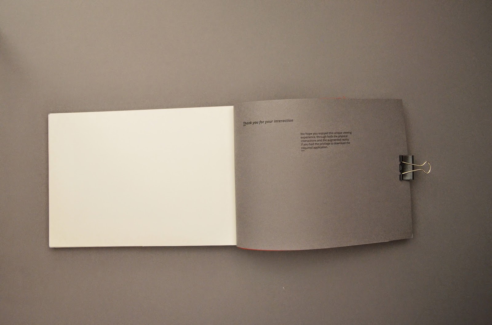
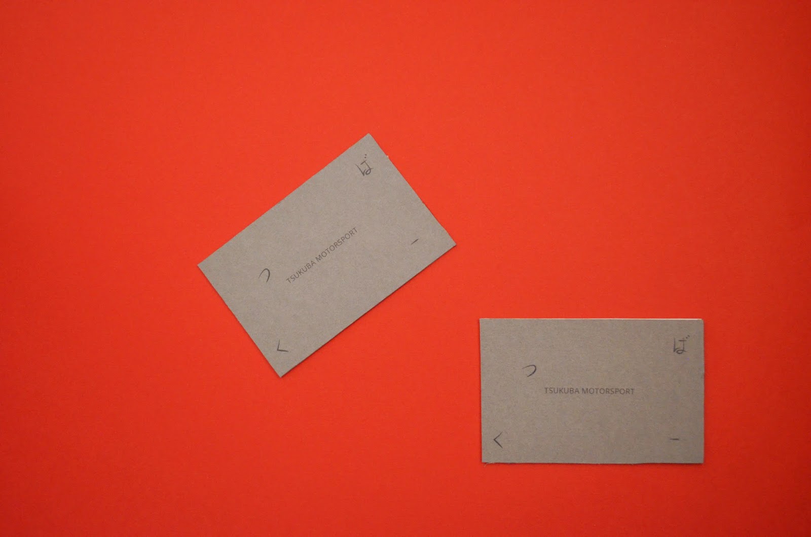
Some of the most successful production methods were the Laser cut key rings for the Augmented advertising campaign (Brief 4), I had the most positive results with this brief and the use of laser cutter and after speaking to the guy down in the workshop I think il make more use of the facilities down there to create more physical work that takes consideration of construction on board rather than just design. Combining construction and design will give me further opportunity to create successful and conceptually relevant outcomes.
Conceptually I think I have been very successfully overall, I have really considered concepts when it comes to ideas and how I visualize these concepts has come on a great deal since the first year. The first brief I incorporated folding techniques and use of paper stocks evaluating its suitability when it came to color and texture and physical quality to help enhance concepts and ideas.
The logo brief made me think how history and heritage can be brought into design ideas to enhance a companies image which in turn helps appeal to certain target markets.
The website and augmented advertising campaign allowed me to fully explore conceptual ideas, be it subtle through the use of inspired grid systems in iconography production, use of color paper stocks to work along side current color schemes associated with a brand image, considering concepts through the use of material and how this strengthens ideas.
Target markets and persona's where another important thing I learnt over the module, learning about meeting the needs of the audience helped me produce more focused work that had a more specific purpose. It will also prepare me well for when I do external work for clients understanding what the audience wants is just as important ad understanding clients needs. Its not about what you like its what they like and want.
Designing for screen based output was something new to me, it was very daunting at first knowing I had to go and code a website with zero knowledge on the subject. Unfortunately we never got round to coding but I learnt all the basics of preparing design work for web and the use of web safe colors and fonts and a familiarity with coding language in CSS and HTML will give me good ground works for self learning as its a skill that is needed in this digital age.
Learning about preparing files for print was something again that is a skill I need and will continue to use in college and externally, preparing color pallets for cross format use within the adobe suite, preparing in design into a package with all the needed files into one neat folder for the printer to use were the most beneficial.
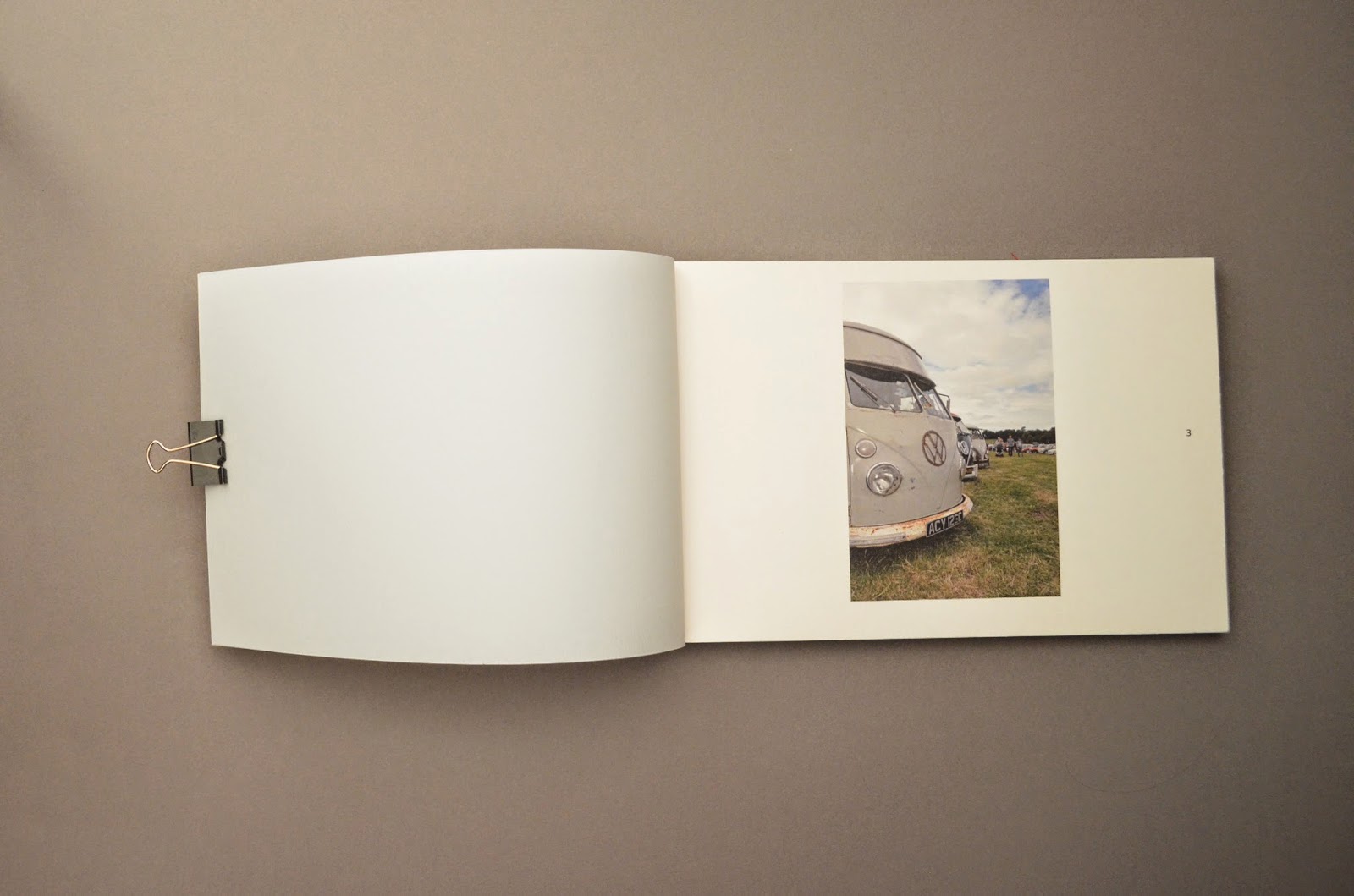
I learnt alot more about physical print techniques, both digitally and traditional. Alot of mistakes where made but it was all a learning process, my especial favorite was the happy accident of the UV varnish effect I achieved through running uncoated stock through the laser printer. A nice cheap alternative, one thing I do want to develop on is the making of stamps. I failed in the production but I feel a stamp is a good medium for any brand collateral as its versatile in its uses and allows a touch of traditionally where appropriate. I liked that I had the opportunity to explore more analogue techniques through the augmented brief where I simulated augmentation (the adding to an existing element) through the use of watercolor painting, a technique I used to enjoy using and the concept idea I had for the design allowed the use of this method.
I continued to push my use of grid systems, after learning about them in design principles I see them as a staple to my practice now, both on screen off screen and for image and animation design they came in handy and they help strengthen concepts a great deal. As i mentioned in the leaflet brief its not all about what you see from the outset, its about the things that went on behind the scene that really make a project successful and properly informed. Something I think I began to understand and carry out.
I made great use of scamps and thumbnails something Simon and Fred taught us last year to get out a great number of ideas out quickly. This rough way of working is a thing I use alot in my design process, I think it comes from my initial drawing background I see it was a quick way of adding and subtracting elements from each scamp or thumbnail to give me a rough idea how somethings going to work before spending more time developing on it.
I have seen the benefits of using books as a more informed source of inspiration and learning, teaching me about construction techniques and screen based delivery's as well as how to create a good brand image. All details that will be used in later projects to enhance final outcomes.
Time planning though is still a problem for me, I seem to be motivated for the first half of the design process, analyzing the problem and figuring out what needs to be done and beginning to gather research and arrive at initial ideas but I seem to slow down from there and accept that I'm at a stable point. Only then when it comes to the end of the brief do I realize that that design idea is still in infancy and it needs developing on.
A final thing I want to touch on is realizing who realistic a design project is in the external world, commercial producing a project is one of the most important factor when making work for input into the public, so realizing the cost and if the business can afford or justify such costs is an important factor. Also figuring out how and where to get certain things done like print finishes, different printing techniques and how things are constructed theres always going to be a company out there that can do the job for you and it all needs to be taken into account.
I have learnt alot about print finishes mostly and now understand how to prepare most files and design work for commercial production. Where lucky enough to have amazing technicians and facilities to help us do almost anything so I need to remember to take advantage of this while I can before it becomes less realistic and I don't have the opportunity to use these methods due to the clients needs, wants, budget and there target audiences.
Overall I enjoyed the module though, the improvements I need to make next time are better time management though and push the design past its infancy idea stage and fully develop and exhaust and idea before finalizing it.
The website and augmented advertising campaign allowed me to fully explore conceptual ideas, be it subtle through the use of inspired grid systems in iconography production, use of color paper stocks to work along side current color schemes associated with a brand image, considering concepts through the use of material and how this strengthens ideas.
Target markets and persona's where another important thing I learnt over the module, learning about meeting the needs of the audience helped me produce more focused work that had a more specific purpose. It will also prepare me well for when I do external work for clients understanding what the audience wants is just as important ad understanding clients needs. Its not about what you like its what they like and want.
Designing for screen based output was something new to me, it was very daunting at first knowing I had to go and code a website with zero knowledge on the subject. Unfortunately we never got round to coding but I learnt all the basics of preparing design work for web and the use of web safe colors and fonts and a familiarity with coding language in CSS and HTML will give me good ground works for self learning as its a skill that is needed in this digital age.
Learning about preparing files for print was something again that is a skill I need and will continue to use in college and externally, preparing color pallets for cross format use within the adobe suite, preparing in design into a package with all the needed files into one neat folder for the printer to use were the most beneficial.
I learnt alot more about physical print techniques, both digitally and traditional. Alot of mistakes where made but it was all a learning process, my especial favorite was the happy accident of the UV varnish effect I achieved through running uncoated stock through the laser printer. A nice cheap alternative, one thing I do want to develop on is the making of stamps. I failed in the production but I feel a stamp is a good medium for any brand collateral as its versatile in its uses and allows a touch of traditionally where appropriate. I liked that I had the opportunity to explore more analogue techniques through the augmented brief where I simulated augmentation (the adding to an existing element) through the use of watercolor painting, a technique I used to enjoy using and the concept idea I had for the design allowed the use of this method.
I continued to push my use of grid systems, after learning about them in design principles I see them as a staple to my practice now, both on screen off screen and for image and animation design they came in handy and they help strengthen concepts a great deal. As i mentioned in the leaflet brief its not all about what you see from the outset, its about the things that went on behind the scene that really make a project successful and properly informed. Something I think I began to understand and carry out.
I made great use of scamps and thumbnails something Simon and Fred taught us last year to get out a great number of ideas out quickly. This rough way of working is a thing I use alot in my design process, I think it comes from my initial drawing background I see it was a quick way of adding and subtracting elements from each scamp or thumbnail to give me a rough idea how somethings going to work before spending more time developing on it.
I have seen the benefits of using books as a more informed source of inspiration and learning, teaching me about construction techniques and screen based delivery's as well as how to create a good brand image. All details that will be used in later projects to enhance final outcomes.
Time planning though is still a problem for me, I seem to be motivated for the first half of the design process, analyzing the problem and figuring out what needs to be done and beginning to gather research and arrive at initial ideas but I seem to slow down from there and accept that I'm at a stable point. Only then when it comes to the end of the brief do I realize that that design idea is still in infancy and it needs developing on.
A final thing I want to touch on is realizing who realistic a design project is in the external world, commercial producing a project is one of the most important factor when making work for input into the public, so realizing the cost and if the business can afford or justify such costs is an important factor. Also figuring out how and where to get certain things done like print finishes, different printing techniques and how things are constructed theres always going to be a company out there that can do the job for you and it all needs to be taken into account.
I have learnt alot about print finishes mostly and now understand how to prepare most files and design work for commercial production. Where lucky enough to have amazing technicians and facilities to help us do almost anything so I need to remember to take advantage of this while I can before it becomes less realistic and I don't have the opportunity to use these methods due to the clients needs, wants, budget and there target audiences.
Overall I enjoyed the module though, the improvements I need to make next time are better time management though and push the design past its infancy idea stage and fully develop and exhaust and idea before finalizing it.