Showing posts with label OUGD405 studio brief 4. Show all posts

Wednesday, 22 January 2014

Ipad App finals & evaluation

Ipad App finals & evaluation

Bellow is the app in simulation on an iPad and the corresponding pages based on a point & click interactive system, the user will click the highlighted red 'i's to zoom in to a more detailed shot off that particular part. 

I am happy with the final outcome to a certain extent. Overall it works, its legible through the simplistic use off type & image, easy to use within its interactivity, structured and consistent throughout the layouts and has very detailed imagery that work well with the technical tone of voice explanations off the parts. 

Issues I had through the creation of this was type size, limited space for positioning type & image, and the problem off "empty" looking compositions. To overcome the type size problem I created the app on an iPad, a much larger surface area gave me a better opportunity to use larger pt size type to aid in readability of the information presented, the detail within the images could be viewed more too which was good. Through the use of an iPad template I was no longer limited in space for positioning type & image, I achieved a better balance between negative space and filled space. This still didn't overcome my feelings off the design looking too empty  I feel the first page works well but the description pages have a little bit too much negative space when body copy is limited. To overcome this problem I could have framed up the top and bottom off the page somehow by using navigation bars or interactive tabs so this would be something to consider in future app designs.

But as this was my first time at creating an app, or a mock up off an app I feel I did ok but have a lot to learn so in future instead of looking into visual research on physical layouts and website layouts I need to look into actual considered and well designed app designs. 


Final App production

Final App production 

Taking the key points off removing the grey surround and the use of a bigger resolution screen I developed the app onto an iPad screen using the existing layout system produced for the iPhone app. Layout inspired by this original sketch for the iPhone app.


I discovered the option of digital publishing templates on indesign which gave me the perfect resolution and dimensions for creating an App layout for an iPad.

Centered the image of the F1 car along a horizontal spine onto the main page using the ruler as a guide. 

Erased the block color surround and used a bold Helvetica weight typeface instead, the sub header "Virtual guide" remained in a regular weight uppercase Helvetica. 

There was too much off an imbalance with negative space either side of the top and bottom off page so I brought the header and sub header in towards the car. This restored balance of negative space, I'm finding it a lot easier to work on this layout due to the opportunity off playing about with more space compared to the limited space in the iPhone app. 

Placing the information highlighters in a contrasting red color, this red color has been brought in from the layout brief as it connotes F1 branding and works well in contrast with the greyscale scheme off this composition. 

Started bringing body copy in, due to having more space I had the opportunity to expand the line spacing bait more to create more readable bodies of text.

Using the same principe off the horizontal spine as a guide for the type and image I created this page layout. Works a lot better with the space around it as opposed the crammed in and constrained elements in the iPhone app. 

In the iPhone app I had to use a light typeface to fit the body copy in the given space, this wasn't needed now and a regular weight fit in much better.  Both the information pages and main page work much better now in these spacial arrangements. 


First draft off App & Final Crit

First draft off App & Final Crit

Ready for the final crit I made a mockup off the interactive Formula 1 app for use on an iPhone. Bellow is what I presented in the crit & the app displayed on an iPhone screen. It may not be obvious from the photos but the quality and the crispness off the type & image is extremely accurate so I feel happy with how it works on a phone and the layout works well with the resolution off the screen. 

A simple single column grid was used for the home screen with a 2 column grid used for the information pages (engine, tires, brakes etc)


Crit feedback was positive on the app as a whole in terms of layout and use of image. What I was concerned about was the minimalism, with it been an app I couldn't add many visual elements too the composition due to clutter and lack off space. So I felt the layouts I presented were a little too "empty". Everyone disagreed on this though and said the style of the blueprint inspired image worked perfect with the minimal layout and use off clean sans serif typography. 

Feedback was extremely positive on my drawings with many suggestions on keeping them for use in other projects or personal projects, which is what I was thinking i really want to screen print these images. It was suggested to make a flick book out off these images so this would be cool if i used screen printed pages. 

In context off the phone it works well, the frame of the phone really locks everything into place leaving a feeling of structure as opposed to a very loose and open feel when the design is just presented with no border the elements of type & image feel lost in my opinion.

I mentioned my difficulty with font choice, as there was a lot of text to display I had to drop the pt size down to 5.5 which in my opinion is far too small, it was readable on screen but thats not to say it would be for anyone who has difficulty viewing on screen text and image. The suggestion was made to mock this up onto an iPad app so this is one main point that I am taking forward. The other point made was on the grey block surround around the type, it wasn't needed so I will be removing this and changing the weight off the header too bold or semi bold. Overall though I was happy with my feedback and don't think creating the app into iPad format will be too much hassle as I already have a layout set, the opportunity of more space to work in may benefit this existing layout too. 


Wednesday, 15 January 2014

Layout ideas

Layout ideas

Taking inspiration from my layout research in the form off the simplistic user friendly blogs and the clean centered branding I have created these rough thumbnails.
The first 2 pages will be for the opening page.

The bellow page ideas for the individual parts page, this will be mainly inspired by the main page though. 

Bellow is an idea for the layout concept, it will change orientation depending on how the user choses to view the  app so layout for both landscape and portrait has been considered. There are 2 main layout styles I want to try out, overlaying type over the image or keeping the type separate from the image. Overlaying the type over may hinder legibility off the type or hide the imagery, but I want to try combine the both as I feel this will create a nice contrast between the analogue imagery and the crispness of the digital type. This goes back to my concept used in the layout of combination of traditional and modern elements but through the use of imagery and type rather than sans serif and serif typefaces. 

I think separating the element is going to work the best though, I learnt from the blogs I looked at that interactive interfaces need to be user friendly and simple to use, and keeping composition elements minimal and having no distracting elements is the key. And as I want the focus to be on the image itself within the hierarchy of the construction I feel this would be the best layout composition to use. There maybe the addition of stats bars at in the composition somewhere to add a statistic to the information provided which will be more a use of technical language and terms. The stats bar will serve as a sort off info-graphic.

At the moment in time I am considering sans serif typefaces and a whole greyscale scheme, I may add a color element in somewhere to add depth to the design. 

Image creation & Preparation

Image creation

From my source imagery I began creating my illustrations for use in the app. The style off image making came from a technique i established in my foundation year. Through the use off fine liner I was able to add crisp and accurate lines to the drawings creating outlines that resembles mechanical blueprints. To add depth and texture I added stippling and simple small lines. Through the use of a single tonal range and colour a flatness was added to the image that I feel will work well and emulates detail well and as I plan on creating a minimal layout this imagery wont feel out of place within the type choices and layout decisions. I could have created these in adobe illustrator which is what I would prefer to add even more accuracy through the vector process, but due to me still been slow with the program time wouldn't allow this. 

Simple line art and block colouring. 

The addition off "stippling" adding dots to create tone and texture 

Bellow are all the final drawings ready for manipulation in Photoshop. 

Simple manipulation process, imported image from my scanner. Selected the background area, the whitest area I could select. 

Select > Similar to highlight all white tones leaving the black positive image. 

I then erased the background leaving a clean image ready for insetting into indesign. This process was applied to the remaining images. 

Monday, 13 January 2014

Concept interim crit & Plan of action

Concept interim crit & Plan of action

Today we formed small groups to have a discussion on our initial ideas. I presented forward my Top trumps idea and my Magazine article on KERS system, feedback was positive, with people favoring the top trumps idea on engineering and technical details of an F1 car. It was mentioned that there are is a pretty even split between people who are clued up about the technical side of things and ones who are not. I established from the crit feedback that interactivity would be a good way to go to communicate engineering off car elements. By been interactive it sways away from typical diagram style descriptions seen in publications and can be quite boring.

Time scale was a common thing to pop up in the crit and I agreed it would effect me and producing a full top trumps set would be difficult to do. Another idea I got from everyone was to create an iPhone app with interactive explanations of car engineering. This is an idea I am happy to go forward with as top trumps are a little boring and outdated now due to the digital age and with most younger people having smart phones now i can branch out to them with an easy to use digital app. 

The specific target market I would be aiming towards would obviously be F1 fans, but to narrow things down I would be aiming at fans who have interests in the engineering side of it and the technical aspects. Not the ones who just watch it for the racing itself who don't consider everything that goes on in the background.

To sum up the crit I have categorized how i am going to react to the feedback.

Plan?
Create an app to display car engineering elements in an interactive way. 

Improvements?
Interact elements to be included in a digital outcome. iPhone/smart phone app. Keep things legible and understandable don't overcomplicate the layout with unnecessary elements.

Achievable in time scale?
Yes with careful planing on timescale

Audience?
F1 fans with interests into technical engineering side off the sport. 

Appropriate for audience?
Yes.

Purpose?
Inform & Educate.

From this I will create myself a brief to work from and form a plan of action for the week from it to produce the final outcome of a mockup app.

I will be creating a digital app for an iPhone/smartphone aimed at a specific Formula 1 enthusiast, ones who have an interest in the engineering and technical side of the sport.

The gap in my research was the lack off technical information on the engineering side off cars, so what my audience will be shown is the technical side off the engineering of F1 cars within an interactive digital app as means of the delivery system. The app will be an interactive sort of diagram image of a formula one car, the user will select elements to zoom into and obtain more detailed information on that specific part. For example zoom into the wheels and find out technical details off the wheels and gyres etc. Or statistics on grip levels and speed ratings of the tyre. I will plan this out before committing to the visuals. I will present visuals through use of type and image, the image style been analogue drawings in a blueprint style. 

I will be educating and informing the viewer on statistics and technical information on certain elements off a Formula 1 car. They will be responding to an interactive app that they can personally navigate around by zooming in and looking deeper into the engineering off the car. The app itself as mentioned will be interactive through a digital phone app. 

It will be a collection of type based on statistics and technical information combined with imagery from engineering elements like engines and brakes.

The tone of voice will be off a technical nature, with language and statistics inspired by vocabulary used in Formula 1. The language and texts used will also be very informative to educate the viewer.

Plan of action
Monday 13th January: Gather inspiration to inform layout, type and image. Form a rough plan off the apps navigation and interactivity. 

Tuesday 14th January: Create rough thumbnails off layout ideas for the app. Begin making illustrations off the F1 car and elements from source imagery in research.

Wednesday 15th January: Cary on making illustrations off the F1 car and elements from source imagery in research. Start putting together the mock up of the app. 

Thursday 16th January: Complete the mock up off the app.

Friday 17th January: Print mock up off the app. Present work in final crit and note down any suggested amendments to make.

Saturday 18th January: Carry out any amendments 

Monday 20th - Wednesday 22nd January: Carry on making amendments from crit feedback and produce a final polished up mock up off the App for module hand in.

Source imagery

Source imagery

Collected here are the source images I will be using for my illustrations, most were found within my research already but the rest were found on the formula 1 website.
Size and resolution of the image isn't a main concern as the image will be used on a phone app which has a small screen. 

Mercedes MP4-28


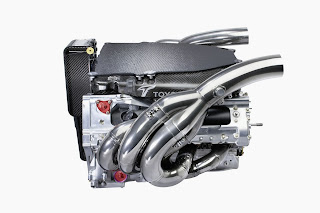
Engine.

Front wing.

Wheels.

Survival cell.

Rear wing.

Steering wheel.

Tyre's.


Gearbox. 

Brakes.