Showing posts with label OUGD403 studio brief 5. Show all posts

Wednesday, 13 November 2013

Poster Finals & development

Poster Finals & development 

Bellow are examples of my final printed outcomes presented in there 2:1 ratio on A3 paper. I am happy with the outcome but when i created the pdf mockup i chose a lightweight grey hoping that I could find a paper stock to match this mockup. But this wasn't possible this was the closest i could get and it changed the ascetics completely, before the grey was light now its darker and more pastel. The outcome instill high impact but the contrast between the light grey and the red provided a higher impact outcome before. This restraint of not having the correct paper stock is something I will consider into more detail next time as this altered the outcome more than I would like, I would also like to try out screen printing next time so with better time management I will try out this method next time. Overall though i was happy with the outcome though and I will display the stages it underwent to arrive at this finished product.

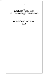
The typeface used was Helvetica Neue in bold weights and regular weights of varying type sizes. Uppercase was used for high impact. 


Below are the source sketches in which my designs were developed from with underlying influences coming from my investigation into existing poster designs. 


I will now go through the digital development stages highlighting were major changes happened. 

Tightened the leading to attempt to increase a more solid block of type to increase the high impact outcome. 
Centre justified to visually emulate a hurricane in an abstract format. 
A quick discussion with Simon made me see that it just wasn't working in terms of impact, from a distance it wasn't very visually eye catching and the centre justification wasn't working. Everything needed to be presented in one flush block of type. Still staying with the centre positioning I went on to start increasing point sizes on important figures to draw the viewers eye into key statistics. Bold weight was used to strengthen this concept.

To keep everything neat and well aligned i played about with leading to create even consistent spaced between all the design elements.


Getting there now in terms of impact, but the page still appears too empt, and the positioning of the type is a little all over the place still so some adjustments need to be made. 

Visually the linking lines weren't working so I began to remove these and started to increase leading a little bit. 

Established it wasn't necessary for any of the linking lines the small lines frame up the 3 blocks of information well enough.

I thought that the bottom of the page had too much white space so to make use of this I placed the Hurricane Katrina as a footer of the poster as the figures were to be the focal point of the poster so the viewer would go through the 3 elements top to bottom in terms of importance. The emissions been the most important issue due to this causing the deaths and the disaster outcomes. 


 I played about with subtle type edits, this helped add a little playfulness to the design and created a feeling of interaction with the glyphs. The A was overturned to emulate death a little more, my concept was that things seem to float and turn over when dead in the water, and the water was the main focal point of the disaster so i edited the 2005 to simulate waves in an abstract format. And the D been blown over to simulate wind. 

Kerning, tracking and leading were altered while playing about with typeface weights and sizes to help focus in on important facts while keeping typography aligned in a rectangular centre aligned block and keeping it as easy to read as possible letting the eye flow from line to line with ease. This works ok i guess with the eye stopping to take in the figures presented in bold and large point size. 

Began to add color to increase impact, red was the main color used in charities in the recovery stages after the disaster and emulates emotions of danger so I felt this fit the concept well. The contrast it created with the black type was nice as well framing up the 3 segments. 

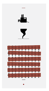
In my research stages I liked the idea of striking elements out to emulate that if the emissions displayed were 'struck out' then the outcomes deaths and other stats wouldn't have happened. 

The strike outs were brought close together to create a more solid block to increase visual impact. But the solid colors completely hid the facts, and my concept was to link the disaster outcomes with global warming.

Adding opacity helped prevent this problem around 70% was applied, it balanced nice in terms of tonal range with the contrasting black typography. 


Played around with different shades of grey arriving at this final grey presented bellow. The image only and type & image followed the same layout style as the type only poster to keep constancy throughout so the posters work nice as a set. 

Friday, 8 November 2013

Poster Final Crit

Poster Final Crit

A new format was used for this Crit, we were given 60 seconds in front of the whole group to sum up were our research went from its original story and how its influenced the poster designs presented. I chose to present mine on pdf as I plan on printing on a colored paper stock and didn't allow enough time. 

Feedback overall was good for the overall concept in terms of consistency and layout. And everyone liked the concept of statistics. But one thing was pointed out was the fact that the figure given for the emissions was a little vague. I was relying on public knowledge in a sense that people would link Hurricane Katrina with America thus linking with the emissions figures presented. It would have been better to state these figures that belong to the USA. 

The whole concept of the striking out was positively received, people understood the contextual concept of it connoting loss of life through the image and type and image one. But they didn't quite get my concept of striking the aftermath facts out. My ideas was to communicate if the emissions were lowered then these figures would be 'struck' out. But i suppose 2 out of 3 is a good outcome. Visually they said it looked like boarded up windows. A common sign during the aftermath of an event. An interesting subconscious element that i didn't intent on. 

People agreed the design was high impact through the varying type sizes and weights and the bold color scheme and positive feedback was received on the subtle type edits. These been the "A" flipped and the "D" been 'blown' over, swell as the manipulated "2005".


Things I would change if i was to undergo this project again would be to be more clear with the links between the statistic and the death figures and aftermath figures, as well as making better use of the space. People liked the layout but there was a little too much space in between each of the 3 blocks of type. It worked better on the image only due to the arrows taking up most of the space.
Type only


It was suggested I tried thinner lines to create the strike out, I disagree on this as it would lose its high impact feel. People liked the alternative colors within the lines framing up each of the 3 elements. A more subtle element that someone pointed out was the position and angle of the strikes had a certain motion too them creating the feeling of a storm which was nice to here, creating feelings of motion from a still image is a good outcome. 
Type & Image
The feedback I received for this was the most positive, people instantly understood it and told me it had a very powerful feel creating an obvious concept of loss of life and how it sparked from pollution. I enjoyed using just image as well its something I would like to look into again, as the saying goes a picture can speak 1000 words and in this sense it did that. 
Image only
Overall I was happy with my feedback and it was a massive improvement on my interim crit, a very quick turn around from were I left off a few days previous as no one really understood my idea. It has taught me to visualize my mockups more clearly in the future so i don't have to back up my ideas up as much. They should be able to speak for there selves. 

Thursday, 7 November 2013

Poster Interim Crit

Poster Interim Crit 

This crit really opened my eyes after receiving my feedback. I wasn't fully prepared for the crit style, I had a concept in my head ready to explain but the crit format was one were the design spoke for itself and half of the group went round and left comments on my initial sketches. A lot of people had large scale digital outcomes, were as i start off with small concept sketches in a rough format I knew from the outset people were going to be confused. So for next time i will remember to create clearer examples. People didn't really understand the crossing out idea so this needs to be clarified in the development states. 


People liked the K that enclosed facts but i feel this would create an illegible design and lack impact. 


As we weren't aloud to explain the concept people did struggle to understand my concept. So the comments saying how confusing the ideas were was expected But with it been statistics some people understood, especially the one communicating loss of life. This loss of life idea is something I will go on to play with to create a strong powerful image for my image only outcome and type and image as its something people can obviously understand.

It was suggested i stick with the facts and figures idea but create a clearer link between that and climate change so I will work on this and stick with the hierarchy of statistics. Maybe experiment with size and weights? I will look into info graphics too thanks to  suggestion on this as I think it will help strengthen my idea of presenting the visuals to do with loss of life. 

Poster development

Poster development 

From my crit i received feedback of vague ideas. Presented below will be them ideas and how they have progressed to different outcomes using type only, type and image and image only. As mentioned in the crit the idea of using statistics would be a good concept to go with linking it with the weather disaster outcomes, and the strong image concept of loss of life was favored. So these main concepts will be tried out in more rough ideas. 


I began to play around with showing a clear distinguish of the hurricane causing the death, and a more vague yet understandable concept portraying the fact pollution causes the hurricane thus causing loss of life. This basic idea is what I am going to progress into the digital development. 

Using simple tally lines and striking them out was supposed to simulate loss of life in a more statistical abstract way but it just appears confusing, as does the factory blowing out smoke in the shape of a tornado in an abstract linear way. This will not be taken further.  

This was a good idea in terms of high impact, but a little sinister and offensive in terms of the imager. It would convey too much anger. But loss of life is something I want to highlight so keeping this strong feeling coming from the image is something I will try out in my final design. 

For my type only poster it was said statistics would be the best way to go about it. So i simply plan on displaying vital statistics, the timeline of how the emissions caused the hurricane which in turn caused the outcomes listed at the bottom of the page layout. The lines will be used to create a visual link simulating motion from one context into the other.  This is the strongest type only concept that I will chose to develop, it needs to become more high impact but this may come about through the digital outcome.

This idea was a kind of play on if emissions were cut down then no aftermath would come about. Sort of flipping my initial idea on its head which was to communicate outcomes caused by emissions. This communicates the outcomes that could be avoided if emissions were cut down.

I personally didn't like this idea in the crit stage but someone highlighted the fact they liked the simplicity of the hurricane icon. I feel it isn't high impact enough but i chose to try create an abstract tornado shape which looks like its fading into smoke. This links nicely with global warming and how it causes weather disasters.

The feedback on the K to include facts inside a K was positive but i didn't feel this would create a legible outcome, but put in context of the date I felt a simple K would easily relate to Katrina through general public knowledge and to back it up the loss of life is presented to create a simple yet strong factual visual response. This links with the poster with the large point size A in my research this high impact feel could work well. 

A more abstract presentation of the above with a tornado overlaid over the K and a car included in to tie in with the emissions concept. Looks far too cluttered and its very confusing and vague. 

A combination of some of the above techniques into the type only layout. The K again could cause confusion but the mass loss of life displayed by striking out lots of vector figures fits in nicely with the presentation of co2 stats and how it links with death.