Showing posts with label OUGD504 Studio Brief 1. Show all posts

Tuesday, 7 October 2014

Final & Evaluation

Final & Evaluation

Concept
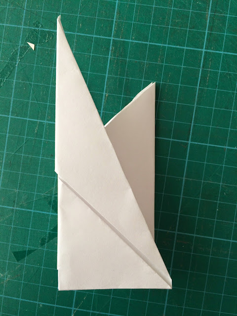
The concept idea for the final outcome I created was a visual representation of how something appears simplistic from the outset and is often viewed by onlookers as unconsidered minimalist design with no real thought behind it. But infact it is made up of complex design stages to arrive at this final outcome. 

The product I created makes use of 3 primary coloured paper stocks that represent the 3 main areas of the design stage (Research, Development & Final), bold and contrasting linear lines make up an abstract interesting aesthetic working with the shapes of the physical construction while creating a series of coloured triangles and squares that represent the more detailed design stages explained in a colour co-ordinated key. The square representing the final stage, the use of a square shows how the triangles/design stages all interlock to create this final outcome/final design. 

The semi translucent strap shows a snapshot of the interior of the design through a swatched colour scheme and shape system. 

When unfolded the construction shows an array of different shapes from different angles but when folded together all comes together to create a complete, structured and simplistic final outcome showing how all complex elements/design stages come together to create a deceivingly simple idea. 


Evaluation 
The final outcome I arrived at was a well received product and a massive improvement from the original construction I presented in the starting stage of the project and I feel along with a mutual agreement from peers that it communicates the intended message in a visually pleasing outcome. Due to the timeframe I had and the fact I overthought the whole process I think theres obvious flaws that go alongside the positives of this final piece.

Positives of the project are the concept idea though, I feel its a very strong concept that had lots of milage for further development but the outcome I created communicated this concept in a clear way. I like how the design can be viewed from different angles and lots of shapes can be seen but when folded up it hides all these elements in a well constructed fold.

Using 3 stocks could have been a problem with creating an accurate fold and construction  when it came to cutting and sticking the panels together I had to be pin point precise one example was that I had to line the black lines up on the blue and yellow panel, but I feel for a hand made product I constructed it well and I am happy with the paper stock I used as I did try out other tones and textures of stock but wanted that bold and vibrant tonal colour value with a light tint so typography could contrast and remain legible and readable. The fold also stays relatively flat with no bulging or miss aligned panels. 

I like the simplicity of the type and key system I think the key system itself works well even with the random arrangement of the color triangles and squares it brings it all together nicely.

Aesthetically I like how the linear artwork creates an abstract complex aesthetic that creates shapes for the key in its negative space. When the construction is unfolded these visuals are obvious and work to present the concept of complexity within the design stages but when folded they support the construction and concept by presenting minimal visual aesthetics and a simplistic construction. 

The colour stocks work well presenting primary colors well, they work well alongside each other which was an important factor they don't clash they support each other tonally. 

The downsides of the project were due to the limited time I had and the production methods I chose.

I feel if I screen printed the colors onto the stock they would have come through more true and consistent, with the coloured stocks having different tonal values they changed the colors slightly so there was slight tonal differences with the key diagrams and the actual shapes this is a minor detail it isn't an obvious thing but obviously It would be better if they matched perfect. I suggested using little cut out squares of colour if I did this too it would have maybe worked, or maybe vinyl sticker shapes? 

I would have liked to have the construction stag folded without the need for a strap, if I used thinner stock maybe I could have achieved this but it may have arisen more problems when folding the pages out as to represent shapes they needed to be ridged so this was a catch 22 in that sense. 

I I had more time I could have experimented with more typography and layout ideas, it works well, nice and simple and well presented but I could have tried finding a typeface that suited the abstract shapes within the structures aesthetics, instead Futura was just a safe bet that worked due to complete readability and legibility with a slight hint of contemporary aesthetics that fits with the abstract construction and bold colors. 

The strap could have been made better, from the front it looks good, but the back due to been stuck with double sided you can see a slight tacky texture through the translucent tracing paper, maybe with a more commercial constriction purpose this could have been avoided, maybe use some type of hot glue machine?

If it was reproduced commercially it would be difficult to do on a budget due to the 3 paper stocks and complex shapes so I feel hand made is the best method I could make this, laser cutting the panels would achieve a more accurate finish though so this is a consideration the next time I need pin point precision, along with the use of screen printing or vinyl stickers for the use of shapes.

But overall I am happy with the outcome and enjoyed the project minus the intensity and the fact I over thought everything.

Monday, 6 October 2014

Final Idea Development

Final Idea Development

Now I have my basic structure mocked up I can begin looking into how I am going to translate my content into a visual collection of either, shapes, colors or patterns. Or a combination of the 3. 

As mentioned in the crit I have a key to translate the design stages, from my design process flow chart I narrowed down to 6 Key precise stages.


The color choice of Red, Yellow and Blue is based on the primary colors, and rounds these 6 stages I have already narrowed down to into 3 main stages wich contain substages within. Research (Problem, Inspiration, Ideas) Development (Idea selection, Feedback, Idea perfection) & Final (presentation & evaluation). Here is the mockup that I will begin creating content for. 

Template to work from for each separate piece. 

I mentioned in the crit and my concept plan that I wanted to try out patterns to create a key type system that represents each of my design process stage. The idea of repetition of a similar element was a common theme through my rough sketches and I quite liked the idea of lines as I could create a number of abstract shapes within the random alignments of lines which would be cool to represent my concept of how all things come together to make a final outcome. 


Began digitally reproducing a series of repeated primary shapes to stick with the ongoing theme of primary colors to represent important and significant design stages. I placed these shapes into representations of a larger shape i.e. triangle made of triangles. Not keen on this so I didn't really keep it going much from here. 

After talking to a peer about the ideas for patterns I had I brought up the line idea again and how creating a pattern with lines allowed me to create shapes within the interlocking lines. This was received by him well and I'm happy with the first outcome and feel potential in this idea. 

Before scrapping the primary shapes idea I had a look how it would look in conjunction with the other panels in a digital mock up with mocked up card stocks.

While sticking with the primary color theme red works alot better with the yellow and blue panels here tonally they all balance out the green had a bit of a clash in tone. 

Beginning to put colors into the interlocking shapes created with the negative space from the series of lines. The idea of a square is to represent the final stage, as 2 triangles make up a square it seems conceptually relevant to the idea of how all elements add together to create a final outcome. The triangles are the in-between stages that interlock together to create a final outcome.  

Mocking up digital panels with a lighter tone of red, creates a nicer contrast allowing the brighter tone shapes to stand out more. This may be a problem when it comes to printing though as I'm using colored stock and not relying on printer ink to fill the paper with color as the effect really isn't the same. 

Trying different color combinations out between the too side panels. 


Prefer the lighter stock, my printer run out of ink but in terms of clarity of the lines the contrast with the lighter stock creates a better aesthetic outcome. An idea to represent brighter colors on the stock due to printing issues with the colored stock altering the color output is to cut the shapes out of colored stock and stick them down. 


Messed up here with the wavy line going across the bottom of the construction! I don't want anything visible just the 3 colors in a tapering system. 


Im happy with how it has all come together though in terms of how the lines and shapes printed onto the construction work alongside the shapes within the folded product. A nice contrast of physical shapes and printed lines and shapes within the negative space of the lines. 

I need to alter the wavy lines so they don't show through when the construction is folded so this was the first alteration I made. The templates were ready for typography and the key applying. 

It was easy enough adding the type, starting out with a clean, sharp and legible Futura in Medium Weigh and pt size 12. And the shapes positioned in alternative positions to add an element of motion to the overall aesthetic as I feel the lines in the design all suggest elements of movement so to keep this theme up would be cool. The idea of movement also is relevant to the design process, you move through the stages.


To add a more informative element I added numbers to show the stages but its pretty self explanatory with the fact that there ordered in a list, if i started putting numbers within the color shapes it would look messy and slightly confusing. 


Tried out Garamond serif font but the traditional feel of a serif doesn't work with the contemporary aesthetic of this design and the boldness of the lines don't lend well to the delicacy of serifs. I also tried adding a little structure and organization to the layout by positioning all the shapes in the same way, I sort of liked the imaginary line it created for the type to fit on but for the overall look of the design it looked too forced, the larger shapes within the interlocking lines have a more random and organic feel to there alignment. So back to the random arrangement of the key shapes!

Also began thinking about the strap that holds the construction together. 


Trying to add a little motion again inspired by the movement the lines and positioning of the shape elements create by insetting every other stage in by around half inch. Didn't work though it just looked like an unconsidered and loose arrangement of typography and effected overall readability. 


Back to Futura and settling on that for the type as it just feels right and flows with the whole aesthetic of bold lines, intersecting lines and a contemporary overall feel. Also back to the straight vertical positioned typography. I  then began thinking of designs for the strap. 

Its quite hard to decide on a favorite right now as Im printing on tracing paper so the aesthetic will change completely. So this selection process will have to wait quite like the top two though bringing the colors into the typography shows a little sneak peak of whats going on inside. 

Added a little more space with some positive leading to allow each design stage to breath a little within the negative space of this panel. 

The shapes alignment and spacing was increased a little as well to work alongside the new typographic arrangement. 
 

Narrowed it down to 4 straps, the colorful one that offers a suggestion of whats going on inside, I didn't want it to be high impact and ultra readable and legible so the contrast wasn't an issue here.

Offers a little more readability and legibility for some of the type highlighting out the main word "Design" with colorful elements. Not sure on this too much of a clash with the black and multicolored type. 

A very simplistic version here framed up either side with the starting shape and the final shape that represents the start of the design process and the final stage. Conceptually this is cool as it shows a sort of start and finish journey but not keen on the aesthetics of it.

Simple type only in black Futura pt 12. Very legible and readable but the black doesn't go with the bright primary colors within the paper stocks. I wanted to just show the primary colors really within the closed construction so I very much doubt I will go forward with this.

The back of these straps all had the shapes in an organized flush format on the back. Mainly for an aesthetic purpose for when the back of the construction is viewed but also again to offer a sneak preview of the stages outlines inside the product.

Final
Final construction photographed up, not keen on the photos using an iPhone doesnt create the best photographs will get some better photos of it but Im happy with the final outcome, I added an indent in the last minute to keep the strap from sliding about it sits flush within the indent I cut out and adds another element of shape too the construction.


This 1 week project has nearly come to a close, all thats left is take some better photos with a proper DSLR camera not an iPhone! And evaluate my final design based on: Quality, Construction, Materials, Process's, Limitations for both Time and Process's, Improvements, Best bits, Commercial Considerations if it was reproduced (Process, Finish, Quantity).

Specific Inspiration Research & Idea Development

Specific Inspiration Research 

The past research post I made covered a wide range of folding and crafting techniques, but non were specific to the direction of how I wanted my final product to turn out. It just gave me a flavour of the options I have in terms of linking a construction method to a certain concept idea. 

Now I have my concept idea based on "complex simplicity" covered more in the previous blog posts. I can begin to go back to the drawing board in terms of the construction method through the body of inspiration I have below. 

The main thing I was looking for in these examples was the use of color, shapes and constructions that appear simple when folded up or from the outset yet have lots of complicated elements within the outcome. 

Highlighted key points in red.

Bringing back this example for its construction technique, I love how when constructed it looks like a simple cube it hides all the complex angles, folds and shapes within the folded document. 

The 2 different main colors is nice too the pink and gold contrast in tone and color but the fact gold has a more luxury aspect and pink is more contemporary shows another element of illusion. The outside appears high end through the simple black strap and gold gloss stock, the inside contrasts with a bright pink tone. 


Back to GF Smiths tearing notebook, brought this back up as I wanted to use shapes win my outcome. I like how all these shapes are random in there appearance but mathematically all make up the shape of the rectangular page. 


This idea of all shapes interlocking to create one complete shape inspires me to look into other mathematical ways of how shapes all come together to create a simple shape like a rectangle. 

All these shapes add up to create a simple square outcome.


Mentioned in my crit I said that I was considering using patterns and colors to emulate the stages of the design process and explain these patterns and color in a key. This construction made up of triangular fold fits the bill for my concept in the construction due to the idea of repetition of a shape to create a complete outcome of simple aesthetic.

The color block and patterns work great too so this is something I am going to take forward into the content idea generation stage. 

I chose this example for the folding technique, I wasn't keen on the minimal loose aligned type on the pages, I don't like the use of colors they seem to clash alot but maybe the concept allowed this sort of clash. 

I like how when folded the shape of the leaflet is a simple thin rectangle but is made up of 3 shapes. Again fitting the idea of all elements coming together to create an overall shape. 

I love the use of a dark tone and a contrasting pastel sky blue tone it creates a very contemporary and precise feel making it have a feel of importance to the document. The ornate fold is relatively simple and portrays abstract shapes within the construction when folded out but it is just made out of a simple A4 piece of paper. Again showing how complex elements come together to create something quite simple, or it could be seen in the reverse perspective depending on the viewers interoperation but thats the beauty of art. Its open to interpretation so presenting this in my work would be cool.

In terms of typography the delicacy and simplicity used here would work well in my outcome as I want minimal typography and concentrate on the patterns, shapes or colors that explain the design stages through the keys definition. 

Nice use of a neutral stock and 3D box construction that fits the company its promoting. The fragile inspired logo and airplane is a nice addition to the content to join the concept of the construction and the imagery and type used. 

I like the interactivity within the construction it allows the user to create something there self, this is a nice idea to take forward.

Going away from construction inspiration I began looking into inspiration for my visual content. I mentioned in the crit I wanted to use either shapes, patterns or colors to communicate my design process alongside a supporting key translator. 

This example from Berlin & Rome studio Mjölk is a nice visual identity using shapes and colors and appears to be a sort of system of shapes and colors that almost appear to have movement through the different designs. Typography again is clean and minimal to not intrude on the imagery which is the main aspect of the design.

I said I wanted to use patterns, the patterns these have created are of very simple aesthetic but work very well in conjunction with block color and a well defined spacious grid system, allowing lots of space lets each pattern be appreciated and doesn't create an overall busy and crowded design. 


Nice contrast of monochrome colors with brighter tones here. 

Blok Design created a nice identity brand design for production company Lucky 21. The identity takes influence from the brands character which is said to be humor and passionate about there services. I think they achieved this through the use of geometric patterns and a simplistic toned down color scheme (grey, orange and blue) that isn't garish or clashy its subtle and works nice on a contrasting basis. It has a very light hearted feel but has a precision and accuracy too it. This is important for my design I want to present precision but I don't want a whole corporate feel going on.


Hey Studios Graphic Identity for Art Fad: Contemporary Art & Craft Awards is a great example of considered use of pattern, typography and colour. The products are intended for use of invitations the company used 100 different patterned materials and applied them to over 500 invites to create completely individual outcomes. I love this idea of using analogue materials and digital printing, but its a shame my time scale and materials at my disposal doesn't allow this. The colors used are very basic, block colors in a more pastel tone keeps the simplistic aesthetic flowing. 

Found this example of design work of a new blog that will turn into a regular resource for me FPO (for print only). 
These designs are very conceptual in elements that you overlook wich links strongly to my concept idea of how people view work but don't appreciate everything that went into it. 

The invites are for an event run by The Design Institute of Australia, the year this was created 6 designers presented 6 of there favorite projects. So design studio Büro North created the layout based on a 6x6 grid with intersecting lines on each laser cut card creating shapes of the letterforms. Another example of how complex elements can create something simplistic yet has overlooked elements within it. 

The idea of 6 is carried through with 6 different color stocks again keeping conceptually relevant and to get even deeper the designers laser cut a set of colors at the university they were taught at. Every angle as considered and this simple design has so much that went into it I am definitely using it as a main source of inspiration for my idea generation. 


Took a trip to the Baltic in Newcastle to view the Daniel Buren Exhibition who's contemporary take on fine art makes use of bright colors, tones and squares exploring lots of different materials that interact with both the viewer and the environment there placed in. Learning from this element of interaction and how things react in different contexts would add a more informed context to my work. 


Much like the cube illusion fold I made this room is one big optical illusion using mirrors and stained glass windows to create abstract shapes, shadows and reflections. One huge interactive installation. 

Idea Development
Taking forward main points of this inspiration I began to develop from the crit feedback keeping the concept idea going on and the idea of using colors, shapes and patterns to communicate the design stages within the final outcome. 

I specifically avoided the sketching phase of my usual development here as with these physical constructions it was hard to sketch out mockups of how it would look folded and the translated net so I stuck to an experimentation through lots of folding and cutting. Like the design process you don't know were your going to arrive and this stage really outlined that. 

The main focus I want to achieve though is bringing together lots of complex elements to create an outcome that looks simple from the outset. 

Tried a simple reinterpretation of this fold but its far too fiddly to fold it up into its closed up form resulting in crumpled and damaged paper so this idea was scrapped straight away.


Taking forward my main aim relevant to my concept idea for the construction experimentation I began trying to play with shapes within folds trying to make a construction that uses many different shapes but all add up to create a solid and structured final outcome.

I had no real guides to follow so it was al guess work so lots of failures happened. 


Beginning to get somewhere now, multiple layers and folds made up of a combination of shapes all enclosed within a rectangular frame when folded up. 

A more simple folded construction that only uses 3 shapes to make up the fins rectangle shape. 

Internally it had interesting shapes too when it was unfolded. 

Adapting existing constructions to extend the structure.

Adding extra panels on a new adaptation of the previous fold I made giving the construction extra depth with the addition of more shapes. 


The thickness of all the different sections doesn't allow a very clean fold to keep the construction shut. 

A simple strap keeps everything tight together and adds a horizontal linear addition that interacts with the 45degree angular lines within the fold. 


The final mockup I arrived at after lots of swearing, cut fingers and scrapped ideas. Its a shame i couldn't document all the failed attempts as I was in the zone a little too much to worry about photographing every mistake I made I just binned the idea and started a new one. It was hard doing this due to not following any existing folding guides as folding is relatively new to me so it was a huge learning curve. 

The simple paper strap that holds it all together will allow for a simple element of type, maybe information for the key I am using to translate the patterns, colors or shapes that represent my design process in the later stages of this ideas development. 


Folded out it has an element of complexity to it compared to when its folded up it looks simple and clean, this construction has presented my concept idea perfectly as I wanted to show "complex simplicity" to emulate how when a piece of design is looked at often all the complex stages that have gone into it through the design process are overlooked. 

I then split the structure down into its 3 main pieces and photocopied them and placed them in adobe illustrator.  Like the 6x6 invites it shares a similar construction process where its more of what you don't see than what you do see, the 3 sections are all a combination of different shapes and when grouped together begin to interact and create even more shapes. 


I created precise and accurate reproductions of the shapes and now have the sections saved for when it comes to adding content to them.


Everything now lines up perfectly thanks to the accuracy illustrator allows you to achieve through its tools and guides. 


Presented here is the final mockup that I will begin planning my content for. I chose Red Blue and Yellow due to them been the primary colors within the color theory. These 3 primary colors link to the 3 main elements of my personal design process, Research, Development & Final. The yellow is the inside cover with the larger surface area when folded out because if typography is going to be used the lighter tone of yellow will allow better legibility and readability of text. 

The addition of tracing paper came from advice people were giving other peers about the interesting aesthetic it can create with solid color stocks. I will experiment with this tracing paper strap and solid paper. 

Next stages are to begin developing my visual content (Layout, Patterns, Shapes, Colors, Type) and look into other shades of Red, Yellow and Blue.