Showing posts with label Secret 7 Bornslippy Responsive. Show all posts

Tuesday, 10 February 2015

Final Secret 7 Idea, Submission, Evaluation & Rationale

Final Secret 7 Idea, Submission, Evaluation & Rationale 

Feedback
After gathering insight from Elliot Brodowski, Joe Lindley, George Boreham and Danny feedback swayed towards the gritty and abstract monochrome and bright tones examples as they all felt it represented the track the best and the use of colour suggested 90s fashion & trend influence. A successful overall piece of feedback as this was an intended outcome. 

Concept, Rationale & Finals
To represent the Born Slippy track and how it was seen as an iconic track defining a generation within the late 90s I wanted to emulate a sense of nostalgia and recognition of this Era in subtle and suggestive ways.

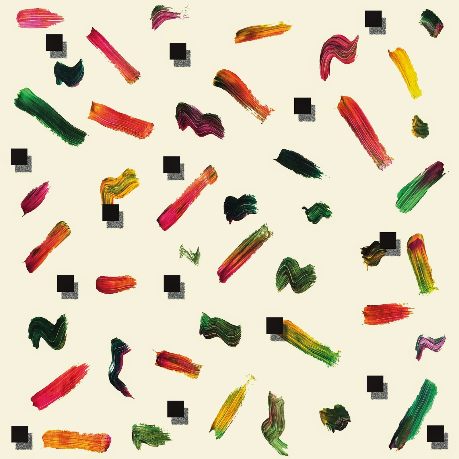
The concept here created a contrast that represented the lyric "Quick & Dirty" through the use of digital and analogue shapes, loose and ridged strokes, gritty monochrome textures and 90s Fashion influenced colors from the likes of track suits and neon windbreakers. Abstract patterns, colours and shapes interact with and contrast with these gritty monochrome textures to emulate the rawness of the track and its lyrical connotations and reference to the Trainspotting film while supporting this emulation and contrast from the lyric "Quick & Dirty" while still maintaining 90s recognition through the use of color and shape. 

Summed up in a short 140 character statement for submission.
Influenced by 90s neon tracksuits & the gritty contrast of analogue and digital music through the use of digital and hand drawn media.

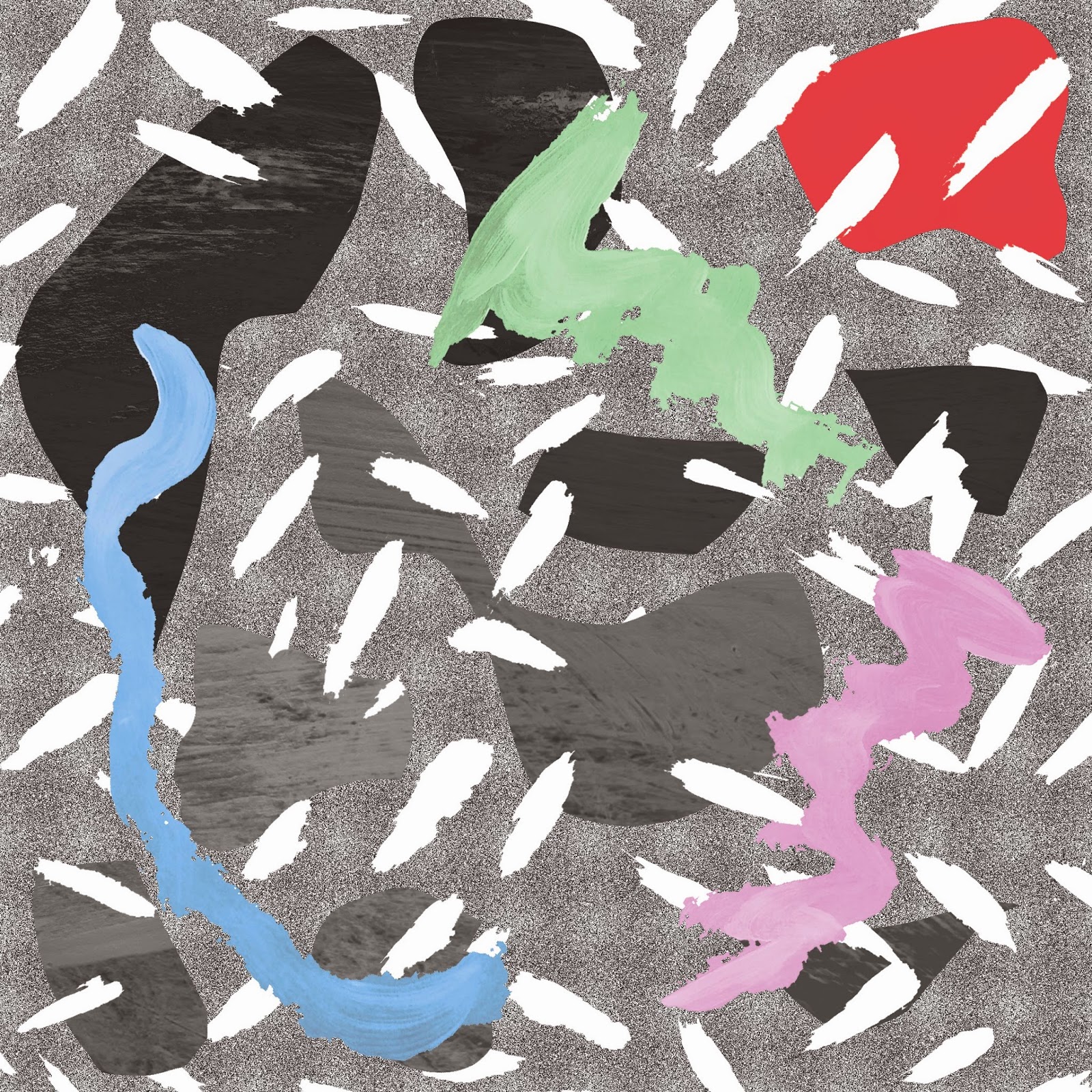
This idea is one of my favourites and will also be submitted as theres no limits to submissions. The concept behind this was influenced by 90s video games and the bright colours seen in 90s fashion. The analogue strokes contrast through random fluid squiggles & ridged lines that interact with digital square pixels to represent the contrast between "Born Slippy" and its British translation "Quick & Alert".

Summed up in a short 140 character statement for submission.
Iconic 90s track so I took influence from 90s neon windbreakers and pixelated video games and the contrast between the track name and its translation to "Quick & Alert"

Evaluation
I enjoyed this project a lot, although intense with me achieving a final result within 8 days I feel it showed how well I can manage my time by effectively using feedback and contextualisation of ideas and influences to swiftly develop and refine finalised and inform ideas based on strong concepts. 

When it came to concepts and ideas I thought of diverse ways of tackling visualisation of the Born Slippy track, by fully exhausting contextual ideas and thumbnails I was able to take elements from all my scamps and initial ideas to feed into produce more informed concepts and visual representations of these concepts. I used a range of visuals to successfully represent ideas to strengthen concepts, particular attention was paid to the use of interaction of colour theory.
By using:
Color & shape as a method of connoting the 90s era through specific influence of fashion.
Analogue and digital textures to create texture and present a gritty aesthetic relevant to the genre of the track and connotations it has with its lyrics and reference to the Trainspotting film. 
Using contrast of tone and hue to maintain feelings of contrast influenced by ideas generated from lyric analysis. 
Contrasting shapes using vector square and analogue strokes to represent elements of video games and fluid motion that references contrasting lyrics "Quick & Alert"
I enjoyed using analogue techniques and producing more experimental work, it was a good opportunity to learn new techniques and process's as apposed to my usual conceptual and minimalist style, I relied on the use of color and use of drawing technique to express emotion and concepts. 

All in all I want to continue looking into how to create recognition of ideas like time eras that consider cultural and social ideas when researching for idea generation. Carry on developing the use of analogue techniques and how it interacts with digital mediums, quite strong aesthetics can be achieved. 

Submission
Irritatingly there was a 140 character limit so an in-depth description of the work could be sent off, I kept it as brief and to the point as possible to best describe all the aspects of the design. 

Influenced by 90s neon tracksuits & the gritty contrast of analogue and digital music through the use of digital and hand drawn media.

Iconic 90s track so I took influence from 90s neon windbreakers and pixelated video games and the contrast between the track name and its translation to "Quick & Alert"

Got into the event too wich is a bonus meeting some needs of wanting to gain external recognition from this brief!

Monday, 9 February 2015

Visual Idea development, Production and Feedback for aiding final choice

Visual Idea development, Production and Feedback for aiding final choice

Concept start point.
Working from the concepts based on:
Look into working from the term Born Slippy and how it contrasts and interacts with its British Slang translation Quick & Alert. Visualise both terms in a contrasting way influenced by the lyric "Shimmering & Dirty".

Emulate the 90s as an iconic generation and era through feelings of nostalgia and recognition using influence's from:
Neon Signs and Neon Colours
90s Fashion & Fads (Striped sweaters, Gingham, Bandana, Graphic Tee's, 90s video games, Windbreakers, Bucket Hats, Tommy Hifieger, Ralph Lauren, Starter Jackets for a few examples) 

Emulate a whole weird and random feel that references a drug experience through exploration of Anxiety, Euphoria and Music. 

Scamps.
I began to produce 40+ rough initial scamps to begin exhausting all possible areas or targeting these concepts individually and combining bits and pieces of the 3 concepts to produce a more informed and refined idea that could be developed further. 

Analogue ource patterns & Shapes
I generated a selection of patterns, textures and shapes to interact with the digital productions I made to create a contrast between gritty and fluid analogue drawings (Born Slippy) and precise (Quick & Alert lyric) digital imagery and manipulations. 

The use of colour was heavily influenced by 90s fashions while the whole aesthetic maintained that random and abstract feel the track denotes. 

Refined concept idea and visuals 
The favoured 12 ideas that had mileage to work from either solo or taking ideas and visuals from each other to aid a further more refined concept, the main concept been worked on now is:

The idea of emulating the connotations the underworld track has with the weird, random and abstract film Trainspotting through abstract visuals that will be developed on using 90s fashions and interests as an aesthetic influence while creating contrast influenced by the lyric "Shimmering & Dirty". Supporting this will be the emulation and further contrast denoted through term Born Slippy and its British Slang meaning of "Quick & Alert". 

This concept will be visualised through the development of:
The use of analogue and digital drawing techniques to create a random and abstract aesthetic. 
Using pattern and use of shapes to emulate 90s fashion in an abstract asthetic.
Using 90s fashion and trends as a reference for the use of colour theory and interaction to create feelings of nostalgia and recognition of the 90s as an Era through the use of color. 
Use some sort of weird photograph to denote the weird lyrics in the song and the trainspotting film. 
Use of squares to represent pixels to reference 90s video games and the whole digital feel relevant to the music genre im designing for. 

Development & Production
To emulate the "acid bear" lyric I cut out pieces of paper, using paper allowed a random outcome in terms of shapes, contrast was achieved between sharp edges and smooth curves to help subtly keep with the concept, these shapes then acted as a way of making abstract patterns.

Playing around with an entirely abstract pattern and a pattern that subtly represents a bear emulated a strange lyric in quite a relevant way in terms of past influences gathered in the research stages, it looks too child like with entire digital imagery though, so there was no point addressing the colours to denote the 90s Era as the aesthetic just wasn't working. 

Loosening these abstract shapes up into more fluid and spacious arrangements not only give better use of the 184mm x 184mm space it also allowed a visual appreciation of the shapes and through experimentation with placement some nice interactions between the shapes were achieved resulting in some good abstract patterns that had contrast in tone, shape and line to further work from. 


Using the paint texture I created influenced by 90s neon windbreaker colours helped maintain that feeling of contrast to represent "Shimmering & Dirty" and the contrast within the term Born Slippy and its meaning "Quick and alert" which suggests a contrast of movement through the idea of slipping and been quick and alert, both entirely different movements. 

Before introduction color it was important to get the texture effect right so the paint texture was not as visually obvious as "paint" it needed to be abstract and quite inquisitive in its appearance to give off that random reel. 


To maintain the contrast using analouge and digital and to give off a more gritty asthetic relevant to the connotations of the song, its lyrics and the film it represents a grey scale noise effect was added and a selection of the analogue and random paint strokes I created. 

To arrive at the coloured section of the shape a few tests were made in greyscale to maintain balance, a large area of colour would create too much of a distraction and unbalance the composition as it has a certain structure to it now through the addition of the analogue strokes. 


The pastel blue hue worked well with the monochrome scheme, not too much of a contrast was created to draw attention away from the detail and abstract pattern and shape. More abstract analouge strokes were added, this time the color was applied in an overlay fashion to maintain subtle recognition of the texture to maintain that gritty feel and contrast between analogue and digital. 

Trying out a block color background was clearly never going to work, it was far too overpowering in terms of contrast of extension within the colour interaction. 

This GIF visualises a number of pattern & colour experimentations using:
Different shapes for the background with the use of the paint texture.
2 Different analogue strokes on the front of the design, some more organic and random, some more pointy and rigid to emulate that quick and alert feel. 
A few colour variations subtlety influenced by 90s clothing 
I need feedback on the best design out of these before deciding what design to submit. 

Taking the abstract shapes to create further patterns within interaction of a different set of analogue lines/double dashes allowed me to create a much more high impact psychedelic influenced abstract aesthetic and outcome. 

By adding a multi coloured gradient over the analogue strokes  I could maintain this neon tonal range within the colours to give off the 90s neon windbreaker/sweater influence, combine this with the contrasting colours and abstract use of shape a very psychedelic pattern was created. Very relevant to the tracks genre and denotations with drug references, while still sticking to the concept at hand. 

Adding a gritty noise texture like the previous idea didn't work, and the blue didn't seem to work in terms of emulating 90s clothing colour schemes and the neon feel.  

This version seems to work the best, the white breaks up the heavy use of bright tones adding a nice tonal balance to the overall piece allowing the blue, orange and red gradient to be used without been overpowering. A nice outcome that represents the concept well in terms of use of colour, abstract shapes and digital and analogue image and pattern. 

Taking the strokes used in the first example in there original multi coloured form influenced by the colours used in 90s clothing and neon lights an organised yet abstract pattern was created, to support the idea of creating contrast some vector squares to represent pixels from 90s video games were added. 

The organised arrangement works perfect in conjunction with the random and abstract analogue strokes to help maintain this feeling of contrast, the colours all denote the 90s era, but it lacks a certain grittyness too it. It has a much too happy tone of voice wich doesn't resonate well the grittiness of the film. 


Playing around with smooth gradients gradients and block colour backgrounds in subtle pastel tones to create a minute contrast of tone to support the bright and vibrant use of colour. Using noise gradients created quite a clash, it achieved that gritty feel but aesthetically it clashed and it had a very digital feel too it, I wanted to avoid this I wanted balance between analogue and digital, same with the use of the noise and the paint texture background it all looked unconsidered, out of place, unbalanced and clashed.

The cream compliments the colours, the tonal difference aids the contrast of extension on the multi coloured lines making them pop a little more. 

The blue does this equally well though so im unsure on what one to go with so some peer feedback would be usefull, blue seems to flow well with the rest of the colour scheme though. 

What seems like a good idea in your sketches turns out to be terrible in digital realisation, this was one of my favourite ideas and it failed instantly.

The use of vector shapes initially created quite an effective pattern, using contrasting smooth and angular shapes worked well, the random arrangement in a structured way worked equally well too but the colour influence was coming from bright tones to represent the 90s era and neon. 

It felt far too digital and pixel based, linked well with the idea of 90s video games but overall when color was added it looked far too childlike, looking like it belonged more within the brand image of a kids building block toy set. The wrong target market, the playful tone of voice way off from the grittiness I wanted to achieve and it didnt have an abstract or random appeal either even when the analogue strokes were added. 


Whats next
Some feedback from peers would be very helpful on where to go from here in terms of the best outcome and what one best represents my concept and resonates well with the Born Slippy underworld track.