Showing posts with label OUGD403 Studio brief 2. Show all posts

Wednesday, 13 November 2013

Illustrator Typeface Final

Illustrator Typeface Final

Presented here is the final outcome of my illustrator brief. I was required too create a manipulated typeface on a word given to us at random and style this around a given typeface. Mine been Garamond and Symmetry. 
The typeface followed suit from this letter from my 10 examples based on symmetry. 

The concept is to use a visible axis point on diagonal strokes or whatever axis point can be used on other letterforms to keep this concept of mirroring and symmetry going on. Through development on elements that didn't have reflected serifs I created a pointed splice on the same angle as this, this is evident in letterforms: I, J, K, F etc. 

As you can see the concept run throughout having a visual angular stroke on most letterforms. It seemed to work best on square, sturdy structured glyphs, on some letterforms the splice had to be repositioned horizontally or vertically but everything still remains constant and still emulates symmetry. 

The outcome was printed from the digital print resource in a 4x7 grid on an A2 stock. I placed my word and typeface in context with a line of symmetry that reflects both words along a baseline point. A nice little finish to apply my concept to something in context. 

I am happy with the final outcome, it obtains subtle changes within the anatomy like simple squaring of the serifs to create a clean and crisp glyph that supports the dismantling of elements and reflection along a set 45degree axis/mirror point. It maintains a good consistency the letterforms that I don't particularly like are the S, and the H. If anything stands out it these due to there obvious horizontal separation. But it still portrays the concept well. What I would like to do with something that has these clean, architectural kind of sharpness within its aesthetics is print it on acetate. It would create less distraction away from the letterforms and create a very clean overall feel, and would also emulate an actual mirror. It would be interesting to create a stencil from these too, as it has that kind of stencil feel. 


Friday, 1 November 2013

Illustrator Typeface Development

Illustrator Typeface Development 

I changed the Z to match the concept of symmetry and a mirror point, i copied and pasted, rotated and replaced the top serif with the bottom serif. This creates a more structured, sturdy outcome and emulates symmetry concept more.

Before

I began by creating X Y Z, these follow obvious anatomical manipulations but still maintain consistency. So this has give me confidence the idea will work on most letterforms and they will still work as a set. The same method used with copying the serifs was used in the X.

When this splice was applied to the F and E they both represented the same outcome, so this problem needed to be sorted to avoid confusion.
The same applied for the D, so the serif will be added into points to create a more distinguished glyph as presented in the E. 


I underwent certain constraints in a sense were there wasn't a visual axis point i could use for mirroring the serifs. I erased the left hand stem to create a similar feel, it worked but looked a little too forced in a sense that the crossbar felt out of place.

I removed the cross bar and this worked well. It still represents an A and the serif feels like it is been reflected from a vertical invisible axis through the the centre of the apex. 


Created symmetry and mirror with serif points by squaring bottom off to match with top. 


Much more symmetrical outcome ready for splicing. 

Subconsciously adapted splice point idea into the concept which flows well with the axis mirror point idea. I like that this angular 'cut' or 'splice' has come into it, its nice to collaborate 2 of my favorite ideas into one overall concept and helps strengthen the overall feeling of splicing and mirroring elements within the typeface.


After discussion with a fellow student I thought of changing the axis/mirror point were necessary and were it fits(crossbar, diagonal stroke etc). Instead of creating the effect seen above the below element emulates the feeling of symmetry better. The F above has a nice feel too it but legibility is an issue it could also be an E so i will create better legibly and a flowing concept by applying the below to the sequence of letterforms.


Adding an angled splice like previous letterforms has a better appearance and keeps the 45 degree angle splice seen throughout in sequence. This 45 degree splice can be seen through letterform mirror points as well as splices and cut offs. 


Duplicated the right hand serif of the T crossbar to create a better feeling of symmetry before splicing the mirror point out. I added a section of crossbar in myself using the shape tool and unite pathfinder tool. The same technique of mirroring elements was used on the U and N too. 


Example of typeface in a 4x7 grid with Garamond Symmetry used as a footer to put the typeface into contest. Readability is good once letters are placed into context. 


This T is an adaptation of the above wich will be used in the final printing, it maintains better structure by adding a section of the stroke in as compared to before were it felt a little like it was floating and wasn't really distinguishable as a T.

Friday, 11 October 2013

Design Skills - Alphabet Soup - Illustrator

Design Skills - Alphabet Soup - Illustrator

Today we got studio brief 2 set, Its an opportunity to develop our analogue drawn designs into a digital outcome. We are required to produce a full range of alphabet from one of the 10 examples created for the alphabet soup brief 1. The digital outcomes will be printed in black and backed up by visual investigation and development and presented on an A2 sheet following a 4x7 grid. 

Experiment, develop, make mistakes and explore!

I will bring elements from illustrator workshops into this project to create more advanced professional looking outcomes. 


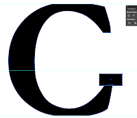
Scanned analogue of font in for manipulation guide. Expanded the shape through Object to allow typeface manipulation of bold 100pt Garamond.


Using pathfinder i created a shape matching the angle of the Diagonal stroke, this will be the the visible mirror point based on an axis of the the letterform. This concept will be used throughout using the pathfinder tool mostly. Pathfinder and minus front was used here to deleted this shape from the actual letterform.  

This was the outcome from deleting this section.  

Same method applied of minus front shape from pathfinder. 


To create a more angular acurate shape i squared off the terminal ends of the strokes. I created the shape to add onto the stem and used the unite pathfinder tool with both the font selected and my additional shape.

I then used the minus front tool again using pathfinder to square off the bottom and top of the stem and serif top and bottoms.


This created this final outcome. This set of techniques will form the basis of my A-Z any other methods used will be shown here.