VERY Rough Initial Ideas, Interim Crit & Progression Plan
Today I had my interim crit for the logo project. The main problem here was that I had no chance to search for inspiration images and concepts so it was pretty intense only having an evening to think of a solid idea to present to receive useable feedback on to develop on. I feel I got a fair bit of help to advance on from though.
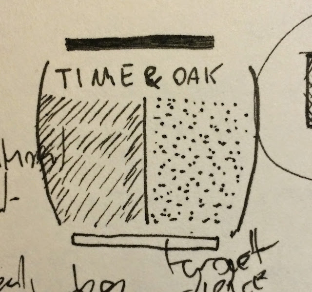
Taking into account the aspect of customization, a suggestion of scientific elements, playing on the ampersand idea, playing on the idea of time & oak and creating a visual that includes the outline the outline of the whiskey element.

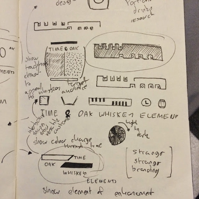
An abstract representation of me presenting time and oak in a periodic table element. Showing a suggestion of 2 different textures to create a visual contrast. Legibility of the logo is a n issue but the Time & Oak isn't the name thats important thats just background to the concept of "Whiskey Elements"

Very rough playing with ampersand glyph I like the op one that has the wood grain and hour glass grains showing a suggestion of time & oak in an abstract alteration of an ampersand.

Playing again with the idea of wood textures and sand grains to represent time & oak within the abstract suggestion of a traditional oak barrel containing the two textures.
An idea suggested by Danny using the visual of the whiskey element offering a sneak preview of the product within the logo. The slits that have been laser cut out have been manipulated in my drawing to make room for the individual characters required to spell "Time & Oak".
My favorite Idea At the moment but this will change.

Abstract representation of the whiskey element split up into 2 to show the 2 main element. Doesn't really have a conceptual point behind it I just like how it looks and feel it has nice aesthetics so if it can be tweaked into a good concept idea that would be good!

My favorite concept idea here presented in a starting point aesthetic, I really like the idea of representing the idea of customizable whiskey through a logo system that is versatile and can be interchanged and customized through a system of icons and typography.
This initial idea just shows the most obvious signifying symbols of a drink of whiskey and the concept behind the Whiskey Elements project. On the left side Ice and a Glass showing how whisky is drunk, on the right symbols represent time and oak. Linking them together is the whiskey element itself showing how they all come together.
Needs some work but has lots of potential.

Crit Feedback
Shockingly my feedback was alot more positive than I expected due to the low quality and effort I put into the sketches as I wanted to get a range of ideas down I wasn't really concentrating on aesthetics.
Everyone liked the fact I played off the Time & Oak words to develop ideas from and felt it had further potential but I hadn't really fully explored it fully.
Elliot Brodowski really liked the aesthetic of this and felt it had potential to work from.
Me and Simon had a quick conversation about the idea of creating cliche design work, I wanted to avoid that typical traditional feel through the logo design as I felt it had been overdone but he mentioned how it would fit better so I think I am going to stick with the Traditional feel, Joe agreed too looking at old whiskey bottles would give me a nice aesthetic to work from. It would appear more to the traditional whiskey drinker too as it is generally targeted at an older audience so doing a contemporary design wouldn't fit this target.
The concept idea behind the project is to enhance a cheaper product, it was mentioned how this was a good promotion point for the product so if I could subconsciously or consciously implement this enhancement into the aesthetic of the logo this would be good.
I mentioned the idea of representing a sand timer/egg timer but said it was too cliche for the idea of time but with it been for a whiskey project it wouldn't be as cliche as I initially thought.
Rosayln Mentioned looking into Portland as a cultural reference point to suggest a sense of heritage somewhere along the idea generation stage like colors for example.
Talor mentioned presenting an idea of colour change over time so I came up with this quick sketch of a clock face with block colour sections getting darker.

I also created another VERY rough sketch to represent customizable symbols with interlocking elements of an ice cube, whiskey glass and the wooden element. Kind of liked this.

Progression Plan of Action
Look into whiskey bottle labels and packaging to influence a primary source of inspiration on developing a traditionally influenced whiskey aesthetic.
Look into Stranger Strangers past branding, Simon mentioned they have done some nice alcohol related branding.
Look into Portland Americas Heritage and link it into idea development.
Look through the book LOGO I have at home to inform myself on how to create a successful logo along with looking at the FUNDAMENTALS OF BRANDING book to influence the brand proposal I am creating as well.
Begin working on and developing logos based on Time & Oak, the idea of visualizing an element of enhancement (colour, taste, chemical make up/filtration) and the idea of customization. All these were strong ideas and aesthetic logos that were positively received in the crit.
No comments:
Post a Comment