Visual Research
To help inspire my design idea generation for both the concept and aesthetic I began looking at some online sources and some books to give me an idea of what kind of 3D packaging or more flat leaflet outcomes I can create from folding techniques.
I don't have a specific concept idea so this is just a flavor of what type of constructions I could create. Once i narrow down a concept idea I will begin investigating folds and constrictions relevant to my idea.
I know we need to produce a "leaflet" but it doesn't have to be limited to the standard flat folds most leaflets share.
From the book Promotional Packaging and Design by Cristian Campos.
A simplistic example of how a flat piece of paper can have added definition with a series of cuts and folds, can turn something quite ordinary into something more ornate. Here the designer uses an alternative alignment of fashion photos with analogue marks creating an organic contrast to the photographic aesthetic.
The fold would be a good one to use if I was aiming for a simple and clean presentation of my design process diagram.


Really like this, for its simplicity within its construction and its minimal design elements with a simple ornate serif header positioned in lots of negative space, it works though due to the very simplistic construction method. I like the idea of a container, I could create the design stage on separate pages with corresponding design and type on each sheet and hold it within this container.
I am going to take note of the neutral brown tone and contrasting colorful elements within the sheets it contains.


But it reveals something with a complete different aesthetic, the purpose of the product was to be an invitation for an event and this to me certainly stirs curiosity. I love the pink and how it contrasts the whole elegant and luxurious feel taking the idea of it been a jewelry product and turning it on its head to something more contemporary.
The fold itself is something I really admire though, I like how its initially simplistic but upon unfolding it it creates very interesting shapes and shows a certain complexity which contrasts nicely with the simplistic initial impression something I really want to take forward is this idea of complex simplicity and creating a construction like this would work well.

The shape it leaves at the end is also very nice, and would leave good space for good presentation of information within the blank space.


I seem to be drawn to the idea of creating boxes, these examples look nice i like from a birds eye view so many different shapes can be interpreted form the construction. This again shows how complex elements can come together within a quite simple structure.

These psychedelic coloured constructions have huge impact using series of coloured shapes to create a retro pattern, alongside it is the equally complex and abstract fold. I think its important to link the content with the construction and this example really shows that.
Theres no point creating an extravagant construction with all complex elements if your design process is functional and precise and vice versa.


I like this example for its simplicity within its construction yet the contrast it creates within the bright tones and patterns. The fold that contains the inside piece is simple yet when folded in certain ways creates interesting shapes I want something like this. Something that appears simple but through interactivity could create different visual aesthetics.


From some Youtube Tutorials from the Laurence King publishing Youtube Channel.
I found these videos from looking at the corresponding book. They explain how to create certain folds. I chose these 2 folds for the fact that they are created from quite complex starting points but the end result is something structured and simplistic. This fits well to my design process, how complex things come together to create a final structured outcome.
A simplistic example of how a flat piece of paper can have added definition with a series of cuts and folds, can turn something quite ordinary into something more ornate. Here the designer uses an alternative alignment of fashion photos with analogue marks creating an organic contrast to the photographic aesthetic.
The fold would be a good one to use if I was aiming for a simple and clean presentation of my design process diagram.
Another simple construction with an ornate curve within a quite angular construction, I like this contrast within the shapes of the construction. The design on the package also has a contrast of complex floral style illustration with a simple uppercase header in a sans serif typeface.
Really like this, for its simplicity within its construction and its minimal design elements with a simple ornate serif header positioned in lots of negative space, it works though due to the very simplistic construction method. I like the idea of a container, I could create the design stage on separate pages with corresponding design and type on each sheet and hold it within this container.
I am going to take note of the neutral brown tone and contrasting colorful elements within the sheets it contains.
Another example of a container this time the document that is contained is a sort of concertina enclosed within a simplistic envelope style fold. Using a neutral color stock with natural colors from textures of plants creates a subtle yet organic color scheme, color is something I really want to take forward to strengthen the concept idea were possible.
This construction encloses a bound book. I don't plan on creating a bound book but alot of folds can be a little loose when folded together. Some don't seem to hold together that well. This construction seems to be quite ridged and strong when closed up giving a nice mechanical & tactile feel. Again I'm liking the neutral stock with contrasting color elements within minimalistic layouts.
From the Cut & Fold Book for Designers by Laurence King Publishing
This book shows more complex and aesthetic folds. These two arcs have a more organic origami feel and are more aesthetically pleasing rather than functional. This doesn't really suit my design process or the designs I produce at the end of my design process. I do like the way the diamonds are formed from a sort of grid this has obvious links with my design process using grids and structure in alot of my work.
But I don't think i will be using any ornate fold like this.
Itsnicethat
Amazing example of large scale paper folding crafts found on Itsnicethat along with the beautiful GF smith color plan sample book that uses tearing to achieve interesting affects to appear to be like some type of Japanese fold technique.
I chose this to show the extent and vast scale you can take paper folding and paper crafts too, this carpet created from paper found on its nice that named "we make carpets" by a trio of designers Marci Nolte, Stijn van deer Vleuten and Bob Waardenburg. Using origami crafts with a4 pieces of paper its an excellent example of how effective repetition can be on a huge scale.
The idea of repetition of a single element is what I want to take forward here, the combination of a simplistic element and how it all adds up to create a final outcome.
This was one of my favorite examples I found on the itsnicethat blog created by London studio Made Thought. It promotes GF smith, a company well known for creating an amazing range of papers and helping designers keep print alive through there latest color plan papers.
I chose this tearing notebook for the beautiful shapes and patterns that can be created through the interactive element of the book allowing the user to tear samples out revealing other colors underneath while not a fold I think theres something I could take forward with this idea of revealing and hiding elements and the interactivity with the shapes would link well with how the design process is a very interactive journey. Discarding something in order to reveal something else could be replicated through something similar to this shape creation system.
Found these examples off Pintrest.
From the outset this box looks relatively simple. Gloss gold stock with a black strap keeping the construction together and creating quite an elegant appearance that looks like it could contain some high end jewelry.
The fold itself is something I really admire though, I like how its initially simplistic but upon unfolding it it creates very interesting shapes and shows a certain complexity which contrasts nicely with the simplistic initial impression something I really want to take forward is this idea of complex simplicity and creating a construction like this would work well.
The shape it leaves at the end is also very nice, and would leave good space for good presentation of information within the blank space.
Another example of how complex paper folding can be these examples are extremely intricate and very delicate in there appearance and have an appearance that resembles ceramics to me. A very sculptural fine art type aesthetic. But this style of paper craft and this complex aesthetic doesnt really resemble my design style or my design process.
I seem to be drawn to the idea of creating boxes, these examples look nice i like from a birds eye view so many different shapes can be interpreted form the construction. This again shows how complex elements can come together within a quite simple structure.
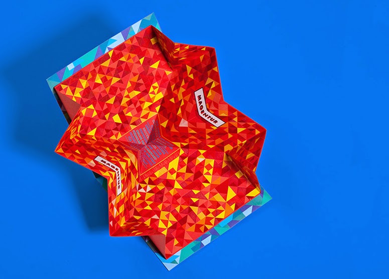
These psychedelic coloured constructions have huge impact using series of coloured shapes to create a retro pattern, alongside it is the equally complex and abstract fold. I think its important to link the content with the construction and this example really shows that.
Theres no point creating an extravagant construction with all complex elements if your design process is functional and precise and vice versa.
I like this example for its simplicity within its construction yet the contrast it creates within the bright tones and patterns. The fold that contains the inside piece is simple yet when folded in certain ways creates interesting shapes I want something like this. Something that appears simple but through interactivity could create different visual aesthetics.
From some Youtube Tutorials from the Laurence King publishing Youtube Channel.
I found these videos from looking at the corresponding book. They explain how to create certain folds. I chose these 2 folds for the fact that they are created from quite complex starting points but the end result is something structured and simplistic. This fits well to my design process, how complex things come together to create a final structured outcome.
No comments:
Post a Comment