Basic Web standards & Limitations & Considerations
From workshops with Simon and my own person investigation aided by the book HTML & CSS Design & Build - John Duckett & websites I have taught myself and been taught basic aspects of web design, its a completely new method of design to me so its all a big learning curve and is something I need to know for future projects or extension of projects.

Introduction to web
In 1990 a proposal was made for the first web page to be published online and on 6th August 1991 it came to reality at CERN based in Geneva & Switzerland. The precise location was a room over the border in France and produced by British computer scientist Tim Berners-Lee and Belgian computer scientist Robert Caillau.
The purpose was "to link and access information of various kinds as a web of nodes in wich the user can browse at will"
 The first web server was hosted from a NEXT computer that was designed and built by Steve Jobs.
In 1990 a proposal was made for the first web page to be published online and on 6th August 1991 it came to reality at CERN based in Geneva & Switzerland. The precise location was a room over the border in France and produced by British computer scientist Tim Berners-Lee and Belgian computer scientist Robert Caillau.
The purpose was "to link and access information of various kinds as a web of nodes in wich the user can browse at will"
Terminology & Acronyms
HTML - Hyper Text Markup Language. Is the standard language (code) used in building websites
HTML5 - Is a new type of language system using the same Hyper Text Markup Language base that helps old browsers read new coding systems and introduces new functions like embedding images, audio, video and interactive documents in a different way.
DHTML - Is a dynamic version of typical HTML, a site that changes content everytime the site is viewed.
WYSIWYG - What you see is what you get is a system used in dreamweaver offering a live coding preview of what the code will look like in visual output.
SEO - Search engine optimization is a method of trying to help your site appear at the top of search engine results when people search for relevant topics that your website may cover. Figuring out those key words that the end user may search is my main priority to achieve optimum SEO and the search engine will pick these key words from;
Page title in the < title > which is found inside the < head > element.
URL/Web Address
Headings < hn >
Text (Try repeat keywords at least 2 - 3 times)
Link Text
Image Alt Text
Page descriptions within the < head > element specified using a < Meta > tag. Should be a sentence that describes the content of the page. (not shown in the browser ouput) DONT TRY FOOL SEARCH ENGINES BY DOING THINGS LIKE ADDING KEYWORDS INTO THE VISUAL BACKGROUND OF THE PAGE IN MATCHING COLOURS.
HTTP - Hyper Text Transfer Protocol defines how messages are formatted and transmitted and what actions web browsers should take in response to various commands.
URL - Uniform Resource Locator is the global address of documents and resources on the world wide web.
ISP - Internet Service Provider is the provider of a persons internet services.
WWW/W3 - World Wide Web, is a system of interlinked HTML documents accessed over the internet and presented through web browsers.
WWW/W3 - World Wide Web, is a system of interlinked HTML documents accessed over the internet and presented through web browsers.
CSS - Cascading Style Sheets are used within HTML that gives me opportunity define aesthetic & design oriented decisions within the code. Making things look better through the use of color, typography manipulation & control how other elements work.
Skeuomorphism - "A skeuomorph is a derivative object that retains ornamental design cues from structures that were necessary in the original" Examples of this can be found in most digital medias these days and is basically a metaphor of a real world object like the newsstand apple use to present digital magazines.


Or the calculator on the macbook and iMacs. Apple make good use of these skeumorphic concepts.
Responsive Design - Introduced by Ethan Marcotte a web designer & developer. This is something introduced to us through a few workshops and professional visits and is a definite trend at the moment, the basic idea is for the website to "respond", "react" and "adapt" to a variety of media outputs using different screen sizes.

The grid - Much like in print based media the grid is important for the placement and arrangement of visual elements and how they are structured on the page. They help set consistent spacings between items wich helps produce a balance/structure and nice aesthetic within the design.
It benefits the end user by creating continuity between different pages that use alternative arrangements of visual elements.
It helps make it easier to keep the site updated adding new rodent to the site in a consistent way.
960 pixel wide, 12 column grid variations & in context. Knowing page dimensions before hand lets you work out specific guidelines for columns and modules benefiting my initial scamps & wireframes to gain an accurate rough idea of how the site would be structured.


Web restrictions (Size, Color, Fonts) - There are alot of considerations to take into account when designing a website, often the target market influences alot of these decisions. For example if you were designing a portfolio website for yourself you would expect the end user viewing it to have a modernish computer but this isn't often the case so to combat this its always good to narrow down to the lowest common denominator. Considering the oldest PC or Mac will help achieve a website that works consistently across all medias.
Size
Size is often a problematic consideration. Different visitors to my site will have different sized screens. The size of the screen is often considered through resolution's (dots/pixels per inch) making sure your site works on 640 x 480 & 800 x 600 pixel resolutions will show consideration for this lowest common denominator but the most common resolution and the one most developers start at is 960 x 1000pixels or 1024 x 768
1920 x 1080 pixels
1280 x 800
2560 x 14400
2880 x 1800 (220ppi) Retina are other possible resolutions.
Color
It is important to consider how colors are mixed through the screen output of RGB (Red Green Blue), its important to know that during the infancy of computer technology screens could only support 256 different colors so a list of 216 "web safe colors" were created so that consistency across all users viewing experiences were achieved.


Highlights a non web safe color, click and it changes it too a web safe color.


Size
Size is often a problematic consideration. Different visitors to my site will have different sized screens. The size of the screen is often considered through resolution's (dots/pixels per inch) making sure your site works on 640 x 480 & 800 x 600 pixel resolutions will show consideration for this lowest common denominator but the most common resolution and the one most developers start at is 960 x 1000pixels or 1024 x 768
1920 x 1080 pixels
1280 x 800
2560 x 14400
2880 x 1800 (220ppi) Retina are other possible resolutions.
Color
It is important to consider how colors are mixed through the screen output of RGB (Red Green Blue), its important to know that during the infancy of computer technology screens could only support 256 different colors so a list of 216 "web safe colors" were created so that consistency across all users viewing experiences were achieved.
The majority of modern computers now though allow the display of at least 16384 colors.
The colors Red, Green & Blue has potential for values from 0 - 255 to be displayed per color, adding up to around 16'777'216 options from the RGB range. Highlighted here are the options available through the color red alone.
Shades of grey or black can be output using equal levels of light though the RGB range in the screen, the higher the value the lighter the shade.
Color is often input through CSS and is defined using a hexadecimal (hex) code for the combination of Red, Green and Blue color values. The lowest value is 0 (hex 00) the highest is 255 (hex FF), Hex values are written as 3 double digit numbers starting with #.
Identifying these codes is important before coding so digital mockups and testing to find this color is important, photoshop has good tools allowing you to show just web colors.
Or use the entire CMYK spectrum and covert to the nearest web safe color.
Highlights a non web safe color, click and it changes it too a web safe color.
There are also 147 predefined colors recognized by browsers that can be used within coding http://www.colors.commutercreative.com/grid/ is a cool website that highlights all these names on one big color swatch page.
Considering color usage and color theory & interaction of multiple colors is as important a consideration in web design as it is in print media. And to create a 100% consistent website just consider the 216 web safe colors to the site can work across older screens but this decision relies mainly on the end user and the technology they use to view the site.
Fonts
A common consideration when choosing a typeface is take into account that a browser will only display a font if that font is installed on that users computer. Common ones that most people have are
Serifs:
Georgia
Times
Sans Serifs:
Arial
Verdana
Helvetica
Monospace:
Courier & Courier New
Cursive fonts based on handwriting styles:
Comis Sans MS
Monotype Corsiva
If the computer doesn't have the font the designer/developer choses its often useful to add alternatives font family into the code for the browser to fallback on. Or even that particular font classification e.g.
font family: Helvetica, Arial, Verdana, Sans -Serif. If a font isn't available on the end users computer or a font classification chosen the default the browser displays is Times New Roman.
CSS allows the @font-face to be used to display fonts that aren't installed on the end users computer, it works by specifying a path to a copy of the font which will be downloaded onto the users machine. Its important to have full usage license and rights when using this method, a few open source resources I found to look back on are:
www.fontsquirrell.com
www.fontex.org
www.openfontlibary.org
www.typekit.com
www.kernesr.com
www.fontspring.com
Another alternative way is to add the text into an image file format, this would be good for use as headers but no for body copy.
There are 0.7pts in 1px so when altering pt size through the pixel measurements consider this (12pt = 16px)
Web images & File formats
There are benefits & disadvantages when it comes to using image files in web, one important consideration though comes to the structure of the site, all images should be stored in a specific folder named images to keep things organized and running smooth.
JPEGS are good to use when theres a large range of colors within the image but make sure to compress to 72ppi (pixels per inch) or more common now 96ppi to avoid long load times on the site. The problem with JPEG is that it doesnt support transparency edits, a PNG file would be best for this.
PDF formats are good for multiple pages of images.
GIFs are good for small simple animations.
Vector files are often used for iconography within the sites navigation system.
Its important to compress images properly as file size can add up quickly and fill up your server space, causing faults with the website with slow load times and incomplete image representations.
Its important to think about the end user here as there ISP often has download limits within there usage policy, the longer a website takes to load the more bandwidth is used up from there data allowance.
Videos
When uploading videos if you are imbedding them its important to compress them in lossy format, a simpler way of doing this and saving space on the server is to use an external provider like youtube or vimeo to host the video and link it up to my website.
Website planning
There are simple steps to follow when planning a website from scratch before even beginning to code.
There are simple steps to follow when planning a website from scratch before even beginning to code.
- Figure out who the site is for. Who is the Target Audience? (Age, Male or Female or both, country, urban or rural location, hobbies & interests, what device they may use to access the web)
- Why do people visit the website? Intentions and goals from visiting the website.
- What are the visitors trying to achieve from visiting?
- What information and content they need to fulfill there needs?
- How often they will visit? Does it need to be updated often?
- Create a basic site map, organize the information into sections and pages.

- Organize the content, prioritize certain parts. Work out how it will be shown in priority order considering visual hierarchy something I touched on last year considering things like size, color, use of image, typography etc.
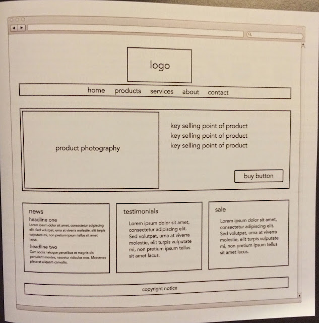
- Create Wire frames, a simple sketch of key information and visual elements of each webpage helping understand how it will use up the page space. Consider using a grid system to organize this content.

- Design the navigation. Concise, Clear, Interactive, Consistent, Selective, give it all context and meaning.

Its important to make all these decisions before coding so you have every decision ready to input into your coding software achieving a more efficient workflow. Creating wire frames that are perfectly scaled down considering all detail will help build a more accurate mockup.
A good tip if I ever do external work is to get the client to sign off the scamps and wire frames you present, if they sign off and agree to this plan there is no nasty come backs when it comes to presenting the digital mockups and they demand changes. I would be then in my rights to request more money for these changes, more often than not once more money has been mentioned they will decide they are happy with what you have produced and you can go on and finalize the site.
Basic HTML Coding
I used this website "www.w3schools.com/" to teach myself some basics at my own pace, it gave the option of live coding and viewing of the physical outcome of my code through tutorials and guides providing me with a brief intro into coding.
HTML stands for Hyper Text Markup Language, a markup language is a set of markup tags.
HTML documents are made up of markup tags.
Each HTML tag describes different contents.
HTML tags normal come in pairs
h1 = Heading
p = paragraph
<p> = open tag
</p> = close tag (p can be anything)


HTML documents are made up of HTML elements.
There written using a start tag and end tag with content in-between as seen above.

Basic HTML Coding
I used this website "www.w3schools.com/" to teach myself some basics at my own pace, it gave the option of live coding and viewing of the physical outcome of my code through tutorials and guides providing me with a brief intro into coding.
HTML stands for Hyper Text Markup Language, a markup language is a set of markup tags.
HTML documents are made up of markup tags.
Each HTML tag describes different contents.
HTML tags normal come in pairs
<!DOCTYPE html> starts a structure/type declaration.
Visible part of the HTML code is placed between <body> </body>
h1 = Heading
p = paragraph
<p> = open tag
</p> = close tag (p can be anything)
Web Browsers read HTML documents and display them, everything contained within the <html> </html> is viewed and known as a page structure.
Hierarchy and sizing can be altered through numbering in header tags <h1> to <h6>
<a> = html link
<img> = image
(src) = source file
(alt) = alternative text
(width & height) = attributes
There written using a start tag and end tag with content in-between as seen above.
HTML attributes provide additional information about an element.
Always placed in the start of a tag.
No comments:
Post a Comment