Website analyse, visual inspiration, trends, intro to responsive websites and different device output.
To influence my design idea generation stage I will analyse a number of websites with a range of target audiences, one element of the analyse will be 1 word reaction's to the site and a reflection on if this was the intended reaction of the site. A successful or unsuccessful outcome for the site based on it meeting the purpose of the target audience will be translated through these 1 word reactions.
I can learn from these 1 word analyze how to create short and snappy communications of a concept so I can successfully communicate to my target market, the person interested in cars and racing. Some 1 word analyses may inspire aesthetic and conceptual idea developments.
To support these 1 word analyses I have asked friend & family with no Graphic Design or Art background to describe the sites in one word to provide a third person view on the websites. This will help determine a successful communication of the intended message to the target audience from this third person view.
Analyzing aesthetics, layout (grids & cannons) and interactive elements will also inspire my further visual idea generation starting off with wire frame scamps of the website pages and interaction between the pages and looking at how these aesthetics & layouts change over different devices will help me understand how to create a website that is friendly over multiple platforms.
Mash Creative (Graphic Design website)
My thoughts: Clean, Simplistic, Bold, Contrast.
Third person view: Graphic Designer, Inviting.
The keywords from my personal thoughts and third party thoughts suggest a successful website outcome from Mash Creative, I feel the clean white backdrop and the minimal and subtle typographic elements of the website helps highlight the important aspects of the website this been the large sized images of work which when clicked go to a full bleed set of images of the project. The intention here is obviously to create all focus onto the design work and the services the website offers are also highlighted in large pt size bold sans serif typography that contrasts on the white backdrop.


This minimal and clean aesthetic is carried out over mobile phone formats, obviously spacial allowance on a phone screen doesn't allow lots of negative space and the text and image elements to make use of lots of white space. But the narrow alignment still allows majority of focus on the images and the introduction body of text (Hello, Im Mark, A Graphic Designer. How can I help you?) A successful consistent series of websites in there priority oriented presentation of the content through a different grid and layout system to suit other devices.


Studio Oegfner (Photographer website)
My thoughts: Cinematic, Abstract, Photographic, Minimal.
Third person view: Pretty, colorful.
I feel the cinematic video of one of the projects really helps highlight the websites advertising point of been a photographers & videographers website and really highlights a distinct style of this use of media through the abstract video production. The clean cut and structured website helps frame up and create focus on this opening video with the long horizontal line along the top of the website further helping frame and lock this content into place within the negative space of the page.
This strong grid based structure carries on over to the project page keeping consistency throughout the website's navigation system. A modular presentation of the projects gives a neat overview of projects to open up through a multi page navigation system.
Like the use of uppercase sans serif typography to help create more impact within the minimal typographic elements on the clean and simple white backdrop to avoid the type feeling lost within this minimal layout. Again the horizontal line gives support to this typography within the negative space.


Like the Mash Creative website the website on the phone output is simplified down into a narrow simple grid system, a continuous scrolling system of the projects in a single column to create a simple presentation of the projects, it doesn't really carry on the desktop websites aesthetics and style though, not really keen on the navigation system that seems to look like an apple default, the grey background and scrolling system of the navigation doesn't fit with the website aesthetics.


My thoughts: Shiny, Inviting,
Third person view: Expensive, Professional, Specialist
Third person views were interesting, Expensive been a main reaction Im not sure weather this was from the presentation of the image and the message it sends along with the support from the website aesthetics. Or the common connotation of Bugatti been an expensive car but this reaction definitely communicates a correct element of these Cars, the feedback of specialist also suggests a limited target market which fits with the small target market these cars are aimed at due to there high price tags and limited availability.
So this exclusive and expensive feel communicated is an obvious intended outcome the web designer considered when producing the site.

I like this use of website navigation all been on one area of the page and structured in a easy to use way, I like the visual quality the overlaid semi transparent color text boxes achieve, nice and subtle to help strengthen the element of elegance.

Not much to say about this really. For a company that charges over £1'000'000 a car you would think they would create a phone friendly website considering the increase in mobile internet usage, especially for the target market of rich businessmen, sports figures & celebrity who are always on the go and this is there main resource of checking out the web.
Everything is too small to be legible and usable, clicking the menu system would be difficult due to the width of your finger and the narrowness of each menu tab mistakes could easily be made.

Ferrari (Luxury/Exotic car website)
My thoughts: Speed, Heritage, Informative
Third person view: Co-ordinated (color), Red
The Co-ordinated feedback based on the strong use of a consistent red color helps carry through the brand image of Ferrari. A strong connotation of the brand is this red color so for a third person reaction to recognize this focus on the color is a positive outcome for the purpose of the website.
I understood this idea of carrying through this red color to emulate the brand so an obvious link to heritage was achieved. Giving the target market will most probably be someone familiar with the history and craftsmanship behind the cars produced a feeling of nostalgia is provoked here.
This all highlights a successful website reaction but the aesthetics Im not keen of, the use of a full bleed image is nice it provokes feelings of speed relevant to the cars they offer but the use of blocky text boxes positioned over the image look unconsidered and messy and creates a more "cheap" aesthetic to the site in my eyes so fails to portray the quality, performance and price of these cars.

Again a terrible phone outcome was produced, impossible to interact with the navigation section due to the illegible and unreadable typography unless you zoom in but that crops out the rest of the website making it even more difficult to navigate round.

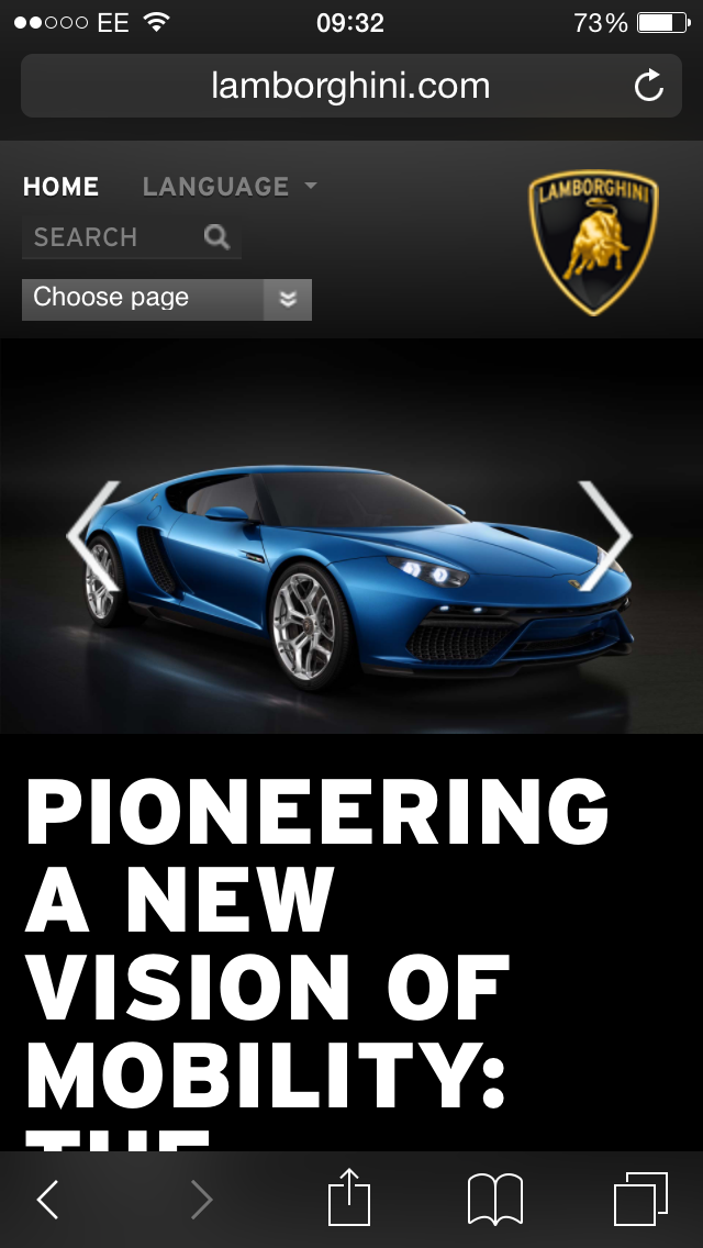
Lamborghini (Luxury/Exotic car website)
My thoughts: Natural, Muted, Contrasting, Subtle
Third person view: Photographic, Yellow
I like the strong use of bold typography color co-ordinated with a large image, but I feel this full bleed image focus's more on the background of the forest so no real focus is created on the car wich is the main advertisement point so this "natural" & "muted" reaction I experienced doesn't really communicate extreme speed and race engineering which is what the car company actually offers in there cars.
This presentation of forests and the outdoors would suit a off road vehicle, the car on a race track would create a much better selling point.
One positive though is the focus on this yellow which happens to be an iconic color of the brand but it could have been presented in a more high impact and obvious way as it is a little "subtle"

Although the desktop website doesn't succeed as well as it should the phone version works alot better, a more clean and focused presentation of the selling point (car) with a navigation system that appears easy to use with a directional arrow interaction system letting you scroll through pages giving a nice fluid feeling of motion. This feeling of fluidity and motion to me links nicely with the aspect of motion and engineering apparent in the cars, strengthened by the high impact typography (in contrasting white uppercase sans serif) describing "Pioneering a new vision of mobility".
Aston Martin (British heritage luxury car website
My thoughts: Monochrome, Innovative, Technology, Elegant, Photogenic, British, 007
Third person view: Photographic
The main selling point to me of the Aston Martin brand is its British heritage and link with James Bond films, the "monochrome" aesthetic of the website strengthens this secret agent brand image, the use of delicate light weight sheered uppercase sans serif supports the "elegant" aesthetic these cars are known for along with the "technical" aesthetic the typography and structure of the website portrays which is also relevant to the connotations of the cars.
The photogenic images of the car in a variety of contexts is the finial finishing point of this successful website which portrays so many things in a subtle and aesthetically pleasing output.


This same elegant, technical, monochrome and photogenic reaction points from the desktop site are brought through into a slim down column grid which is ever so common on website outputs.


Bentley (Luxury car website)
My thoughts: Royalty, Elegant, Heritage, History
Third person view: Chariot, Posh, Weddings
The aesthetics of the bentley website present royalty through common connotations of Bentleys and links with the royal family, along with elegance through the subtle color palette. So relying on this elegant color scheme and common connotations of royalty a successful selling point and brand image has been portrayed through the website aesthetics.

The iPhone website carries on this aesthetic through use of color and image with a more stripped back use of typography and no gradients or background colors to create a more minimal and clean output that is more legible and usable on a phone screen as well as faster loading times through devices that arnt as powerful as computers.

Barclays (Corporate banking website)
My thoughts: Informative, Clean, Personal, Corporate, Dull, Boring
Third person view: Crowded, Ugly
The barclays site to me looks clean, typical of a corporate website so they achieve this connotation of corporate identity, the blue is an evident color keeping strong links with another connotation of the barclays brand so again succeeding in presenting familiarity in the website is achieved. But aesthetically its boring and third party sources suggest its ugly, I can see were hey come from I'm a lover of clean websites but some of the large images here make appear quite clashy and too busy.
It does present a personal feel though through the informative elements it presents so for its purposes the website works but aesthetically it doesn't work in my eyes.

The website they have made for phone use works much better though, aesthetically it works better, the interaction menu system is well suited to phone output creating an easy to use interface with legible typography and that recognizable blue hue used in a subtle but pleasant way. I like how it follows the trend of the typical narrow column based layout for phone use but turns more interactive when the menu system is selected offering a versatile website system that is easy to use.


Its nice that (Creative blog)
My thoughts: Analogue, Artistic, Clean, Clear
Third person view: Interesting, Intriguing, Colorful, Informative, Subtle
The Its Nice That blog communicates to its intended audience in the correct way, the analogue typography on the common "the weekender" banner suggests creativity and artistic content on the site without having to dig deeper into the sites intentions. So from the outset it succeeds here, the clean and clear presentation of the articles and advertisements shows a consideration of structure and layout evident of art/design based media's so again communicated the intended message correctly.
From a third person view the site also succeeds, people with no creative background made 1 word analyses saying it was "colorful, intriguing and interesting" all positive reactions for an art/design targeted website.


Common trend happening again in the narrow central alignment of all the website elements to suit the given frame of a phone screen, I like the way the menu system flows with the central alignment too and keeps up that structured, clean and legible and functional aesthetic.


Time attack (Racing website relevant to summer research)
My thoughts: Bold, Rush, Speed, Illegible, Clashy, Illegible, Contrasting
Third person view: Busy, Dark, Messy
My focus for my website I am creating will include content form time attack so it was obviously important to analyze these sites and learn from them on how to communicate elements of racing, speed and other aspects relevant to the sport and the target market.
The website aesthetically is awful, its illegible, busy, and very bold. The use of clashing colors and contrasting reversed out type and black type on white backgrounds helps achieve this illegibility and ugly aesthetic.
The layout system also looks unconsidered, to me there looks like theres no visible grid system only on the image modules.
The only thing that communicates speed is the use of suggestive imagery of the sport wich is an obvious presentation of the sport, could have been achieved in a more subtle and conceptual way. The other is the sheer and angle on the "Time attack" logo, although aesthetically horrible this suggestion of speed and movement from this sheer is an obvious one to take forward.

The website however is a little more refreshing, again keeping that central alignment along a single column guideline it doesn't have lots of clashing colors and garish use of images, it has a much more considered structure too it. And I actually like the bold use of colors and how the menu bar expands into an all green navigation menu, the grey, red, white and black colors actually do work aesthetically and also do communicate a sense of speed so thoughts of color are going to be taken forward to achieve positive communication to the intended target.


My thoughts: Action, Racey, Movement,
Third person view: Powerful, Grey, Dull
A common trend obvious for these websites is ugliness, the designs aren't very considered in there layouts and they just want to create high impact and a sense of speed and racing through the use of very bight colors, heavy weight typography and action shot images. Nothing they communicate is done in a clever or conceptual way, but that may be because the target market may not be interested in this way of there hobbies or interest been presented to them. They just want straight to the point media presented to them.
A more considered use of a grid system is used here but still not very well.
The points this website does present wich connote the intended message are the aspects of action and movement it presents through the use of action shots and this sheer/angle in the bold high impact typographic logo.

The website appears to works around a responsive interaction, it just seems to narrow down the website into a single column central alignment layout.

My thoughts: Orange, Clashy, Technical, Mechanical, Angular
Third person view: In your face, Pushy, Advertising
A common trend to represent drifting is this bright orange hue so this is a consideration to take forward that may connote drifting clearly to the target audience.
The angular visuals of photography and this common/trend sheer in the typographic logo again connotes the element of sliding that is the main concept behind the drifting sport. And a third party point of feedback which while visually ugly and garish works for the sport, "In your face" aesthetics communicate the sport quite well as it is quite action packed so considering presenting this straight forward visualization of the sport is needed.

The website is just a narrowed down version of the desktop with the advertising images on the borders removed, the small images and extremely small typography create a hard to navigate website so this wasn't considered when creating this output.

My thoughts: Square, Grid, Muted, Subtle
Third person view: Presentable, Considered/Thoughtful, Clean
Another example of an art/design based website/blog to give me some aesthetic inspiration and inspiration on how to creatively use structured grid systems and the positive feedback these types of websites achieved from third party sources based on there aesthetics make me want to take main influence from there aesthetics for my car oriented website.
The "square" and "grid" feedbacks I personally pointed out will be the website designers intentions as the work that is presented has a certain minimalist style and consideration to typography and layout. The "subtle and muted" points I made will be the intentions of the designer so the focus will draw in to the images the blog presents.


The website again appears to be a responsive interaction between the two output devices but, I would have thought this wouldn't work due to the already small typography used in the desktop site but it seems to stay the same size so legibility and readability remains good.
The website manages to carry the structured grid and square aesthetics through into the phone output wich shows nice consistency.

Examples of responsive websites.
Responsive web design is a common solution to achieving a website that can be used across a number of platforms ranging from the smallest (mobile phone) to the largest (desktop & TV outputs). And is an approach that focuses on providing an optimal viewing experience through easy reading and navigation of the site through these different outputs.
A site using the responsive web design approach adapts the layout of the site on differing devices by using fluid grid systems, proposition based grids and flexible images and typography .
The fluid grid system helps page sizing stay in proportion through percentage calculations rather than pixel and points which are common in web design.
Flexible images are also sized in this relative percentage method.
Media queries allow the page to use different CSS style rules based on characteristics of the site is is been displayed on, most commonly the width of the browser on that device all helps keep things consistent and in proportion.
Design for Care by Numiko
My thoughts: Impact, Precise, Balanced, Structured, Informative, Charitable
Third person view: Eye-catching, Bold, Charity


Hungry Sandwich club
My thoughts: Bold, Impact, Colorful, Illustrative, Playful, Interactive, Fluid
Third person view: Bright, Colorful, Cartoony.
I like the way the interactive and playful element of Hungry Sandwich's work is portrayed through this website, its a very interactive and motion based website and I like the hover over feature where you can hover over an image and an overlay appears with supporting typography. A good way of incorporating typography onto an image in an interactive way.
They certainly portrayed the intended message through there website here, the Bold, High impact, illustrative, playful and interactive aesthetics and interactions communicate the work they produce perfectly.

Again the fluid motion and central alignment of this responsive website shows how perfectly it would work on narrower devices.

Websites on a TV output
To show how websites can appear across other formats I looked into the largest output as I have already looked at the smallest output seen on phone screens.
I think this will be done using this responsive website idea, using fluid grid systems, flexible image resolutions and considered screen based typography helps maintain ultimate resolution, crispness and legibility on a larger output.

Crisp typography, no distorsion or pixelation from the increased screen size demonstrates successful increased screen size output & consideration of screen friendly fonts.

Points to take forward from these examples.
Consideration of a responsive website.
The presentation of a brand connoted through the use of things like color to suggest familiarity of a brand. Like red connoting Ferrari, typography manipulations like the sheer/angles in the drifting and time attack logos. They all create a visual connection to the brand.
Creating well structured websites with consideration of grid and layout to create balance within typographic and visual elements.
Minimal website design layouts which allows focus on main aspects like images and important typography, if it doesn't need to be there don't use it.
Consider smallest screen sizes on devices when using typography and images.
Consider screen size on smaller devices when creating navigation systems as it can be easy to click the wrong link due to things been too close and finger tip width, figuring out ideal distances to avoid this would be good
Take influence from more aesthetically pleasing websites like art/design blogs and websites to add a better aesthetic to the awfully presented car racing websites out at current, linking them to high end car manufacture website still keeps it relevant to the automotive target and maybe even give these racing events a more exclusive appeal.
Presenting feeling of heritage and history will give long term fans a nostalgic feel and make them appreciate the website more due to considerations of looking into the history of the sport to give the site more meaning and ethics.
Drawing attention with bold colors is good but don't over do it, so consider making an impact with interaction between color, type & image while considering how it all sits within a balanced layout.
Keep things clear, concise, legible, easy to navigate.
Subtle presentation of concepts rather than in your face visuals, although straight to the point visuals is what the target market is after don't over do this or the site will just appear overall too loud and in your face.
Consider the use of typography to work alongside the content I present conceptually and visually.
Points to avoid from these examples.
Avoid the use of garish colors that clash and cause readability, legibility and navigation issues.
Avoid the excessive use of different size images and the over use of images as it causes a clash and creates ugly aesthetics as well as confusion within the sites layouts.
For future websites I create professionals consider he limited use of adverts as this can become distracting.
When creating a simple, clean and minimal overall aesthetic don't take it to the extreme or it will bore my target audience who are obviously looking for high impact and adrenaline influenced media (racing, cars etc)
Further plans for website analyse to influence design process.
Look further into responsive websites and how they work to create a versatile website system that can be used over a variety of devices.
Look into more detailed analyses of a selection of websites to influence me on grid and layout systems within websites and how they used them to create structured and well functional websites. Break down these visual elements & try recognize the grid/cannon system.
Look at interactive elements, focusing on navigation aspects, interactive menus, images, hover over interactions etc. All to add a little interactivity to my website.
No comments:
Post a Comment