Logo Design Development & Definite Logo Requirements
Taking forward key points from the summary of progression points I made from the crit feedback & my primary and secondary research into logo design and brand strategies I began to develop an informed logo outcome.
The logo needs to be influenced and present critical elements to aim it at its target market the traditional whiskey drinker.
Key Logo Requirments derived from Study Task 3 & Research present these key points that made up this final outcome came from the previous design process stages and narrowed down too:
- Development of the idea of heritage influences within the logo system (Whiskey heritage, Portland Oregon's heritage)
- Customisable and versatile logo system
- A contemporary twist on traditional design aesthetics
- Inspiration from whiskey labels to influence the logo to aim towards the whiskey drinker target market
- Consideration of traditional typefaces to keep a sense of heritage
- Consideration of color inspired by vintage whiskey bottles and current common color schemes
- Consideration of vector icons to add that contemporary element to traditional influenced design
Made a series of more considered sketches to work from, very rough still but a few had more focus that I could build on with feeding of my research and crit feedback into the development stages later on.


Took the descriptive elements out to present a more simple centre aligned with uppercase Times New Roman as a tester just to see how it looks in terms of a simplistic and punchy logo. It sort of works but leans towards a corporate edge instead of the traditional influence of whiskey labels and logos.


Taking forward the curved typography that was influenced from the circular Oregon stamp I combined this with a contrasting straight horizontal aligned typographic element. ITC Souvenir Std was the serif used, sticking with serif to link with the heritage and traditional use of serif fonts in whiskey labels but it adds a more contemporary twist and doesn't make the logotype feel as corporate like the previous type only elements.


Settling on Big Caslon (Type on the left)

Theres always use of sheared and italic fonts in whiskey labels and branding so I started adding manual sheers in adobe illustrator.


12 degree sheer and a more informative sort of tagline to support the Time & Oak initials and add recognition to the company name and product. Quite like this so played around with type alignments within the "stamp" influenced circle athletic.


Taking some feedback of the above logos and the use of time & oak as initials it was mentioned it was a little subjective and confusing to what T & O meant so I added the full description, just doesnt work now, it worked with a combination of initials and tag/strapline but now it doesnt used the space of the circle container very well it suggests somethings needed on the bottom half of the circle were as previous there was a better balance of used and unused negative space.


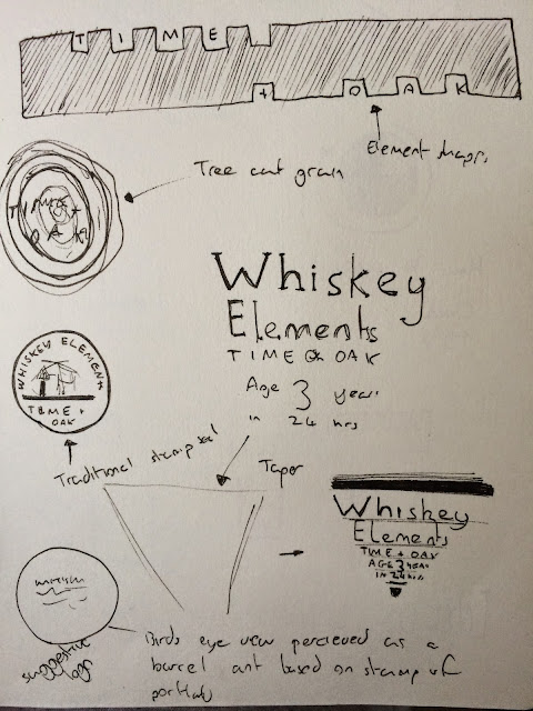
Loosely looks like a whiskey barrel on its side or from above however the viewer perceives it, quite a nice example of a suggestive logo something I looked into in my research stages. I like the spacious tracking and how the type interacts with the negative space and the shapes created through the interacting lines. It uses up the negative space nicely.

Took away the squared off based and the overlapping lines, it no longer really suggests a barrel from a birds eye or side view, it looks like a sun setting on a horizon so if this is interpreted by me it fails its intended message of connoting whiskey.

Scrapped that idea and began playing with lines to section off elements it now looks like an old style life ring used by life guards so this is a major fail!

I tried to change this suggestion of a life ring by using abstract interacting lines again but ended up taking it so far I ended up taking the type out and began playing around with interacting lines and creating abstract shapes, its really lost its origin of influence from traditional seal of Portland Oregon.


But I began to consider the inclusion of representations of the product, the whiskey elements are rectangular pieces of wood so I began to present these in an abstract form within the suggestion of a birds eye view of a whiskey barrel.


As an aesthetic icon it really did work, but I had to add explanatory typographic elements to add informativeness & relevance to the logo that would work alongside the imagery to communicate the company name and product.
Making the type feel like it belonged was hard, with the first 3 sections only needing one single word so they worked well in there negative space allowing a diagonal alignment of the typography which flowed well with the whole interaction of circular, square shapes and lines within the logo icon. A nice contrast of angles and shapes. The final string of words "whiskey elements" is what caused problems though.

Matching the pt size didn't work here, the heavy weight from the lines of the icon clashed with the more subtle and thin lines of the typography and they felt lost and out of place within there frameworks and positioning in the logo icon.

Trying out a serif face back to larger pt size for the single word elements, the serif font doesn't work aswell as the sans serif face, the clean and simple lines of a sans serif font worked well with the aesthetics of the icon I created. But I need this use of serif to express the aspect of traditionally or I have just lost the whole idea of a contemporary twist of something traditional and just created something completely contemporary.

Trying again to make this longer element of typography work along the curvature of the circular shapes


Took out the typography to create consistent reversed out type within the outer black ring leaving a large amount of negative space to fill. This made me think about a use of imagery to go in there, it will really link with the main influence for this aesthetic then (the Portland Oregon stamp)

So taking forward the idea in the crit where I wanted to create a versatile logo system I decided this versatile logo system would come from a series of icon style vector images that would work alongside each other aswell as solo. Initial thoughts at this stage was that I could apply the logo system to certain products and collateral over the "brand range" with an icon that represents this product.


To do this I rounded off all corners and joints to around 1.3pt to create a subtle round edge that took away that harsh sharpness of the initial icon.


While subtle I feel this change helped the icon fit into the negative space and its surroundings alot better.

The rest of the icons came from there very easily, the only real considerations were the alignment of this whiskey stone or ice cube.


Settling on this icon with the suggestion of the ice cubes been submerged in an abstract aesthetic, got alot of good feedback from this icon although simple people seemed to really appreciate it.


The full logo system in all its versatile forms, I decided to do two sets of logos. The system was already complete so changing to a simple outline form was simple enough to do, Initiial thoughts at this moment were the outline logo would work on more subtle product application, maybe embossed or engraved onto stationery or onto glasses? The more heavy weight solid logos would work on an impact base or were heavy contrast is needed to recognize the logo.


I took some feedback forward on the typography choice, ITC Souvenir Std was too playful, the logo systems icons presented structure and versatility. I needed a typeface that could support this so Big Caslon pro was used, nice sharp and angular serif points with elegant curvatures and tapering weights of the strokes within the glyphs anatomy worked well alongside the quite angular yet soft edges icons and the overall circular enclosure of the logo.
A final addition of mine was to add the companies founded date to link with typical whiskey labels where they like to highlight the age of a whiskey, a nice subtle reference to this typical traditional element of whiskey branding.
To support the impact and weight of this logo as I now have a more subtle wire frame outline logo for more subtle applications I added solid black elements to certain icons to create a better balance of white and black.


Going to push the type only idea to keep with that traditional typical whiskey brand heritage. Will try keep a contemporary twist too it though.

To keep that feeling of heritage whiskey branding tends to follow I brought in the Portland Oregon seal into the logo development to link with the products birth place.
I like the wood off cut one but I don't think it would fit the typical aesthetic of whiskey and doesnt really suggest heritage, suggests more of a timber or joinery company? I like the bellow idea though a broken down and simplified interpretation of the Portland Oregon seal giving it that contemporary twist I needed.

Started out with the typical hierarchy considered use of type only. Most whiskey labels have a descriptive element to them so I emulated this in this logotype idea. A little text heavy though for a logo and wouldn't be very versatile in terms of logo application, it needs to be adaptable. Also all the text will make it less memorable it needs to be shortened.
Took the descriptive elements out to present a more simple centre aligned with uppercase Times New Roman as a tester just to see how it looks in terms of a simplistic and punchy logo. It sort of works but leans towards a corporate edge instead of the traditional influence of whiskey labels and logos.
Scrapped this idea of presenting a logo that represents whiskey labels. Went back to the influence of the Portland oregon stamp to touch on heritage again with a minimillst contemporary twist to achieve a logo that can be adaptable to various applications. I may take this type alignment forward but its far too minimal, too much negative space feels a little loose a little like two logos combined together.
Starting to bring the circle shape back from the Oregon stamp with the contrasting curved and horizontal typography, starting to work, looks like it has potential to consider later on maybe.
Inspired by Stranger & Strangers branding and packaging I took influence from these traditional wax style seals.
Quite liked this very minimal stamp, shows a nice consideration of a very contemporary twist of something very traditional and heritage influences. So I began playing with some serif fonts that had more pleasing aesthetics.
Theres always use of sheared and italic fonts in whiskey labels and branding so I started adding manual sheers in adobe illustrator.
12 degree sheer and a more informative sort of tagline to support the Time & Oak initials and add recognition to the company name and product. Quite like this so played around with type alignments within the "stamp" influenced circle athletic.
Taking some feedback of the above logos and the use of time & oak as initials it was mentioned it was a little subjective and confusing to what T & O meant so I added the full description, just doesnt work now, it worked with a combination of initials and tag/strapline but now it doesnt used the space of the circle container very well it suggests somethings needed on the bottom half of the circle were as previous there was a better balance of used and unused negative space.
Taking forward this circular shape for the base of the logo with the ITC Souvenir Std used to support the contemporary appearance I began playing about with lines and interacting overlapping shapes, all this was an experiment in trying to make what started out as a stamp influenced logo with heritage/traditional links into something more contemporary.
Loosely looks like a whiskey barrel on its side or from above however the viewer perceives it, quite a nice example of a suggestive logo something I looked into in my research stages. I like the spacious tracking and how the type interacts with the negative space and the shapes created through the interacting lines. It uses up the negative space nicely.
Took away the squared off based and the overlapping lines, it no longer really suggests a barrel from a birds eye or side view, it looks like a sun setting on a horizon so if this is interpreted by me it fails its intended message of connoting whiskey.
Scrapped that idea and began playing with lines to section off elements it now looks like an old style life ring used by life guards so this is a major fail!
But I began to consider the inclusion of representations of the product, the whiskey elements are rectangular pieces of wood so I began to present these in an abstract form within the suggestion of a birds eye view of a whiskey barrel.
As an aesthetic icon it really did work, but I had to add explanatory typographic elements to add informativeness & relevance to the logo that would work alongside the imagery to communicate the company name and product.
Making the type feel like it belonged was hard, with the first 3 sections only needing one single word so they worked well in there negative space allowing a diagonal alignment of the typography which flowed well with the whole interaction of circular, square shapes and lines within the logo icon. A nice contrast of angles and shapes. The final string of words "whiskey elements" is what caused problems though.
Matching the pt size didn't work here, the heavy weight from the lines of the icon clashed with the more subtle and thin lines of the typography and they felt lost and out of place within there frameworks and positioning in the logo icon.
Trying out a serif face back to larger pt size for the single word elements, the serif font doesn't work aswell as the sans serif face, the clean and simple lines of a sans serif font worked well with the aesthetics of the icon I created. But I need this use of serif to express the aspect of traditionally or I have just lost the whole idea of a contemporary twist of something traditional and just created something completely contemporary.
Trying again to make this longer element of typography work along the curvature of the circular shapes
I had to make the hard decision of leaving this logo behind it clearly wasn't going anywhere, its very easy to get stuck into on idea and fail to see its errors, so accepting its wrong will help you see things a fresh in a new light. I know now I need to use the Portland Oregon stamp as a main influence for the logo to keep that feeling of heritage and traditionally which is all so relevant for the idea of a whiskey based product. I also like how in its simplified state the logo icons I have created from it so far suggest a birds eye view of a barrel.
Going back to the combination of curved type and horizontal type I added reversed out ITC Souvenir Std to the black ring and contrasting horizontal type "whiskey elements" to create a nice simplistic logo that worked, was balanced out well in terms of negative space so I knew I had a system here that I could develop on.
So taking forward the idea in the crit where I wanted to create a versatile logo system I decided this versatile logo system would come from a series of icon style vector images that would work alongside each other aswell as solo. Initial thoughts at this stage was that I could apply the logo system to certain products and collateral over the "brand range" with an icon that represents this product.

Although very simple and square I feel these will work, showing traditional whiskey elements in a stripped down, minimal, contemporary aesthetic. A perfect blend of contemporary and traditionally something I wanted to push alongside the customisable logo system.

It was important to create the "whiskey element" icon first as this was the main point of advertisement, once I got the aesthetic for this all the other icons would follow easily. The initial icon worked in size, scale and weight but the edges were too sharp and angular, they need to be more subtle and soft to work with the circular logo base.
To do this I rounded off all corners and joints to around 1.3pt to create a subtle round edge that took away that harsh sharpness of the initial icon.
While subtle I feel this change helped the icon fit into the negative space and its surroundings alot better.
The rest of the icons came from there very easily, the only real considerations were the alignment of this whiskey stone or ice cube.
I took some feedback forward on the typography choice, ITC Souvenir Std was too playful, the logo systems icons presented structure and versatility. I needed a typeface that could support this so Big Caslon pro was used, nice sharp and angular serif points with elegant curvatures and tapering weights of the strokes within the glyphs anatomy worked well alongside the quite angular yet soft edges icons and the overall circular enclosure of the logo.
A final addition of mine was to add the companies founded date to link with typical whiskey labels where they like to highlight the age of a whiskey, a nice subtle reference to this typical traditional element of whiskey branding.
To support the impact and weight of this logo as I now have a more subtle wire frame outline logo for more subtle applications I added solid black elements to certain icons to create a better balance of white and black.
Final logo system, shown in all its variations and colour options.
No comments:
Post a Comment