Responsive - Fedrigoni scamps, content & idea development
Concept & Influence
Taking influence from Italian culture, Fedriogni's original paper mill location & Art movement's to reference Fedrigonis heritage and past creative disciplines to influence contemporary & traditional print process's and finishes to focus on presenting the relationship between print & paper in a sustainable and contemporary light.
The marketing tool will take influence from this considered approach of emulating sustainable print & paper relationships through exploration of multiple print process's, finishes, production methods to show off the versatility of the Sirio Ultra black range in a more modern output. By taking influence from the transition between Renaissance periods, Futurism and how modern day art trends and communication has been influenced by these periods more focused suggestions of more modern and sustianable print and production process's can be portrayed.
The physical outcome will be a re-invention of typical promotion materials, rather than creating entirely solo products each item will work equally well by itself as well as tied up into a tactile package that the end user can interact with and fully understand the versatility and possibilities of the Fedrigoni Ultra Black range.
It would be effective sent out as:
A mailer to designers to show off the samples and possibilities.Act as a tool for a salesman to present at events like print fairs, visiting universities, visiting creative agencies or for leaving in shops that sell paper and print products to achieve some further external recognition from target markets.
Be a perfect tool for a designer to carry around to show clients possible samples and place proposed print and production techniques into context.
Particular focus on;
Format, size, construction of material and promotion collateral.
How to take influence from transition between Renaisance, Futurism and modern day art culture and make it resonate with Fedrigoni brand image and there requirements of keeping the print and paper industry alive.
Typography to represent transition from Renaissance to modern day creative industry.
Use of print methods in modern ways working on the renaissance "Rebirth" to demonstrate sustainable and the future of print media within the creative industry.
Use of color theory to enhance the focus on the color black, contrast of tone, color, extension, hue, tints etc.
Creating a system using iconography or wordplay that represents the versatility and possibilities of the range eg possible print process's and production methods.
Format of collateral
Golden section influence on format of material and how they could tie together as a package.


This didn't work, just looked like an offset printed booklet, doesn't cover the requirements of any other promotion materials like flyers and posters.


This was far too complex and the unfolded outcomes where all A4, once the package was deconstructed all the individual items needed to work solo.
When folded together it works well and presents harmonious proportions and symmetry though.


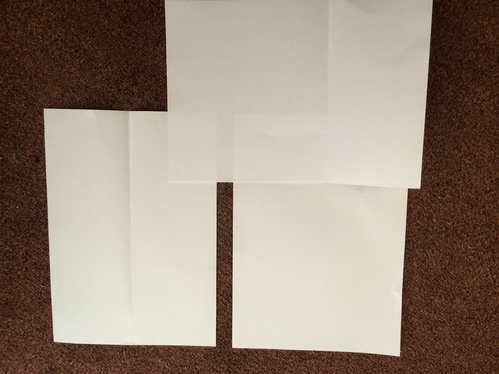
This is starting to work, the narrow leaflet deriving from the half width of the A4 shows consideration to symetry and the folded a4 holds all the structure together, but it still feels a little clumsy when deconstructed.


The multiple small formats that come from the vertical halving of the A4 piece then a horizontal halving of this narrow format to create small formats that could work very well as items that carry different print techniques and production process's on them to show versatility and opportunities of the range in a tactile and compact way.


Taking influence from these readings on how shapes can interact with each other in structured way I began experimenting with:
How different shapes could be placed in each other to create an idea of geometry in a modern way.
Using guidelines and grid systems from Renaissance Symettria helped me create shapes within set guidlines that worked along an adaptable system.
Influenced by the format of the templates for the promotion material based on halving a rectangle on vertical and horizontal levels I created a number of abstract positioning of square elements but this only worked to communicate the abstract aesthetics of futurism, not an informative icon system.


I played around with using the CMYK color range to begin representing digital print, from here I was going to reproduce the icons using the colors in different shapes and formats using different print techniques like traditional screen-print and letterpress to emulate the idea of sustainability of print media.
I needed to create a system that represented the process's and techniques they would be printed with, a simple connect was all that was needed as it would be placed in context with typographic explanations.
Each icon works along a varying proportions of elements and shapes within a square format, this idea resonates with the structure and format of the templates for the marketing tool, all the elements structure are influenced by symmetry and the harmonious proportions influenced by renaissance Symmetria in a stripped back and modern aesthetic to show a transition of time periods.


Print process sample cards
The print cards need to act as a vessel for the icon system to work in context, printing the icons within there designated process with an explanation of the process used to act as a very minimal example of the possibilities of the range but still allowing quality of the paper to be observed with no distraction. This is where the simplistic and minimal iconography system works perfect.
When the marketing tool is compiled together thee pamphlet will act as an explanation key to the

The ideas that work on symmetry influenced by Renaissance symettria work well and could allow the opportunity of different color applications to show the possibilities within color interaction and the sirio ultra black.
The ideas with the single icons used make good use of the space and will allow quality of the paper to "breath" within this space with no distraction, when they interact with the pamphlet there shouldn't be any distracting visuals or confusing layouts.
.jpg)

A 2 and 3 column modular grid system was used to create these mockups, the modules helped maintain balance and structure when working with the idea of symmetry.

Narrow leaflet
Like the introduction cover information needs to be clearly communicated, working from a set 2 column grid would allow the information to be simply positioned maintaining that feeling of symmetry, the more complex alignments take influence from the idea of renaissance symettria based on "sublime proportions" through the organized positioning of this textual content.


The introduction of more columns, from 2 to 4 helped position subheads and information more accurately, Plying around with large point heavy weight headers was obvious even in scamp form that there would be an imbalance and go against the whole idea of symmetry, golden ration and harmonious structure influenced by the renaissance period.


Poster
To simulate the transition of time periods and development of art culture the use of image aesthetics will be influenced by futurism and modern day creative trends, this keeps with the needs of aiming at a contemporary creative audiences, a range of poster styles will be made to demonstrate the versatile qualities of digital printing through various image making techniques to meet more creative tastes:
Analogue image techniques.
Photography.
Type only.
Typography and iconography.
Vector shapes.
Gradients and grids to show tonal differences through trend driven asthetics that from my investigations are influenced by futurism.


Margins based on proportions from Van De Graff with inclusion of multi modular grid.
Modular grids help achieve finer tuning of layout adjustment and more possibilities of effective layout design to aid communication of information and aid aesthetics to help meet the creative needs of Fedrigonis target audience.

These small print process cards relied on symmetry in the scamps, so the inclusion of a modular grid helped maintain this balance and structure when emulating this.


Format of collateral
Golden section influence on format of material and how they could tie together as a package.
Further analysis into the series of books on geometry, symmetry, golden section, QED and perspective I began looking into Symmetria and how theories form this can work within the ordering principle of the golden section where everything fits in together nicley. These ideas on symmetry and the "Harmonious arrangements of parts" come from the Renaissance period, a period that im working from to influence my ideas.
From these ordering principles influenced by the golden section and symmetria a series of sketches where made to begin understanding and developing a system for the format of the print collateral, I wanted to break away from the typical promotional materials that worked solo and produce a package that worked as a tool and could be interacted with to emulate versatility and appreciate the quality of the paper.
To gain a better understanding I took a few of the strongest ideas into mockup stages using A4 paper, I want to use A4 as a maximum size as its a size that can be carried around easy if the resolution was to be used as a physical marketing tool to take to show designers or to design related events, any larger and it may become a bit cumbersome.
This idea worked well, it allowed various formats to work solo in booklet form, A6 leaflet form and an A4 poster but when presented solo they looked a bit mediocre, I wanted to break away from typical format and sizings of promotional materials, the way the sizing works is strongly influenced by the golden section ratios though, not so much Symettria though which is part of the focus due to its links with Renaissance.
This didn't work, just looked like an offset printed booklet, doesn't cover the requirements of any other promotion materials like flyers and posters.
This was far too complex and the unfolded outcomes where all A4, once the package was deconstructed all the individual items needed to work solo.
When folded together it works well and presents harmonious proportions and symmetry though.
This is starting to work, the narrow leaflet deriving from the half width of the A4 shows consideration to symetry and the folded a4 holds all the structure together, but it still feels a little clumsy when deconstructed.
Final mockup
This idea that came from the sketches and development of the pervious mockups, it worked the best in terms of fitting together in a structured and harmonious way influenced by symmetry, proportion and rotation from renaissance symmetria and the golden ratio through halving the paper formats horizontally and vertically through cutting and folding so everything tied into together nicely.
The multiple small formats that come from the vertical halving of the A4 piece then a horizontal halving of this narrow format to create small formats that could work very well as items that carry different print techniques and production process's on them to show versatility and opportunities of the range in a tactile and compact way.
Feedback
Feedback from Alec suggested that the idea worked very well as a marketing tool in a versatile sense and agreed it works alongside presenting the versatility of the range within its consideration to sustainable print and paper process's.
Iconography system
It was important to sort the format so I knew what spacial formats I had to work with to influence my content from, considering the use of type and image in a way that works with the concept and influence from the transition from Renaissance, Futurism and modern day graphic trends.
I wanted the iconography to be very stripped back in its asthetic, it wasnt to be very visually distracting, the purpose was to provide a suggestion of print techniques and process's without drawing attention away from the focus point, the paper. They just need to act as an informative icon for explaining the print process's that can be used on this versatile range.
Taking influence from these readings on how shapes can interact with each other in structured way I began experimenting with:
How different shapes could be placed in each other to create an idea of geometry in a modern way.
Using guidelines and grid systems from Renaissance Symettria helped me create shapes within set guidlines that worked along an adaptable system.
Influenced by the format of the templates for the promotion material based on halving a rectangle on vertical and horizontal levels I created a number of abstract positioning of square elements but this only worked to communicate the abstract aesthetics of futurism, not an informative icon system.
I played around with using the CMYK color range to begin representing digital print, from here I was going to reproduce the icons using the colors in different shapes and formats using different print techniques like traditional screen-print and letterpress to emulate the idea of sustainability of print media.
I needed to create a system that represented the process's and techniques they would be printed with, a simple connect was all that was needed as it would be placed in context with typographic explanations.
Each icon works along a varying proportions of elements and shapes within a square format, this idea resonates with the structure and format of the templates for the marketing tool, all the elements structure are influenced by symmetry and the harmonious proportions influenced by renaissance Symmetria in a stripped back and modern aesthetic to show a transition of time periods.
These icons work by providing a concise and minimal presentation of there techniques;
Digital print = Influenced by the crop marks from digital print outcomes.
Foil Blocking = The use of a square presents the idea of "blocking" and also act as a bold and tactile vessel for carrying this foil technique.
Letterpress = Influenced by the individual letterpress blocks.
Emboss = Acts as a touch point for physically interacting and appreciating the emboss possibilities of the range.
Screen Print = Represents a stripped back aesthetic of a screen.
A few amendments where made with weight and proportions to make the icons feel more balanced and structured, the roundness to the strokes and lines added a less serious tone of voice to the aesthetic, a little more playful, the multiply effect created overlap points that represent ideas of construction within the icons relevant to the influence from symettria and its use in renaissance period, especially architecture.
When printed black on black legibility maybe an issue with black inks, so a series of dark grey's will be used to maintain good contrast through development stages.
Final weight and proportion choice in varying tones of grey with black outline to add a tactile detailed feel to the simplistic shapes, doesn't feel as delicate and wire like this way.
Layout & structure
To begin gaining an understanding of the format, structure and layout of the pack a series of scamps were made to understand how each element would appear solo and interaction with each other, I wanted the collateral to work solo and as a whole so maintaining this balance was important and rough scamps allowed me to explore multiple layout formats using mockup rough grid systems that can be further developed on into digital development.
Influence from the renaissance's use of symettria and geometry will influence layouts & grid systems, expanded on the past readings I began to look into the rise of layout considerations in publication design, the beginning of mass media communication through this period, the 2 column structure and centre aligned header demonstrates considerations of symettria.
Cover & Structure for collateral and overall package.
From these scamps I came up with the structure and requirements of the content and chosen formats for the content to be applied on.
The small cards will be solo for showing the iconography in context of this particular print technique.
The posters will focus on digital print use of the paper using various image making techniques focusing on producing imagery and designs influenced by the transition from the renaissance period, to futurism and how it all influences modern day design.
The narrow pamphlet/leaflet will work in connection with the print process sample cards, acting as a key and explaining the possible print techniques and production process's the Fedrigoni range can undergo.
The cover sleeve will be the entrance to the marketing tool, introducing the range and some background information on it with explanation on how the marketing tool works.
Scamps
Working from the structured Van Da Graff and more loose deconstructed Futrist inspired layout possibilities I came to a basic system to work from.
Organisation and hierarchy of information was the issue, what to include and what not to include, within the digital developments I need to fully decide if the iconography is needed or should the first thing the marketing tool communicates is the brand name and product range.
The loose deconstructed layouts looked aesthetically pleasing so would meet the creative target audiences needs but the communication of the information was a little vague as there was no explanations to the iconography.
More structured layouts worked and took the consideration of Van Da Graff into account wich was the turning point of communication through print, so this would probably be the better way to go. Explore more layouts in the digital developments using tight grid systems and balance of space to enhance communication of information (legibility, readability) and hierarchy.
The content on the inside cover needs to explain the marketing tool, creating a diagram explaining each item within the pack without the need of a sales pitch, so this would work perfect as a mailer keeping information communicated clearly and concisely as possible in a friendly yet formal tone of voice to help inform and educate.
Icons using the style and system from print process iconography to keep things consistent. Round edges, overlay effects and thin outlines to each stroke adds a friendly tone of voice but maintains an informal and technical aesthetic.
The print cards need to act as a vessel for the icon system to work in context, printing the icons within there designated process with an explanation of the process used to act as a very minimal example of the possibilities of the range but still allowing quality of the paper to be observed with no distraction. This is where the simplistic and minimal iconography system works perfect.
When the marketing tool is compiled together thee pamphlet will act as an explanation key to the
The ideas with the single icons used make good use of the space and will allow quality of the paper to "breath" within this space with no distraction, when they interact with the pamphlet there shouldn't be any distracting visuals or confusing layouts.
A 2 and 3 column modular grid system was used to create these mockups, the modules helped maintain balance and structure when working with the idea of symmetry.
Narrow leaflet
Like the introduction cover information needs to be clearly communicated, working from a set 2 column grid would allow the information to be simply positioned maintaining that feeling of symmetry, the more complex alignments take influence from the idea of renaissance symettria based on "sublime proportions" through the organized positioning of this textual content.
The introduction of more columns, from 2 to 4 helped position subheads and information more accurately, Plying around with large point heavy weight headers was obvious even in scamp form that there would be an imbalance and go against the whole idea of symmetry, golden ration and harmonious structure influenced by the renaissance period.
Poster
To simulate the transition of time periods and development of art culture the use of image aesthetics will be influenced by futurism and modern day creative trends, this keeps with the needs of aiming at a contemporary creative audiences, a range of poster styles will be made to demonstrate the versatile qualities of digital printing through various image making techniques to meet more creative tastes:
Analogue image techniques.
Photography.
Type only.
Typography and iconography.
Vector shapes.
Gradients and grids to show tonal differences through trend driven asthetics that from my investigations are influenced by futurism.
Grid systems to work from
Moving on from the scamps and grids used I took them into more defined digital format in adobe indesign, influence came from the use of the Van De Graff proportions and more modern day modular grids to show the influence and transition of communication and design over time periods from the Renaissance.
More simple 2 column and 3 column grids were used to show this transition from simple columns used within Van De Graff proportions.
Margins based on proportions from Van De Graff with inclusion of multi modular grid.
Modular grids help achieve finer tuning of layout adjustment and more possibilities of effective layout design to aid communication of information and aid aesthetics to help meet the creative needs of Fedrigonis target audience.
These small print process cards relied on symmetry in the scamps, so the inclusion of a modular grid helped maintain this balance and structure when emulating this.