Visual Idea & Concept development & Production - Freakonomics for Penguin
Idea Development Scamps
The first stage was to figure out how I could go about meeting the typographic focus Penguin wanted for the design, while doing this I needed to consider contemporary audiences so keeping the ideas conceptual and contemporary in there aesthetic would need to be a focus point.
To work from the idea of decoding & decryption from the original concept I began creating image based glyph scamps that would resonate well in an interactive way with the personality of a contemporary economist, they like to figure out theories so presenting this through ideas of puzzles and encryption was one way to go.

The cover needed to stand out in a crowded book shelf, an abstract aesthetic with use of bold shapes and colours within the typography would be a good direction to go to achieve this, it also presents an idea of decoding and decryption in a puzzle influenced aesthetic meeting the initial concept.
Physically deconstructing glyphs would give off this puzzle feel and present the idea of decoding and working a theory out in an abstract and contemporary way.

Using puzzles as an influence for aesthetic and layout would defiantly present the idea of economics in a more contemporary and playful light, standing out from the typical dry economic book covers and defiantly resonating well with the target markets inquisitive nature and offer an interactive gateway into the world of economics which was a brief requirement.

Source imagery and contextual reference points for glyph imagery.
Using old tile puzzles was something that could possible work well in terms of using it as a layout influence, the idea now was to create a set of individual glyphs, each glyph would be influenced by aspects of the book to represent the books content in a conceptual and contemporary way. The idea of using a puzzle layout as influence would add interactivity to the cover and as mentioned resonate well with the inquisitive nature of an economist.

These source images would support my development of creating glyphs using pattern and shape to give off a decrypted aesthetic that could work alongside the puzzle idea.


Similarities between estate agents and Klu Klux Klan.
Connection between sumo wrestlers cheating and teachers cheating to enhance test results.
Money for connoting economics in a contemporary light through these contemporary aesthetic glyphs.
Concept change
Through idea generation from the initial concept a few changes had arisen through the idea generation, the concept now wasn't really focusing on presenting an idea of decryption and decoding.
The concept now was to take aspects of the everyday theories the book covers and apply them into typographic forms to place the presentation of the content of the book into a more contemporary light rather than dry and bland images of typical economic subjects like cityscapes and money.
These glyphs would then be presented in an interactive layout and aesthetic to give off a puzzle like feel, this resonates well with the inquisitive nature of an economist and how they like to work things out.
Glyph scamps
Using these source images helped create initial scamps that focus on using culture and content of the book as a reference point to represent economics in a conceptual and contemporary light.
Using image based glyphs as a method of communicating aspects of the book in a subtle way, rather than been obvious the viewer needs to work out whats been presented to them, something that resonates well with a economists thought process.
Using shape and pattern as a method for contemporary aesthetics to keep the overall design contemporary and standing out from typical economist books.
Playing around with weight, line, pattern, depth/dimension and interaction of shape helped me create a diverse range of glyphs that would work as a starting point taking into account tone of voice, culture and influence from the book.


Glyph refinement
As there was a focus on typography for this book cover it was necessary to create my own glyphs rather than adapting existing glyphs.
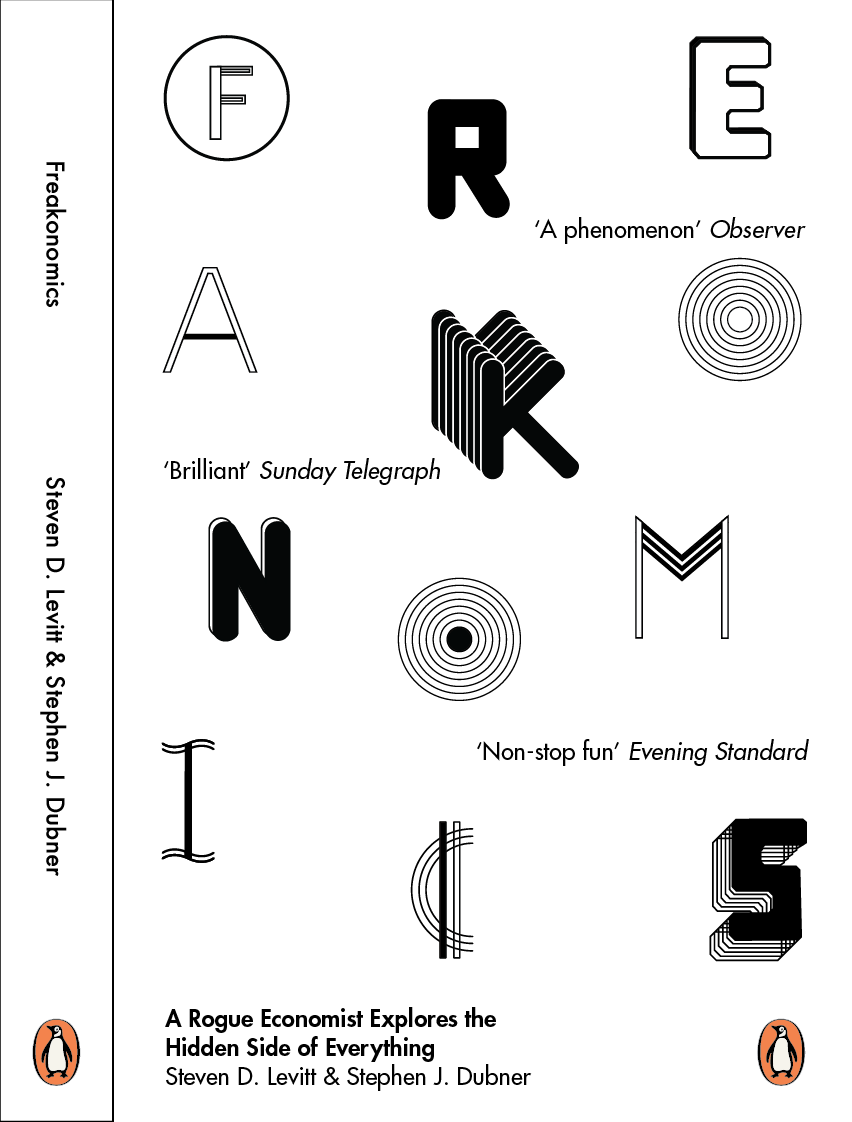
As a starting point I used Myriad Pro in a heavy weight as a starting point for the Klu Klux Klan to maintain structure of a legible glyph, once I had got the base down for the E it was easy enough to create the S by copying sections of the E over, this squared and angular woodblock takes influence from the Klu Klux Klan logo.


The sumo wrestling glyphs are quite playful in there visualisation of this section of the books content, using bold rounded lines to create the legs and stem of the K, these simple elements made it quite easy to create an effective and structured glyph with only a few changes needed within the anatomy of the glyph, this been the lower leg needed to intersect from the upper leg rather than both pivoting on the vertical stem of the K.


A few alterations were needed for the counter of the R to achieve balance within the glyph, it needed to feel structured and quite square in its aesthetic so consistent weight of the stems, legs and bowl needed to be achieved.


Variations and developments
All these variations and developments will be used in the later design stages to offer me a good range of glyphs to experiment with which ones work the best together to give off a strong and high impact design aesthetic to make the cover stand out.
Sumo Wrestling inspired
These variations play around with tonal contrast and depth through repetition of the glyph in a 3D aesthetic, its important to have a few variations as when these glyphs interact I need a balance of weight and tone, I dont want the hierarchy of the glyphs to be inconsistent where one stands out more than the other.
They all share a roundness too them to playful present the perception of a Sumo wrestler.
They share a very contemporary aesthetic meeting this element of the briefs requirement and are legible in all there variations while maintain high impact to help meet the needs of the brief and the cover standing out.


Teacher & Test Cheating inspired.
In the book theres a comparison between Sumo Wrestling and Teachers and the fixing of matches and exams, this connection was displayed here through the presentation of an outer ring that represents both a sumo wrestling ring as well as a traditional exam multiple choice circle.
The idea behind the empty and filled in circle with an illusion of multiple circles is to represent the idea of the fixing of the test, the F glyph representing the F grade, something teachers strive to avoid through the fixing of tests to enhance there image of an effective teacher.


Money inspired.
Using an a C and the use of lines creates an abstract visualisation of the cents symbol, the use of these waved lines on the I and variations of the C represents economic and financial graphs and the unstable economy. The different weights and and aesthetics in these variations will provide good experimentation when all these glyphs are placed together, the stronger ones are the solid black and multiple line versions as they have good contrast and have a more financial connotation about them.

Estate agent inspired
The use of multiple lines gives off that financial and banking aesthetic, which resonates well with how the book talks about how estate agents exploits clients for financial gain, the use of angles and the choice of an M glyph represents the roofs of houses and buildings to connote real estate. Again the use of solid and singular lines helps maintain contrast of tone to aid variation and balance when these glyphs interact.

Klu Klux Klan inspired.
There was a comparison in the book that there was links between estate agents and the Klu Klux Klan, the E & S was influenced by the Klu Klux Klan emblem, the woodblock and squared off aesthetic aids this, the idea of the drop shadow adds depth too it to enhance this woodblock typographic aesthetic as the focus is on typography. The multiple line 3D S connotes this same idea in a more contemporary aesthetic.
The A plays around with the idea of presenting the iconic triangular Hood of the Klu Klux Klan and the angles of roofing deriving from the M to tie these 2 subjects together in a subtle visualisation.


Testing how they interact with each other shows how they all work well together, theres no imbalance and its actually readable even though theres a variety of aesthetics and styles going on.
Theres good balance of weight, tone, and depth going on to create a good visual impact but without causing illegibility.
Cover spread scamps & Development
One section of the concept was carried out by creating glyphs that resonate with the content of the book, the next stage was to consider the target audiences thought process and how they like to work things out, but playing around with alternative layouts and use of shapes in the scamps helped achieve initial ideas that could be perceived as interactive, like a puzzle.


By using green as a common connotation as money a few tile puzzle ideas were made.
The structured way didn't work so well, the format of the template didn't give me good positioning opportunity solo these tiles work very well, the free space at the bottom just didn't work though creating an imbalance.

This chess board sort of layout worked well, it made perfect use of the space in the given format but this layout wouldn't allow much opportunity for the headers, subheads and copy that needed to go on the front cover.

This more deconstructed layout works well, it makes use of the space across the full spread rather than just the front cover, the deconstruction of the glyphs also meets the idea of a puzzle and gives off that interactive feel to the cover giving the viewer opportunity to put the pieces together which is obviously relevant to the idea of working out theories in economics.

At this point it was clear the idea of trying to present an obvious interactive puzzle was going to be difficult, and making use of the space within this format needed to be efficiently used to accommodate the body copy, headers and subheads provided by Penguin.
A multi modular grid was created, no gutters where used so I could make accurate and precise use of the space.


The grid system give me much better opportunity for aligning the glyphs, the focus was on typography and bringing impact in through typography rather than colour was how I wanted to go about the initial development stages, taking the square shapes out allowed more appreciation to the detail of the glyphs and better opportunity for more fine tuned positioning.
Futura was chosen as it had quite a geometric roundness too it, but the tails of the strokes where quite angular, this contrast resonates and interacts well with the contrast of shape, tone and depth in my glyphs, it also has quite a contemporary aesthetic about it which will support the overall aesthetic.


I played around with the positioning of the content on the spine, aligning sections with the horizontal grid lines to create structure and integration of the textual content and the image based glyphs rather than them been separate entities.


It was difficult to work out the text content alignment with the glyphs I made visible, there was 2 ways to tackle this, sort the alignment and position of the type then work round this with the glyphs I made.
Or position the text around the glyphs, after trying out both methods it was clear It was more effective to work around the given positioning of the glyphs I made.


The hierarchy of information was presented better in the text only developments but when the glyphs I made were added it just didn't read right, it interfered with the glyphs i made which where the focus of the hierarchy as they spelt out the book title.
The way around this was to position the text around the individual glyphs, the grid system allowed me to play around with creating a sense of movement to aid the feeling of piecing parts of a puzzle together within the interactive front cover without them feeling lost and randomly placed within the space, a sense of structure was achieved.
To enhance the communication of information the quotes worked better on 2 lines rather than single lines, this separated the quotes from the references of the newspapers that provided them

Playing around with a tetras sort of idea, using shapes to mirror the cover page in a abstract visualisation on the blurb side of the book gives off an abstract representation of "the hidden side of everything".


I received some feedback at this point based on the mirror image idea of presenting "the hidden side of everything" most people suggested it was a little abstract, I know the idea of economics is working out theories but this maybe a little loose and not very well informed.
I came up with an alternative idea to present this "hidden side of everything", an underlying concept of the book, by using the cover and back of the book as a vehicle for presenting a mirror image I created a number of abstract distortions of the glyphs on the cover image to represent this idea of how everyday aspects can be distorted and viewed in many different ways.

These distorted versions of the cover where passed through liquify filters and distorting filters in photoshop then reapplied to illustrator and converted back to vector format to keep quality as high as possible for consideration of external production and printing.


After receiving feedback on the best out of these 6 majority voted for this one as it still had recognition of the glyphs, economics in this book is about understanding real world issues so the contrast between the front and back cover cant be too drastic as the theories investigated in this book are not overly complex, there more general everyday aspects so this subtle contrast emulates "The hidden side of everything" quite well.
The text was aligned in a similar way as the cover, mirroring its
sense of movement across the multi column grid guidelines on the template, keeping the eye moving around the page to work with the concept of putting pieces of a puzzle together to emulate the understanding of an economist understanding a theory.

Going back to using green to denote economics, this caused a less prominent impact due to the more pastel tint and lighter tone of the green, while also destabilising the hierarchy making the quotes and subheads stand out more than the actual title.

I needed impact and a contemporary aesthetic so I played around with enhancing the contrast between the front cover and back cover with some contrasting tones, white on pastel blue didn't work well, the glyphs became illegible and the detail couldn't be appreciated.
The slight colour additions to the glyphs only worked well but I feel an all black scheme will work better, colour is often used in quite un-informed outputs and if I went with green it doesn't really stand out in a crowd of typical economic books. A little cliche.


The grid system used ended up been quite complex, this isn't so obvious upon initial viewing of the spread but the use of the grid really helped me create movement within the layout rather than keeping everything flush and justified like typical bland economic books that just go with these standard layouts. This again meets the needs of placing economics book in a contemporary light.
From the outset this book doesn't look like an economic book, it has a nice visual aesthetic that brings people in to unpick whats been presented too them, and adds curiosity to elements like the glyphs and what there meant to represent, this will result in people investigating further by reading the book, meeting the need of the brief suggesting the cover should be a gateway into the world of economics.

The requirements for submission required me to place the individual front cover and the spread into a combined PDF spread with a 5mm bleed in CMYK mode, I had selected the ISO Coated 39 colour management when creating colour swatches in the design process.


Final cover and full spread


No comments:
Post a Comment