DH & JS Trading Branding Idea generation, development & production - Responsive
Idea generation
Expanding on my initial ideas with a specific focus on concentrating on angles to emulate engineering and ideas of mechanics, further development will be made to denote and represent the companies services and focus on distribution of mechanical & electrical components through a defined concept and visualisation.
Expanding on my initial ideas with a specific focus on concentrating on angles to emulate engineering and ideas of mechanics, further development will be made to denote and represent the companies services and focus on distribution of mechanical & electrical components through a defined concept and visualisation.


Focusing on image based logo type and typographic experimentation through these scamps exploring:
Angular logotypes to keep with the mechanical engineering feel.
Deconstructing typefaces with angular and linear components to emulate the idea of mechanics, deconstruction and constructing something.
Playing with the idea of representing a bolt through iconography based logos, or type as image logos using the hexagonal representation of a nut & bolt which communicates mechanics well.
Stripping back the aesthetics of lines and there interaction with shapes to emulate a more minimalistic representation of blueprint drawings and engineering drawing style.


The next few ideas and scamps took forward the logotype concept but focused on sectioning and highlighting Danny & Jason's initials within the logo, the idea behind this was to emulate there strong personal involvement within the business and there positive customer service and experience they want to give.
To support this idea the deconstructed aesthetic of the glyphs inspired by engineering and mechanical products emulate Danny & Jasons strong involvement as ebay experiences can often lack this connection through the structure of the services and how business's operate from them.


Concept Idea
After initial idea generation and development though scamps I came up with a concept for the logo and the brand image as a whole, a logo can often be an effective vessel of expressing all iconic elements of an organisation so is often seen as a strong method of presenting a brand image.
The concept was to present mechanics and engineering through ideas of deconstruction and angles used in the visuals to produce a visual representation of the companies services and products, the idea behind this is to tie the company name in with its products and services it offers rather than them been two separate elements coming from a business name and the products and services they offer to there target market.
Taking forward the idea of deconstructing a letterform into angular components I began using a regular weight sans serif font and stripping its structure back to create angular glyphs that gave off connotations of mechanics and engineering.
Issues I had through this process was the amount of interaction points, playing around with minimal angle points compared to lots of angle points showed that the better aesthetic came from the more stripped back and simple constructions.
Constant 45degree angles produced a structured aesthetic, structure is important in engineering and mechanics so this worked much better.


The ampersand worked amazing, one of the best glyphs that came out of the logotype set, it simulated engineering through angles and interacting lines but the hexagonal shape to the bottom bowl represented a hexagonal nut and the the top eye within the negative space and the stem/stroke looked like a rivet or a philips screwdriver head.
I applied circular shapes on intersecting sectors of the glyph pieces, this emulate mechanics and constructing something while adding nice contrast of tone giving off a more high impact image based aesthetic, this will aid drawing attention in which is one of the main purposes of the logotype.


After deconstructing the original typeface into the logo type, the logotype was dismantled and the initial parts from Danny & Jasons initials made up the rest of the logo, again this emulates there strong personal involvement and how they built this business, this idea shows a physical and visual representation of there involvement, it also keeps everything consistent.


I wanted to create a logotype that was versatile in its orientation, either centre justified or along a horizontal single line the logotype worked well and remained readable & legible. At this stage I started playing around with the dimensions of the glyphs, shortening the X height of all the uppercase characters and adding a little weight to all the stems to give the overall logo more structure, it also felt more locked together which works with the concept.


Iconography development & Concept idea
Taking a few source images that best sum up there best selling product I took forward the idea of bringing in iconography to the logo. It seemed a good idea to add supporting visuals to give the target audience an even clearer idea of what products the company offers, it also stands out from the current Ebay shops who just use standard stock photographs throughout there branding putting DH & JS in a more contemporary sector of the engineering & mechanical distribution sector.


Taking the shapes from the logotype glyphs to tie everything together even more to emulate positive ideas of connection between the company, its services and products and how they are not 2 separate things operating mainly for making profits, the company is fully involved in its range of products giving good piece of mind to the end user through this brand image.

Began to play around with kerning, tracking & leading of the iconography and logotype to make everything feel balanced, structured and overall more readable, legible and high impact. This logo is now in its ebay specified guideline template of 310 x 90 pixels so there wasn't a lot of room to play around in.
The use of white space frames up the logo nicely, keeping the icons close made them feel locked in and involved with the logotype rather than a separate element, they also give off a suggestion of the products the shop offers. Good consideration to the target market and presentation to them.


At this point I received some feedback from Jason, he loved the aesthetic and concepts I had used behind the creation of the logo but he still wanted the addition of colour, I presented a large variation too him starting with green and blue as this worked a little better, Light grey, Grey and black worked much better though for emulating mechanics and maintaining a better aesthetic & legibility so I wasn't giving up on trying to convince them on this colour scheme yet as I believe it would enhance there brand image, the bright hues here look too childish and give off the wrong impression.


The banner I created incorporated a colour change, creating a scattered arrangement using horizontal and 45 degree angles from the logotype alignment and angles in the letterforms kept things informed and placed in a grid like structure created a strong impact without the need of colour to maintain impact.
This gave me more opportunity to tie in aspects of the products into the logo, there best selling products were automotive fuses and the colourful range of them worked very well in creating a contemporary aesthetic to the logo while enhancing impact and drawing people in, they all worked together, they contrasted nicely but there was no contrast of extension causing unbalance and clashing.

Legibility was an issue on the logo only example with this colour, the iconography must have frames up the banner logotype and the contrast between monochrome and colour created better legibility and readability, so these colours were applied in more subtle variations.
They didn't like this whatsoever though, they said it looked boring and didn't stand out at all and reminded me of the inclusion of purple and green in as bright a tone as possible, an absolute nightmare.

So back to a large range of colour variations including the purple and green, I sent this testing board over and they chose the bottom right two, bright tones of purple and green just as they requested, it didn't look so bad I had shown it to tutor Danny at this point and we agreed just to go with the garishness and clashing and work with it to as much of as an advantage as I could. It definitely met the requirement of drawing attention in though which was one of the main focus's

Playing on the idea of using the high contrast and impact purple & green I went all in and placed it across the iconography in varying orientations, creating a pattern that had good impact too it, and drew focus into the logotype through the positioning and angles of how everything seemed to frame up and point too the logotype which was effective.
After I sent the bright tones they said it looked too much and agreed with what I said at the beginning of keeping things more stripped back and dull in there tones to keep a more professional image that suits the business sector of engineering.
These revised versions work much better, good the colours interact well with each other, working alongside each other rather than the previous fighting against each other and causing clashing contrasts and in turn bad legibility.
They paid me £50 too, for a logo and banner I dont think this is too bad! They were happy with the outcome, in this sense proving I met all requirements in an efficient manner while allowing myself to add my usual conceptual approach and giving me experience in my focus area of branding.

Project extension & brand collateral ideas, concepts & development
I suggested that they should consider a small selection of brand collateral to extend there new image, they have an online presence rather than customer facing but there was collateral I could extend the brand image over too, we decided to look into producing a well designed invoice rather than using the standard Ebay template.
Create gratitude cards that can be placed in orders thanking them for there custom, giving a very friendly tone of voice to the customer service experience.
Business cards to place in orders for a tactile piece of material that the customer can keep creating remembrance and potential word of mouth promotion if they decide to hand it out to friends or family.
Envelopes was an idea but we decided against this as it wouldn't be very cost effective as they are a start up business.
Letterheads would be designed, this would aid there professional image when contacting suppliers through analogue methods as apparently emails often get ignored when trying to source new suppliers to buy from, this more personal approach will make more impact.


I mentioned how I didn't want to be influenced by aesthetic research so working from the concept of stripping back the aesthetics in a structured way I created scamps based on 2 and 3 column grids with a focus on presenting the content in a concise, precise and high impact way.
The concept for the collateral was to focus on the use of angles, use of space, and high impact to extend on the logo concept based on engineering.
Making good use of the space and creating balance of negative and used space was the best route to go here, allowing the use of hierarchy to present relevant information in order.
I proposed a few ideas for individual business cards for Danny & Jason, this extends on that personal connection I was experimenting with in my development.


Using the 3 column grid as guidelines for the invoice would extend the idea of structure and also represent ideas of blueprint drawings through this type of accuracy.


Letterheads can be pretty bland pieces of design, it was difficult to make any drastic changes outside of the 3 column structure I was working from, I wanted to avoid this type of full width justification of body copy as these long line lengths often lead to quite in-efficient reading. Efficiency & accuracy is the key in this stationary and brand collateral.

Aviner is the typeface used here, it has quite an angular aesthetic that works well alongside the logotypes use of angle but isn't too sharp so theres not too much of a contrast, this angular & geometric typeface will also maintain the feeling of stricture and accuracy.
Limiting the body copy to 2 columns helped maintain a more efficient read, it also allowed more alteration into the structure and positioning of content, through this placement it was important to consider hierarchy of information the email, ebay handle and return address of the letterhead needed to stand out so these experiments focus on that as well as achieving a balance of use of space and a structured and angular aesthetic too the whole letterhead.


This example works well in terms of balance of space, and the edges on each textual element's justification produce an illusion of angles which works well for the concept and extends from the concept used in the logotype making the logotype fit in better within the space.

This structure and use of angles was carried out onto the letterhead, all the collateral needed to be consistent to maintain an overall brand image. the logotype, address, email and ebay handle remained the same to maintain this.
Playing around with the invoice guidelines proved that the full width ones didn't work again, it took up far too much room causing imbalance of space ruining the structure.


The final letterhead and invoice remain constant in there layout and structure but as documents are clearly differentiated, to strengthen the hierarchy and attention to important information, subheads and headers were given a heavy version of Avenir, this contrasts well with the book version of Aviner used

Playing around with use of words for the gratitude card, the first one seemed a little too pushy, by saying "We hope it meets your needs" it sort of suggests in a pushy way that they should be expected to be satisfied. Uppercase heavy Avenir in size 18 was also a little shouty.
The revised version has a more personal approach with the addition to Danny & Jasons name, expanding on the personal approach to business within the brand image and also putting names to the business rather than using the company name as a handle entirely for promotion, this will achieve a positive reaction from the customer.
Using size 11 lowercase heavy Avenir works better, its more informal, friendly, stands out and is more readable, it also interacts better with the contact info in size 8 Avenir.
Contact details supplied at the bottom allow them to leave further feedback, by adding these it shows confidence in the service Danny & Jason offer.


The back of the gratitude card makes use of a memorable pattern, again using blueprint drawings as an aesthetic influence to extend the brand image through this concept of structure, angles and accuracy. The purple and green are applications of the brand identity through colour and will add more impact.


I decided the letterhead would need the brand image applying through use of colour, invoices would be printed black and white to cut down on print costs but letterheads are intended for suppliers so a professional & memorable appearance needs to be upheld.

A 3 column grid is used to play around with the alignment and positioning of the content, 85 x 55mm is a small space to create balance and structure, and size 8 type can often be hard to read so it all cant be crowded in one place as these are important vessels for contact information they need to be concise and well readable.
The structure of the email and ebay handle remained consistent through letterhead, invoice and gratitude cards, playing around with alignment of other content threw up main issues concerning the address feeling quite lost and out of place when positioned more to the right, but when positioned to the left it all became too squashed and cramped.


To combat this, a header with the company name was added to tie everything together, the layout works well now, it fits with the angular and structured aesthetic and even though its a much smaller format it shares a similar aesthetic to the invoice and letterhead maintaining consistency across the brand collateral.
The use of bold size 8 Avenir draws attention to important information in the hierarchy of information.

Prepared files & production


Through the printing process I will experiment with interaction of color, I produced individual business cards for both directors to extend that personal approach, I didn't want to rely on using both purple and green within the logo so will be playing around with single colours to represent them as individual contributions to the business, and the online presence makes use of the green and purple in conjunction with each other to tie the individual elements of the brand together in its online visuals.
The brand collateral acts as a more personal vessel for communicating the company in a more informal and individual way rather than been just under the umbrella of a big corporate organisation.


Playing around with stock colour will help me decide on what works best out of all these colour variations, greyscale seems to have a more mechanical feel too it, and using paper stock colour maybe a good vessel for carrying the brand colour in.


Production Testing
GF Smith 270gsm Amethyst, Lockwood Green and Pristine white will be experimented within printing.
There was various options for carrying the brand identity colour through the range of collateral, either stock choice or printed ink, these show the printed versions trying out the brand color in singular purple and green or the interaction of both like the digital online presence.
Printed though this feels a little childlike and has a playful tone of voice, like a toyshop so the colour needs to be applied more subtly to keep this focus of the business's mechanical and automotive services.

The printing on the purple stock had a little legibility issues in bright light due to reflection from the coating on the laser jet ink, when cut down to size hopefully the surface area will be less meaning less reflection.


To carry through that mechanical feel A few tones of grey stock where used for the invoice, the white worked as well but I wanted to add a more mechanical & metallic feel to the brand collateral to break up all the bright colours and tones.


Tried duplexing and triplexing the business cards, this didn't work though it had a far too child like feel with the interaction of 2 bright colours and tones again losing focus of the services the business offers.


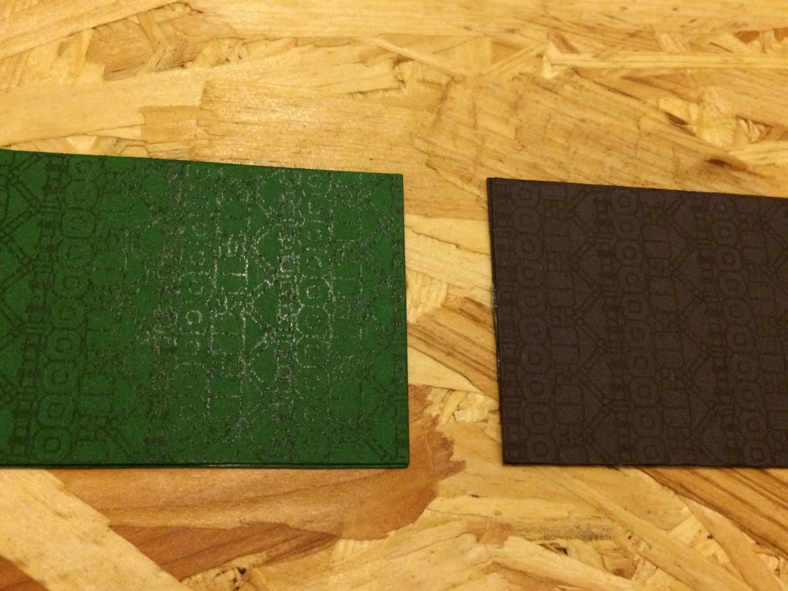
After having a conversation with Jason & Danny we came to the conclusion of carrying the brand identity color through the use of both stocks with the grey and black logo as this contrast of tone within the printed logo on the stock has a more accurate mechanical feel too it giving resonating well with the business services.


Played around with carrying the brand colour through the complement cards but the iconography in purple and green didnt show up very well on the coloured stock so printing on white will work better while also breaking up the strong use of purple and green. The bright tones makes a quite heavy contrast of extension meaning even though its only a small selection of colour it creates a big impact.

The final brand collateral has balance within all the different colours, tones and tints, and the brand identities colour scheme is carried out in a more subtle way through the business cards as this personal mode of print allows the brands tone of voice to shine through.

No comments:
Post a Comment