DH & JS Trading Brand image & collateral inspiration
I mentioned I didn't want to rely too much on influential design research, now that I have fully understood the problem at hand I can begin looking at some aesthetic influence to help inspire aesthetics, layout, use of color and enhancement of the current concept based on;
Presenting mechanics and engineering through ideas of deconstruction and angles used in the visuals to produce a visual representation of the companies services and products, the idea behind this is to tie the company name in with its products and services it offers rather than them been two separate elements coming from a business name and the products and services they offer to there target market.
Presenting mechanics and engineering through ideas of deconstruction and angles used in the visuals to produce a visual representation of the companies services and products, the idea behind this is to tie the company name in with its products and services it offers rather than them been two separate elements coming from a business name and the products and services they offer to there target market.
Use of intersecting lines, geometric simple shapes used in blueprint drawings gives off a nice aesthetic to represent engineering.


To denote the idea of mechanics and present the companies products and services in the brand identity looking at some of the products they offer will help this visual connection.
Taking influence from Sagmiester and Walsh's brand identity for Function shows how stripping back a shape, icon or letterform into simple use of lines can really enhance the perception of engineering and mechanics in such simple ways. The monochrome scheme works perfect for representing this too, its a shame my client requests the strong use of purple and green.
Use of color both for screen output and print collateral can really effect tone of voice and either aid or hinder effective delivery of concepts, the brand image can be carried out through use of colour alone as is presented here for a child friendly Cafe, the pastel colour ranges work perfect through screen output and use of stock, so considering this is important when developing my visual responses for the concept.
The pastel tones give off a very light hearted and friendly feel.
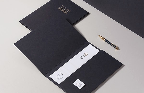
On the opposite end of the scale this corporate and luxurious brand image for Privlege produced by For Brands makes use of subtle additions of gold on dark tones of blue to give off a more corporate image as opposed to the gold foiling used in the village cafes soft and playful tone of voice. Interaction of color theory is very important.
A logo along with a company name is the gateway to the brand image so its important to consider the concept throughout this development stage, the use of geometric simple lines can create logos that are visually strong but also present concepts in clear and concise ways. These examples help me consider the idea of geometric accuracy and use of contrasting angles and curves, intersecting lines and shapes to create strong logo outcomes.
No comments:
Post a Comment