Responsive - Fedrigoni research into: Heritage, Location, Culture, Art Movments & Visual influence
To help spark influence for further ideas related to presenting heritage and the routes of where Fedrigoni started alongside supporting research into Italian culture and art movements to link past creative disciplines in a parallel way with heritage & history of the company.
History
Iconic dates to look into are 1888 as this was when paper production started, 1931 was when the company began to really grow and expand. By 1979 there were 3 main mills (Verona, Varone and Arco) that operated producing paper products.

The production process is ever changing, as mentioned in my previous idea development I want to emulate there sustainable approach to the paper industry constantly adding a modern input to there process's, visualizing this will show the development and advanced features of there products, especially the new Sirio Ultra Black range.
It mentions here the ever changing technologies and process to meet the demands of the market, emulating this advancement will add relevance to the concept idea of sustainability within the print & paper sector of the creative industry.

They take quite a consideration to the environment, maybe enhancing these approaches to strengthen the sustainable brand image through my resolution would work?


In my previous ideas I mentioned wordplay, Italian literature may influence this idea, look into the Italian language system, maybe look into modern Latin?

History
Iconic dates to look into are 1888 as this was when paper production started, 1931 was when the company began to really grow and expand. By 1979 there were 3 main mills (Verona, Varone and Arco) that operated producing paper products.
The production process is ever changing, as mentioned in my previous idea development I want to emulate there sustainable approach to the paper industry constantly adding a modern input to there process's, visualizing this will show the development and advanced features of there products, especially the new Sirio Ultra Black range.
It mentions here the ever changing technologies and process to meet the demands of the market, emulating this advancement will add relevance to the concept idea of sustainability within the print & paper sector of the creative industry.
They take quite a consideration to the environment, maybe enhancing these approaches to strengthen the sustainable brand image through my resolution would work?
Culture & Art
Italy is quite an iconic location when it comes to its creative heritage, not only within the visual arts but through music and literature. Iconic movments and artists from the past that could influence asthetic influence and concept enhancment are Leonardo da Vinci, Michelangelo, Rapael, Botticelli, Caravaggio, Bernini and Titian. A comparison could be made with these to the more current generation of artists like Bettarini & Anselmi.
(www.zainoo.com)
Music could provide quite strong influence to the concept to add a cultural feel too it outside of the visual arts, rhythms and compositions of music could provide a system to work too that may enhance previous thoughts of showing the paper ranges versatility and adaptable approaches to creative usage.
Maybe look into contrasting modern Italian music like experimental music and electronic music to more classic seventeenth century Italian Music?
In my previous ideas I mentioned wordplay, Italian literature may influence this idea, look into the Italian language system, maybe look into modern Latin?
There patriotic nature and how they like to stand out from others strengthens initial thoughts on using culture as a focus of the concept, obviously the campaign needs to stand out so using culture as a focus on creating this impact will be an effective way to go. Using art movements and influence from creatives past and presence as a vessel for displaying individuality.

Renaissance Movement & Futurism
Looking into the renaissance period seems relevant to the paper product I am creating the marketing tool due to it been a period where the production of paper and the application of printing process's came about to begin developing methods of communication, learning and enhancing cultural understandings.
(http://www.britannica.com/EBchecked/topic/497731/Renaissance)

Renaissance was seen as the bridge between the middle ages and modern history, by using influence from Renaissance and more modernist influences from the Italian futurism movement that spanned the period 1909-1940 which runs parallel to the advancement of Fedrigoni as a paper company will strengthen the idea of development of creative cultures and how Fedrigoni has reacted and adapted to these constant changes to reach where they are now within the modern day creative industry, constantly applying more modern ideas to traditional paper productions with constant consideration to the advancement of the print industry.
The term Renaissance means "Rebirth", using Renaissance as influence and this term fits perfect with how Fedrigoni want to keep the print and paper industry alive. Using futurism as influence alongside renaissance shows a transition of time periods and advancement of techniques process's and specialisms from architecture, design, publication all the way to poetry.
(http://history-world.org/renaissance.htm)

Examples of influential work
Rather than going into the in-depth theories of these examples of works, I want to take forward influence of aesthetics and use of production techniques to influence the focus on the relationship between print & paper products. As the focus is demonstrating the features & versatility of the paper, these investigations into culture and art movements are there to influence visual content and concepts to strengthen the idea of sustainability and how the company has reacted to changing periods to constantly stay at the forefront of the creative industry.
Renaissance
The target audience is the creative, probably more focused on the graphic designer so looking into the Vitruvian Man by Leonardo Da Vinci could provide influence for representing one of the starting points of structure, proportion and composition, this could be used to present grids and modern day layout in graphic design within the aesthetics and layouts of the design.

This historic influence from geometry, symmetry and layout could be further enhanced by looking into this series of books I have on Sacred Geometry, Symmetry, QED and Golden Section. The influence I take from this could go towards strengthening the adaptable iconography set I plan on creating to represent the endless possibilities and features of the Fedrigoni range. The content in these books comes from a lot of iconic movements and periods both scientific, historical and artistic adding further cultural and historic influence to my development.

LOOK FURTHER INTO THESE BOOKS FOR FURTHER INFLUENCE!

Further investigation into these books could influence the format, sizing and invention of printed promotional material, breaking out of the typical folding, production and interaction of typical printed media.

The works of Michelangelo, Da vinci, Paulo Uccello all share the same aesthetics and ideas, detailed paintings and structures of religious scenes and ideas of war. This doesn't give me much opportunity to work from so what Im taking from the renaissance period is more the transitional period from middle ages to the start of modern creative movements working of the term "rebirth".
Strong use of color but in dull tones is a common feature of this work, this would most probably due to the quality of the paints at this time, maybe consider these dull tones when using color to reference the renaissance period.


In terms of production methods everything seems to be done with painting and sculpture so focusing on this relationship between construction and print will demonstrate consideration to the renaissance period, influence this with the asthetics and production methods and print process's within the works made within the Futurism period.
Futurism
The aesthetics' across work created in the Futurism period offers much more versatile aesthetic influence and consideration of print techniques, process's used and production methods to influence my modern interpretations of the Futurism period & Renaissance.
The paper is described as extremely light fast, based on this I looked into the work of Giacomo Balla who created a visualization of light movement and speed in his work.
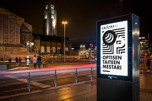
Velocity of an Automobile makes use of contrasting tone across a monochrome scheme, this contrast of tone may enhance the promotion of sirio ultra black been the "blackest" paper available. The use of abstract angular lines and geometric twirls work alongside this contrast and cause quite an impact and provoke further investigation into the detail of the work, provoking the end user is something I need to consider.

Gino Severini's The Dance of the Pan-Pan provokes energy and interaction into the detail of the painting immersing the audience into the piece of work through fractured shapes and contrasting color to create an abstract message of modern day life at this time. This consideration off adding a concept to how everyday things are perceived is something I could consider when visualizing aspects ad features of the paper and how they can benefit the creative target audience.

Theres definite links with Filippo Tommaso Marinetti's and influence on modern day design, the strong use of pattern, abstract shapes, squiggles, zig zags, grids and gradients are often seen in trend driven work. Showing a strong link between referencing historic practices in modern day trends giving me some confidence in the fact I can create resolutions infuenced by past practices, production process's and aesthetics.


Tumblr Trends!
Backing up my point of the feature of gradients, squiggles, zig zags and all this cliche trendy stuff in a more stripped back minimalistic aesthetic. These aesthetics were probably carried out subconsciously by these designers, I highly doubt they looked into such works to take these influences from.
It seems to be forming a new type of movement, known as "experimental" design, this consideration of trends may help target at the more contemporary creative audience though.


Renaissance Literature
I mentioned previous to look into Literature and Music but upon feedback from some peers it was suggested this is going a bit too far a field. This makes sense as its leaving the focus point of the visual creative target audience, instead I had a brief look into basic renaissance literature and latin that could influence word play if this was a route I went down in my idea generation.
The renaissance period influenced the transition between renaissance latin, early modern latin to modern latin with most printed books beginning to be printed using this writing and language format. Showing its influence on modern communication methods.

Rather than relying on wordplay as this may begin to get confusing with the use of latin language. I decided a good approach would be to begin placing a visual connection between these facts that resonates well with the creative target audience would be the best way to go. Looking into latin typography and the transition between hand wrote calligraphic writings to italic typefaces from the renaissance period to modern day type design could influence relevant use of typography in the resolution I create while maintaining this consideration to historic references in a modern light.
Features to consider are the ornate ligatures, strong use of serifs, contrasting stroke widths and angular sheers.
.jpeg)


More contemporary influence
As I want to show a transition of time periods to work alongside showing sustainability a collection of more modern design work was gathered, the influence from this will work alongside the more historic references, portraying these aspects in a more contemporary way. I will also focus on looking into alternative promotional formats.
I often use blogs as a reference for uptodate design aesthetics to influence my working practice for both concepts and production methods and aesthetics, so this route will benefit my ideas on comparing and contrasting past and present creative works and portraying it in a contemporary light.
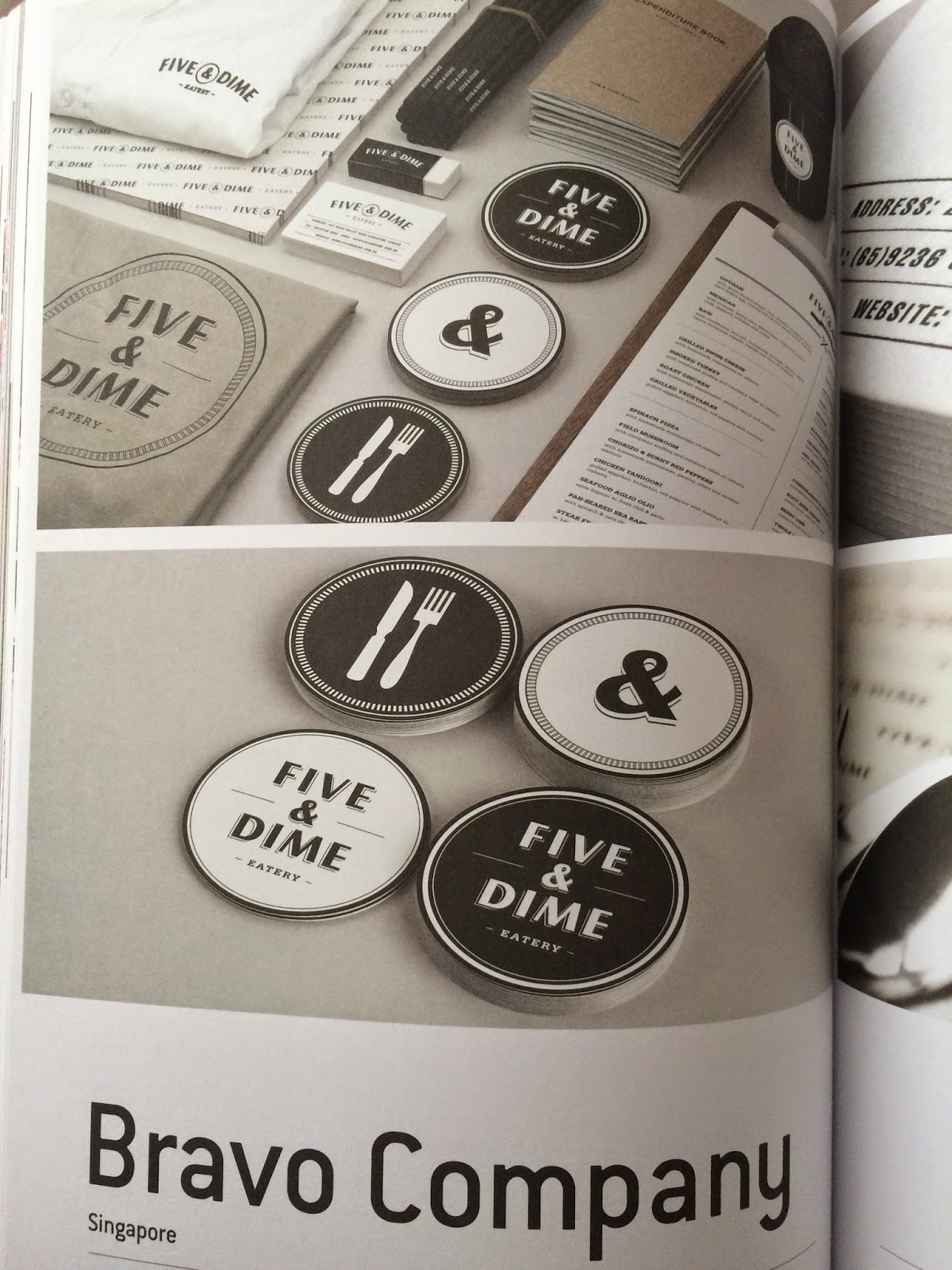
To help me think of alternative ways of approaching promotional material I will look into branding collateral rather than typical use of posters, flyers and brochures (standard singular use of A3, A4, A5 formats). Ideas used in Branding are much more considered in the concepts used to target the intended target audience.
99u Conference Branding collateral makes strong use of the brands fluorescent red color throughout the majority of the collateral, using large point serif font Sentinel to show off the detail of the typefaces anatomy to emulate the focus of the brand identity been design oriented. Focusing on how ideas are presented through these details will help me communicate the relationship between paper, print and sustainability to target at the creative audience.


I need to show the versatilely of the Sirio Ultra Black range, using black as a consistent color to represent the brand may throw up restrictions so by looking at some good use of black will help influence further ideas.
I mentioned playing around with black and the contrast between other colors on a tonal range and physical color interaction. This publication for ANY, Absolute New York makes use of black stock and contrasting white analogue, uppercase sans serif & serif typefaces to create impact and add tactility and detail to a relatively simple design composition.


These works from the Victor Vasarely Exhibition by designers Wirklig & Rasmuss Snabb, it shows how versatile the use of simple contrasting tones of black and white tones can be used to create high impact optical aesthetics that give a certain depth to the flat promotional materials. A clever way of provoking interaction, something I need to consider. They also go about there promotionl material differently, usualy posters and flyers concentrate on clear presentation of information, this uses iconic imagery and patterns to create memorable asthetics to promote the event.


The features of the Sirio Ultra Black range are its versatility within print possibilities, the promotional material created for a Design Film Festival took clear consideration of its target audience when going about the use of material, pattern and process's. Spot UV and screenprint techniques were used to compliment the use of black stock, the use of pattern is a subtle yet effective way to create tactility within the items.
Like me studio Anonymous too an alternative approach when considering the sizing and format of the collateral, something as simple as narrowing the width worked effectively.


Simple aesthetics and layouts can be used when majority black is used, as negative and unused space isnt as obvious so everything feels more structured. This will benefit me well as im trying to focus on the qualities of the paper rather than the content printed on the paper, so the content included needs to be minimal and very well informed to communicate the ranges technical features and versatility without causing distraction away from the quality and tactile qualities of the paper.


Different sizes and formats of printed material can work well with each other, I mentioned I wanted an interactive tool that could include promotional materials that work well solo and as a tactile package that a target audience could interact with to experience the qualities and versatility of the range. There are many different interactions between different sizes,formats, aesthetics and production methods that could be experimented with with these individual items that tie together into one package.

Consider how an adabtble iconography system could be made to represent things like possible process's, production methods and other features of the paper like its zero carbon content, and lightfast qualities.
Build studio make use of simple shapes and lines with contrasting bright colors and tones to create high impact yet simplistic iconography that interact with each other in unique formats but follow set guidelines so they maintain consistent.


Visuals for aesthetic influence & print process's and finishes
To demonstrate the versatility of the range I should interact with print finishes and process's, this collection will collect together production methods I could experiment with.
Risography, could provide a modern interpretation of screenprint due to its similar aesthetic and how the colors overlay and interact with each other.

The Low Tech Print book by Caspar Williamson collects together 100 iconic designers and studios that use traditional print process's in contemporary design work, this is exactly what I need to do within my production methods to demonstrate the sustainability and future of print and paper crafts.

No Brow Press enhance there bold and quirky aesthetic through screen print process's, the strong tones and application of screen print inks allows a good tonal contrast on the stock, rather than been faded out by the stock like with digital printing, screen printing places the ink on the top of the surface leaving a more bold and vivid image.


Letterpress is a technique that can produce a nice texture through de-bossing or embossing the stock, a nice tactile approach that could be used to provoke interaction for the end user to appreciate the quality and possibilities of these techniques within the Sirio Ultra Black range.

Relief printing/stamps can give off a nice analogue feel and traditional feeling of craft within the texture of the print. Wood and lino is often used in these two methods, either hand carved or using CNC machines or laser cut machines.


More modern approaches to letterpress are been explored, using abstract materials to create new aesthetics, texture and endless possibilities within the print the focus of the brief is to outline the possibilities of the paper range so working alongside modern interpretations of traditional print process's could strengthen this idea.


To emulate a modern approach to printing and the idea of sustainability and adding a modern twist to printing I plan on using the laser cutter as a method of creating linocut stamps, woodblock printing blocks, relief prints and maybe play around with creating acrylic letterpress dies alongside digital printing methods and screen printing (maybe fluro inks and metallic inks to emulate foiling in a more efficient way).
No comments:
Post a Comment