Type Family
Completed the hand rendering stage off developing my own typeface for the type family task. I started out with Minion pro and made tracings of ABC XYZ & abc xyz ready for manipulation.


I started my manipulations by creating a set off letterforms for the regular version off my font. This would give me a base to work on for the rest of the manipulations in bold, light and italic versions.
Plan and visual inspiration.
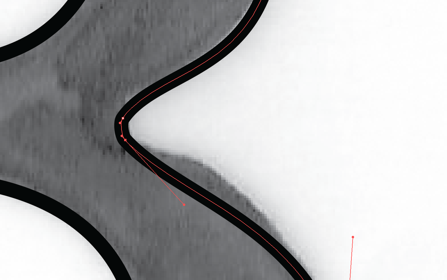
This was the original edit, as mentioned I liked the editions of the curves within the negative space of the counters giving a nice soft round feel, but this contrast with the sharp serif extensions I began with didn't work so I decided to go with an overall very round set of glyphs.

The plan for the manipulation was originally too add curves to the serif points with a sharp extension, i added this gradual curve but instead of having a sharp edge as seen in previous developments i chose to round things off.
This worked well with the curved and rounded elements added to the joins of the apex, stems and cross bars. I also added curves within the negative space of counters. This created softness and roundness within the closed counters and turned a sharp angular classic stone typeface into something quite soft, lighthearted and playful and less corporate and official looking and reminded me a lot like Neville Brody's blur typeface. The terminals were also rounded off and extended slightly and the curve within the serif bracket had a much steeper angle too it. I am happier with this manipulation compared to the one I made in the preparatory session.
Neville Brodys Blur.
 |
I found tracing off and repeating and tracing off again give me more confidence in creating a letterform in less line strokes so a smoother softer feel was added too the letterform.
I am happy with the outcome although due to the roundness off the letterforms I don't think this would be very suitable for large body copies.
I am happy with the outcome although due to the roundness off the letterforms I don't think this would be very suitable for large body copies.
Regular lowercase.
Added a slight bit more weight from the first one you see, subsequently added more curves and a softer feel.
Added a slight bit more weight from the first one you see, subsequently added more curves and a softer feel.

Regular uppercase.

I then went on to manipulate and create hand renderings for the bold typeface creating 3 tracings to see how bold I could go, the final one been the boldest I dared to go due to the aperture in the counters and bowls beginning to decrease/close and the serif points just started to touch on letterforms like Y and Z in uppercase and lowercase. I liked this though it again took the feeling away from corporate to more playful typography and added an even softer feel to the letterforms. I decided to even the stems and strokes out that contrasted in thickness in some letters, like A and Y and Z i created bold stems and spines to create more consistency and give an overall high impact bold outcome. I like how there is almost a circular element within the crossing points of the stem/stroke of the X and Y, this is due to the curvature and weight added to the regular face, the gap in the open counter begins to round off instead off been angular.
For headers I think this will work great with its high impact and illustrative feel.
For headers I think this will work great with its high impact and illustrative feel.


These final tracings were done with one or 2 strokes and i started to be more loose with the motions off the lines i drew, the basic shape still followed minion pro but as you can see the characteristics have changed completely now as the typeface gets bolder the serifs points become bigger and more round creating an even more playful letterform that has slight retro influences as it gets bolder and the curves get smoother.


The one i struggled with the most was how light I could make a typeface, as i started on the heavier end of the scale with the appearance of the typeface i found it difficult matching the outcomes up they felt like they didn't belong in that type family. But after many attempts of trial and error with different line weights and contrasting line weights like in the original font I finally achieved an outcome that matched the previous letterforms I created.
Top one is too angular and straight contrasts too much with the softness and curvatures of the bold and regular glyphs, the second is too light but the serifs in the Z look like they could work. Need to remember this is a large point size displayed here, once it is in its most common format of pt12 legibility and readability will become an issue due to hard to distinguish letterforms caused by too fine and light strokes.

Bringing back the contrast of light and heavy strokes seems to be working here. Again too angular though and the contrast of light and dark feels too mechanical and geometric for some reason. Again this doesn't go well with my playful and soft cloud like outcomes produced previously.


Line weight is almost there but still need to address the angular clean cut appearance, looks extremely minimalist and accurate which is nothing like the bubbly roundness in the bold and regular fonts.

Took a risk and decided to bin the majority of the straight stems and ligatures and once again be very loose with my pen strokes and playful, below is the outcome and it has a much softer feel and has lost its clean cut minimalism and appears once again playful so I feel this will work well with the bold and regular fonts.

The final issue was how sheered could my italic be? This as difficult i have never really liked italics I see it as like a script font, it has very limited uses apart from displaying quotes maybe? So due to the fact i saw it more of a script font the base i used was the light version of my manipulated font family. I feel script fonts are light and elegant and this italic would need to follow a similar concept.
Produced a few rough sketches of different level sheers but it was clear legibility was becoming an issue due to the morphing of the characteristics of the glyph. I feel my final outcomes just about push the boundaries for positive sheering.


These fonts are now ready for digitizing on adobe illustrator, this will give me an accurate representation of how well these fonts would work on screen.
Regular creation.
To begin with I started to trace round a scanned in image off my drawings. I decided against the contrast in stem weights so I could create a more consistent structured glyph which would work better with the curved nature of the serifs, spurs, apex, terminals, bowls and counters.
Regular creation.
To begin with I started to trace round a scanned in image off my drawings. I decided against the contrast in stem weights so I could create a more consistent structured glyph which would work better with the curved nature of the serifs, spurs, apex, terminals, bowls and counters.

Rounded the apex off to create an overall roundness and softness of the glyph. It looks almost like its been made out of play dough which to me emulates my playful concept I wanted to present.

Added the counter in. This I feel is too wide though.

More condensed counter, much better balance in negative and filled space now. The thinner counter creates an illusion of a condensed glyph which was good because the glyph appeared a little too wide footed.

To save time and maintain symmetry and structure of the glyph I copied and reflected/rotated the top half of the Bs Bowl and counter and merged it into the bottom half off the glyph.


As i imagined it didn't line up too well so some more points were added and some alterations off anchor points and curves.

Using a perfectly horizontal line as a spine or a pivot point to position and manipulate my bowls off the B.


Too angular.

The same type of techniques were used for the remainder of the glyphs.

Again maintaining that consistency with equal weight & length strokes, arms and legs on this X, notice the curves within the stems no straight lines anywhere (This maintains the fluid feel replicated by my pen strokes in the drawing phase). Using this same mirror technique to create a symmetrical finish on this glyph.


Here are the finished glyphs in regular weight, pretty happy how these have developed from Minion Pro, a very traditional stone/serif typeface with angular elements. A complete contrast of the original with its soft serifs and overall bubbly playful feel compared to the seriousness off the old original font before manipulation.
I tried to create each glyph with minimal anchor points, my drawings were developed to be made of very few strokes of the pen. This gave an overall more fluid appearance to the glyph and aided the smoothness and roundness off the glyph so I carried this idea forward into its digital counterpart.


Bold creation.
Before I began creating the bold glyphs I thought of an idea to maintain a consistent shape for the glyph, instead of redrawing the glyph out with more weight and volume and risk imperfections in the structure and characteristics of the glyph I added a stroke to create an exact replica of the shape of the regular font from my typeface.
2pt was too light still but its clear it will work.

3pt Still too light.

Almost there.

Perfect just one more pt size and I'm there!

8pt stroke here and it works perfect although too much negative space in the counter of the b.

Added a heavier pt stroke to the negative space of the counter to "fill it in" (Decrease aperture) and increase the weight of the glyp to maintain a consistent heaviness in the glyphs tone and weight.


Adding weight to the uppercase B. I notice in other uppercase B's a slight bottom heaviness to the negative space in the counter of the B, I kept with tradition here and maintained function over aesthetics and compromised on my overall symmetrical feel as I wanted to maintain a better presented glyph in turn. Adding this bottom heaviness with negative space to me solidifies the glyph down onto the baseline, if it was top heavy I feel like the character would feel like it was leaning.


Lightweight creation.
Creating this was much easier, instead of creating shapes with lots of anchor points it was just a matter off creating lines and adding a nice round bevel to the edge off the line stroke to maintain that round feel. The serifs have turned into "swashes" this maintains serif elements (and serif font type characterisation) keeps the overall fluidness and roundness theme going seen in the regular weight version.
I also used minimal anchor points which is what I wanted and adopted the same idea of copying and reflecting parts off the glyph was used in some creations.


One problem I did find though was that when the pt size of the letterform was decreased to something like 12, compared too a professionally created "lightweight" glyph it appeared too heavy.


To combat this I decrease the line weight from 2pt to 1pt. And it works much better alongside now, I didn't wasn't to go all the weigh to the lightness off this sans serif glyph as I feel it would start to distort the smoothness and the softness off the glyphs construction and sway towards very clean angular lines which is something I wanted to avoid.


Shearing the font for oblique.
To create the oblique font I sheared (transformation edits) the original light font, as said previous I wanted consistency in the glyphs and feel it would have been too hard to trace over my original drawings and dissertations would appear due to the complexity off drawing out angled letterforms.
10degrees isn't enough.

15 degrees is too much.

13 degrees meets in-between and looks just about as far as I can shear the letterforms without losing legibility off the characteristics off the glyph.
The finished glyphs in a more reasonable smaller font point size in context off typographic guidelines.

Regular.
Fluid, softness and round serifs, terminals and spurs.
Inspired by Neville Brodie Blur.
Extended rounded serifs.
Illustrative.
Looks like its made from play dough, very playful.
Lost that corporate and traditional feel from original Minion Pro typeface with a contrasting illustrative and fluid motion to the characteristics and shape of glyphs.
Lost that corporate and traditional feel from original Minion Pro typeface with a contrasting illustrative and fluid motion to the characteristics and shape of glyphs.

High impact.
Loud.
More bubbly now compared to the roundness and softness off the regular.

Bold oblique.

Light.
Clean.
Crisp.
Smooth yet accurate.

Light oblique.
Regular oblique.

No comments:
Post a Comment