Research task expansion 2
From the pooling together of our groups research we needed too individualize and prepare our own personal body of research based on past questions and responses for the content of the DPS.
What source materials do I need?
More images of a with a similar style & more focused individual research on the 5 definite questions we pooled together.


There is also no limits to aesthetics as this abstract geometric example from type token proves.


To best answer this its best to look back into history, 100 years ago Germany was divided between people who claimed that either Blackletter or the Romany face is more legible and should be used to set German. The supporters of blckletter typefaces claimed that the simple Roman shapes would hurt the eyes and cause fatigue. The supporters of the Roman typefaces claimed that the blacklister shapes are way too complex and therefore hurt the eyes and cause fatigue. In science there are two models of how letters could be read: as a visual template or as a combination of features.
For every letter of the latin script we can think of a certain generic skeleton, a unique set of stems, curves and diacritical marks that in combination make up a letter. We depend on a structure to define it as a legible designed both in a generic and familiar way (recognizably) and also in a way that stressed letter differentiation (distinguishability). These are the two forces a type designer needs to balance out when creatine a legible typeface. Simplicity makes a legible letterform, minimal manipulation makes an easy to understand form.
Typeface designers work hard to ensure that the individual glyphs in a typeface design adhere to expectations and represent identifiable characters for reading. The legibility of a typeface then is inherent within the design of the type. It included characteristics such as stroke modulation (the changes from thick to thin) relationships between proportions of character width and height, serif size and formation, the relationship between shapes of individual characters and the size and shape of counters. All these effect the legibility of a typeface and letterform.


Green has links with nature, it can simulate growth, harmony, freshness and fertility. Green has strong connotations with safety, dark green with money. Green has a mental healing power, can improve vision and can suggest endurance or stability.

Blue has associations with the sky and the sea. It often simulates trust, loyalty, wisdom, confidence, intelligence, faith, truth and heaven. Mentally blue is considered to enhance the mind and body. It has a calm in effect due to its association with tranquility and calmness.

Purple makes use of the stability of blue and the energy of red Purple has links with royalty, symbolizes power, luxury, nobility and ambition. It has links with wealth, wisdom, magic and mystery. People consider purple to be artificial due to it been very rare in physical nature forms. Light purple can be seen to be quite feminine.

White has links with light, goodness, innocence and purity. It is seen to be the color of perfection through its simulation of safety, purity and cleanliness. As opposed to black white has positive connotations.
Black has links with power, death, evil and mystery. Black is seen to mysterious, a color linked with fear and the unknown. Its a very negative color but denotes strength and authority. But it can also be seen to be very formal and sometimes elegant so it is quite a versatile color depending on its use. For example a black tie is formal, a black funeral car has obvious connotations with death.

Were will I get them from?
Graphic design blogs, websites, books and make my own images.
I narrowed down 5 questions & responses from our groups pool of questions. For long text heavy bodies of research I cut down the text to be more concise and snappy for the double page spread content.
I narrowed down 5 questions & responses from our groups pool of questions. For long text heavy bodies of research I cut down the text to be more concise and snappy for the double page spread content.
What are the main applications of the font classifications?
Block
Block typefaces are mainly used for headers or initial capitals, there main use is for high impact decorative visuals. Due to there complexity the letterforms can be hard to distinguish in large blocks of text. This example used the traditional wood block printing method.
http://www.typetoken.net/typeface/north-south-—-anthony-burrill-for-print-paste/
Example of how blackletter typefaces are used within the traditional block classification.
http://www.itsnicethat.com/articles/giulia-garbin-the-street-of-ink
Serif
Roman typefaces or serif typefaces are typically used for body texts. This is due to the use of serifs which are said to help the eye move from letter to letter along with the eye scanning the text using ascenders and descenders to distinguish words, increasing legibility off each individual character. The more ornate serif versions within this category are used in headers. Its also more common that traditional old style subcategories within the serif classification are used for publications depending on the concept.
http://www.typetoken.net/publication/yearbook-of-type-1-slanted/
Sans Serif
Sans serif/gothic typefaces are most used in headings or short bursts of information, it is said that the cleanliness off the letterform can disturb legibility off the glyphs and cause overall readability issues when used in large body text's.
A good use of a sans serif typeface in a typical short hit of information, a header. Or a header on a book. Extreme cleanliness and legibility in small bodies of text.

http://www.typetoken.net/publication/fhk-henrion-the-complete-designer-unit-editions-unit-13/
 http://www.itsnicethat.com/articles/fontsmith
Sans serif/gothic typefaces are most used in headings or short bursts of information, it is said that the cleanliness off the letterform can disturb legibility off the glyphs and cause overall readability issues when used in large body text's.
A good use of a sans serif typeface in a typical short hit of information, a header. Or a header on a book. Extreme cleanliness and legibility in small bodies of text.
http://www.typetoken.net/publication/fhk-henrion-the-complete-designer-unit-editions-unit-13/
Digital
Due to the traditional construction techniques off block, roman, gothic and script fonts the main use for digital fonts would be for display on screens due to the construction process been different and originating from a computer rather than old style techniques like carving, wood block pressing, hot metal type setting, bone calligraphy or sable brushing. This construction process brings me onto my next question.There is also no limits to aesthetics as this abstract geometric example from type token proves.
http://www.typetoken.net/typeface/glue-grist-gareth-hague-alias/
http://www.itsnicethat.com/articles/stahl-r-folkdays
Script
Script typefaces were originally created to mimic handwriting, there vague legibility means that its difficult to read the typesetting of script in large body texts so there use is limited to decorative uses like wedding invites or anything that needs decorative details such as brand names or captions.
Typical use off the style in context of a wedding invite.
A more decorative use of script typography.
http://www.itsnicethat.com/articles/calligraphi-dot-ca
How does kerning/tracking/leading effect readability?
Leading.
Leading is the spacing between the baselines of type. The term leading is derived from the practice of placing lead strips between lines type on older hand set printing presses such as a letterpress. Adjusting the leading is also a very useful way of saving or using space on a page. Leading can also be used to change the aesthetics when dealing with a typographical design.
Leading effects how we read paragraphs as it effects the spacing between the lines. If the leading is increased too much the lines will not sit together and they will just read as individual line and on the other hand if the leading is decreased too much the lines will over lap and will be un readable. If the leading is changed the right amount the lines relate more to each other which helps increase readability.
Different typefaces will need different leading as some typefaces have bigger decenders and ascenders which will effect how much you can alter the leading.
Most softwares have a default leading of 120% so a 12pt font will have a leading of 14.4 pt.
Examples using 12pt Helvetica.
Auto leading.
8 leading. Illegible & unreadable lines aesthetics.
60 leading. Readable lines but illegible as body copy.
Kerning
Kerning is the spacing in between individual characters. Most fonts will have specific default kerning for individual character sets so that the spacing in between the letters in words feels more natural.
If the kerning is to big it will make the letters seem unjoined and it won't flow. This effects the readability as the words don't appear as words they appear as individual letter forms so it doesn't read well. The opposite of this is negative tracking, by changing this too much the letters will overlap each other and won't read at all.
0 Kerning.
+200 Kerning.
-120 Kerning.
Tracking
Another adjustment to type that hasn’t been mentioned is Tracking. Tracking is very similar to kerning in that it is the spacing between individual characters, but tracking is the space between groups of letters rather than individual letters. Tracking affects the overall character density of the copy. Other than the actual effect that it could have on readability of type, tracking would be used to make lines of type even. Tracking will help to eliminate widows and orphans in paragraphs. Widows are when the final line of a paragraph begins a new column or page. Orphans are when paragraphs end in single words, part of words or a short phrase that seems out of place.
http://n-gilchrist1316-dp.blogspot.co.uk
When creating a typeface are the italic/oblique fonts created from manipulations of the original regular font or drawn out separately?
aa
Italics are drawn out separately from the regular letterforms in a typeface based on an axis ranging from 7-20 degrees. Italics have a calligraphic style & serif elements and can sit close due to the angle they have individually drawn at.
aa
Obliques were created because italics were considered inappropriate for the industrial and non-calligraphic designs of most sans-serif typefaces. An oblique is essentially a copy of the roman character put at an angle often around 8-12 degrees.
Italic is a special version of the font, whereas an oblique version is just the regular version inclined a bit. So both are slanted and related to the regular font, but italic will have special letterforms made especially for it.
An italic is created by the type designer with specific characters (notably lowercase a) drawn differently to create a more calligraphic, as well as slanted version.
http://stackoverflow.com/questions/1680624/css-font-style-italic-vs-oblique
http://stackoverflow.com/questions/1680624/css-font-style-italic-vs-oblique
What makes a letterform legible?
For every letter of the latin script we can think of a certain generic skeleton, a unique set of stems, curves and diacritical marks that in combination make up a letter. We depend on a structure to define it as a legible designed both in a generic and familiar way (recognizably) and also in a way that stressed letter differentiation (distinguishability). These are the two forces a type designer needs to balance out when creatine a legible typeface. Simplicity makes a legible letterform, minimal manipulation makes an easy to understand form.
Legible example.
Illegible example.
http://n-gilchrist1316-dp.blogspot.co.uk
Most common color connotations & there meanings?
Red can represent fire, blood. Can be associated with energy, war, danger, strength power, determination and love. Emotionally the color red is very intense. It enhances respiration rates and raises blood pressure. Its high visibility benefits its use in stop signs & stop lights.
Red brings text and images to the foreground, when used as the accent color it can stimulate people to make rash decisions. Its used often in "click here" or "buy now" buttons.

Yellow is the color of sunshine. Its associated with joy, happiness, intelligence and energy. Yellow has a warming effect sparking cheerfulness, stimulates mental activity and generates muscle energy. Yellow has links with food associations. Taxi cabs are painted yellow due to its high impact and luminance. In use with black it can simulate danger.Red can represent fire, blood. Can be associated with energy, war, danger, strength power, determination and love. Emotionally the color red is very intense. It enhances respiration rates and raises blood pressure. Its high visibility benefits its use in stop signs & stop lights.
Red brings text and images to the foreground, when used as the accent color it can stimulate people to make rash decisions. Its used often in "click here" or "buy now" buttons.
Orange combines both the energy from the color red and the happiness of yellow. It has associations with joy * sunshine. Orange can present enthusiasm, fascinations, happiness, creativity, determination. attraction, success, encouragement and stimulation.
Visually the color orange is a very hot color, it gives of a feeling of heat. The color can stimulate mental activity, and due to its citrus color companion it can be associated with healthy food so stimulates the appetite. Orange is also the color of fall and harvest.

Visually the color orange is a very hot color, it gives of a feeling of heat. The color can stimulate mental activity, and due to its citrus color companion it can be associated with healthy food so stimulates the appetite. Orange is also the color of fall and harvest.
Green has links with nature, it can simulate growth, harmony, freshness and fertility. Green has strong connotations with safety, dark green with money. Green has a mental healing power, can improve vision and can suggest endurance or stability.
Blue has associations with the sky and the sea. It often simulates trust, loyalty, wisdom, confidence, intelligence, faith, truth and heaven. Mentally blue is considered to enhance the mind and body. It has a calm in effect due to its association with tranquility and calmness.
Purple makes use of the stability of blue and the energy of red Purple has links with royalty, symbolizes power, luxury, nobility and ambition. It has links with wealth, wisdom, magic and mystery. People consider purple to be artificial due to it been very rare in physical nature forms. Light purple can be seen to be quite feminine.
White has links with light, goodness, innocence and purity. It is seen to be the color of perfection through its simulation of safety, purity and cleanliness. As opposed to black white has positive connotations.
Black has links with power, death, evil and mystery. Black is seen to mysterious, a color linked with fear and the unknown. Its a very negative color but denotes strength and authority. But it can also be seen to be very formal and sometimes elegant so it is quite a versatile color depending on its use. For example a black tie is formal, a black funeral car has obvious connotations with death.
http://www.color-wheel-pro.com/color-meaning.html
http://www.empower-yourself-with-color-psychology.com/meaning-of-colors.html
____________________________________________________________________________________________________
The final thing we needed to do was think off 5 individual questions for the publication spreads and answer these for our DPS content.
The final thing we needed to do was think off 5 individual questions for the publication spreads and answer these for our DPS content.
How colours are relevant to designs produced for/from different countries?
Color is very important within the aesthetics and concept of a design. Its not only needed to be aesthetically pleasing but designs produced by designers for/from different countries have a lot of differences. Each designer has there own style influenced by the country its designed for or were the designer is from.
Swiss/International style makes use of bright & vibrant colors tending to use a lot of primary colors inspired by the De Stijl movement.


Swiss/International style makes use of bright & vibrant colors tending to use a lot of primary colors inspired by the De Stijl movement.
Chinese graphic design makes use of a color that links to traditional Chinese culture. The color red has conniptions with luck within the Chinese community so its used a lot in there design, pastel tints are used as well rather than vibrant colors. This denotes the tradition influences of China as a country.
http://moretong.tumblr.com/image/27749119275
Going back in history this famous poster makes use of Americas bold attitude within there patriotic nature. The Red white and blue denoting Uncle Sam, the legend of American history.
http://www.loc.gov/exhibits/treasures/images/tlc0090.jpg
What are the advantages of traditional print methods & new age methods?
In terms of advantages and disadvantages there can be many drawbacks or benefits of using traditional and digital print methods.
Digital printing is a four color process reproduction method that uses electronic files from computer artworks and dots of color to produce an image using toner and ink. Each dot of ink comes from a CMYK color palette. Unlike traditional printing a pre prepared framework like a screen or a printing plate isn't required.
Digital print benefits.
Short turnaround.
Consistent colors, every print is the same due to pre determined ink mixes.
Cheaper printing for volume printing.
More environmentally friendly, less waste.
Can use the pantone color system.
Traditional printing methods are best suited to limited runs and have much wider opportunities for better aesthetics and finishings. Letterpress, lithography, linocut, screen-printing, thermography, spot UV finishing, UV varnishing and foil blocking are the most common traditional printing methods.
Traditional print benefits
High quality output, much better aesthetics.
Limited edition hand made feel creates more exclusive prints giving more profits.
Opportunity to print on different surfaces like wood, metal, glass.
Opportunities to add texture like embossing or debossing, felt printing.
UV & Neon ink printing possibilities.
http://www.pinscreative.com/articles/digital_vs_offset.htm
How is woodblock type traditionally made?
- Wood engravings are a form of relief printing. The starting point would be a hard block of wood that would create a solid shape when printed. The letterforms are created by wood been cut away from an outline leaving a final image. The other common relief printmaking methods are the woodcut and linoprint methods.
- All engravings start with a drawing. The image you cut into the block needs to be the reverse output of the final print. This means when the print is pressed the letterform appears the right way round. A good tip would be too create mockups on acetate so the actual print outcome can be viewed on the other side of the acetate.
- The block engraving. The wood that you intent to use needs to be cut across the end grains of the block. The depth of the block is normally the height of the letterform. The traditional wood to use for wood engraving is boxwood, alternatives could be lemonwood. The wood needs to be capable of coping with fine detail and be robust enough to withstand many prints.
- There are 2 methods of drawing onto the block. You can draw onto the natural wood block, or you can cover the block in watercolor wash and draw on in pencil. Its a good idea to use tracing paper before hand to plan on were to place the visual elements onto the block.
- Using typical woodcarving tools like; spitsticker for curved lines. A scorper for straight lines and large surface areas. A tint tool for parallel lines.A lozenge graver for cutting lines of varying widths. The multiple tool cuts several parallel lines at once.
- After lots of patience the block glyph is finished with sandpaper for curved elements of the letterform.
- The block is ready for printing now, good quality printing paper is recommended. Strong thin paper like a Japanese paper is the traditional medium.
- In terms of a printing press it can be done by hand for a more worn out rustic effect. Or a proof press or a typical letterpress were moveable type can be placed in the pressing tray.
Top 10 most famous type designs?
 Neo-grotesque sans-serif
Designed by Max Miedinger
1957

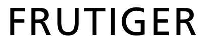 Huminast sans-serif
Adrian Frutiger
1975
 Serif
Serif
Giambattista Bodoni
1798
 Geometric sans serif
Paul Renner
1927
 Transitional serif
Victor Lardent
1931
 Slab Serif
Monotype
1936

 Humanist Sans Serif
Eric Gill
1926

Neo-grotesque Sans Serif
Adrian Frutiger
1957
http://100besttypefaces.com
Designed by Max Miedinger
1957
Old style serif
Designed by Claude Garamond
1989
Adrian Frutiger
1975
Giambattista Bodoni
1798
Paul Renner
1927
Victor Lardent
1931
Monotype
1936
Sans Serif
Linotype
1931Eric Gill
1926
Neo-grotesque Sans Serif
Adrian Frutiger
1957
http://100besttypefaces.com
How does pantone work?
Pantone is a color matching system wich was introduced by the Pantone corporation in 1963. Its main uses are for printers and graphic artists to deliver reliable color matches for the customers. It is a color language that is communicated and understood the same worldwide.
How the pantone system works is that that each color swatch has a code. This code can be translated by printers to create specific color matches. Designers can see colors in the real world and translate them into a color code.

This is the screen representation of the physical color swatches through the pantone matching system proce.

The pantone system is made up off CMYK colors. (cyan,magenta, yellow, and key/black). Each color code has certain percentages of each color proportion. Or the pantone code can be entered into the print process to create an accurate match.
http://www.wisegeek.com/what-is-the-pantone-matching-system.htm
Pantone is a color matching system wich was introduced by the Pantone corporation in 1963. Its main uses are for printers and graphic artists to deliver reliable color matches for the customers. It is a color language that is communicated and understood the same worldwide.
How the pantone system works is that that each color swatch has a code. This code can be translated by printers to create specific color matches. Designers can see colors in the real world and translate them into a color code.
This is the screen representation of the physical color swatches through the pantone matching system proce.
The pantone system is made up off CMYK colors. (cyan,magenta, yellow, and key/black). Each color code has certain percentages of each color proportion. Or the pantone code can be entered into the print process to create an accurate match.
http://www.wisegeek.com/what-is-the-pantone-matching-system.htm
No comments:
Post a Comment