Secret 7 design development (Simpsons idea)
Initial idea was too present how Jake got into the guitar by listening to The Simpsons by showing a donut.

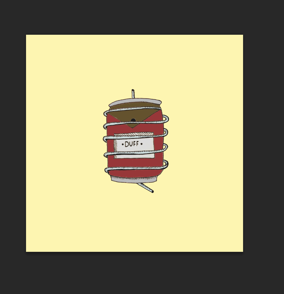
I felt a Duff can suited better as it denoted homer more who is the key character of the show. I created a very minimal visual of the can to simulate Jakes stripped back style while using pastel tertiary colors to create a more traditional overall feel. The idea of presenting a beer can has vague social connotations off youth culture and drinking which has loose links with Jakes urban upbringing.
Duff can below used as source image.

Vector resolution. Using minimal typography simulates a better presentation of minimalism and simplicity.

After deciding against the vector resolution above and feeling like an illustrative approach would be more relevant conceptually. Having illustrations emulates Jakes traditional style through the used of traditional image making techniques. Bellow are the rough drawings I created experimenting how the guitar string would entangle the can. I experimented with drawing style and fine liner widths to create a variety of depths and tones through the lineart.

Began filling the image in watercolors, I like the blending that can be achieved with the paints and the varieties of tones that can be achieved with watercolors and how well they blend together. The neutral shade and tints are also dialed down and more pastel compared to the strong tones and bright colors in the vector resolutions I created for the interim crit. The tones and hues remind me of autumn which in turn reminds me of the country which has relevance with Jakes country music style.
I added the guitar string round the can to emulate the lyric "trapped" the can is trapped by the guitar string, and the guitar is Jakes staple instrument in his music production.

Added stronger tones of orange creating a brighter overall feel and better connotations to autumn and the links with country and the musical style.

Added highlights to the lines of the drawing with heavier weight lines to create more contrast between the colors and the lines of the drawing, this in turn creates a flatter overall feel of the image.

Removed the background ready for placing in the 7"x7" record document.

Placed the image central to the frame as this creates a better balanced composition between the negative and positive use of space.

Added the pastel toned yellow hue that derived from the vector composition.

I began to morph the images by using the distort twirl filter, I added varying degrees of twirl settling on the central composition. The idea behind morphing the can was to abstractly represent the idea of a change of perspective, this has obvious links with the song lyrics "nightmare". The idea of a nightmare been a changed perspective off the real world. It also has an abstract aesthetic too it which has relevance too the track name "strange creatures". The final image represents a cd rotating in an abstract sense but the morph was too strong and lost recognition of a duff can which was the main concept idea.

Trying out different hues to represent traditionally like the one bellow, brown hues connote this the best. But it doesn't work with the image of the duff can, the contrast just isn't right, the dark tone of the brown outweighs the duff can. This causes in-balance within the composition, there needs to be a tonal contrast of light and dark, the dark element been the Duff can so its the more obvious visual element (Hierarchy) within the composition rather than the background image.

A very pale tint of peach color creates a nice contrast of tone of light and dark. Peach has comforting connotations with the idea of "dreaming" dreaming derives from the lyric "nightmare" been flipped on its head.

Brown tone but of a lighter hue, using this pastel tone keeps things neutral, having a neutral background creates a nice contrast of light and dark as mentioned previous. The idea of neutral colors as defined by the dictionary" a fairly neutral background will make any small splash of color stand out." This strengthened the requirement of the duff can needing to stand out.

Settled on a light tint of yellowy off white or cream. This created the nice contrast I required, connoted traditionally through the saturation and darkness off the rustic tonal range off the can and created n overall consistent color composition between the 2 color elements (Background & Can)

Experimented with layer edits to create different abstract effects, bellow is the screen effect. A nice contrast and subtly is the outcome when the colors are removed from the can and just the white tones remain. But legibility of the can is too low.

To create a more traditional feel I created a sort of sepia outcome by using the luminosity layer edit. I like this but I wanted to have elements of color within the can to display the common color connotations of the Duff can.

Using the color burn layer edit created an abstract effect to the Duff can, it made it feel as if it was worn out, something that had connotations to the country, it looked like rusting paint. This reminded me off how paint fades and rusts off typical farming equipment like tractors, and street signs in traditional American country locations. It did however fit with the abstract shapes of the image.

Made sure everything was central and evenly aligned within the composition. The small central lines (top and bottom) are used to frame up the can within the centre of the composition. It stops it feeling like its just loosely positioned in the middle of the composition, creating a better overall balance of negative and used space. I changed the color off the lines and changed them to a darker yellow tone swatches from the background. This creates less contrast and they blend in a little more with the background, before when they were black the contrast was too strong. I needed an overall subtle tonal range throughout the composition to create an overall constant feel.

I began making a Photoshop colored in variation inspired by the bellow image I found in my research stage.

Took a high resolution photograph instead of scanning in the image, scanning in the image creates an overall graininess through the accuracy of the scan picking up details off the texture of the paper. A photograph avoids this problem.

Instead of deleting the background to add color, to create a more rustic effect I altered the levels of the outlines so the black became more vibrant within the tonal range and the white became brighter ready for color blocks to be added.

Color added, very strong tones, not very bright. Very rustic, good links to elements of traditionally and the country life (links with country music style of Jakes) been very rustic.

Background removed.

Toned things down a little by lowering the contrast, this creates a more neutral/pastel feel but keeps the dark tones of the reds and the brown hues.

The strong tones in the can makes it easier to create a stronger contrast between the background image so I didn't need to lower the tint off the yellow too much. The tone is a lot brighter than the watercolor variation but works.
I made the lines that frame up the can black, it kept the tonal range quite strong. The lines within the drawings are also quite heavy so this keeps constancy through the design composition.

Final composition, the colors are quite flat though. I felt it needed some kind of effect to display rustic emulations a little more.

Added noise to add a graininess too the image, this graininess gives off a more rustic feel which is what I intended.

Added the same angle of twirl seen in the watercolor composition to emulate the change of perspective and abstract aesthetics.

Changed the background to a pastel orange shade, it has obvious connotations to autumn which has links to country life (subjective personal opinion). Visually it just doesn't work though. Its too bright and vibrant, the luminance clashes with the more dark tones in the duff can.

Added the same light tint yellow seen in the watercolor composition, this creates a stronger contrast bringing forward the can image as a stronger visual element.

No comments:
Post a Comment