Monday 31 March 2014

Type Journal

Type Journal

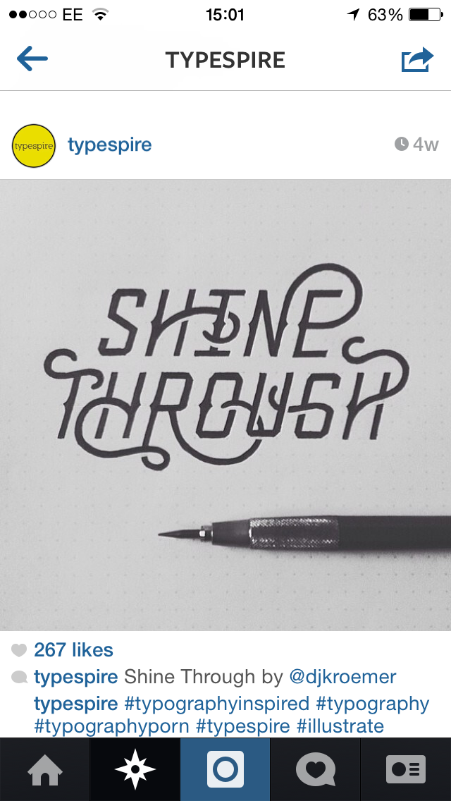
Production method: Sable. Script font. 
Anatomy: Tapered terminals contrast with squared terminals, 
Identity: Casual script font. Traditional. 
Character: Subtle use of ornate extensions on terminal ends and script like ligatures, very scruffy and illegible with the 'p' and 's' in 'septic'

Production method: Stone. Roman category. 
Anatomy: Contrasting weights in horizontal and vertical stems/strokes and spines. Rounded terminal end on 'a' contrasts with angular and sharp serifs on other glyphs. Long extended serifs on 'S'. Lowercase with one uppercase character within the header. 
Identity: Transitional serif.
Character: Traditional, accurate, quite corporate and professional looking, accurate details. 

Production method: Bone. 
Anatomy: Bold weight, squared bowls and curves, short descenders and ascenders, triangular terminals.  
Identity: Blackletter script type. 
Character: Ornate, traditional, medieval, sharp, angular, evil, dark. 

Production method: Digital. Gothic. 
Anatomy: Contrasting bold and light weight stokes, constant stroke width in both, squared off joints, short descenders.
Identity: Geometric sans serif. 
Character: Irregular, unbalanced, contrasting, mechanical, bad attempt at geometric type. Condensed. 

A B C D E
Production method: A:Wood B:Sable C:Lead D:Stone E:Woodblock
Anatomy: They all share consistent weights in line apart from 'b' it slightly thins on diagonal strokes. A combination of heavy weights, light weights, 'E' has very solid square serifs, 'd' has triangular serifs.
Identity: A:Grotesque sans serif B:Casual script C:Grotesque sans serif D:Glyphic serif E:Slab serif
Character: Playful combination of styles of type, contrasting, decorative, solid, delicate, condensed, sharp, soft. 

Type Journal

Type Journal

Production Method: Lead origins gothic font. Neo grotesque sans serif.  
Anatomy: Lightweight typeface in mostly lowercase, short ascenders and even spacing within bowl depth and descender. Quite circular 'o' very geometric overall feel. 
Identity: Modern typeface, maybe a lightweight Helvetica used here in context of high end electrical branding.
Character: Delicate yet accurate, has a corporate yet clean feel. 

Sunday 30 March 2014

Salt & Sauce competition pack & Round up evaluation

Salt & Sauce competition pack & Round up evaluation

For the competition we were running with the people who bought the T-shirts me and Neil created and printed a competion pack consisting of prints of the T-shirt illustrations plus a California map that didn't make it onto the T-shirt created by Daria along with a sticker pack of some quirky and fun cone of chip stickers that Me and Neil designed in some different color variations using the blue color to establish and distinguish the brand throughout. The final sticker was a keep repping sticker me and Niell created intended for T-shirts but due to time scales and budget we went with a sticker pack.

Here is the images that will be used for the prints and sticker packs. 


It all came together quite nicely I thought bringing back the tracing paper gift wrap we tried out before which were intended for the T-shirts for the stall. But due to cost we decided to scrap this idea and use it as a bespoke design element for the competition pack. 


Evaluation
I am happy with the final results from running this stall, we did manage to sell out of the T-shirts raising around £140 for Skatepal which was good. It proved we went viral in that sense with the T-shirts selling out. I think this was due to the strong promotions we carried out with print media and social media methods getting the word out there to a wide audience, and also me sending an email to be forwarded on to the whole college informing them of the stall. 

But the competition pack we run didnt go so well, everyone bought a T-shirt but the idea was for people to post photos on our instagram page wearing there T-shirt in unique locations. We had no submissions to this, I think this is because we didnt really push this element of the project very far. We just put a tag in with the T-shirt in with the details and a short tweet and facebook message reminding people. If we pushed the competition a lot more maybe we would have got a few submissions and gone viral on the social media side of things, although we did get a large amount of followers on the instagram, twitter and facebook page combined so this provide we succeeded in this area I guess. 

The things we did best on this were the promotion and the running of the stall, this all went really well.
The girls produced some really nice T-shirts that people were obviously attracted to buy which was good.

Really loved the quirky sticker set me and Neil made too, these were one of my favourite elements too it to round things of nicely with the chips in the cone really carrying through our brand name with unique and aesthetically pleasing visuals. Loved the different materials and print methods I used too using tracing paper and stickers so our groups name and style was portrayed through many different mediums. 

I myself carried out all print promotion, some social media promoition, the competition pack, the instagram page and the sending of the chain mail but wasn't available for the stall due to illness wich I wasnt happy about so obviously if I could do the project again I would hope to be there for all stages of the project. 

Saturday 29 March 2014

Type Journal

Type Journal

Production method: Rendered. But based n a woodblock type. 
Anatomy: Extreme large pt size, uppercase and lowercase with contrasting line weights, the cap height of the initial caps in B and D are larger than the rest of the header. 
Identity: David Carson. 
Character: Abstract, grunge, textured, faded, artistic, contrast. 

Production method: Digital
Anatomy: Ornate extensions, abstract crossbar on T, mostly a consistent line weigh with a contrasting light element added in some of the curves on the bowls of 'e' 'r' and 'n' 
Identity: Based on a manipulated geometric sans serif with obvious visual additions.
Character: Playful, floral, abstract, contrasting shapes, angular and cirular elements.

Production method: Woodblock. 
Anatomy: Chunky serifs, rounded and semi squared off counters,. 
Identity: Slab serif, gothic. 
Character: Abstract, textured, faded, contrasting colors. 

Production method: Digital.
Anatomy: Inconsistent line weight, abstract triangular serif point on the G, squared off 90 degree right angle on the base of the G. 
Identity: Looks like a manipulated version of Neville Brody blur? An edit of a geometric sans serif font. 
Character: Soft edges, abstract, uneven, retro.

Production method: Rendered
Anatomy: Uppercase, irregular weights, light, regular, bold and ultra bold. 
Identity: David carson
Character: Type as image, textured, abstract, photocopy style, 

Production method: Digital manipulation of a lead type. 
Anatomy: In the actual glyphs the line weight is pretty consistent, all lowercase. 
Identity: Origins look like a monospaced geometric sans serif typeface with modern manipulations. 
Character: Technical, playful use of combination of letters and symbols. 

Type Journal

Type Journal 

Production method: Lead. Gothic. 
Anatomy: Consistant weight, no extensions from bowls in 'd' and 'a' giving a very round feel to the type, lowercase and uppercase, medium weight and short legs on the lowercase 'k'
Identity: Looks Bauhaus influenced so a modern geometric sans serif. 
Character: Geometric, round, unstable o, d, a. the a looks like an upside down e that has been manipulated, confusing, constant structure. 

Production method: Woodblock. 
Anatomy: Heavy weight, extended terminals create a square within the negative space of the 3. Square terminals, very angular terminals, acute angles in joints in Ms negative space. 
Identity: Grotesque sans serif, functional style. 
Character: Structured, tightly kerned, heavyweight, solid structure, squared off block of glyphs. 

Production method: Wood. Block classification. 
Anatomy: Consistant line weight
Identity: Geometric sans serif. 
Character: Playing with negative space and interactivity of joint letterforms. 


Production method: Woodblock.
Anatomy: Consistant weight, short horizontals long vertical strokes, all uppercase. 
Identity: Modern grotesque. 
Character: Condensed, interactive, simple, confusing. 

Production method: Digital. 
Anatomy: Angular joints, consistent line weight and length on horizontal and vertical strokes. 
Identity: Modern twist on geometric sans serif, instead of been perfect circle elements perfect squares create the base of each glyph. 
Character: Squared off, reversed out type, angular, even, set square style accuracy. 

Friday 28 March 2014

Type Journal

Type Journal

Production method: Digital. 
Anatomy: Uppercase, small apertures in counters, condensed glyphs. 
Identity: Modern playful sans serif/gothic font. 
Character: Playful, Bold, colorful, awful, outlined 

Production method: Stone would be the origin but this is a digital reinterpretation. 
Anatomy: Triangular serifs contrasting with more gradual pointed serifs. 
Identity: Glyphic serif.
Character: Warped, ornate, traditional, tightly kerned making a joined block of text illegible, don't like this. 

Thursday 27 March 2014

Type Journal

Type Journal

Production method: Lead.
Anatomy: Consistant lightweight, uppercase, even stroke lengths on diagonal, horizontal and verticals. 
Identity: Geometric sans serif. Gothic.
Character: Highend, accurate, light, delicate, 

FABRICE GYGI
Production method: Woodblock.
Anatomy: Consistant line weight, squared off curves and bowls, narrow glyphs. 
Identity: Grotesque sans serif. Gothic. 
Character: Condensed, stencil style, broken up, deconstructed. 

Production method: Lead. 
Anatomy: Consistant weight of lines, equal line lengths. 
Identity: Album cover, digital manipulation of a geometric sans serif. Gothic. 
Character: Tightly kerned, mechanical, sharp, accurate.

Production method: Digital
Anatomy: Consistant light stroke, square glyphs with curved corners instead of a bowl with a gradual curve. 
Identity: Square modern grotesque sans serif. 
Character: 3D, thin, mechanical, emboss, curved, squared off glyphs. 

FUEL
Production method: Woodblock/Digital. 
Anatomy: Consistant stroke weight, squared of bowls, equal length strokes on horizontal and vertical positioning. 
Identity: Blackletter? Or decorative digital. 
Character: Neon, floral, decorative, intricate. 

Production method: Woodblock.
Anatomy: Very heavy weight, short vertical strokes, quite stumpy glyphs. 
Identity: Gothic. Geometric sans serif.
Character: Bold, colorful, hyphenated, gradient.

Type Journal

Type Journal

Production method: Hand rendered sable.
Anatomy: Square elements were curved things should be like bowls, sharp angles on spines and elegant extensions of terminals joining letters up together in an abstract ligature joint. 
Identity: Formal script. 
Character: Accurate, spiral, tangled, interactive, joint up. 

Wednesday 26 March 2014

Final crit feedback for Mercury Rising poster

Final Crit feedback for Mercury Rising poster

Presented here is the design board to support the physical screen prints for the final crit presentation ready for feedback on my final designs.

In terms of crit feedback I wasn't able to obtain much feedback off the group in a formal crit format due to been away on the day. I did however gather some feedback from a range of different audiences over the past few days after the screen prints were made. 

I explained the basic concept of the design in as minimal detail as I could get away with to non creative friends and they understood the idea I presented forward and all mentioned how eye catching it was and loved the use of silver inks and didn't think it was possible to create metallic effects so well with such a simple method.

I asked a few of my peers in class too what they though of it, they all liked the concept and loved the aesthetics of it but there was a pretty even split on which was the better stock choice, I personally preferred the lighter stock due to the contrast but some people favored the more subtle contras within the grey stock and mentioned how the metallic silver has more of a "sheen" too it on that stock. I think thats due to the smooth texture of the grey stock compared to the more rough texture of the antique white paper stock.

The only negative feedback received for my final design was that a few people said the words "mercury rising" weren't really legible within the mass of glyphs and symbols, I didn't want pure legibility but I wanted the viewer to distinguish the words after slight investigation of the image to give it that interactive feel like they themselves are decoding a message. Most people could notice these glyphs though which shows the visual concept worked reasonably well though.

The final points made were the good use of color pallet and how well the two hues worked together as a good contrast of light and dark tones.  A simple color pallete was my intentions and they agreed with the use of red for presentation of action connotations and when I asked about the idea of a thermometer they thought that was a good little extra to the connotations and links of the color. The use of metallic silver was strongly favored due to the shine too it and how well it linked with and visualized the metal "mercury".

Screenprinting Mercury rising poster

Screenprinting Mercury rising poster

Today I finished the physical production of my movie posters in the rossington street print room. 

Mixed up some inks to replicate the digital mock up and my intentions for metallic silver ink to represent "mercury", The choice of red having connotations with violence and action true to he synopsis of the film. The red color is also the common color used in thermometers, an instrument that included the metal mercury.

Screens exposed ready for printing, split the 2 sections up the first to be printed will be the the square shapes to be printed in silver. The line and circle elements inspired by the mayan numerical system and type will be overlaid on the second printing process in red. 

First print down with the base color, not too visible in the lighting of this room but there is a certain shine too the silver that has a very metallic feel too it, almost like molten metal, this is true to my intentions and Im happy with this outcome as it really does have a representation of mercury. 

Did a test print on some cheaper stock to make sure the red lined up ok over the silver square glyphs. Took a fair bit of practice to line the type up and the linear elements but once I got the hang of it turned out to be a successful outcome. 

I printed the design on 2 different stocks to further experiment with the contrasts of the visual type & image and the background of the poster. 

The grey stock worked nice, the silver symbols and glyphs stook out but due to the similar tone and hue of the background and the glyphs there was a more subtle contrast which drew more attention to the red which threw out the balance of the design as I wanted the 2 visual elements of the red lines and the square symbols to work alongside each other so in terms of a balanced and legible design this one doesn't work well

The antique white allowed a much better contrast though due to the contrast of tone between the silvery tones and the vibrant red tones. I think due to delicate weight and size of the red elements they work well with the silver symbols. If the red was any bolder I feel they would overpower the silver and cause unbalance in the design. I see this as a good use of contrast of extension between the red and the silver, only a small amount of red was needed to create a balanced contrast between the lighter tone silver. 

Again you can't appreciate the metallic finish of the ink here due to lighting so I plan on taking some better photos in the photography studio if time allows before submission.

On an angle and close up you can appreciate the metallic finish a little more here but again I only took this photo on an iPhone so quality and resolution lacks a little. 

The quality and vibrance of screen printing really does bring out the tones in colors that usually appear quite flat in digital print. I mixed a little bit of fluro orange in with this red and it really did help it pop out more creating nice contrast for the typography to sit on within the lower tone background. This created good legibility and readability and drew attention into the typography well enough without the need for un-nesceary large scale heavyweight type which would distract attention away from the cryptic code imagery. I liked the overlay of the red over the silver, with a digital print there would be a solid color separation, with screen printing the 2 colors sort of mix and provide a darker tone on the red lines. 

I really enjoyed the screen printing process as it is all still quite new to me I like the whole process of preparing the images and preparing the screens before the alignment and printing stage. It really does give you a better sense of achievement compared to digital print and I will continue to explore the different possibility's through specialized inks and mediums like UV varnishes when relevant to my concepts. 

Type Journal

Type Journal

Complete the look
Production method: Bone.
Anatomy: Very thin line weights, very curved strokes, long vertical strokes taking extensions of stems well above cap height but not beyond the baseline. 
Identity: Formal script. Traditional and functional to the context of elegant product promotion. 
Character: Consistant, neat, elegant, accurate, decorative, exciting.

Production method: Physical production of a lead typeface. 
Anatomy: Filled in the bowls so there are no apertures.Making a contrast between heavy and light within the filled characters and the light weight glyphs they sit next too. The line length are equal. 
Identity: Geometric sans serif font. Gothic.
Character: Physical, filled in, solid, 3D, layered, shadow.

Production method: Digital manipulation of a lead font. 
Anatomy: Light weight strokes, long vertical strokes, short crossbars and very acute angles on spines of glyphs like N W. 
Identity: Square grotesque sans serif. Gothic. 
Character: Condensed, square, spacious, positive tracking, very thin yet solidly placed in there positioning.

Tuesday 25 March 2014

Type Journal

Type Journal

Girls on film
Production method: Sable font digitally made. 
Anatomy: Strong line weight, elegant simple flicks and angular terminals. 
Identity: Casual script.
Character: Playful, seductive, cheesy, cliche. 

Production method: Hand rendered. 
Anatomy: Uppercase, medium to bold weight, soft edges on terminals. 
Identity: A very accurate hand rending of a geometric sans serif font. Gothic. 
Character: Textures, sign, accurate, rough, old, worn. 

Tastiest street food
Production method: Digital. 
Anatomy: Consistant line weight, square bowls, uneven edges on terminals, irregular shape to the curves within the S, the S also doesnt follow a strict spine so looks very unbalanced.
Identity: Decorative digital. 
Character: Playful, colorful, loud, experimental, loud, musical. 

Production method: Hand rendered. 
Anatomy: Squared off curves, very angular glyphs but with soft curves on the corners, consist and light line weight. Consistent line size to say its hand rendered too, mostly uppercase. 
Identity: Hand rendered based very accurately on a square grotesque sans serif font. Gothic. 
Character: Simple, clean, contrasting, reversed out type. 

1 G
Production method: Digital development from a woodblock font. 
Anatomy: Outline of a sans serif font, medium weight, round base on the G, contrasts with angular 90 degree inset within the Gs bowl. 
Identity: Square grotesque sans serif. Gothic. 
Character: Awful, irregular, ilegible.