Advanced/Detailed sketches & ideas for interim crit
For the interim crit on the 17th of March I began creating more detailed mockups of my initial ideas to present forward to peers to help me move foreword with around 5 of these ideas to advance on and develop into 3 final digital mockups which will then be perfected into 1 final design ready for screen printing.
In terms of colors the only thing set at the moment is the use of a metallic ink to represent the substance mercury.
This new idea incorporated the idea of a game of hangman with a slight twist, the gaps were presented with symbols to visualize the idea of decoding/decrypting a message. As mentioned previous if the idea of using symbols and the presentation of coding and decoding messages is supported I will begin to develop my own visual code/language to use within the design of the posters.

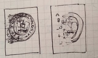
Here is a more detailed version of the bellow 2 sketches showing the deterioration of the NSA logo, this represents how the NSA was decoded by Simon. The addition of simple geometric shapes has simple links with educational shape toys kids play with to distinguish hand eye co-ordination.

A more illustrative 2 versions of the bellow rough sketch. I also changed the presentation of the shapes and the type to show a better visualization of decoding a language with the translated letter underneath each symbol/character. The idea of the geometric shapes and presenting the type in an abstract way creates difficult readability of the movie title but in turn sparks an interactive element with the viewer so they look deeper into the design and figure out what it says.


The visual i produced for this was very rough so I put down a much neater version, the idea here is to represent bullet holes with the blood seeping out of the holes been glyphs & symbols with the movie information encoded within the jumble of symbols/glyphs. The color choice silver presents a visual of the "typographic blood" been changed to the substance mercury.


I combined these 2 ideas together to create a much more minimalist and legible visual. The idea I had first was to draw out the house in a very child like illustration to denote the child within the storyline but this didn't really have any relevance to the films storyline as a whole. Clean cut linear art visuals presents the idea of decoding and coding a little better.


A much neater version of the combination einstien email password scene and the periodic element of mercury with extra information added. In this case the actors name. If i produced this it could have opportunity for nice aesthetics within the typographic layout. It will give me a good opportunity to work with a grid to experiment with how the information could look within a large negative space. A nice balance could be achieved.


A neater version of the literal response based on the movie title with extra typographic information added.


I took the idea of a jumble of encoded glyphs and symbols and presented the decoded movie name within a river of the large body of glyphs. I would highlight the movie name through a contrasting weight or color of typeface. I much prefer this visual, the idea of drawing the viewer in to decode the message themselves turned out to be a little confusing so I simplified it down a little and did the work for them but the visual of something been decoded is still there with the new idea.


I advanced from the simple minimal cross word idea. Adding more information gave me the opportunity to create a better example of a crossword puzzle. The movie name again would contrast with type weight or color.


A more advanced version of the visualization of the train scene with typographic information overlaid over the top.


Opportunity for further development
In terms of color choice I will begin to investigate this once a concept idea is decided upon from the interim crit. Color could link with the genre of film (Action), movie scenes, the storyline itself (decoding/encoding/government/conspiracies,murder) Current thoughts on image creation is simple illustrator graphics to keep things minimal and clean. But consideration into halftones may arise depending on the graphics used.
No comments:
Post a Comment