Screenprinting Mercury rising poster
Today I finished the physical production of my movie posters in the rossington street print room.
Mixed up some inks to replicate the digital mock up and my intentions for metallic silver ink to represent "mercury", The choice of red having connotations with violence and action true to he synopsis of the film. The red color is also the common color used in thermometers, an instrument that included the metal mercury.

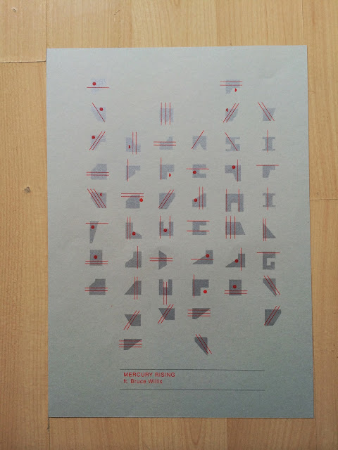
Screens exposed ready for printing, split the 2 sections up the first to be printed will be the the square shapes to be printed in silver. The line and circle elements inspired by the mayan numerical system and type will be overlaid on the second printing process in red.

First print down with the base color, not too visible in the lighting of this room but there is a certain shine too the silver that has a very metallic feel too it, almost like molten metal, this is true to my intentions and Im happy with this outcome as it really does have a representation of mercury.

Did a test print on some cheaper stock to make sure the red lined up ok over the silver square glyphs. Took a fair bit of practice to line the type up and the linear elements but once I got the hang of it turned out to be a successful outcome.

I printed the design on 2 different stocks to further experiment with the contrasts of the visual type & image and the background of the poster.

The grey stock worked nice, the silver symbols and glyphs stook out but due to the similar tone and hue of the background and the glyphs there was a more subtle contrast which drew more attention to the red which threw out the balance of the design as I wanted the 2 visual elements of the red lines and the square symbols to work alongside each other so in terms of a balanced and legible design this one doesn't work well
The antique white allowed a much better contrast though due to the contrast of tone between the silvery tones and the vibrant red tones. I think due to delicate weight and size of the red elements they work well with the silver symbols. If the red was any bolder I feel they would overpower the silver and cause unbalance in the design. I see this as a good use of contrast of extension between the red and the silver, only a small amount of red was needed to create a balanced contrast between the lighter tone silver.
Again you can't appreciate the metallic finish of the ink here due to lighting so I plan on taking some better photos in the photography studio if time allows before submission.

On an angle and close up you can appreciate the metallic finish a little more here but again I only took this photo on an iPhone so quality and resolution lacks a little.

The quality and vibrance of screen printing really does bring out the tones in colors that usually appear quite flat in digital print. I mixed a little bit of fluro orange in with this red and it really did help it pop out more creating nice contrast for the typography to sit on within the lower tone background. This created good legibility and readability and drew attention into the typography well enough without the need for un-nesceary large scale heavyweight type which would distract attention away from the cryptic code imagery. I liked the overlay of the red over the silver, with a digital print there would be a solid color separation, with screen printing the 2 colors sort of mix and provide a darker tone on the red lines.

I really enjoyed the screen printing process as it is all still quite new to me I like the whole process of preparing the images and preparing the screens before the alignment and printing stage. It really does give you a better sense of achievement compared to digital print and I will continue to explore the different possibility's through specialized inks and mediums like UV varnishes when relevant to my concepts.
No comments:
Post a Comment