Type Journal
Production method: Rendered/Digital.
Anatomy: Thin line on bowl contrasting on very thick vertical stem with sharp point serifs contrasting with the floral image within the negative space of the aperture within the bowl.
Identity: Logo identity. Heavy manipulated old style or glyphic serif. Roman.
Character: Ornate, floral, decorative, illustrative, experimental.

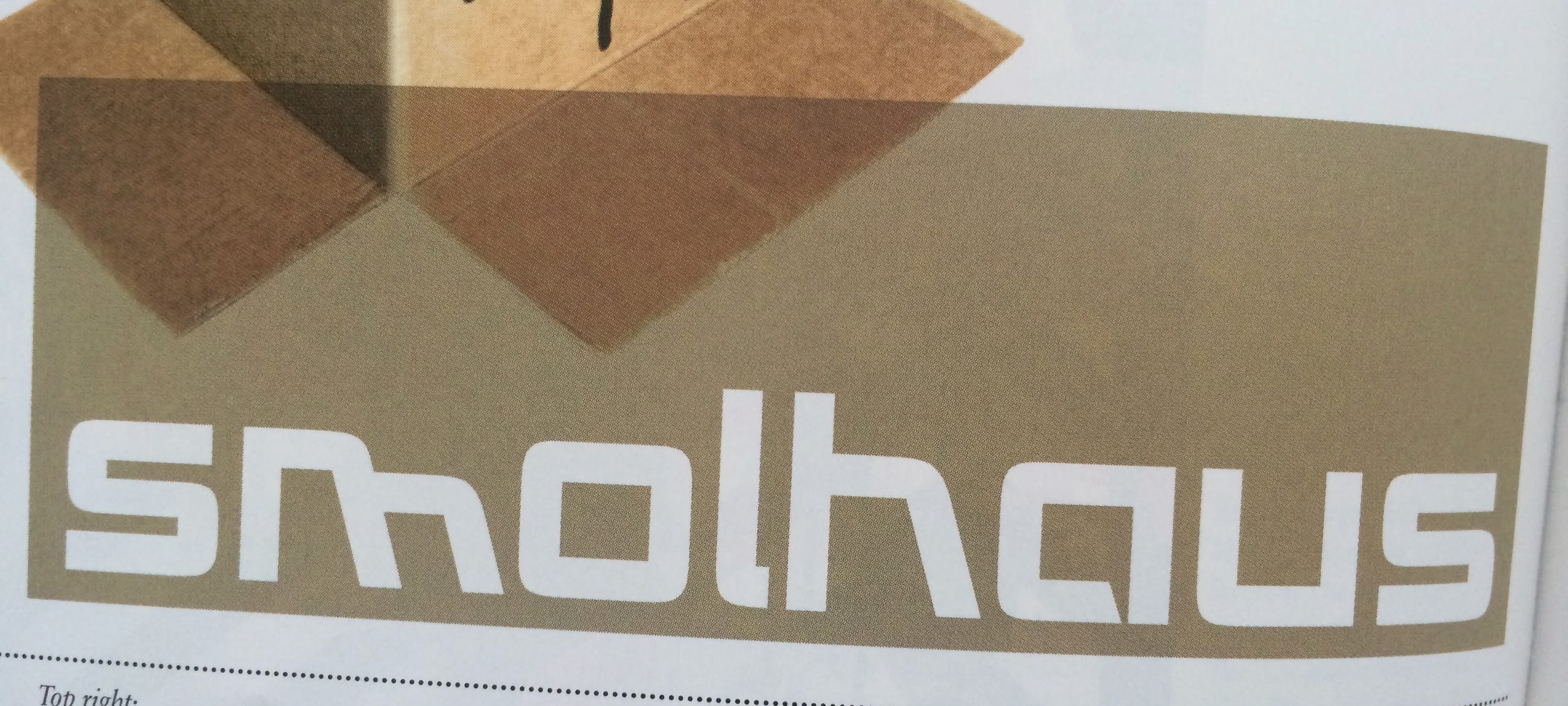
Production method: Stencil.
Anatomy: Heavy verticals with contrasting thin horizontal elements even though they are small. Rounded off small serifs.
Identity: Roman. Traditional.
Character: Abstract, manipulated to look like analogue paint, moody aesthetics, glum, bold, high impact.

Production method: Digital.
Anatomy: Consistant line weight, angular bowls instead of perfect roundness, contrast of soft edges of joints and sharp edges of joints, a random 45 degree angle leg on the h and m wich looks weird and unreadable. Lowercase.
Identity: Decorative, modern.
Character: Bauhaus style influenced, random, abstract, irregular, playful, digital appearance.
Production method: Lead.
Anatomy: Uppercase, consistent line length, constant line weight, squared off terminals and apexes, long extensions on the E though? slightly but I think its because they are equal length to the vertical stem of the E
Identity: Geometric sans serif. Gothic. Header on a poster.
Character: Opaque

Production method: Woodblock.
Anatomy: Small lettering , combination of uppercase and lowercase, all the caps follow the lowercase cap height but they do all work together. Solid weight, constant weight throughout, square apex and terminals.
Identity: Geometric sans serif. Gothic.
Character: Structured, sturdy, high volume block appearance, large pt size full stop to work alongside heavy weight glyphs.

Production method: Digital, would be far to thin and delicate to woodblock print or carve in stone.
Anatomy: Very strong contrast of heavy and light weights within the strokes here. Very sharp serif points contrasting with elegant simple line serifs.
Identity: Neoclassical serif. Roman.
Character: Extreme intricacy, delicate, sharp, angular, extreme contrast.

Production method: Digital. Based on a geometric sans serif with added serifs
Anatomy: Consistant weight throughout from regular dot size and positioning alone an imaginary guideline, I like the addition of serifs on the Z in this angular way.
Identity: Decorative digital sans serif with abstract serifs added on Z.
Character: Pixels, colourfull, cryptic, code,

Production method: Bone.
Anatomy: Inconsistent line weight, angular terminals, bold weight, slight curves within normal straight strokes.
Identity: Pure decorative script, taking influence from blacklister with obvious extravagant editions.
Character: Floral, spirographic, spirals, ornate, decorative, confusing, arabic.

Production method: Lead.
Anatomy: Uppercase lightweight strokes, even line lengths, consistent line weights.
Identity: Geometric sans serif. Gothic.
Character: Geometric, small, delicate, accurate, colorful, feminine, sexsist, contrasting.

Production method: Origins would be lead.
Anatomy: Uppercase, medium weight, long verticals, shorter horizontals,
Identity: Grotesque sans serif. Gothic.
Character: Manipulated, photocopy, abstract, stretched, unreadable, illegible, photocopy. Condensed.

No comments:
Post a Comment