Colour Theory
Today we looked into the basics of Systematic Colour, a basic introduction into color theory. Color is an important aspect off design as it can communicate an array off different aspects and meanings. It can have common cultural connotations within society like the Chinese see red as luck, but on the other hand the color red is seen to be the symbol off danger? Interesting the variety off perceptions but color and its meaning is something I will look into later. Its our jobs to think about how color is to be perceived and if its relevant to the concept off the piece of work we will be producing based on the viewer.
Color itself is perceived by light, the eye can distinguish over 10 million colors. Light reflects off an object and into our retina refracting white light into a whole color spectrum The way in which color is perceived is based on how the rod cells (used in low light) or the cone cells (active in normal daylight) absorb these chromatic values. Cones allow the brain to perceive color while rods convey shades of black white and grey.
Type 1 cone cell is sensitive to red/orange wave lengths of light.
Type 2 is sensitive to green light.
Type 3 is sensitive too blue/violet lightwaves.
The color spectrum the eye works on is like computer screens. RGB, or red green and blue. The eye can pick up one of each of the colors through the eyes 3 different cone cells. Light travels in wavelengths and the length off these wavelengths differentiates the chromatic value, or the color outcome. Blue having the shortest wavelength, this is why the sky is perceived too be blue. The light bounces off particles off matter in the atmosphere reflected from the sun when its at its high point creating the illusion of blue. Yellow doesn't actually exists its the representation off visuals green & red.

Some people are unfortunate enough to suffer from conditions off Deauteuranopia, commonly known as color blindness and effects around 25% off the population in varying ways and alters how they interpret color. Its hard to distinguish this problem due to our cultural acceptance of a color through primary education, been told an item is a said color has solidified it in out minds and we believe it true.

We briefly looked ad legibility off type through the use of color, regardless of the text construction color can create a range of visual outcomes.
Legible.

Legible due to contrast.

Unreadable and illegible.

Awful, Tinted pastel tones create hard to distinguish words and cause confusion.
There were 2 main pioneers off color theory.
Josef Albers and Johannes Itten the founder and creator of the Itten color wheel.
The basic color terms.

Ittens color wheel.
3 primary colors in middle been mixed to produce Green orange and violet.

Complimentary colors. They rant actually complimentary though they clash when used together instead of working together and been harmonic.

Mixing quantities off each complimentary begins to create neutrals and tertiary colors, mix enough of each color and they cancel each other out and create a neutral greyscale with no chromatic value.

Tertiary wheel.

"The eye cannot differentiate between spectral yellow, and some combination of red & green. The same effect accounts for our perception of cyan, magenta and other in between spectral colors"
Introducing color modes.
RGB - Red, green and blue used in Screens and the detection of color through the retina.
CMYK - Cyan Magenta Yellow Key. Key been black and the value that locks everything together and puts tonal value into the print process. CMYK is based on matter, the color is a physical thing.

Additive color is used in screen applications and when working with light, it gets its name additive from the need off light to reflect off the surface and back into the viewers eyes giving the perception of color. The light source is white which if deconstructed is made up of Red Green and Blue so as mentioned previous its just been split up into its different chromatic elements.
Subtractive Color as mentioned is used in print for the use off physical matter, the term subtractive comes from the fact that these color matters are viewed by the absorption of light rather than the creation off the light within the color spectrum.
Chromatic value is the way in which the common term color is now to be described as. It has 3 distinct sub dimensions within its construction.
Hue. The wavelength of light, the main chromatic value.
Tone, or the luminance. Made up off shade, tone and tint based on amount of reflected light.

Saturation. The intensity of a color value.


To this changes your perception of the chromatic values off the viewed color. the addition off different tonal ranges creates a whole different feeling on the initial pinky colored box and the orange box.


We used 2 different families off swatch books, coated and uncoated, In the industry inks behave differently on different stocks. Coated papers tend to be glossy finished papers with uncoated been matte papers.
We matched the pantone code up.
Lightest: 515C Solid coated


Most purple: DE 185-1C Uncoated

Most blue: DE 192-2C Coated

Most red: 513C Solid coated
Originating from this.
To this changes your perception of the chromatic values off the viewed color. the addition off different tonal ranges creates a whole different feeling on the initial pinky colored box and the orange box.
This is the same perception of how light effects a white painted room, natural light is pure white while bulb lighting has a yellowness too it. With lights on a yellow tinge is added too the room even though its light there is still an element of tinting going on. With the lights off the room appears neutral and the walls pure white. This is something that needs to be considered when producing a design, the type of light it will be viewed in and how the perception of the design will be changed in changing light conditions.
On the subject of lighting conditions, the chromatic value of a hue can change completely through the use off different filters of light.

Physical color wheel.
From our basic understanding of color theory and Ittens color wheel we collected all the class's coloured items and created a physical example of Ittens color wheel in an order were each color faded into its counterpart for example how purple merged into reds chromatic values.
The whole color wheel.
Close up of the tonal ranges, hues and saturations of the items in a chronological order.
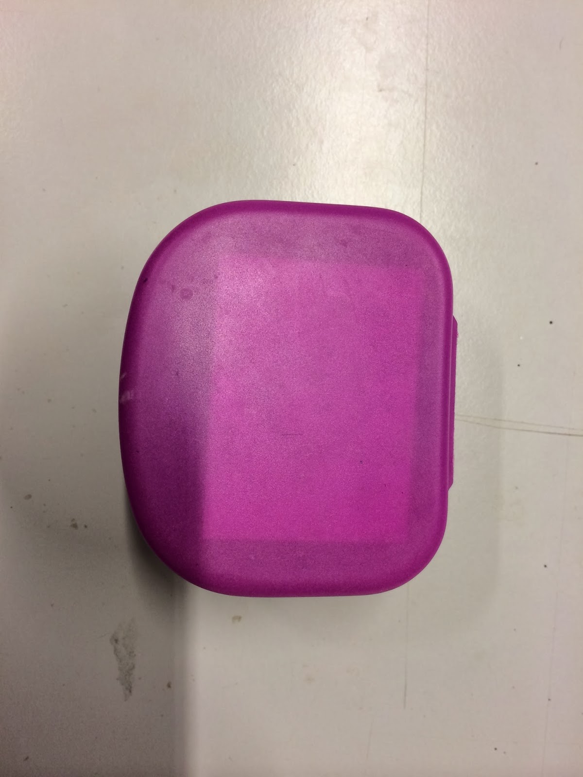
Mine and my groups purple items.
Panton color matching.
From the physical color wheel we were asked to carry out a task using the Pantone color selection system. A collection off carefully calibrated color swatches used for print for accurate reproductions and color matching.
We selected the darkest and the lightest item out of our groups, the most purple and the most blue and the one that starts merging into red. We used 2 different families off swatch books, coated and uncoated, In the industry inks behave differently on different stocks. Coated papers tend to be glossy finished papers with uncoated been matte papers.
We matched the pantone code up.
Lightest: 515C Solid coated
Most purple: DE 185-1C Uncoated
Most purple: DE 185-1C Uncoated
Most blue: DE 192-2C Coated
Most red: 513C Solid coated
No comments:
Post a Comment