Hierarchy task - Newspapers
Here is a photo off a spread in the daily star dedicated to celebrity gossip and in typical gossip magazine style garish colors and a huge collection of font styles no set type families are used just 10 different font's 1 been Digital "Sale" in the EE magazine, oblique block style font used in the "Goss" header, a stencil style digital font used in the "eye spy" and "goss spot" circles, Bold sans serif used in "Harry gets around bruce" title, round serifed roman font used in "RIRIS NET FIX" & "EDS NO FITTIE" in uppercase and "Mariahs the tops" lowercase. The body copy combines bold sans serif, serif regular and regular sans serifs. A script style font is used in the "Ed dyson" header in italic form and the rest off the smaller details is made up off miss matches of past used fonts in the obvious visual texts.
The ratios on this are 75% Editorial and 25 Advertisements.
65% imagery and 25% text.


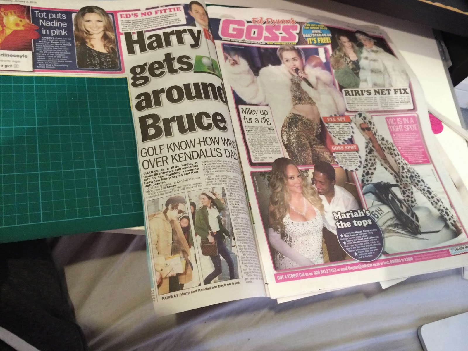


First hierarchy layout with a hard hitting advert drawing attention in first with its bright bod colors and tempting offer information. The rest of the hierarchy goes on high impact fonts, colorful elements, decorative elements and reversing out, weight and use of shapes.

Advanced deconstruction of advert, SALE hits you first (Uppercase high impact colors) because everyone loves a sale, promotion offers on date and minutes is shown next as this is what people will be getting if there drawn into the offer everything else fades down in order with terms and conditions in tiny print with hidden information which no doubt explains theres catches to this cheap deal that you initially see.

Further deconstruction and hierarchy arrangement based on high impact fonts (Scripts, block, lead, roman origins) and bold colors. Very busy very messy but does cause high impact and does keep the eye moving about.


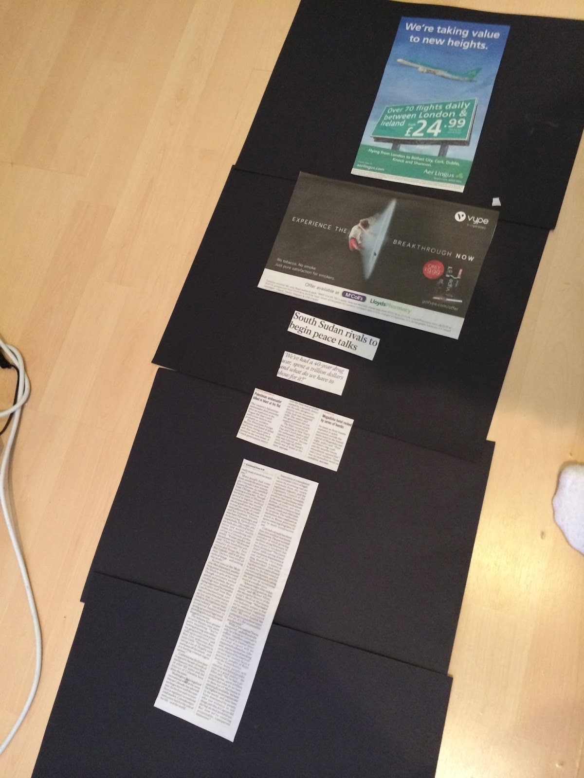
Heres an article coming from the recent Independent redesign. So simplistic and clean with it 40% advertisements coming from 2 large ads and 60% simplistic consistent editorials. 90% editorial and 10% editorial imagery is used in this layout.
The typography choices is nice and limited with 2 type families used. A clean sans serif and a traditional serif in varying point sizes. To begin with the top left of the first page has used a semi bold uppercase sans serif font from the serif type family, bellow this is a regular weighted and condensed combination off fonts used in sub headers on the top of article columns. The second type family is the serif one used in regular forms in the main body text and the headers in italic and standard regular.
After doing some research into the rebrand through the whole paper there are 14 fonts used in total these been the following:
1 hairline font, 3 serifs including an italic version and a bold and light 3 sans serifs, 3 condensed and a specifi serif for the masthead.


Again the advert is what is seen first as this is the newspapers main source of income the advertiser wants you to see this first so the designer builds this into the hierarchy so the adverts hit you first and the eye bounces around the page and arrives back at it before turning over the page.


Deconstruction of advertisement, eye is drawn to the offer details like the previous example the terms and condition comes in las hiding disguised facts.


Further deconstruction and arrangement off hierarchy based on type weight, body copy size, reversing out, type size, legibility and readability and color backgrounds. It shows that even small type elements can draw the eye in through the use off color. The weight and contrasting reversed out white type is what brought the eye in to the advertising point at the top of the hierarchy.

My final deconstruction begins with the Daily express. Consisting off 75% editorials and 25% advertisements. And 45% imagery and 55% text in editorial terms. The type choice is again limited and simplistic, 2 type families a serif typeface and a sans serif typeface. The main headers and titles and subtitles use the serif type family in regular weights. The other family is the sans serif used in highlighting journalist names in regular and bold contrasting weights and bold weight column headers highlighting elements like "Vacancies and "Burden" A black version of this sans serif typeface used in "A cappuccino welcomes EU arrivals" makes the font count come too 5 from these 2 type family The table on Euro jobs also has a combination off regular and bold fonts from the serif family.


Initial hierarchy, showing classic things like hard hitting high impact headers in serif fonts as the first hit off information. For once the advert didn't strike out to me that much this time the color was more dulled down in tone and the typography promoting the offer isn't as high impact as the other adverts i have analyzed (Lightweight serif that doesn't contrast much off the background due to the softness surrounding the letterforms).

Further deconstruction based on type weight, body copy size, reversing out, type size, legibility and readability and use of color. Sections have been highlighted out of the body copy with heavier weights drawing in key shock words or the name of the journalist.

No comments:
Post a Comment