Hierarchy task - Websites
The BBC website is very simple in terms of type choice, 1 type family of a sans serif typeface that looks like Helvetica a standard universal typeface. There is 2 different fonts within this family regular and bold. Regular used in body text and bold been used in headers and website tags.
100% editorial content 0% advertisements.
80% editorial text and 20% imagery.


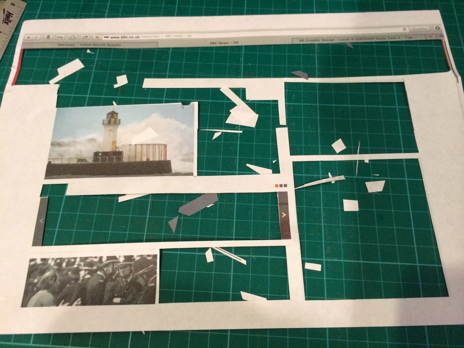
Initial hierarchy of typography with the big hitter coming from the color contrasts in the top bar with the websites tags in it. The next things down the hierarchy are elements of body copies with short snippets off information as opposed to newspapers with large bodies off text.

Further dissection off website banner, with important information like the news logo coming in near the top of the hierarchy followed by categories of information and the little hyperlinks for live RSS feed coming in last with the "sign in" button coming in second to last as this isn't too relevant for "breaking news" which is why people access the website to read into the news.

Advanced hierarchy layout based on high impact headers coming from colorful (blue) heavy weight sans serif fonts, the actual body copy of the news doesn't come till a quarter of the way down. The eye bounces about the page on all the high impact news headers. This stores in the mind the big news headline so you briskly read through the body copy visible on the website and start accessing other news hyperlinks drawn in by the previously mentioned high impact headers.

This is a screenshot of its nice that and has 2 type families in it a serif and sans serif. The Advert displaying printed pages has 2 of the type families in it. A bold serif font and a lightweight uppercase sans serif face in a small point size. The "Its Nice That" header is in a condensed font from the sans serif typeface family and the serif family reappears underneath with the uppercase tagline "Championing creativity across the art and design world" The tags "about, regulars, publications, events, projects, shop" use a regular font from the sans serif family.


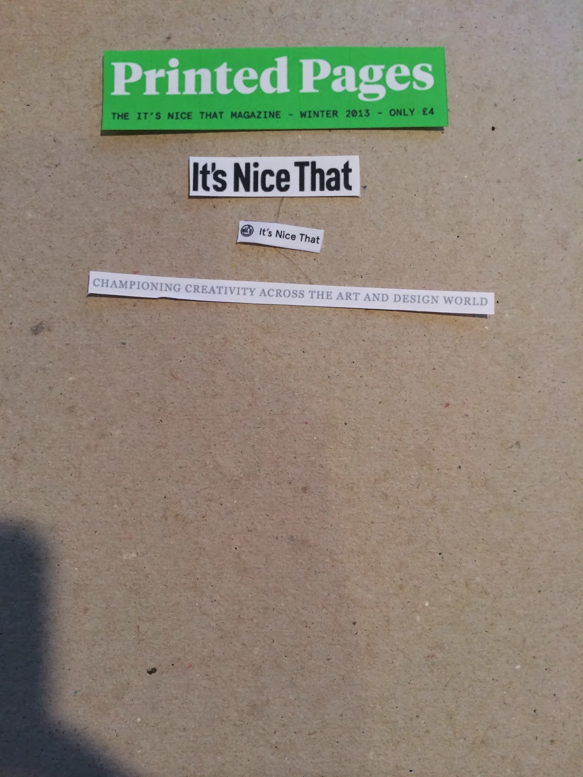
Very simple hierarchy, the hard hitter coming from promotions for "Printed pages" the blogs seasonal magazine so this is what they want people to see first, the reversing out off the type creates a contrast with the white type on the green background, the black sans serif typography underneath contrasts with the serif header in terms of type family and color contrast. (Black and white) bringing it in second, with sub information coming in after with its subtle typesetting.


Further hierarchy barley changes just the more hard hitting serif fonts is most visible mainly due to its large point scale and contrasting color.

By the looks off things the END website has a custom sans serif font created for the logo so this is one font, the curvature within the D has quite angular additions so has a nice contrast between soft curves and angles. The 2nd font found on the website maintains consistency all the way through with the only variations coming from uppercase and lowercase texts. Uppercase found in the SALE promotions this helped draw my attention into these main elements due to the high impact.
The content here is 100% content related to the website with no advertisements coming from outsources just adverts for there own promotions. The image and text content splits up to 40% image and 60% text.


Initial hierarchy based the custom logo hitting first dye to its high impact within the white space of the layout. The banner bellow highlights "sale" with a red heavier weight sans serif font. Hitting the viewer with these promotions off sales is what creates the majority off the upper half off the hierarchy through the use of large point size sans serif fonts in regular weights contrasting on background images. They are very legible and readable which aids in the high impact it proves the font doesn't need to be heavy weight to draw attention in. Legibility of individual characters creates overall readability which in turn creates high impact.

Further dissection highlights how bodys of text has highlighted sections by using increased font weight and use of color highlighting the sites main promotions of "sale".


Final deconstructed Hierachy, use of color and reversing out and contrasting type on image was a main point for creating hard hitting hierarchy elements. More subtle colors were used further down the hierarchy allowing lower contrast off the type on its colored background tabs.

No comments:
Post a Comment