Concept idea for calendar visuals & rough sketches for numbers and calendar
I needed to consider the visuals and aesthetics of the design, I couldn't just do some random aesthetics. The visuals needed to have influence.
As the calendar will be placed in the studio I decided to inspire the visuals around the studio itself.
I took a selection of photographs to inspire my visuals, I noticed the studio to be very structured, very angular with lots of straight edges, an industrial feel with the rustic open ventilation piping wrapped in insulation foam.
In terms of colors the studio is very monotone and greyscale, very light tones and with the large amounts of light been let in from the windows appears very spacious and airy.


My idea is to inspire the visuals around these angular elements and straight edges, a solid grid will be used for the layout, with the visual aesthetics been inspired by angular elements, linear edges, spacious and airy use of space and use of pale colors.
To add a visual spark to the pale and light studio I will add a contrasting color to the whole calendar to make it pop out within its surroundings causing a higher impact in terms of visuals.
The stickers I mean to produce to work with the calendar system I will experiment with 3 ideas.
Using a range of tones from one color, e.g. red I will create stickers related to there specific subjects. For example a very bright tone of red will be to signify something important like a module hand in, a more subtle light tone of red will signify something less important (non academic maybe) like bank holidays.
Use a range of colors to signify important through common connotations, for example red symbolizing urgency for an important deadline, and a light hearted color like blue for something pleasant and less important like a holiday?
Or match colors up from color elements in the studio, theres not alot of color in the studio just red n the roof wiring, the greeny color in the door and the wooden frames of the windows.
Other aesthetics.
The whole feel of the studio is quite clean and industrial, I will consider this industrial & clean feel when it comes to binding methods, use of stock, visuals along side the angular and linear edge inspiration.
Sketch ideas.
Carrying on from my past sketches for the todo lists I tried out a few more alternatives on the top row of this selection of drawings, loving the simplicity and space for writing notes on that the idea on the top right allows.
Started playing around with front cover ideas inspired by angular elements and linear elements within a spacious use of the pages negative space.

Playing around with vertical and horizontal elements to create an angular and linear feel inspired by the design and aesthetics on the studio. I like how the type feels locked in and secure through the use of these linear elements.

More simplistic use of type with the extended hyphenation included in to bring in that angular, linear elements inspired from the studio images.

Started experimenting how the hyphenation line could sit within the context of the glyphs, the first example seen bottom right works ok but doesn't really suggest a hyphenation, it more so underlines the 2014 making it seem a key element within the typographic hierarchy when its not really that important.
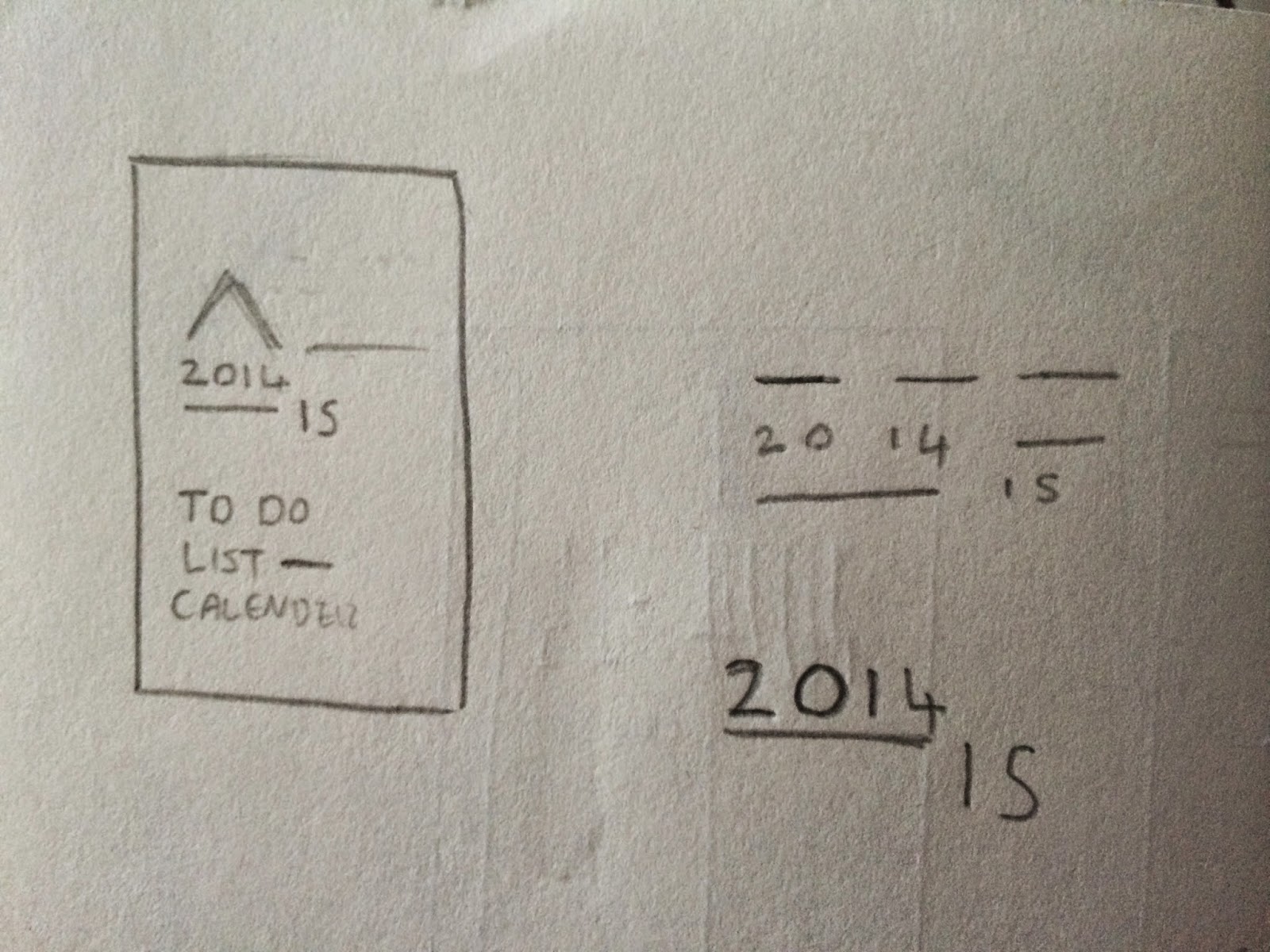
The more common use of a hyphenation mark along the central horizontal spine, this works better than the one before bringing both the "2014" and the "15" together rather than singling each set of letters out.
I am going to settle with the bottom idea though running along the baseline of the letters positioning. This makes better use of the negative space within the surrounding area of were the glyphs will be positioned.

It also simulates a blank space to show that something can be added within this space, this is relevant to the space I will be leaving within the todo list, so it sort of puts this header into context of the future use of the calendar Im creating.

Making some numbers
Thinking again of the studio layout and aesthetics I began creating a set of numbers for the dates within the weeks calendar sheets.
The idea of condensed, tall, square, angular letters is inspired by the long, thin slit windows that let so much light into the studio, and the long thin posts/columns within the studio.

Experimenting with how the numbers look and making them as distinguishable and recognizable as possible, the ticks marked the developed sketches.


To keep the glyphs structured I followed a guideline for the letters to follow when it came to joints, spines, bowls, crossbar stems. This gave the glyphs a structured and solid feel, like the structure within the industrial aesthetics of the studio.

All the letters ready for digitizing, not sure on the aesthetic it of it at the moment, at large scale it looks a little clumsy and out of proportion but some tweaking in the digital stages may fix things. With the '0' I'm not sure on how it will look so I will experiment with this some more in adobe illustrator.

Started to make a typeface but decided against it and just to go with the numbering system as the main aesthetic within the use of glyphs in my typesetting on the designs. The use of numbering us quite minimal, the style of the letters won't allow very good readability when used in combination of a selection of words.

Playing around with the rough typeface in context with some linear and angular elements, having a vary airy feel to the use of space. Nice and spacious with the use of negative space, doesn't look too busy and overcrowded.
Looking at this now I see potential in doing a sort of birds eye view of the studio, a sort of blueprint of the structure of the main elements of the room. Windows, columns, doors, walls, tables etc.

Quick little idea of framing the numbers up in a box and underlining it to create a very solid structured feel, feels locked in place so this "box logo" style date could be placed in a lot of negative space without feeling lost.

More playing about with the use of linear angular elements, and introducing an idea of using large square shapes within the background to emulate the shapes I noticed within the studios industrial, square, angular interior.

Contrasting simple linear/line elements with simple shapes. Quite like this idea.

Advanced it to this stage of a more detailed large scale sketch for a visual idea of the front cover. Quite liking this idea, has a nice aesthetic too it, good use of space without feeling to overcrowded. Type and lettering could do with been smaller though, and the hyphenation/linear element within the headers needs to be a lighter weight as it stands out too much its not meant to be part of the shapes within the background.

Took the top right idea into more detailed stages.
Quite like this idea, leaves a lot of space for notes to be added, simple and effective, nice bold element within the block color rectangle for the days of the week visual element. This breaks up the very minimal aesthetic and stops everything looking lost within the negative space.

To keep things consistent with the 40 week sheets that will be in the calendar I need to flush all the type to the left, this will make it feel more structured and solid too which suites my concept idea better.

Need to remove the bullet points, giving blank bullet points restricts what notes can be wrote, if the note has quite a lot of lines it needs to be recognized as 1 solid note, not a number of individual notes.
Also the "To Do" section looks out of place, it distracts the information of the days of the week. The calendar system and To do list need to be kept separate.

Thought I would experiment with the same positioning of these visual elements in the background but add a warped appeal to them to contrast with the straight cut, angular typeface and use of a mock sans serif type in the sketch. I like this wavy aesthetic and the contrast it creates so will advance this idea into the digital stage along with the straight use of shapes and lines. The straight use of lines fit in better with the concept idea of inspired by the visuals and shapes of the studio interior.

Works much better now with these alterations, much better use of space, more space for the student to right notes in, and the separate/individual sections of the week calendar and To do list are more obvious now rather than merging into one.

No comments:
Post a Comment