Physical production of calendar & Final
Began to create the physical outcome, printing onto the chosen stock choices and colors influenced by the crit feedback.
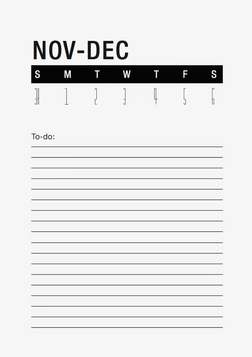
Here is the designs in digital format before been produced. Simulated on darker background to demonstrate how it would look on the off-white paper stock.


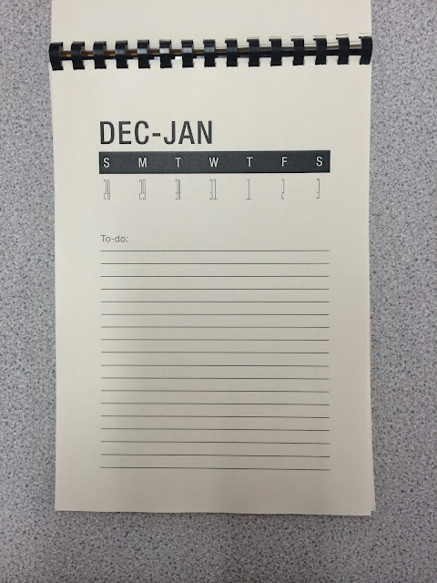
After printing the designs onto a vibrant yellow stock and bulky newsprint for its "tearable" qualities for the perforations of each week sheet. I began to punch holes into the pages in small bunches.
Here is the designs in digital format before been produced. Simulated on darker background to demonstrate how it would look on the off-white paper stock.
After printing the designs onto a vibrant yellow stock and bulky newsprint for its "tearable" qualities for the perforations of each week sheet. I began to punch holes into the pages in small bunches.

Then began lining them up in the binding machine, I like the simplicity of this bind this stage went quite smoothly.

Ready to trim.

Printed out and bound Im happy with this outcome, would have preferred a more experimental bind like the ones I mentioned in previous design stages but time didn't allow for this unfortunately, but the black comb bind and the simplistic aesthetic of it works in conjunction with the simplistic yet structured design layouts. I like the contrast of the circular element within the comb bind to the squareness of the visual elements, it simulates the contrast seen in the studio with the round contrasting element coming from the ventilation system thats wrapped in reflective insulation wrap.

The contrasting tones within the yellow and off-white paper stocks make the black for the type and image work alongside everything rather than stand out with a vast contrast like it would with a cleaner white stock. Making a nice balance of color.

Good use of space within the layout of the page, lots of space to write important dates down and note them with the corresponding days on the overview of the years. A good addition to the calendar influences from a suggestion from Elliot in the final crit.

Taking forward more crit feedback. The final week pages with the thin, regular width helvetica subhead for "to-do" and the lines added. The lines added as mentioned in the crit would provide guidance for notes to be put on and also strengthened the simulation of structure and linear elements inspired by the studio aesthetics.


Went down to vernon street to see about a perforating machine, such a handy little tool.

Need to be careful with the pages, the hole punching method didn't leave much paper left so these pages could tear off easy, not very happy about this.

Love the simple addition of a perforation though, really happy with this subtle addition to the design, the calendar can now be used fully to the potential I intended for it. A tear off system allowing the students in the studio to use the calendar to-do lists on a week by week basis and giving them the option to tear off the todo lists and pin them up in the studio or photocopy them to take with them.

Evaluation
Out of all the projects on this brief I wasn't as happy with this outcome as I should have been. It should have been one of my strongest projects to round off the year. In terms of the physical production, aesthetics, layout, construction etc. But the actual idea of creating a calendar for the students next year isn't very though out. Its my own fault really though I produced a brief that lead to problems of time management. So I didn't allow much room for original and original design solutions from the outset. Some people in the class have really unique, simple and effective ideas.
Although on the other hand this will actually come in useful for the students if they use it right, as mentioned allowing them to all input and benefit the group as a whole from combined inputting of notes.
I enjoyed making the actual calendar, making something that is going to be actually used was good, and I liked the finishing touches I added like the perforation, didn't like the binding method though as mentioned I would have preferred to create a more industrial looking robust bind to contrast with the clean visuals and work alongside the robust, raw, industrial aesthetic of the studio. The plastic comb bind seems to clean for the studio. Better time management would have allowed me to spend a day experimenting with binds rather than just making do with a plastic comb bind.
I struggled at first trying to think of relevant visuals for the calendar, didn't want to just do random visuals. But im very happy with the final visuals.
I inspired them around the aesthetics and construction of the studio that it would be placed in. It allowed me the opportunity to create my own typeface for the numbers, based on the window frames and the angular elements within the studio. The rest of the aesthetics and layout were based on the angular elements contrasting linear elements from wires and thin beams contrasting with robust structured columns and vast wall space. This stage of it I was very happy with it as the visuals actually had some meaning too them and seem relevant due to were the calendar is going to be placed.
If i were to do this project again I would spend more time on making the brief though I would concentrate more on creating a brief that aloud more original ideas which would have resulted in a far more unique design outcome that I could be proud of to round off the OUGD406 module.
No comments:
Post a Comment