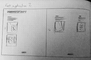
Double page spread layout ideas & thumbnails 2
After receiving positive feedback on my to scale thumbnail ideas in terms of layout and use of space I began to create thumbnails for my final 5 double page spreads based on the 12 column grid which gives me alot more versatility.
One spread is for the contents and introduction.
2 spreads will be for the information and content for "What are the main applications and uses for font classifications?" due to large amounts of body copy and text.
Advantages of traditional print methods & new age methods?
How does kerning,leading,tracking effect readability?
Again to keep a consistent feel through the double page spreads I kept a good amount of negative space within the composition and positioning of type & image along with left aligning the type. As mentioned this aids digestion of the information due to the the space around the type & image so the eye doesn't get distracted by overcrowded elements and unnecessary visuals.
Now I have 10 final thumbnails to work with I will begin to digitally develop them on a 210x210mm double page spread using a 12 column grid. Each page will be 220x210mm so it can fit on an A3 page.
Experiment with type size, lowercase & uppercase, type weight, tracking, leading, kerning and different type classifications.
Try out different positioning of type & image within the composition.
Experiment with color, bright tones, pastel tones, light tones etc.
I will experiment with 4 different margins using the 12 column grid lined up to these margins ranging from 5mm to 20mm.
This will allow me to position type & image tight up-to the edge of pages close to the bleed of the page. Giving me more opportunity to use the negative space inside these margins.
A larger margin leaves more negative space on the outer of the margin but leaves less space for the inside of the margin bringing the type & image closer together and may in turn create a more crowded appearance.


No comments:
Post a Comment