Digital development of Calendar
Took my thumbnails into more detailed sketches, then these detailed sketches began to create the digital development of my Calendar.


Refined sketches
Took the best thumbnails from the sketches I made for the to do list system into more refined scaled up sketches to get a better idea how the visuals would work in terms of layout, aesthetics, use of space.


Digital Development
I then took these sketches into the digital development stage using adobe illustrator and indesign.
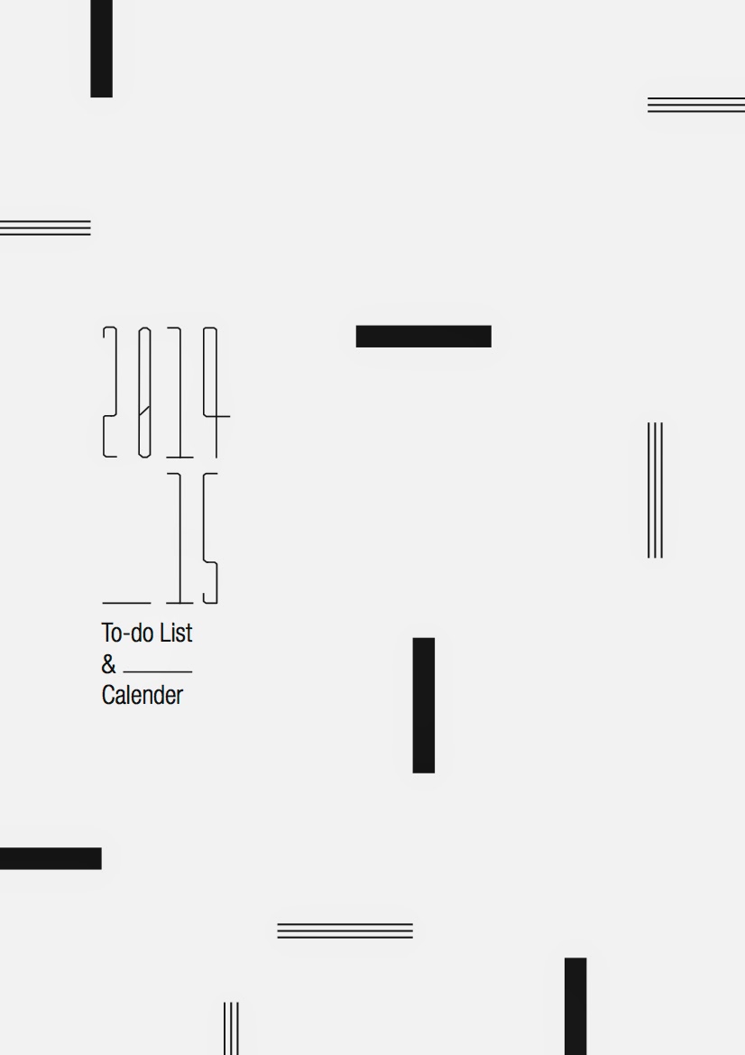
Experimenting with typefaces was the first task, I had sorted my translation of the rough sketch into a digital visual and was happy with how it looked, kerned and tracked the numbers out a little more so each glyph could be distinguished. First choice of type as an ultra modern contrasting geometric sans serif typeface, I though a contrast to the straight edges would work.
Turns out it didn't, in hierarchy terms it drew too much attention when the eye needs to digest both pieces of information. The dates and the title.

Tried a typeface with similar characteristics to the numbers, simple angular anatomical elements like in the simple crossbar on the 't'. these worked together but the weight was a little heavy and there was no lighter weights available.

So I went with a standard sort of choice, helvetica is fairly universal. It works with most things, even in a regular weight and large point sizes it worked better in conjunction with the numbers better than the previous choices though.

A lighter weight, condensed example of the helvetica type family, in a smaller type size, the weights are consistent now between the numbers and the "To do list" title. I aligned the type box up flush with the numbering system to make it feel more structured and it felt like it belonged together rather than been separate elements of text.

Tried bringing it to the right aligned with the horizontal cap height of the bottom row of numbers, this worked well and had a nice structured feel leaving a nice 90 degree angle of negative space wich I liked, pretty relevant to the angular linear feel within the room.

Solo it worked perfect centered in the middle of the page. Allowing clean simplicity and great readability, theres no visual support for the concept I want to simulate inspired by the visuals in the room. I need some image elements to work alongside the numbers I created.

Really picky detail here but I altered the weight of the numbers to match the type, I also aligned them up exactly along a horizontal guideline. This helps keep an even stronger constructed, accurate aesthetic.

Looks a little large though does the type, sort of an unbalance between the lettering and the numbers.


Lowered the point size, with the size it works alongside the numbering system but the alignment doesn't work now, losing all structure and losing that 90 degree angle of negative space I had before.

Smaller point size still, begins to work a little more but still looks like its floating next to the numbers, doesnt feel locked in place alongside them.


Due to the eye reading left to right I felt it best to place the type simply to the left, when the image elements are added I don't want any confusion caused I want the information to be clearly communicated and digested and work alongside the imagery in a balanced and structured way. I don't want everything to feel random and deconstructed within the positioning of everything.

Tried out a contrasting wavy line like I tried in the sketches, It contrasted nice with the rectangular block, But the lettering I feel it contrasted too much with the linear, angular aesthetics drawing attention away from the date. I wanted the images to work alongside the type in harmony, not stand out and overpower. So the aesthetics needed to stay on a consistent level of square, linear, angular, accurate and make good use of negative space leaving a minimalist aesthetic without the design feeling too empty.

Beginning to add visual elements, playing around with set angles of horizontal, vertical and 45 degree diagonal to create contrast within a repeated visual element. This stops it looking boring, keeps the eye moving around the design and works alongside the angular, linear and condensed numbering system.


Scrapped the idea of having diagonal angle elements, they didn't really fit that well within the structured, locked in visuals I wanted to create within the layout.

Tried separating the 2 type elements, didn't work though, although they were both locked in between the space of the visual symbols I still think they felt more solid in con unction with each other.

Back in there original position and everything lined up, everything locks inlace with something else within the guidelines of the design, like a jigsaw puzzle. I Like how the 3 line elements contrast with the rectangular blocks, the 3 linear element work alongside the numbering system. They share that thin, wire like aesthetic. The Bold rectangles create a contrast between these 2 elements but don't overpower anything, they also represent the columns within the studio.
I feel I have translated the studios aesthetics into an abstract design solution quite well, the numbering inspired by the long narrow window frames, the block rectangles by the columns, the 3 line elements by the visible wires within the roof. All positioned within a spacious use of negative space, like the spacious airy, and light feel within the studio.

Translating from the sketches for the date sheets was simple, just chose a condensed helvetica in a heavier weight to keep consistency within the type choices derived from the front cover (for the month header). The days of the week benefited from a medium weight helvetica in regular format, the square characteristics of the glyphs aloud them to feel locked in with the rectangular block which is an adaptation of the visual blocks on the front cover.

Added the to do list subhead, don't think its needed to have list there to, its self explanatory what the space is for due to the description on the front cover.
Added the numbering system with each number aligned to the left of each day of the week on a vertical guideline.

So I shortened it down to be more concise and it sits better within the negative space.


Tried bringing the extended line deriving from the front cover idea to simulate a blank space to input something into, it didn't work aesthetically though.

Moved the To-do up a little bit, doesn't feel as lost within the vast amount of negative space now, feels like its in conjunction with the date system a little more now.

The final solutions for the first few months and the front cover ready for experimentation with stock choice and front cover color choice.


Placing brief breakdown tips & help sheet into the calendar system.
I mentioned in my previous intentions of creating a brief breakdown to help the students understand how to tackle a brief, It took me a while to figure out how to effectively analyze and break down a brief before implementing things.
I was originally going to create 60+ for all the students, but now Im making a calendar for the whole studio to benefit everyone as a group I think doing the same thing with the brief breakdown would be best. If i made 60+ I don't thing everyone would want it, this would result in wasted print costs so this way anyone who wants to access the information simply just takes a look at the guidance within the calendar.
Simply copied and pasted in the content I created previously doesn't work, looks awful, unconsidered, long line lengths tiring the eye out and the whole body of text doesn't make good use of the space.

Narrowing the columns down created shorted line lengths, easy to digest smaller line lengths in short snippets of information. Less daunting and boring to look upon, also tried out highlighting each section with a bold regular width helvetica to contrast with the thin helvetica I used in the body copy. Don't like this, too overpowering, there only really sub headers, a quick intro to the brief breakdown points. This use of hierarchy makes it seem like a header causing confusion.

This subtle addition of the section number been highlighted out in bold works much better, a simple addition of a horizontal dash (/) subtly communicates the intentions of angular and linear elements inspired by the aesthetics of the studio within the previous visual developments. The 2pt indent also creates a nice angular feel leaving a small rectangle of negative space wick I like.


Tried filling this negative space in with a single thin line deriving from and influenced from the triple line I used in the front cover and brief breakdown page.
This works best, the rectangular angular space before worked but it felt like something was missing, the bolder weight line contrasts with the body copy and works alongside the highlighted number, working alongside this number to highlight individual sections of information a little more.

Smaller, thinner typeface feels more delicate and a little more legible, but also need to get rid of the widows and orphans as the aesthetics look unconsidered, and the edges of the paragraphs feel "soft" I want them to feel angular.

Widows and orphans removed.

Removed this orphan by adding simple additional words to the body copy.


Slight extension of the text box helped erase this orphan.


Now this body copy looks much more visually appealing and aesthetically relevant to my concept of angular elements, linear elements, and bold contrasting weights.

To emulate this use of linear elements and structuring and framing things up inspired by the studio visuals I tried underlining the subhead. Didn't work though looked out of place, it actually drew attention too it more than the bold vertical line which was weird and caused confusion bouncing the eye around randomly rather than smoothly through the information.

Tried highlighting sub header in bold again to see if it worked alongside the vertical line, feels unbalanced within he use of weight and contrasting weight.
Much better contrast of weight between light and heavier elements within the type format and the vertical line.

Using the grid system deriving from the previous pages to create the equal spacing in the weekday dates I placed my content in conjunction with a header, makes good use of the negative space this way, just need to figure out were to place the header. Works ok central but the symmetry of the top and bottom bits of negative space don't feel right, I want structure but none of my past visuals have thus symmetrical structure.

Moved the header up slightly linking it up with the subhead points within the brief breakdown. I liked this it seemed to lock into place within the main body copy leaving a square element of negative space above and a rectangular element of negative pace bellow. Simulating the contrast influenced by the contrasting solid, angular, linear shapes within the studio.

Taking forward the rectangular idea with negative space I brought the header well up creating a huge contrast in rectangular negative spaces. Too much of a contrast though.


Felt like the negative space needed something more going on, in terms of volume the right hand side takes up alot of negative space with large amounts of body copy. So using elements of contrast of extension and a considered use of negative space I balanced the left and right side out with altered visual elements from the front cover. With each horizontal element lining up along a guideline to the subhead and separate section of the brief breakdown. This made it feel "locked in" simulating this structure I wanted even more.

Header added within conjunction with the visuals, works well in-between these visual elements again it feels locked in within the trio of block and linear elements. A nice overall contrast of weight & visuals created through the whole page.


Took forward some minor details I noticed myself and from feedback from the interim crit.
Didn't like the condensed type on the to-do list, on a large scale the condensed type worked for the header displaying the months but for this element the condensed width didn't make the letters feel like they belonged in the negative space. Felt like they were floating so need something more solid and structured in width.

Sketched out a reminder for myself from the interim crit feedback of needing lines to draw on, this was a helpful comment from Elliot as I hadn't really considered neatness and writing guidelines, it also simulated a better feeling of structure and linear elements which was obviously relevant to my concept for the visuals and layout.

Works much better now, taking forward more crit feedback. The final week pages with the thin, regular width helvetica subhead for "to-do" and the lines added. The lines added as mentioned in the crit would provide guidance for notes to be put on and also strengthened the simulation of structure and linear elements inspired by the studio aesthetics.

Tried out a simple full stop at the end of the month headers, didn't really work though, suited the top half of the design but for it to balance out throughout the rest of the design I think the guidelines for writing on would need to be very heavy and this just wouldn't be realistic for writing on.

Emailed Janet for details on submission info to put into the calendar system at the beginning overview of the year, unfortunately I have left it a little late as she is busy and next week will be too late as everything will be handed in.


Quick sketch to remind me about the feedback I got given about putting in a year overview with important dates highlighted within.

Good use of space within the layout of the page, lots of space to write important dates down and note them with the corresponding days on the overview of the years. A good addition to the calendar influences from a suggestion from Elliot in the final crit.
And examples of how the rest of the pages will look.


No comments:
Post a Comment